The Nonprofit Distinction Struggle
How to break free from sameness and claim your own authentic visual identity.
By Deroy Peraza, Partner at Hyperakt
Walk into a conference for nonprofits and you’ll start to notice a strange sameness.
Logos with circles of people holding hands. Color palettes heavy with blues and greens. Icons of leaves, doves, and outstretched hands.
These visuals weren’t born out of laziness. They're shorthand attempts to signal trust, hope, and community. But when every organization draws from the same visual library, the result is a sea of look-alike brands that struggle to be remembered, let alone inspire action. And when people don’t remember you, they don’t fund you, follow you, or fight alongside you.
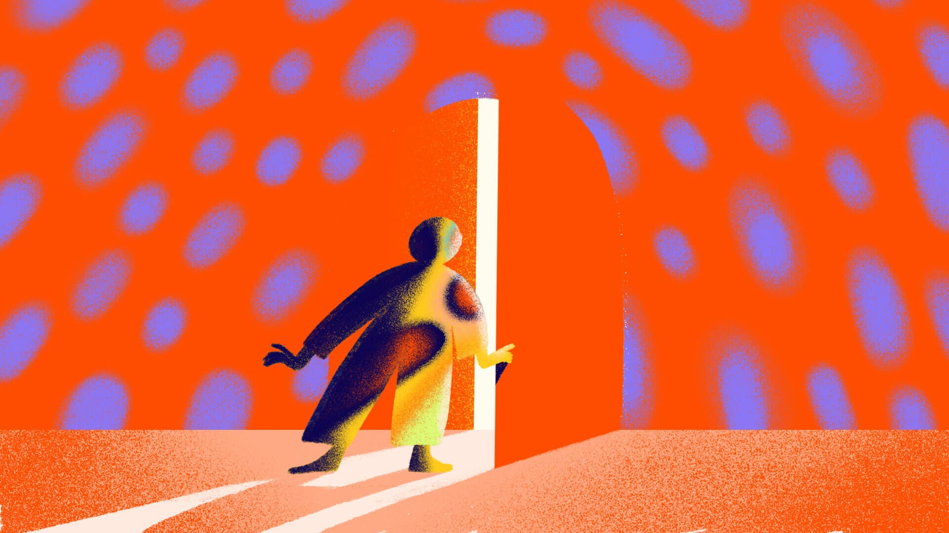
Illustration by Merit Myers
The social impact sector is full of recurring design patterns. They are symbols, palettes, and styles that aim for safety but too often flatten individuality. The challenge for nonprofits is not to reject these cues outright, but to use them with intention: to understand their history, their limits, and the ways they can be subverted or borrowed against to better reflect a unique mission.
A strong visual identity doesn’t just “fit in” with the sector, it helps an organization claim its place in the world with confidence and distinction.
The Problem with Sameness
Nonprofits face enormous pressure to appear trustworthy and funder-friendly. Visual language becomes a shortcut: a globe for “global,” a hand for “help,” a heart for “care,” blue for trust and stability, green for growth and environment. These signals feel safe because they’re familiar, but they rarely make people stick around.
When every organization uses the same icons and colors, safe can quickly become stale. Sameness erodes clarity and makes causes feel generic or interchangeable—an especially risky liability for urgent missions. And when your brand blurs into the crowd, the consequences are real: fewer eyes on your message, fewer dollars in your fundraising, and less confidence from partners and peers. Distinction isn’t vanity—it’s what helps people remember you, trust you, and choose you over countless others doing good work. Without distinction, your brand risks being overlooked in crowded inboxes, lost in crowded funding cycles, or mistaken for another group entirely.
Navigating the Visual Landscape
So how do you move past visual clichés without abandoning the signals of trust that matter?
- Acknowledge the codes. Know what icons, colors, and shapes mean in your ecosystem. Understand what your audience already associates with them.
- Choose intentionally. If you use a common motif, pair it with an unexpected twist—a distinctive typeface, a bold scale, or an unusual pairing of elements.
- Seek specificity. Root your visuals in the lived reality of your organization. Draw from your geography, your people, your culture. That authenticity will stand out more than another abstract dove.
- Subvert strategically. Sometimes the best move to signal your organization’s evolution is to flip the script. Swap “safe” blue for an audacious coral. Replace literal icons with metaphorical ones. Play with humor or surprise. If the symbol is overused, resist it—or reinvent it.
Borrowing Power from Other Spaces
Uniqueness doesn’t always mean inventing from scratch. Sometimes the strongest way to stand apart in your sector is to borrow visual language from outside of it.
Pete Buttigieg’s 2020 presidential campaign brand, which Hyperakt designed, leaned on the unifying nature of baseball and blue jeans in American culture—everyday icons that cut across divides at a time when the country felt fractured on so many fronts.
The Vera Institute of Justice draws credibility from the visual language of journalism, borrowing cues from The Atlantic to signal seriousness, rigor, and authority.

Baseball and presidential campaigns are both about bringing bringing people of all stripes together around something they can rally behind. Both tap into deep American traditions and local pride.

Vera was transitioning from being a behind-the scenes research and projects-based organization to a thought leader advocating to end mass incarceration. Their new brand blended human-centered storytelling and rigorous reporting.
Sometimes the strongest way to stand apart is to borrow visual language from outside your lane.
These choices work because they stretch beyond the expected nonprofit toolkit. They give organizations fresh visual codes that still feel familiar, because they’re rooted in broader cultural contexts people already know and trust.
Inspiring Alternatives
Across our work, we’ve seen how courage in visual language pays off. A nonprofit that rejected “trust blue” for a vivid magenta suddenly felt electric, alive, and impossible to miss. Another organization abandoned stock iconography in favor of custom illustration rooted in its community’s art traditions—instantly distinct and deeply authentic.
These aren’t arbitrary design flourishes or trend-based decisions. They’re strategic. Distinctive choices cut through the noise, earn attention, and build the kind of recognition that leads to more funding, stronger partnerships, and greater public trust. They remind audiences: We are not like everyone else. We are uniquely us.
A Call to Nonprofit Leaders
Your brand is the story you tell before a single word is read. Visual language is the first impression—and it can either reinforce your individuality or erase it.
Don’t let fear dictate your visual choices. Don’t let a committee vote water down your identity to the lowest common denominator. Safety is not the goal. Connection is. Recognition is. Trust is.
Visual courage signals organizational courage.
When you claim a bold, intentional visual identity, you’re telling the world: we know who we are, and we’re not afraid to be seen.
And in a sector defined by urgency and transformation, that courage is not just an aesthetic choice. It’s a strategic necessity.
If your organization is ready to break free from sameness, reach out—we’d love to help you claim a visual identity that’s truly your own.