Three Ways to Evolve Your Logo
Refresh, replant, or reseed. Each path reflects a different strategic moment for your organization’s brand.
By Deroy Peraza, Partner at Hyperakt
Logos have a way of becoming lightning rods. They’re the most condensed visual expression of identity, and they carry layers of history, emotion, and meaning. Your logo can feel like the face of your organization itself.
So when it’s time to rebrand, the question of whether, and how much, the logo should change can feel thrilling and unnerving at once.
The real question isn’t “Do we like it?” It’s “What moment are we in?”
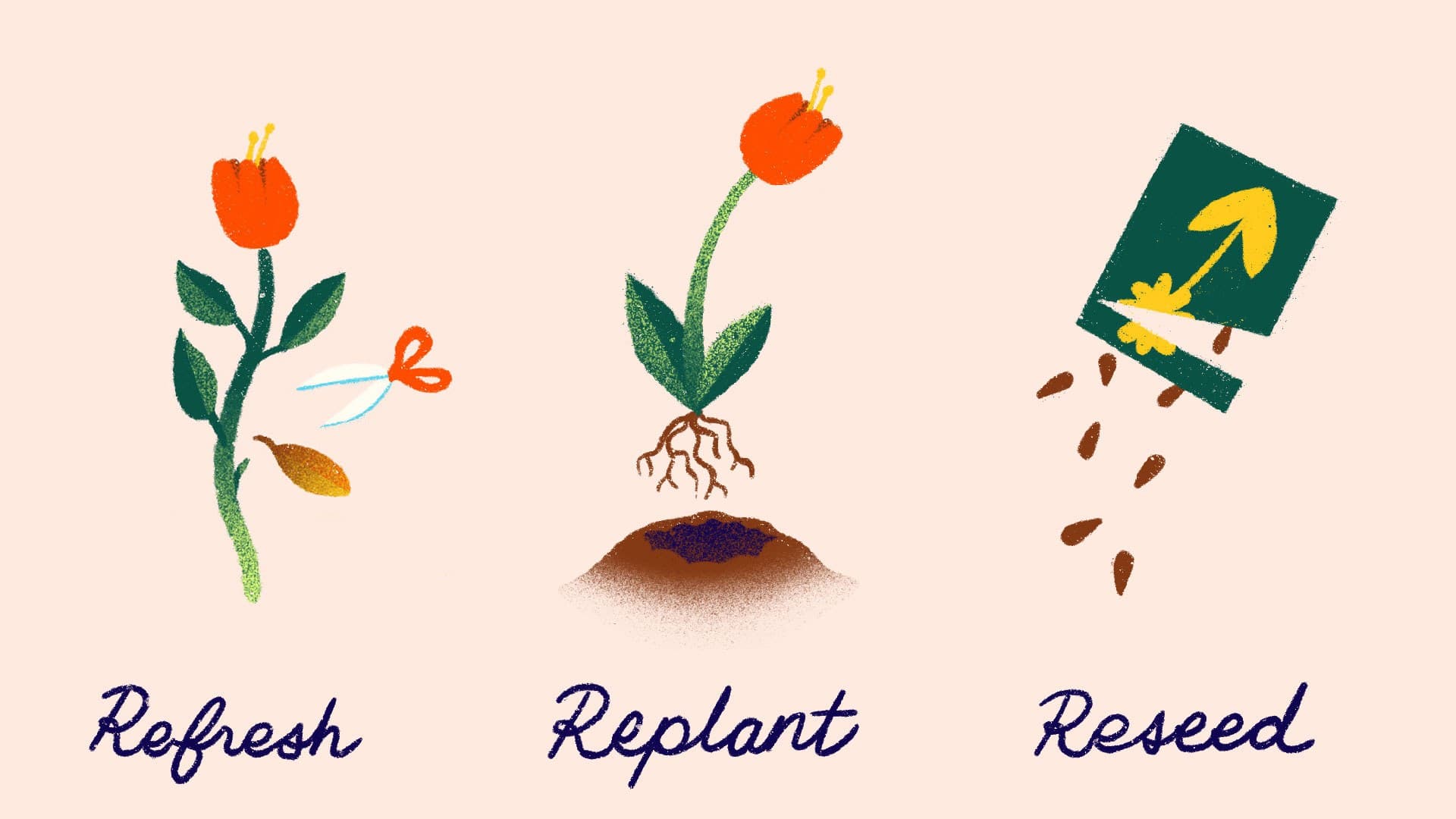
Illustration by Merit Myers
How Much Change is Right For You?
A logo change shouldn’t be looked at in isolation. The right path becomes clearer when you step back and examine your broader brand landscape:
- Organizational change: Are you signaling continuity, evolution, reinvention, or disruption?
- Brand equity: Is it an asset people rally around, or a liability holding you back?
- Visual system: Are other brand elements evolving too, or staying largely the same?
- Name changes: A minor tweak, a moderate shift, or a full rename will directly influence how much the logo must evolve.
These aren’t just design questions. They’re strategic ones.
When it comes to your visual identity, design systems naturally adapt over time. Color palettes shift or expand. Typography evolves. Layouts adjust for new platforms and technologies. Logos, however, carry deeper equity. They should never change casually. Updating a logo is a meaningful investment. It should reflect your broader brand strategy, not just aesthetic preferences.
Do you refine what exists? Evolve it while preserving recognizable cues? Or begin again to signal a more fundamental shift?
While there are clear principles for what makes a strong logo, there’s no universally correct amount of change. The right approach depends entirely on your organization’s moment and needs. When change is on the table, it helps to name the level of evolution you’re considering. We call them refresh, replant, or reseed. Each path is valid when chosen intentionally and grounded in purpose.
Refresh: Honoring What’s Thriving
A refresh is the lightest touch. It keeps the recognizable core intact while modernizing its execution. That might mean refining typography, simplifying a complex mark, improving spacing, or adjusting colors for accessibility and digital performance.
Organizations choose to refresh when their logo still holds strong equity. Audiences recognize it. Funders trust it. Staff feel connected to it. The foundation is solid, but the presentation needs polish. If deeper challenges exist, though, a refresh can feel cosmetic. If there’s confusion about your purpose or outdated perceptions about your impact, a surface-level update won’t solve the underlying misalignment.
A refresh is like tending a well-loved garden. The roots are strong. The soil is healthy. A little pruning and fresh mulch help it thrive for seasons to come.
Replant: Realigning Strategy and Brand
Replanting is a middle path. It preserves some DNA of the original mark while significantly evolving its form. Letterforms may be redrawn. Symbols abstracted. Visual tropes modernized. The goal is continuity with progress.
This approach works when the current logo no longer fully fits, but the organization is not ready for a dramatic departure. There’s recognition that change is needed, paired with respect for what came before. Replanting requires clarity and discipline. Without a strong strategic anchor, it can feel caught between worlds, not fully honoring the past and not fully embracing the future.
Every logo evolution is a choice between honoring what’s familiar and signaling what’s next.
Think of replanting as redesigning your garden layout. You keep the plot and some of the plants, but you rearrange beds for better light, replace what no longer thrives, and introduce new growth that complements what’s already there.
Reseed: Signaling a New Chapter
Reseeding is the boldest move. It begins with a blank slate. This path often accompanies major change: new leadership, expanded geography, a sharpened strategy, or a desire to reintroduce the organization to the world. It’s not just a design decision. It’s a signal that something fundamental has shifted.
Reseeding can energize staff, clarify direction, and reframe perceptions among partners and funders. It creates space for a new story to take hold.
Resistance is natural. People form emotional attachments to logos over time. A complete departure can feel like erasing history. But when handled thoughtfully, with context, storytelling, and a clear rollout plan, reseeding can galvanize people around a bold vision.
It’s like planting a new garden from seed. You enrich the soil. Choose varieties suited to today’s climate. Plant with intention. The landscape changes, but the mission remains rooted in the same hands.
Refresh, replant, and reseed are not stages of progress. They are strategies for different moments.
Refresh
Lightly modernizes a trusted logo, preserving equity while improving clarity, accessibility, and performance for today’s audiences and platforms.
Replant
Reworks key elements of an existing logo to better reflect progress, balancing continuity with meaningful change as the organization evolves.
Reseed
Creates an entirely new identity to mark a major shift in strategy, leadership, or scope, signaling a bold new chapter forward.
The Question That Matters Most
Before deciding how far to evolve your logo, ask:
Does our current identity still serve our future strategy?
If the answer is yes, a refresh may be enough.
If the answer is partially, replanting could bring alignment.
If the answer is no, reseeding may be the courageous step forward.
Logos are just one part of your brand’s story. But they shape first impressions and signal intent. Choosing the right path isn’t about taste. It’s about clarity, confidence, and courage.
If you’re weighing how far to evolve your identity, Hyperakt can help you choose the path that prepares you for the future you’re building.