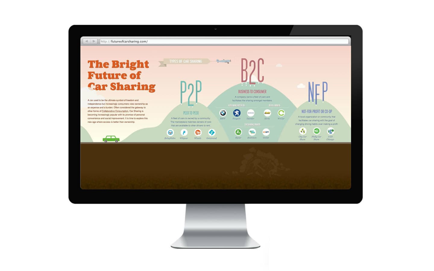
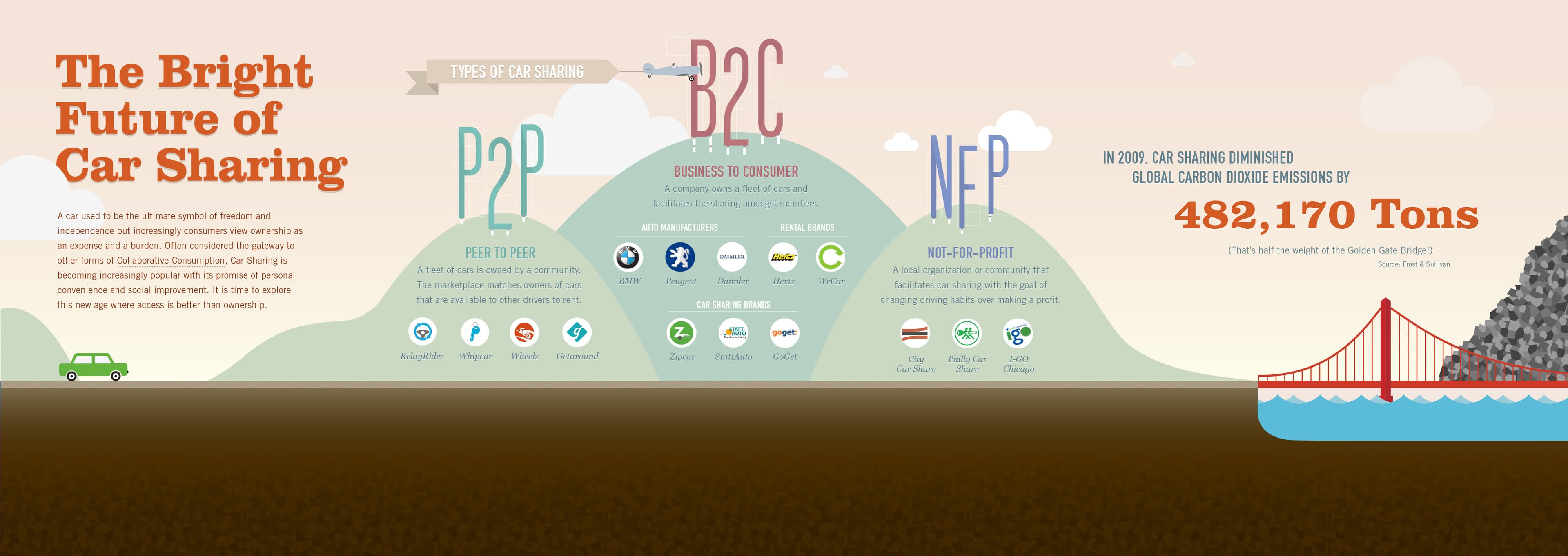
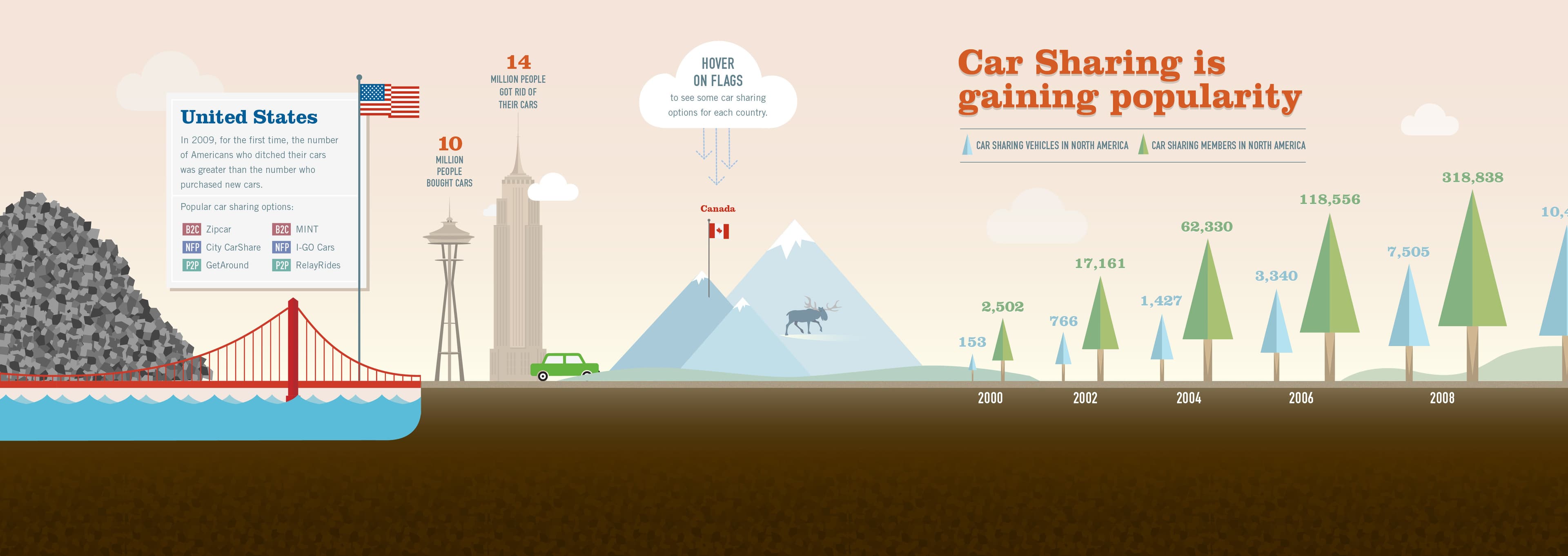
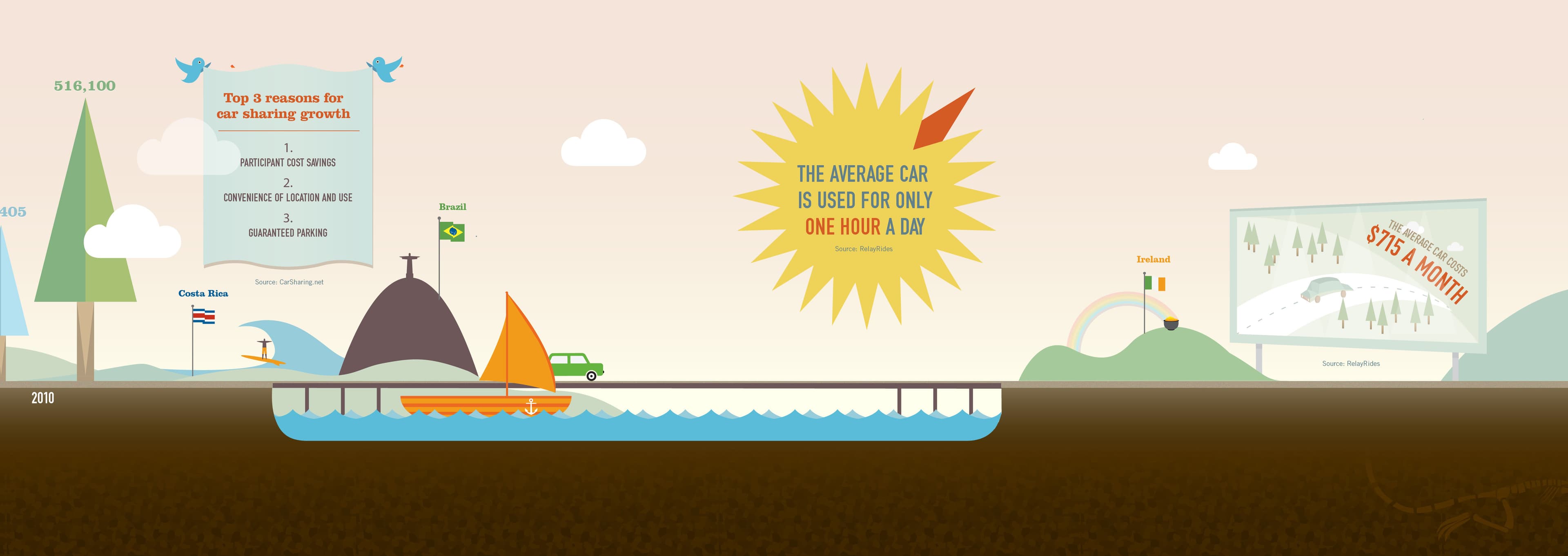
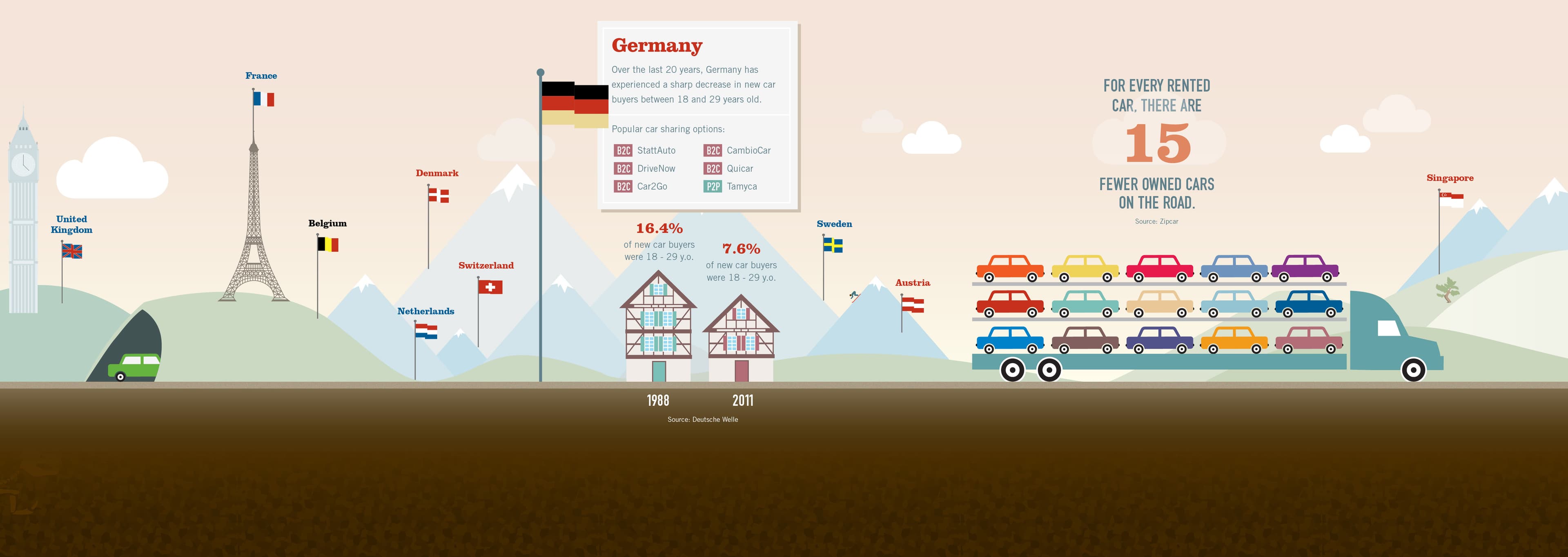
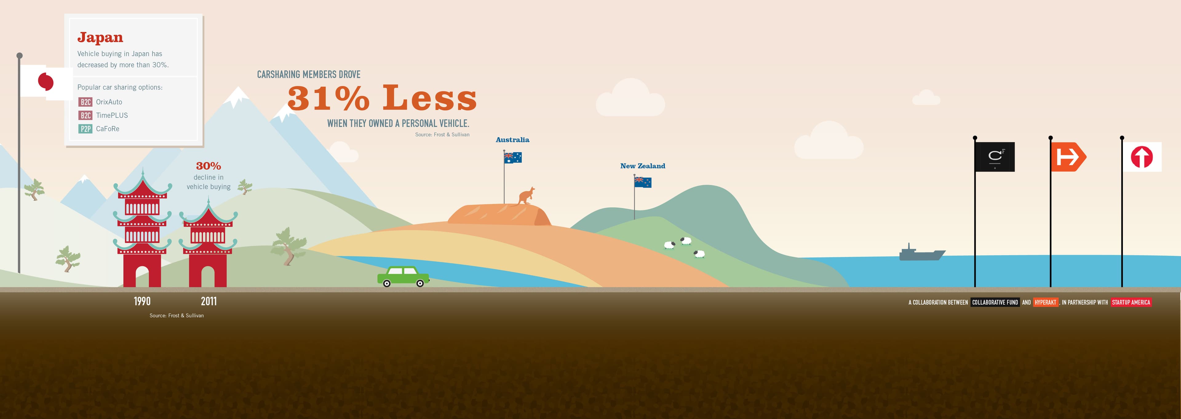
Over the past decade, car sharing has become an increasingly popular trend. With the promise of financial savings and personal conveniences, the idea of collaborative consumption is influencing people all around the world to forgo car ownership. With fewer automobiles on the road, we are already beginning to see tremendous environmental benefits.
The Collaborative Fund is an initiative between several dozen internet companies and entrepreneurs that invests in the growth of the creative class and the concept of collaborative consumption. We worked with The Collaborative Fund to create an interactive infographic: The Bright Future of Car Sharing.
The infographic explores car sharing and its impact around the world. Users are invited on a journey around the world, scrolling through to “drive” an animated car down a global highway of statistics and data visualization. We helped The Collaborative Fund’s audience to discover a new age where access is better than ownership.
News & Recognition
- What Are Microsites, And Do They Belong In Your Marketing Strategy?Forbes
- A Driving Tour Of Global Car SharingFast Company
- The One Show Award WinnerThe One Club for Creativity
- A Fun Approach To Creating More Successful WebsitesSmashing Magazine
- Site of the Day - The Future of Car SharingAwwwards
- Infographic: A Driving Tour Of Global Car SharingFast Company
Project Credits
- Deroy Peraza
- Eric Fensterheim
- Rui Ribeiro
- Josh Smith
- Aymie Spitzer
- Simon Corry