Work

W.W. Norton: Biology Now

The wonderful world of biology.

A collage against a black background featuring various objects: a frog, butterflies, sneakers, mushrooms, slices of pizza on plates, capsules, pills, a red blood cell, and microscopic organisms.

Background

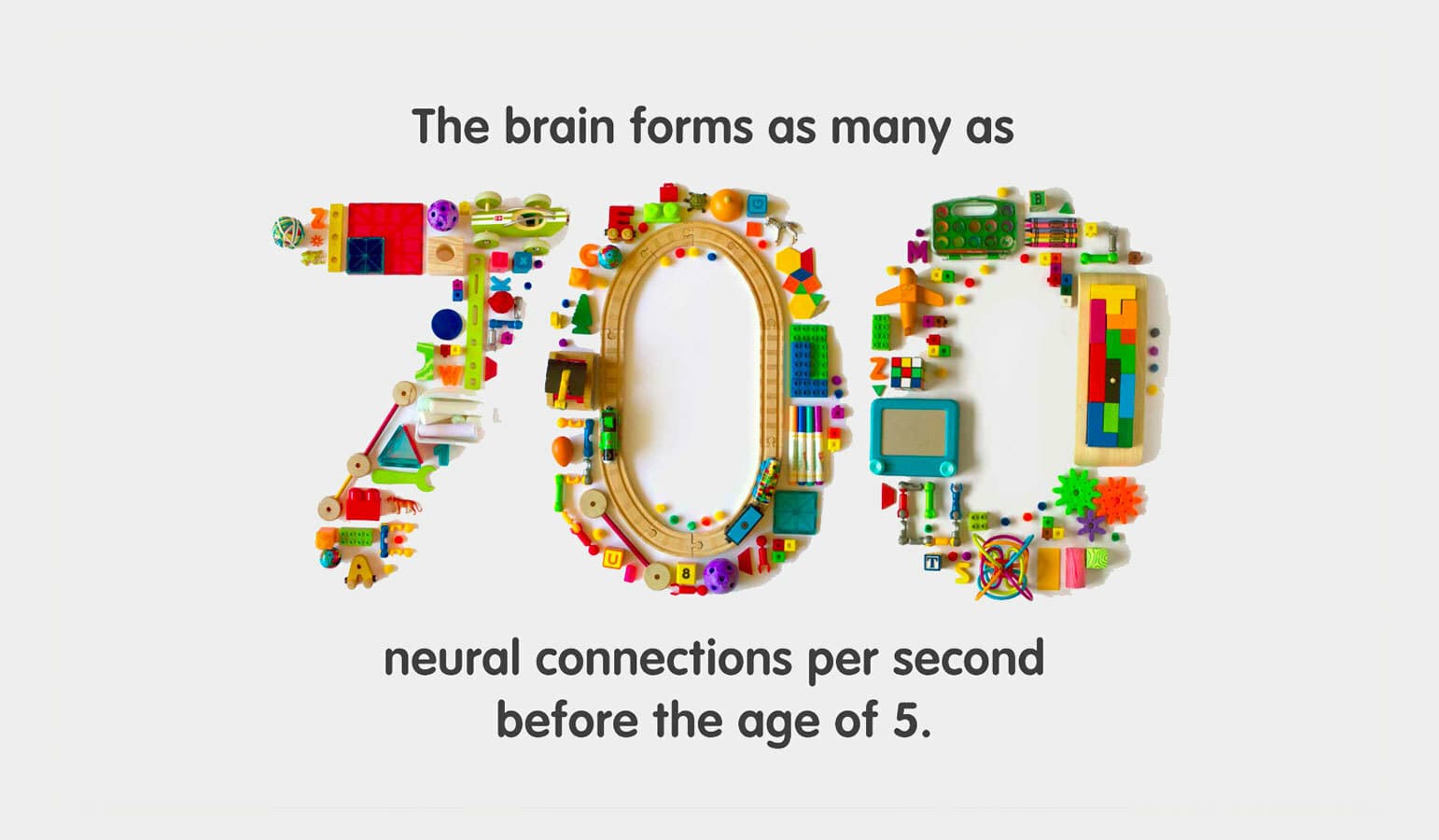
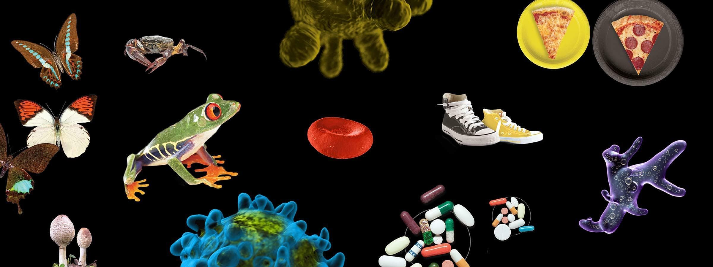
Science can sometimes be as puzzling as it is fascinating. Our latest work for W.W. Norton is a series of 25 single page infographics that illustrate a diverse collection of subjects, from why certain creatures have more DNA to the composition of the universe.

An open magazine displaying an infographic titled "What's It All Made Of?". It shows a cross-section of Earth next to diagrams depicting the composition of Earth's atmosphere, the human body, the universe, and Earth's crust. Each diagram has labeled pie charts.

The challenge

W. W. Norton is the oldest and largest employee-owned publishing house, and publishes books across genres of fiction, nonfiction, and textbooks. For their recently published science textbook, Biology Now, Norton wanted engaging and approachable infographics that broke down different subjects in an easy to understand way.

An infographic titled "On the Diversity of Species" shows the estimated numbers of various species. Numbers include, for example, 1,000,000 insects, 47,000 crustaceans, and 10,000 birds. Illustrations of species accompany each category, with text briefly discussing diversity.
An infographic titled "Sizing Up Life" depicts various microorganisms and cells at different magnifications. It includes amoebas, human egg cells, human red blood cells, E. coli, Mimivirus, HIV, Influenza virus, and Rhinovirus, each with size measurements.
Infographic titled "Plastic by the Numbers" showing types of plastics, their uses, and recycling rates in the U.S. Sections describe PETE, HDPE, PVC, LDPE, PP, PS, other plastics, and their recycling percentages. Pie charts show recycling rates for paper, metals, glass, and plastics.

The opportunity

We used a combination of photography and illustration to build upon different data sets giving each page an editorial feel. Our goal was to bring each subject to life and get students excited about the world around them.

A two-page spread from a magazine titled "Race Against Resistance" shows a timeline of antibacterial drugs approved by the FDA and a graph depicting the incidence of bacterial strains resistant to three common antibiotics from 1980 to 2011.
Image of various microscopic organisms and cells arranged in two rows against a white background. Top row features a bacterium, a lymphocyte, a platelet, and a red blood cell. Bottom row shows a virus, a bacterium, another virus, and a white blood cell.
A digital illustration showing a cutaway cross-section of the Earth, revealing the inner layers. The image depicts the outer crust, mantle, outer core, and inner core, set against a starry black space background. The surface details include continents and city lights.
An illustration of a multi-layered environmental pyramid floating against a black background. Each layer represents different ecosystems, from aquatic at the bottom, wetlands, forests, mountains, and the topmost layer symbolizing molecular elements.
A 3D rendering of human internal organs on a white background, featuring the lungs, heart, liver, pancreas, and kidneys in various bright colors. The organs are depicted in a simplified, stylized manner.
An infographic on "Growing Demand". It shows a renewable energy consumption pie chart: Fossil Fuels 80%, Nuclear 2.7%, Renewables 10%. Biodiesel sources: 69.2% soya, 25.9% non-agri, 0.15% jatropha. Bioethanol sources: 60.3% grains, 29.9% sugarcane, 3.9% molasses.
An infographic titled "Grocery Cart Outbreaks" displays various foodborne illness outbreaks in the US. It shows affected regions, years, case numbers, and foods: jalapeños (2008), peanut butter (2009), peppered salami (2010), spinach (2012), cantaloupe (2011, 2012), and ground turkey (2011).
Infographic showing "Forest Devastation." One tree ring diagram illustrates the causes of deforestation: agriculture (commercial and subsistence), infrastructure, mining, and urban expansion. Another tree ring diagram shows drivers of forest degradation: logging, fires, livestock, and fuel. A chart lists top 5 countries that cleared the most forest between 2000 and 2005: Brazil, Indonesia, Sudan, Myanmar, Zambia.
A printed page featuring a diagram titled "Watching Evolution Happen" with blue background. The diagram includes a petri dish, DNA representations, and step-by-step text explaining an evolution experiment. The book is open and tilted slightly to the right.

Project Credits

Client
Year of Completion
Issues
Project Team
  • Jason Lynch
  • Margaux Le Pierrès
  • Marianna Fierro
  • Ambika Roos
  • Misa Rodriguez
Collaborators
  • Andrew Jerabek
Ready to unlock the potential of your nonprofit's brand?
Reach Out