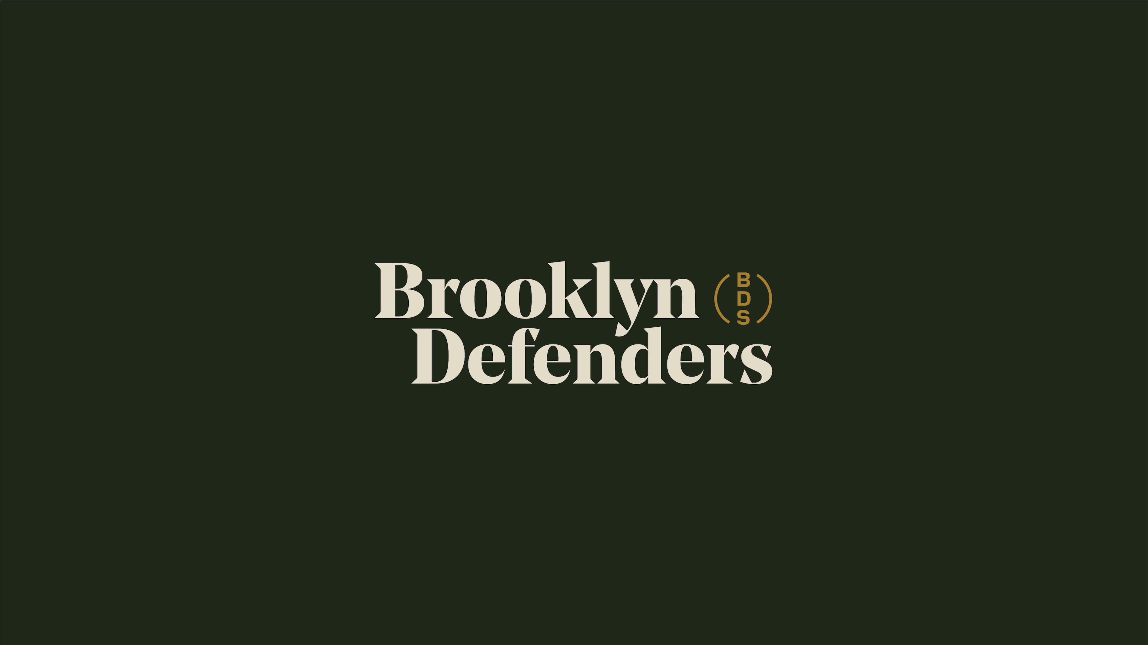
Brooklyn Defenders
A leading legal defense organization representing over 25,000 Brooklynites a year was ready to amplify the grit and grace of its vision, its people, its clients, and community.
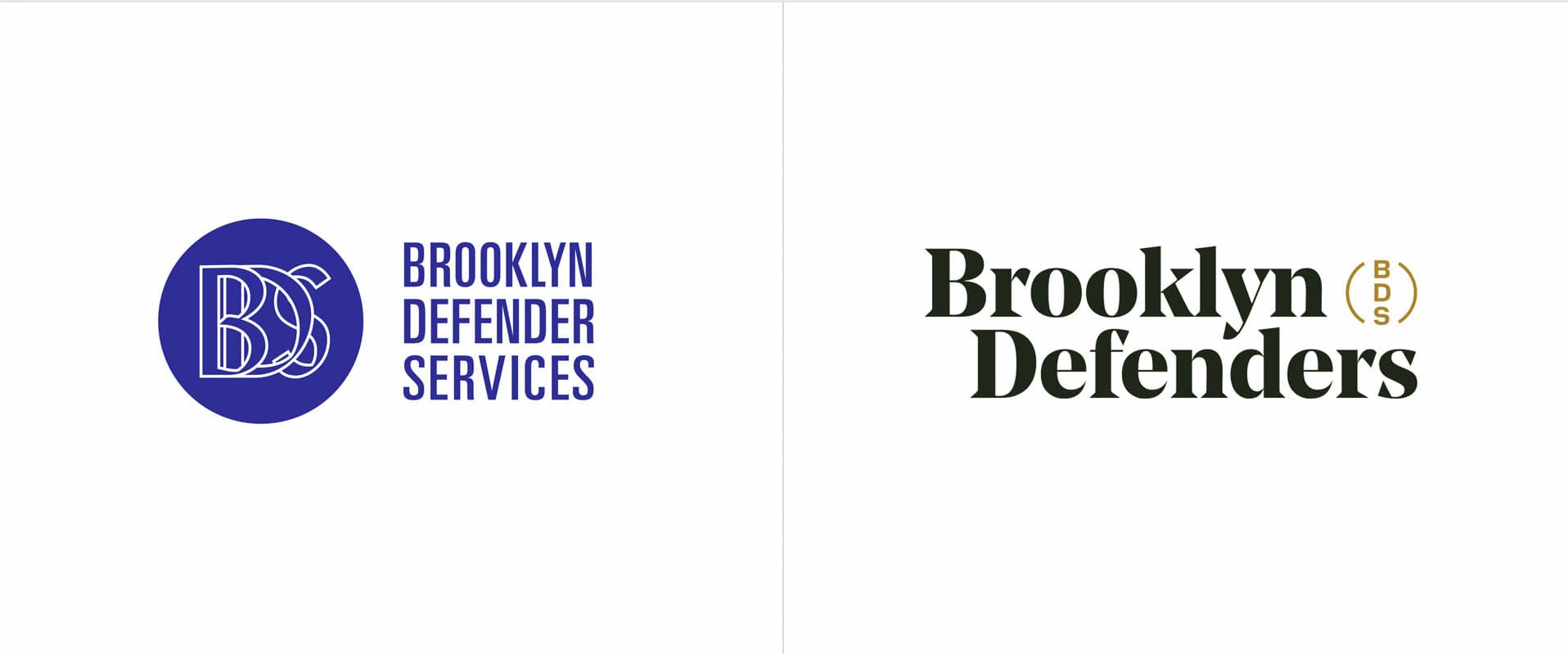
Before (left) & After (right)
The challenge
Public defenders have historically had a bad rap – overworked, underfunded, and stretched thin. Working against this entrenched stereotype was a challenge for Brooklyn Defenders, especially with a dated, hard to use logo, a very limited visual brand system, no unified verbal identity and a website that had little of the information that would be useful to their clients. BDS wanted to recast the image of a public defender and rekindle trust and connection with its clients and the wider Brooklyn community. Furthermore, their unique story of public defense and the fight for justice stretched far beyond the courtroom, into the community and the halls of legislature.
The opportunity
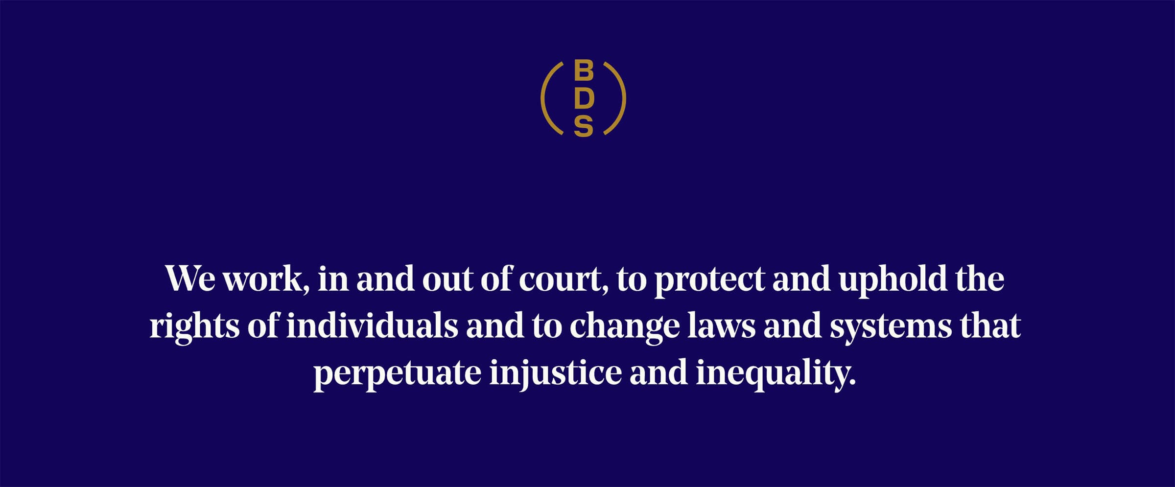
We needed to tell a cohesive story of a multi-faceted organization committed to holistic defense, whether in the courtroom or the community, or agitating for systemic social justice reform for all New Yorkers. That story needed to convey the professionalism of their top-notch attorneys and social services professionals and the humanity of their work.
Listening and learning
We knew early on that the success of the project was predicated on inviting many voices into the conversation. Brooklyn Defenders’ is a massive organization with over 500 employees, spread over a borough that stretches from Greenpoint to Coney Island and from Brooklyn Heights to East New York. In addition to leadership staff and the communications team, we spoke in depth with the policy team who spends alot of time lobbying with local, city, and state government, clients with diverse experiences across the staff (whether in criminal, civil, immigration, or other cases), community outreach staff (whose job it is to build a consistent presence at the neighborhood level), and leaders at peer organizations.
We worked closely with a wide range of stakeholders through large-scale workshops and one-on-one interviews. Long-time employees and new faces, defenders and administrative staff, leaders and juniors, as well as clients, shared their expertise. Through each and every conversation, we gained a 360-degree understanding of the lived and learned knowledge that became the foundation for our redesign.

People first
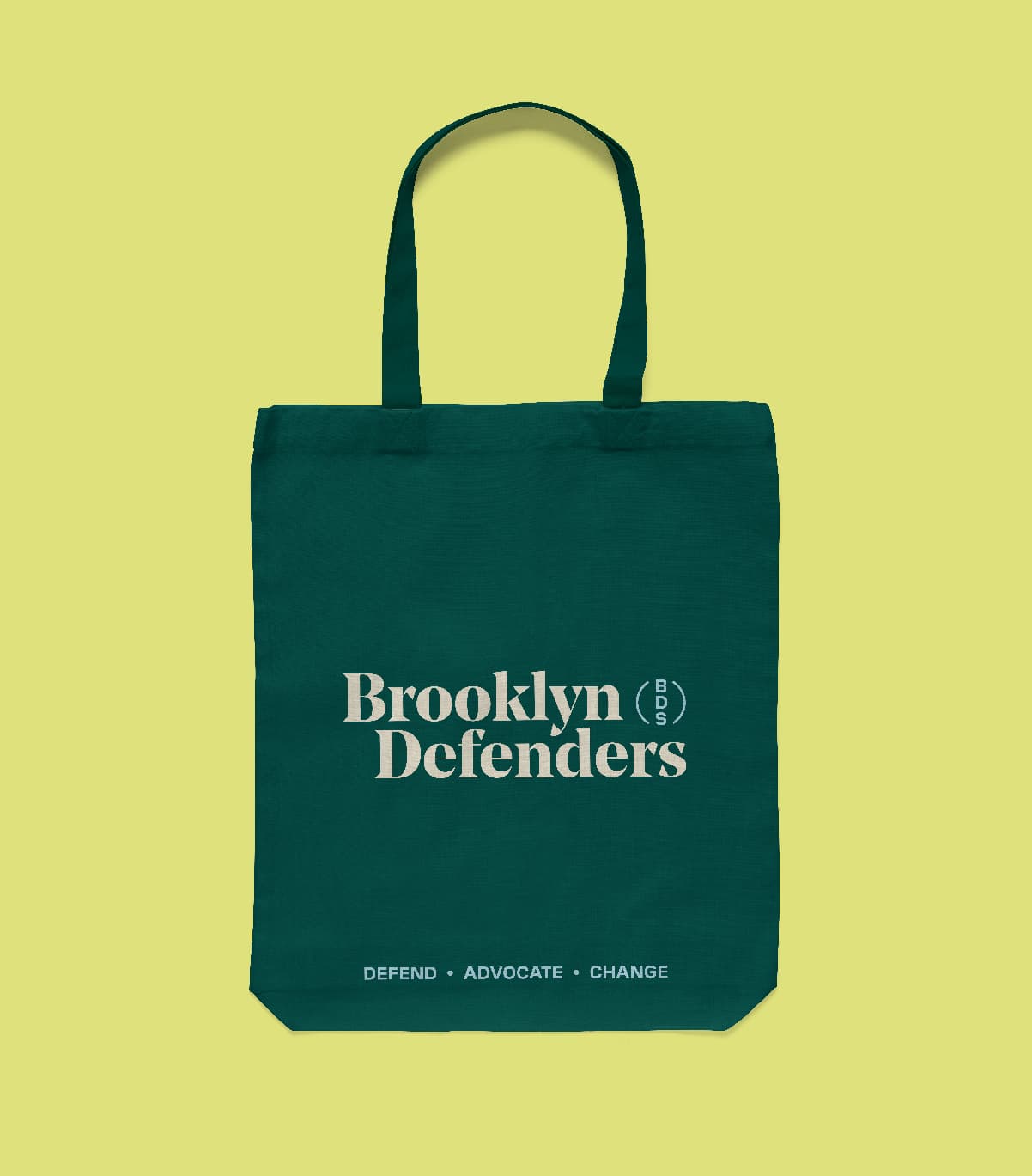
We simplified the brand name from Brooklyn Defender Services to Brooklyn Defenders in order to bring focus to the people who carry out the work and draw attention away from the previously institutional tone.
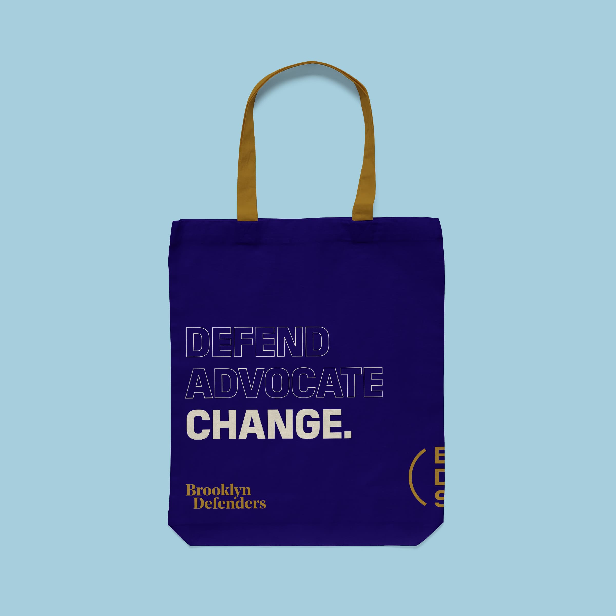

A strong, essential story to rally the team
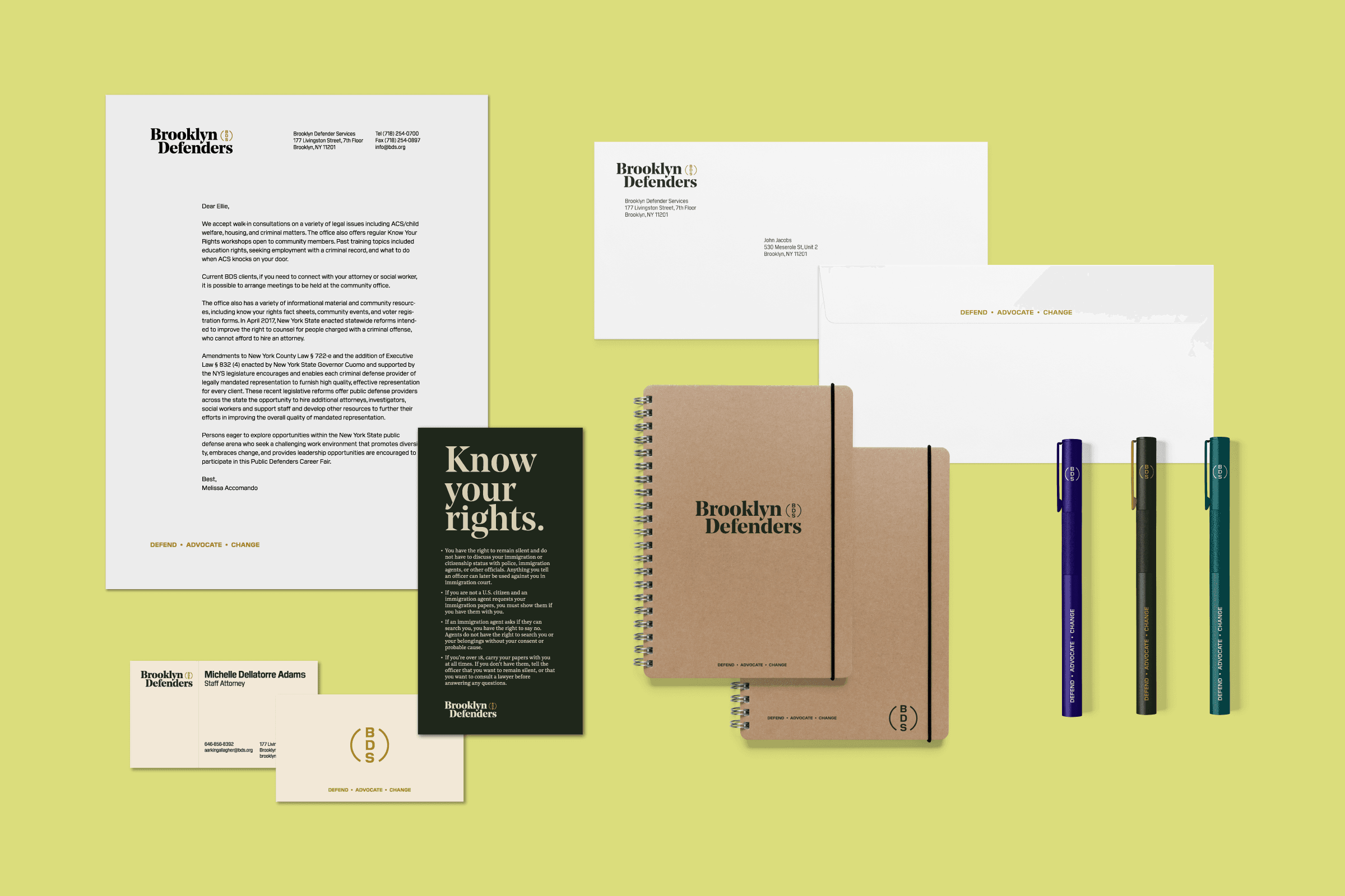
To hang all the rest of the creative work (visual, verbal, and digital), we needed a pithy story, a means of communicating the breadth, diversity, and power of the organization’s work in one breath. The result was encapsulated by three words: Defend, Advocate, Change. Three pillars, each distinct on their own, but together, conveyed the full power of an organization dedicated to holistic social justice, from individual to community to system.
This tagline was supported by a wholesale reworking of the organization’s verbal identity and communication tone. Their new voice was stripped of legalese and jargon, crafted in simple language, flexed equally from courtroom to community, and imbued with the commitment and passion of their dedicated staff.

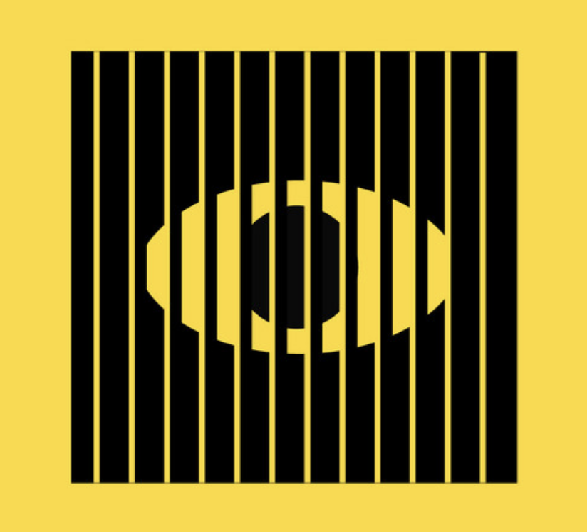
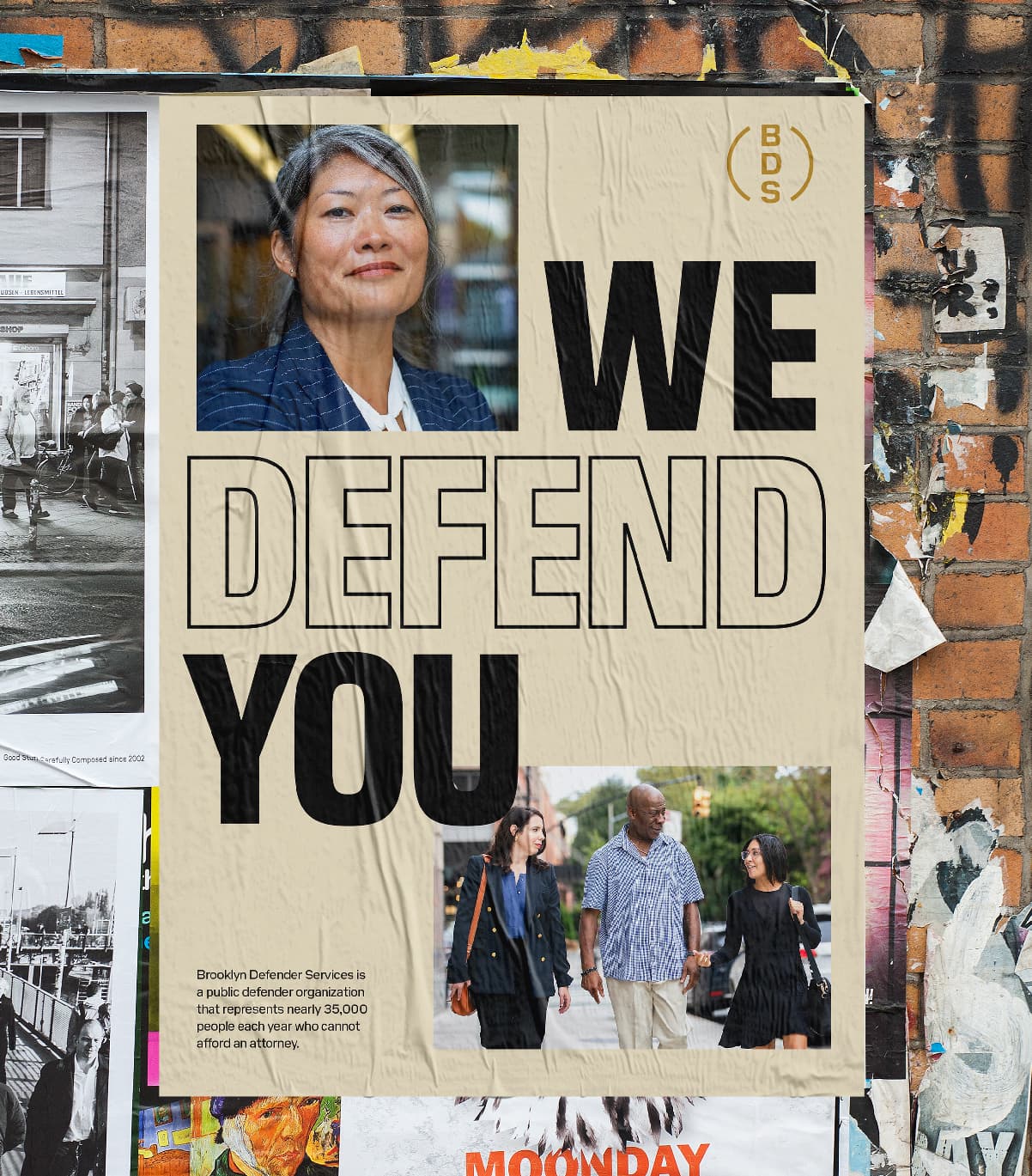
Defending clients from all sides
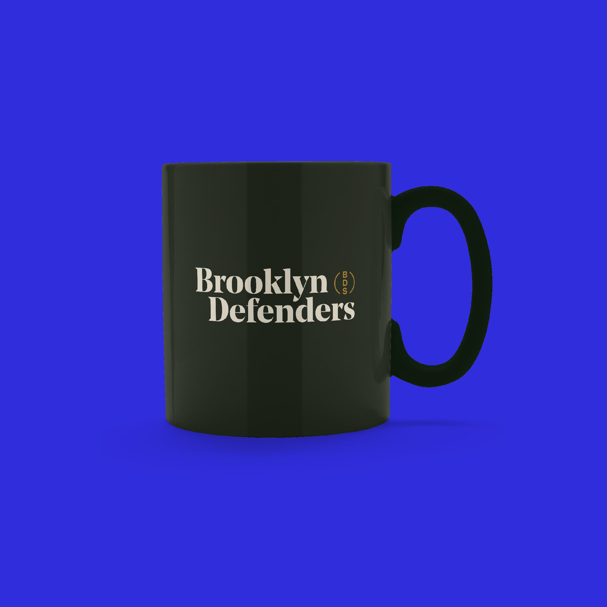
The new Brooklyn Defenders logo represents their 360° approach — defending clients from all sides. Inspired by a stamp or seal, the logo references the organization’s roots in the courtroom. The BDS seal is the foundation for the icon system representing Brooklyn Defenders areas of expertise.
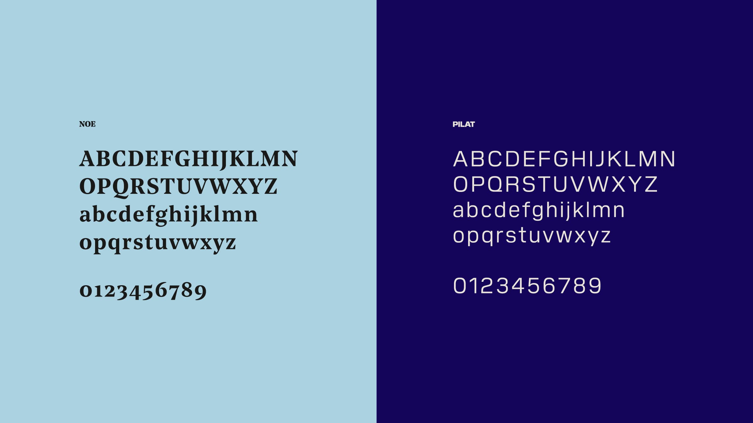
Striking the right tone
Our type choices — Noe, a serif by Schick Toikka supported by Pilat, a sans serif from General Type Studio — reflect the twin characteristics of the new Brooklyn Defenders brand - topflight quality and tenacious rigor.

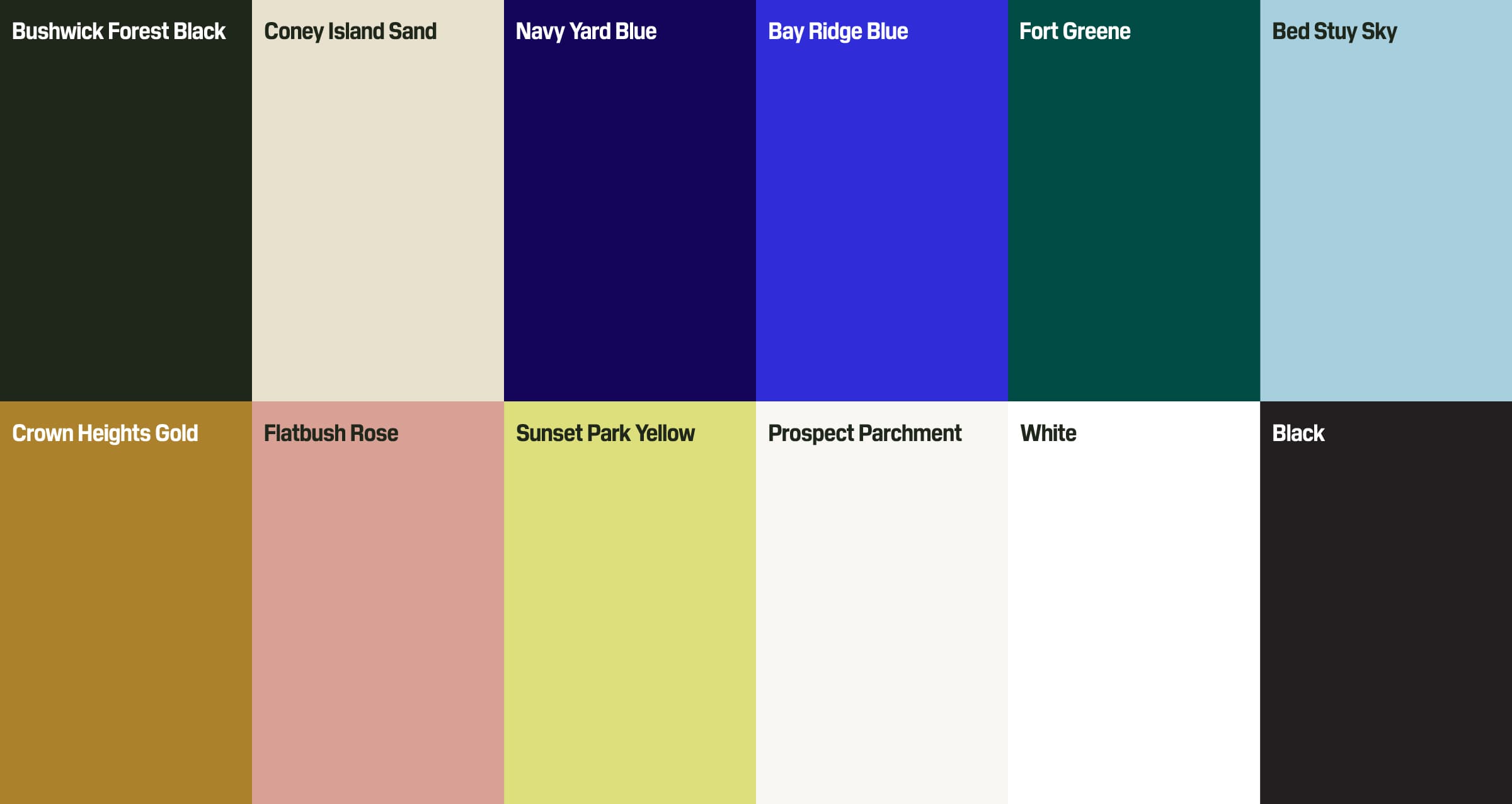
Expressive colors convey range and emotion
Deep greens and off-whites draw on the seriousness, poise, and centuries-old tradition of the legal practice. The brighter blues, inspired by the Brooklyn Dodgers, pack a powerful visual punch. All together, the color palette is an homage to grit and grace of Brooklyn’s neighborhoods.
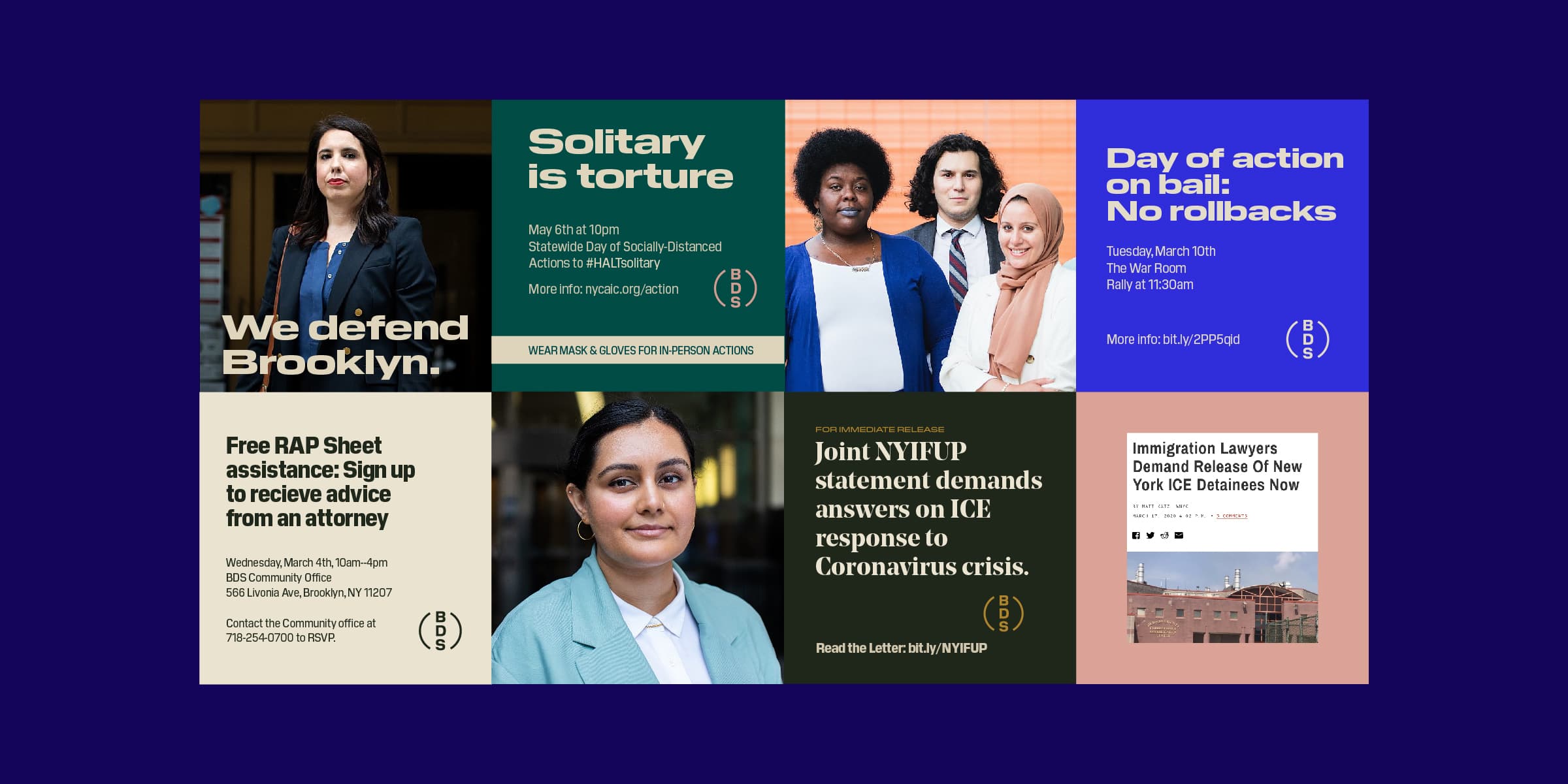
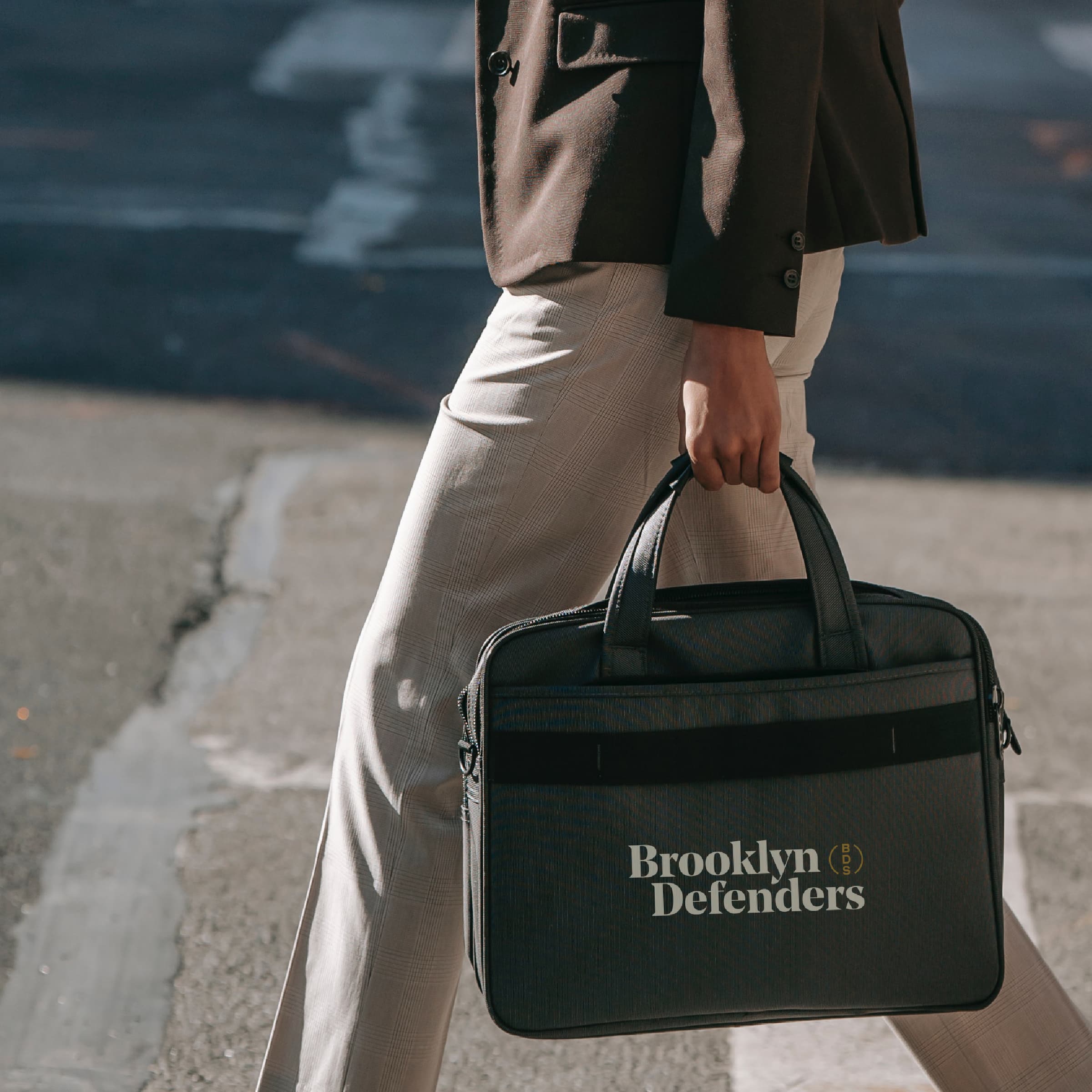
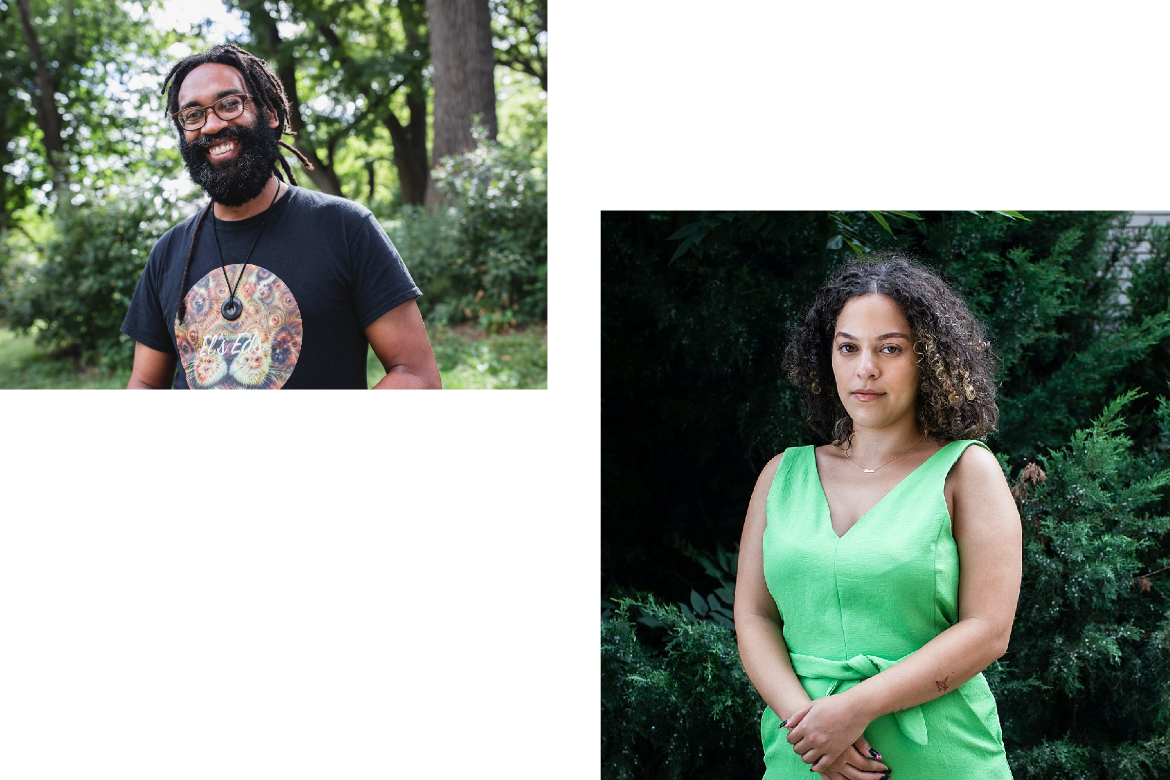
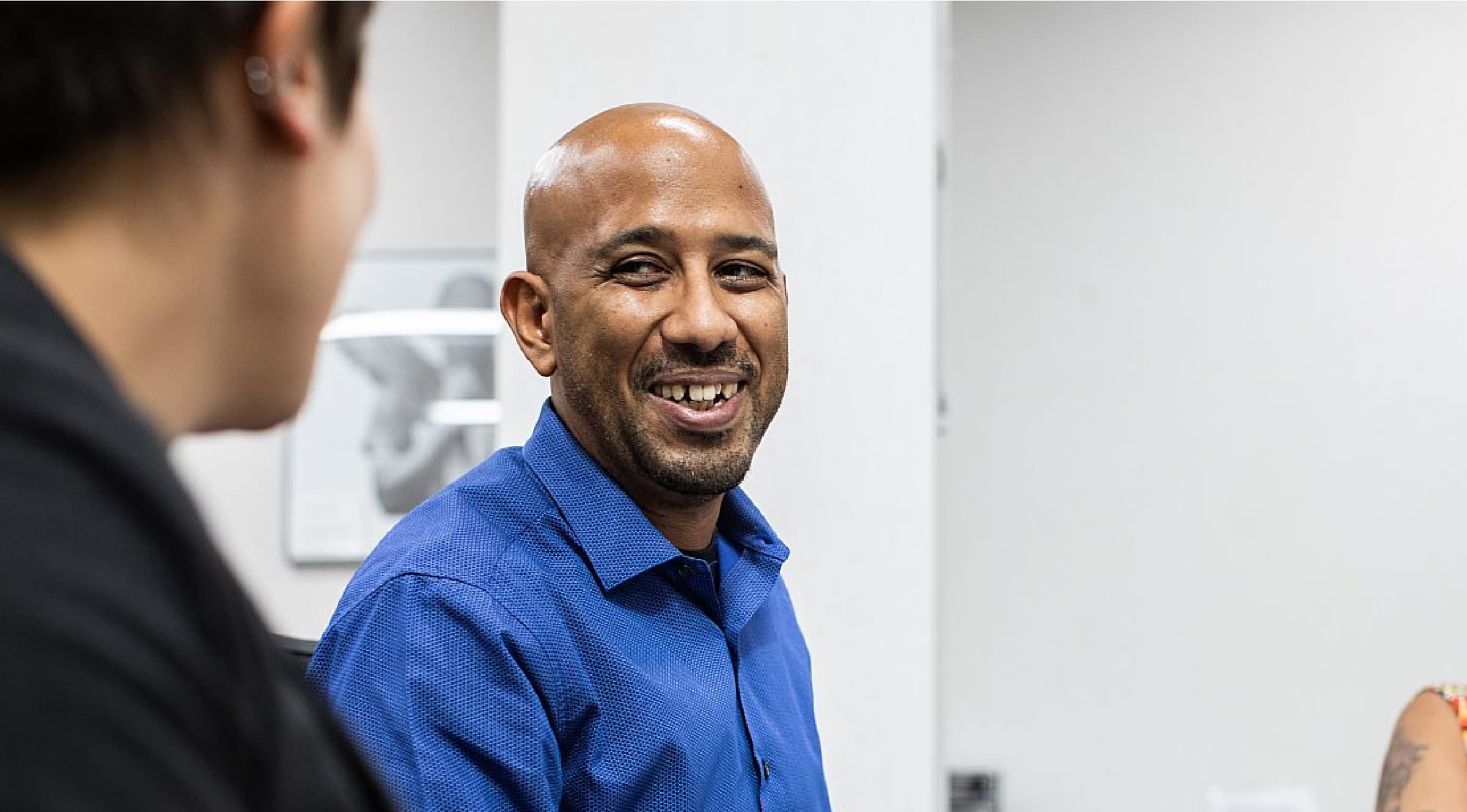
Asset-based photography
Imagery can have great impact on someone’s life – both positive and negative. We see it as our responsibility as creatives to recommend photography and videography direction that conveys asset-based framing as opposed to poverty or trauma. We encouraged Brooklyn Defenders to hire photographers with relationships to the Brooklyn communities that the brand is trying to reflect, and to always include a caption, and/or credit the photographer.
Brooklyn Defenders selected Aundre Larrow, whose exquisite work we featured in our earliest explorations of the brand. The humanity of Brooklyn Defenders and their clients is beautifully captured by his portraits.
![[Left image] A close-up of a person with curly hair wearing blue lipstick, blue earrings, and a blue blazer over a white top, smiling at the camera. [Right image] Three people, dressed in business attire, walking and conversing on a city sidewalk.](/_next/image?url=https%3A%2F%2Fwww.hyperakt.com%2Fassets%2Fimages%2Fbrooklyn-defenders%2FBDS-Case-Study-Image_3.png&w=3840&q=75)
Vibrant humanity
Brooklyn Defenders' photography focuses on portraits, representing clients and staff alike, that aim to reflect compassion and respect for the subjects being captured. Visually, we wanted the vibrancy of Brooklyn and of the new brand to come shining through.

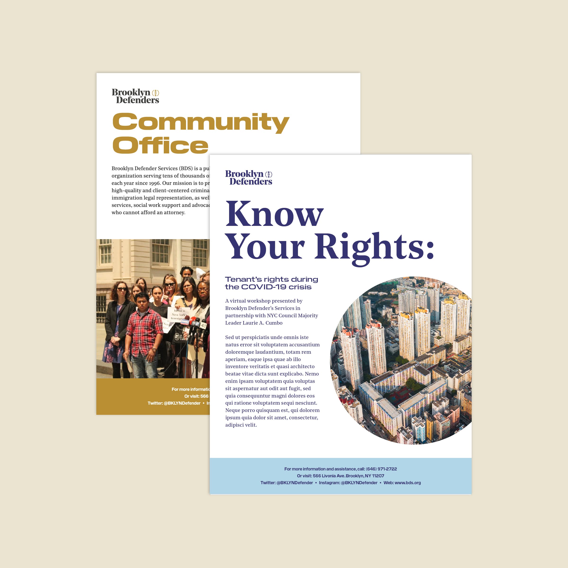
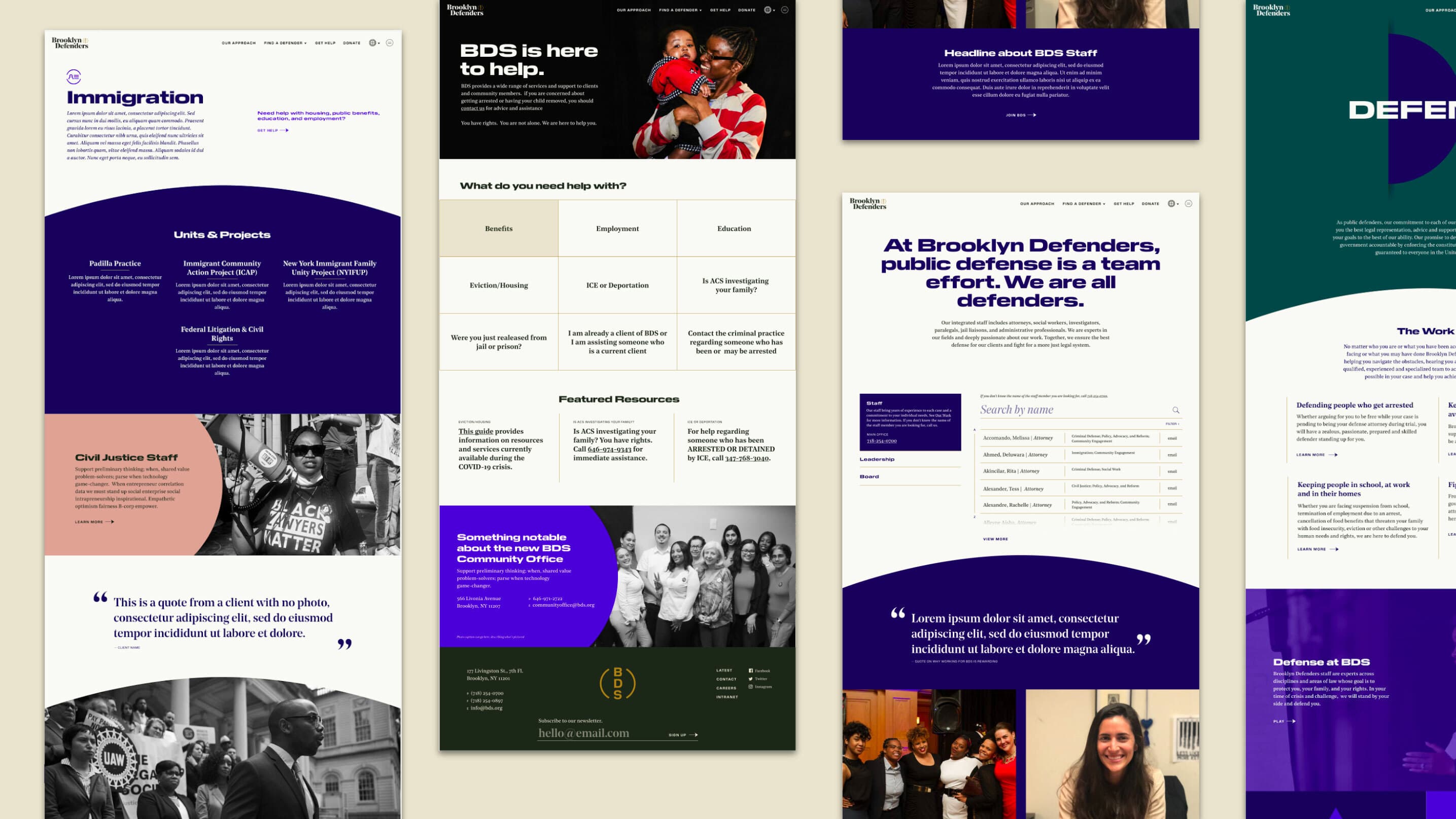
Rebuilding the digital experience from the ground up for clients and partners
As one of the final pieces of our head-to-toe rebrand, the website presented a huge opportunity to tie it all together, and make the entire story coherent and resonant for the Brooklyn Defender community.
Defend, Advocate, Change became the central organizing principle for the entirety of the site - a way for users (whether funders, policymakers, or like-minded advocacy organizations) to get a full understanding of the breadth and depth of Brooklyn Defenders’ work.
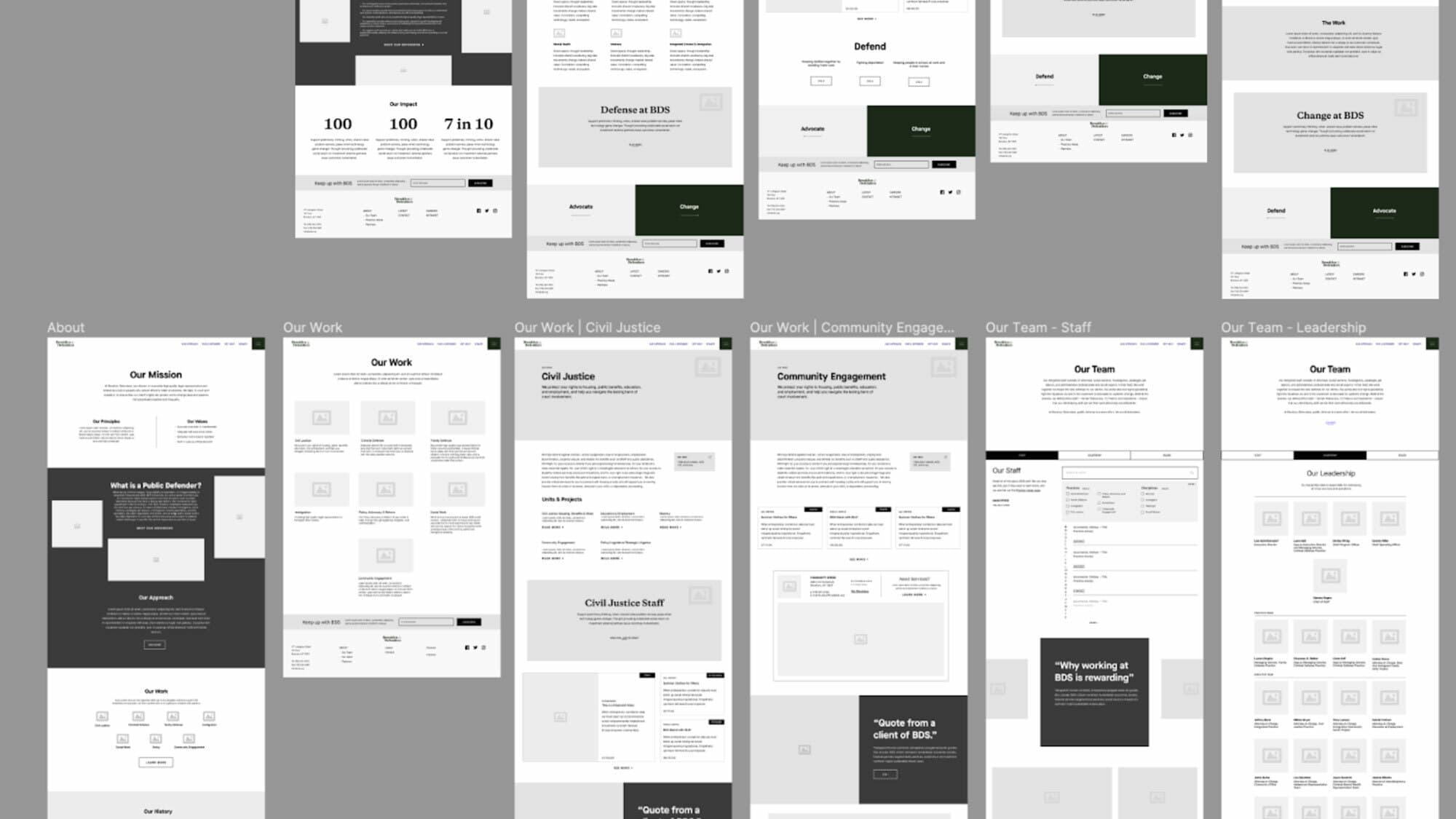
Wireframes
Design System
An experience designed around real needs
Interviews with various stakeholders told us that clients, who are all randomly assigned a Brooklyn Defenders’ lawyer, often sought to vet and understand their new counsel. It was important that the new site allowed clients to quickly look up their new attorney and learn about what they could expect from their new counsel. The website’s help page is robust resource library that connects clients to all sorts of tools, city services, and emergency hotlines to address a variety of immediate problems they might be facing.
News & Recognition
Project Credits
- Deroy Peraza
- Sruthi Sadhujan
- Abigail Fisher
- Sarah Hallacher
- Jarrod Mayes
- Eric Wang
- Lauren Jones
- Laura Jo Hess
- Dylan Viola