Work

Center for Urban Pedagogy

Using the power of design and art to support meaningful civic engagement, in partnership with marginalized communities.

A group of six people sit around a table covered with papers and documents. They are engaged in discussion, with one man pointing at a document. Books and shelves are visible in the background. The atmosphere appears collaborative and focused.

Background

Policies touch all aspects of our lives -- where we live, where we work, how healthy we are, and whether we are welcome in certain spaces. Despite the fact that they shape our lived experiences and built environments, they are hard to understand, making it difficult for the people who are most negatively affected to actually have a say in how they work. The Center for Urban Pedagogy (CUP) is a nonprofit that leverages the power of design and art to support meaningful civic engagement, empowering people to exercise their rights and demand and access the services they need and deserve.

The challenge

CUP has long nurtured a small and loyal fan base. Those who knew, knew. But those who didn’t found CUP complicated to approach. As CUP had evolved over the years, new programs and offerings had sprouted, adding more complexity to the organization and its work. Potential partners, advocates, and educators were eager to work with CUP but unsure how. In its 2 and a half decade existence, CUP had inadvertently become inaccessible to exactly those they were trying to reach.

A tablet displays a webpage with the headline "Creative tools for building community power." The screen shows images of people working and collaborating. Below, there is a green section with text about collaborating with people impacted by public policies to create visual materials.
Working with a team that cares about our work and respects what we're trying to build, however messy or in progress our work can feel at times, is truly invaluable. I could feel the team's excitement and energy to make something work well for us.
Pilar Finuccio
Community Education Program Manager, Center for Urban Pedagogy
A webpage with a split design. The left side details ways to work with the organization, including materials for organizing, civic learning, design teaching, community partners, and supporting the organization. The right side explains the organization's methods and impact.

The opportunity

The opportunity was clear, how might we increase access to CUP’s services, products, and community through their digital presence? In this work, we had the chance to let the world know that CUP was more than an organization or a brick-and-location, but rather a resource, for all, and especially those who needed them the most.

A smartphone displaying a website with the logo "CP" at the top. Below, a collage of icons including a book, stars, and the American flag. The text reads: "Why It Matters: Our work increases access to rights, services, and decision-making power for individuals and communities.
Side-by-side comparison of two webpage designs. The left page is minimalist with sections for About Us, What we do, Our Impact, Our People, and Our Values. The right page has colorful sections for What We Do, Our Vision, Why It Matters, What We Do, and Our Values.
A webpage titled 'Explore Our Work' with a light green header displaying menu items: About Us, Our Work, Work with Us, News & Events, Donate, and Search. Below are illustrated project categories: People Power Transit, Giving Care and Getting Care, and Big Data? Big Issue?.
Three smartphones display different project pages from the welcometocup.org website. Each screen shows a project with a unique illustration and title: "Good Cops? Bad Cops? More Cops? No Cops?", "Here to Stay!" and "Swept Up". Each project is labeled "Made With Students".

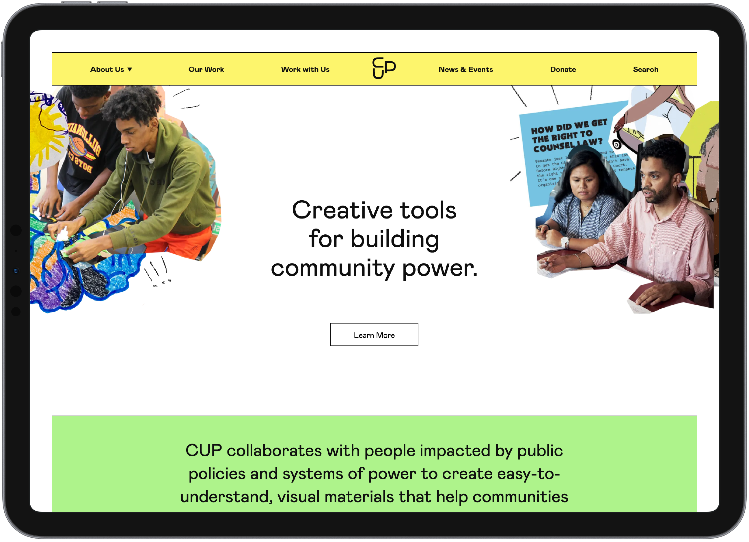
Capturing the essence of CUP

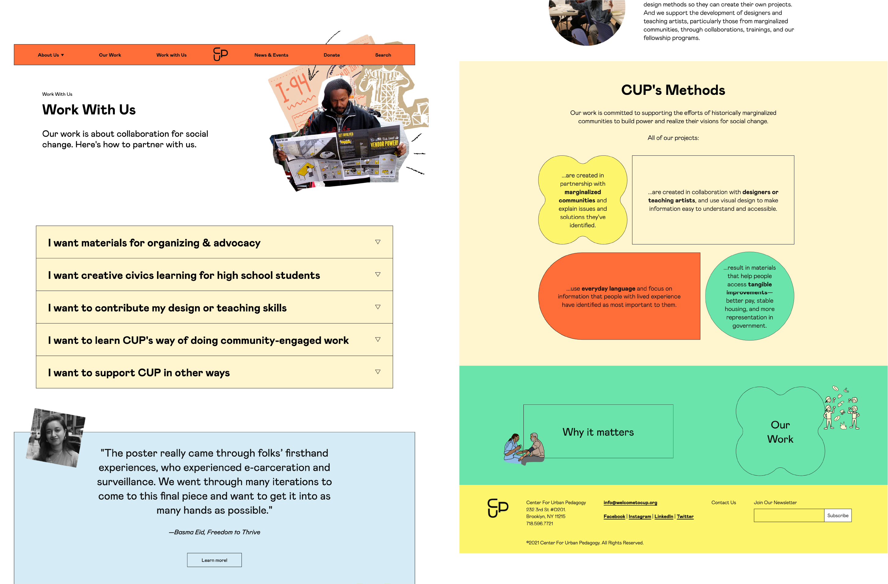
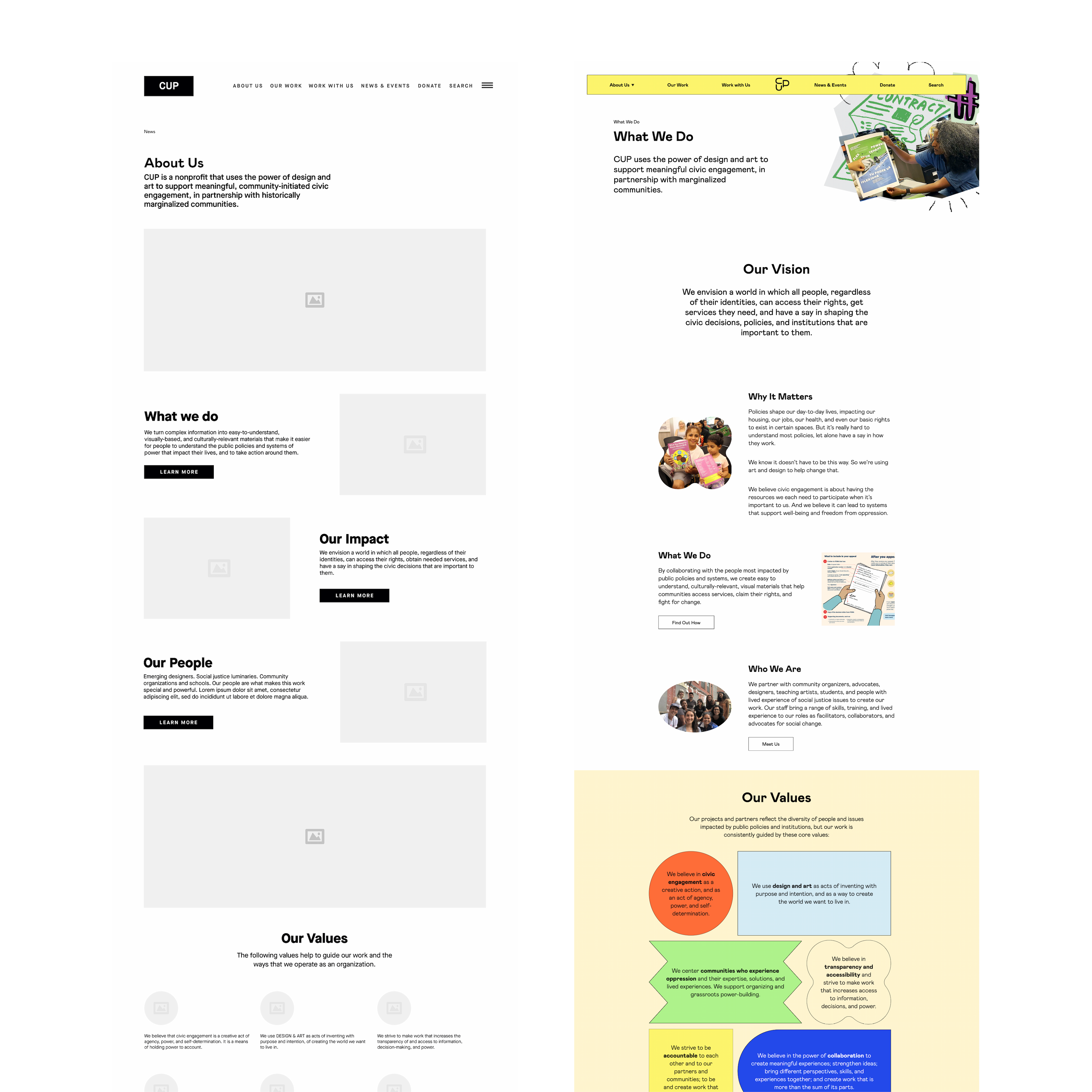
We created a cohesive visual language that evolved from the way CUP currently lives in the digital space. While the mark remains the same, our design team took the vibrancy of color and tactual nature of CUP’s work and created a web style guide. Our approach was to move the brand toward inclusivity and attention to accessibility, without losing the human feel so evident in the organization’s creative partnerships.

A graphic layout shows the progression from "Project Artwork I" and "Project Artwork II," featuring different mint green starburst designs. Below them are "Photograph," depicting a tattooed woman, and "Expression," with illustrated overlays of the woman.
As a team, I think it's given us a really firm grounding for the years ahead—a way to be organized, thoughtful, and clear about how we communicate our work and purpose.
Pilar Finuccio
Community Education Program Manager, Center for Urban Pedagogy
A series of slides on an orange background detail design elements such as shapes, color palettes, typography, accessibility, and collage techniques. Each slide includes text, diagrams, and images explaining the respective topics.

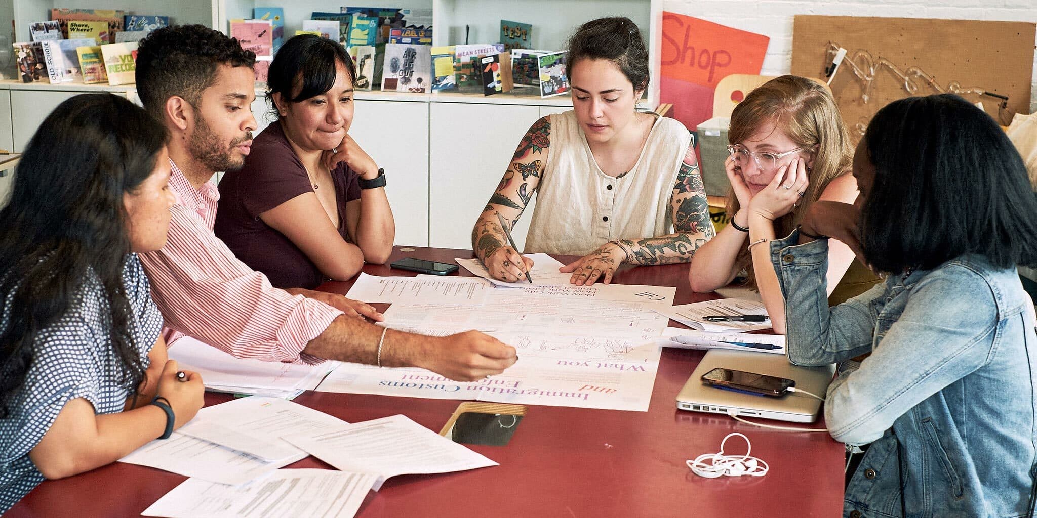
Handmade and collaborative

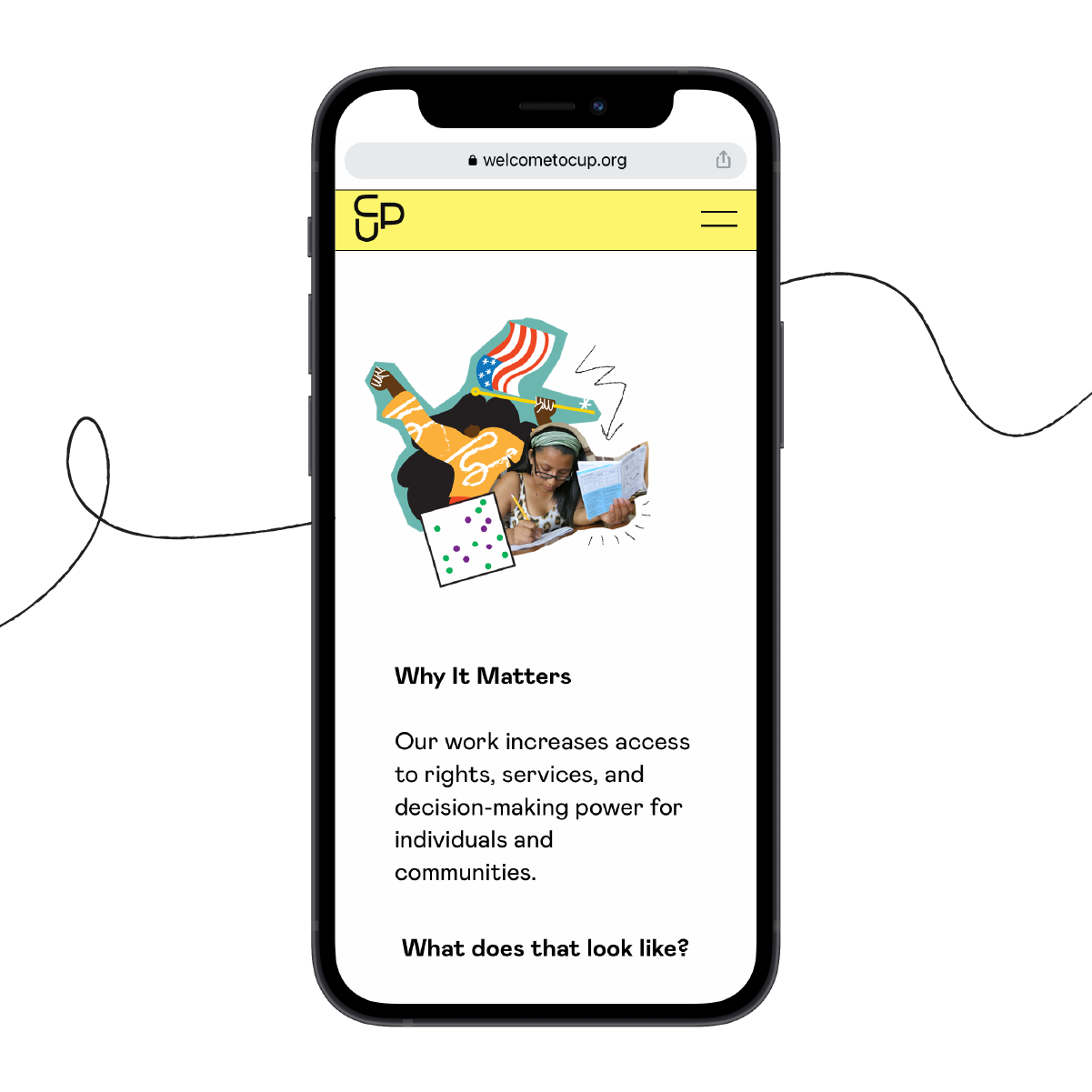
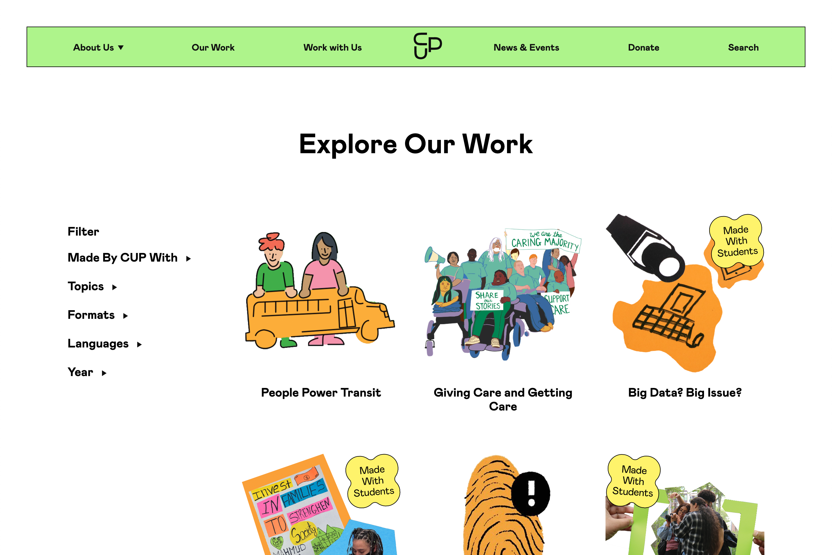
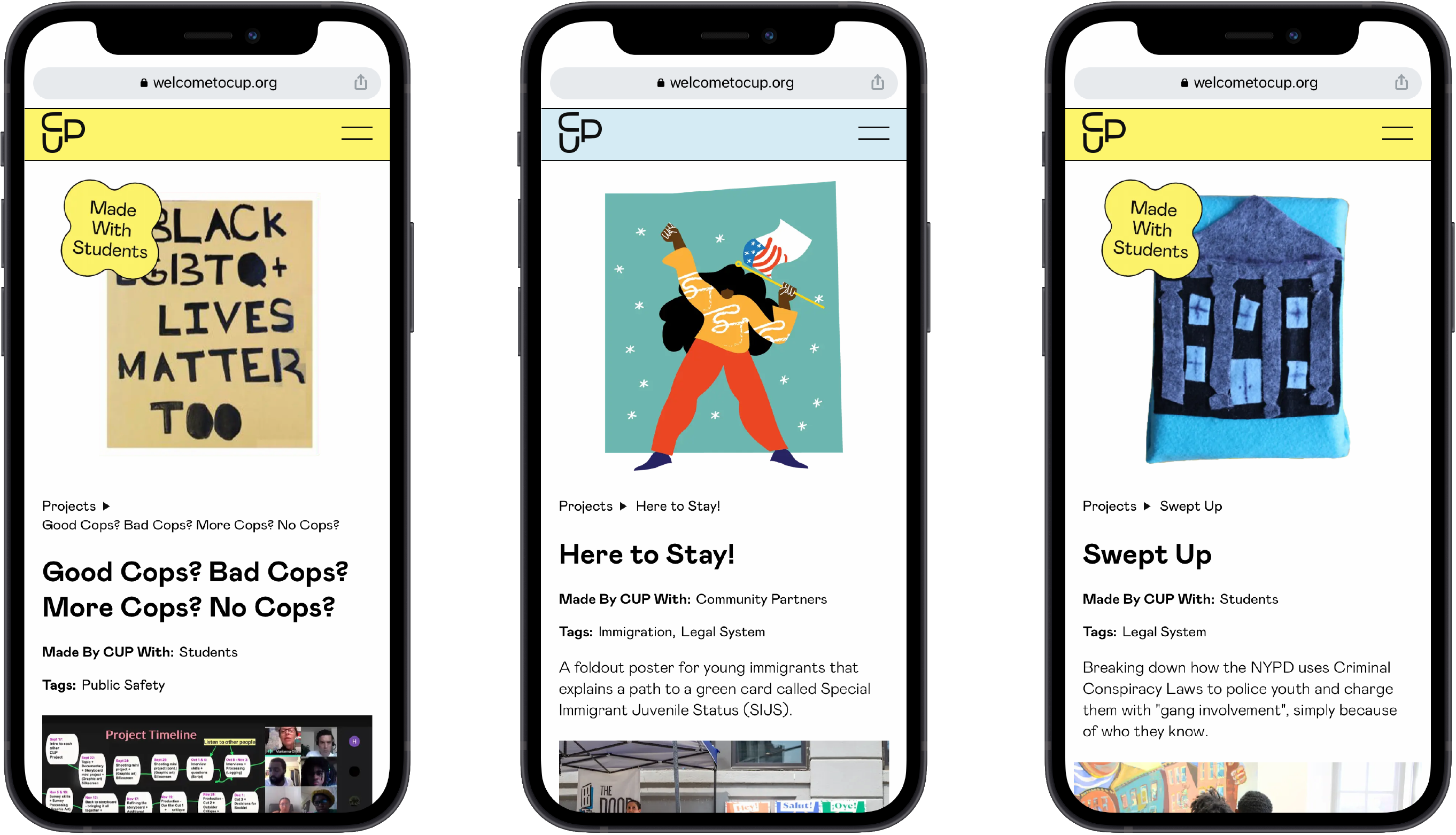
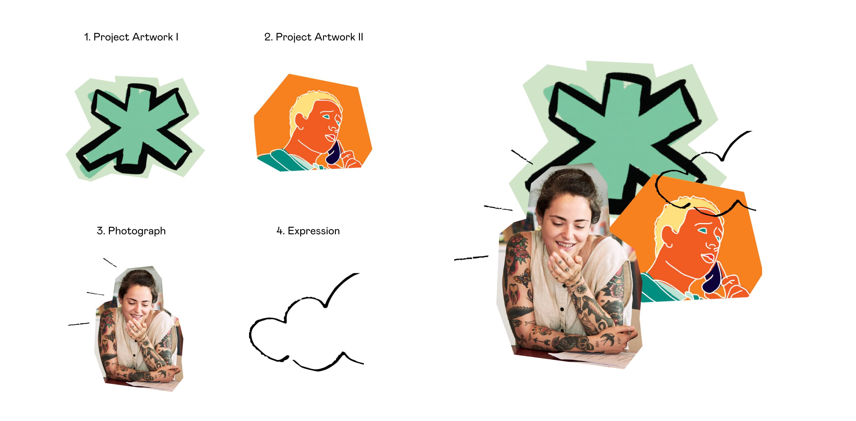
CUP often works with designers, educators, and students to create educational tools. Often partnering with high school students on demystifying policy and planning issues, understanding the demographic they serve was an important part of the process. We worked to incorporate a colorful environment which positioned analog visuals appropriately within the digital space. The digital experience is peppered with moments of unexpected hover interactions and cut-paper collages that feature the community, the work, and a vibe that is ownably CUP.

The web style guide has given us the energy to evaluate and translate our web identity to our internal presentations, social media accounts, and newsletter. For that, I am deeply grateful for the time we had with Hyperakt.
Pilar Finuccio
Community Education Program Manager, Center for Urban Pedagogy

Project Credits

Ready to unlock the potential of your nonprofit's brand?
Reach Out