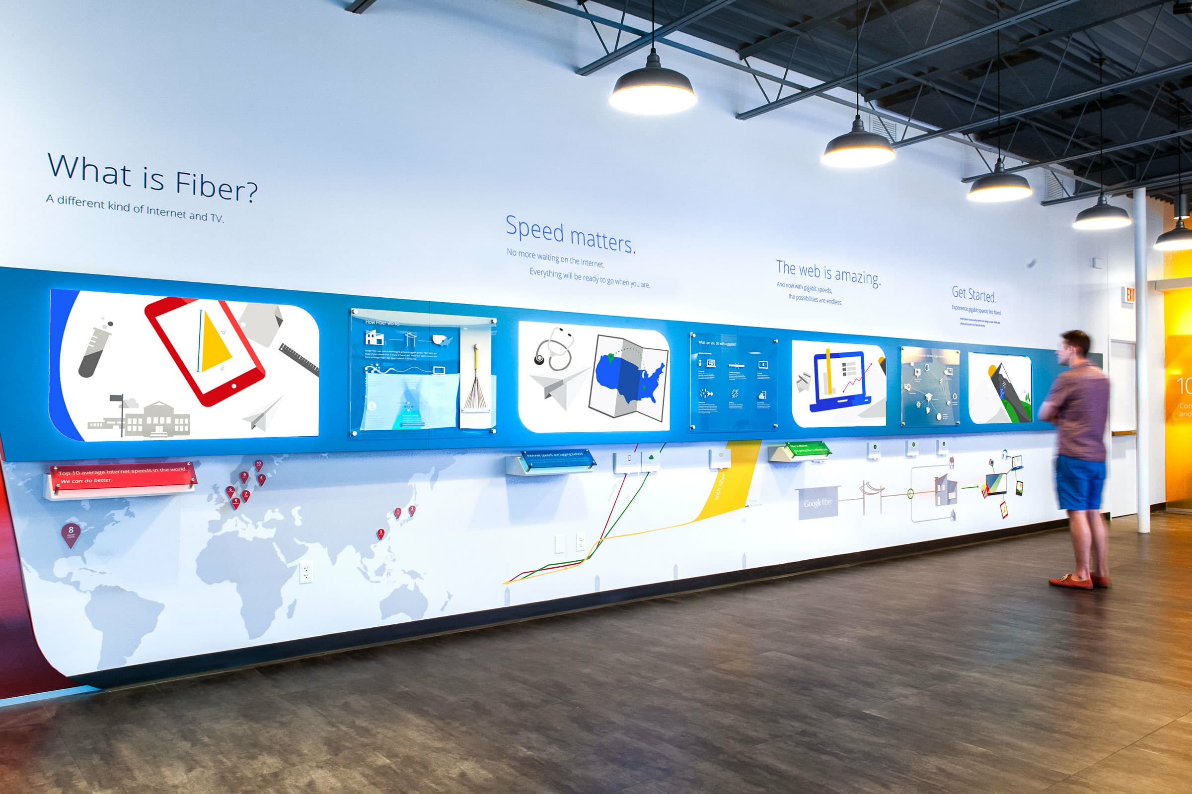
The opportunity
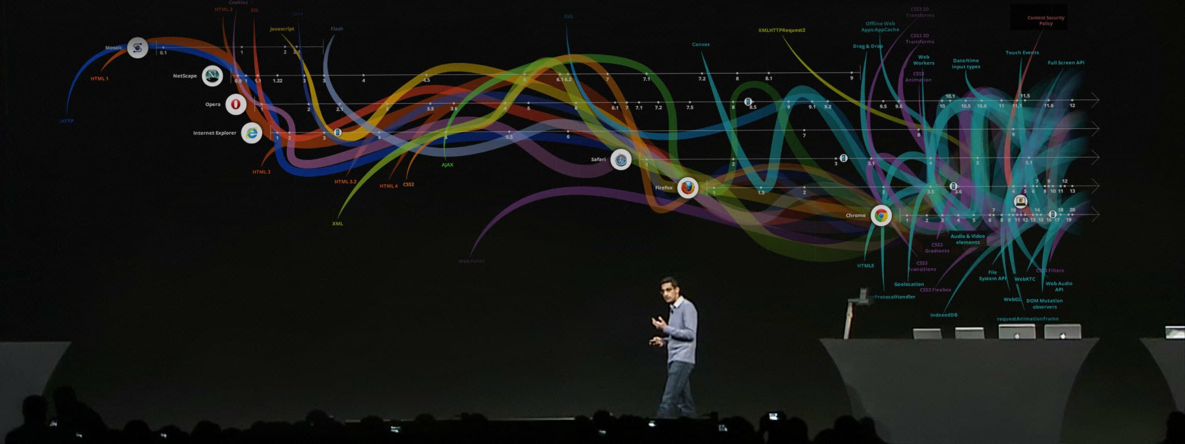
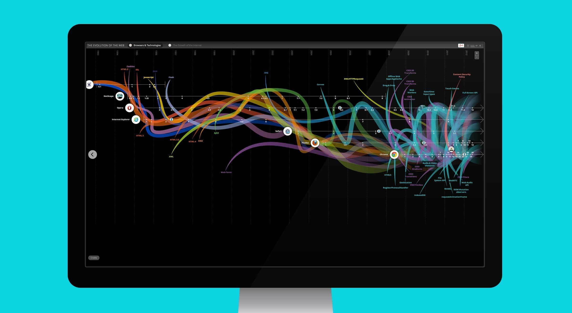
We worked with our development partner, Vizzuality, to create an online visualization that simplified layers of information and immediately gave an overview of crucial moments in web history over the past 22 years. With vibrant colors and elegant curves, we mapped the joint evolution of web browsers and internet technologies from HTTP to CSS, Netscape to Chrome, highlighting the incredible acceleration of growth these technologies have had since the advent of the Chrome browser.
Impact
Since its release in June of 2012 at Google I/O, over 1 million unique visitors have seen the Evolution of the Web. The piece has been tweeted 5200 times. Forbes called it “awesome…beautiful, easy to follow,” TIME called it “a beautiful thing…the latest in web design,” The Guardian called it “beautiful - and elegant - solution.” And from Mashable: “stunning and extensive, an immersive walk down digital memory lane.” The Evolution of the Web won Silver in Interactive Visualization from Information is Beautiful in 2013, and Best Site of the Day from Favorite Websites Awards.
Mining the data
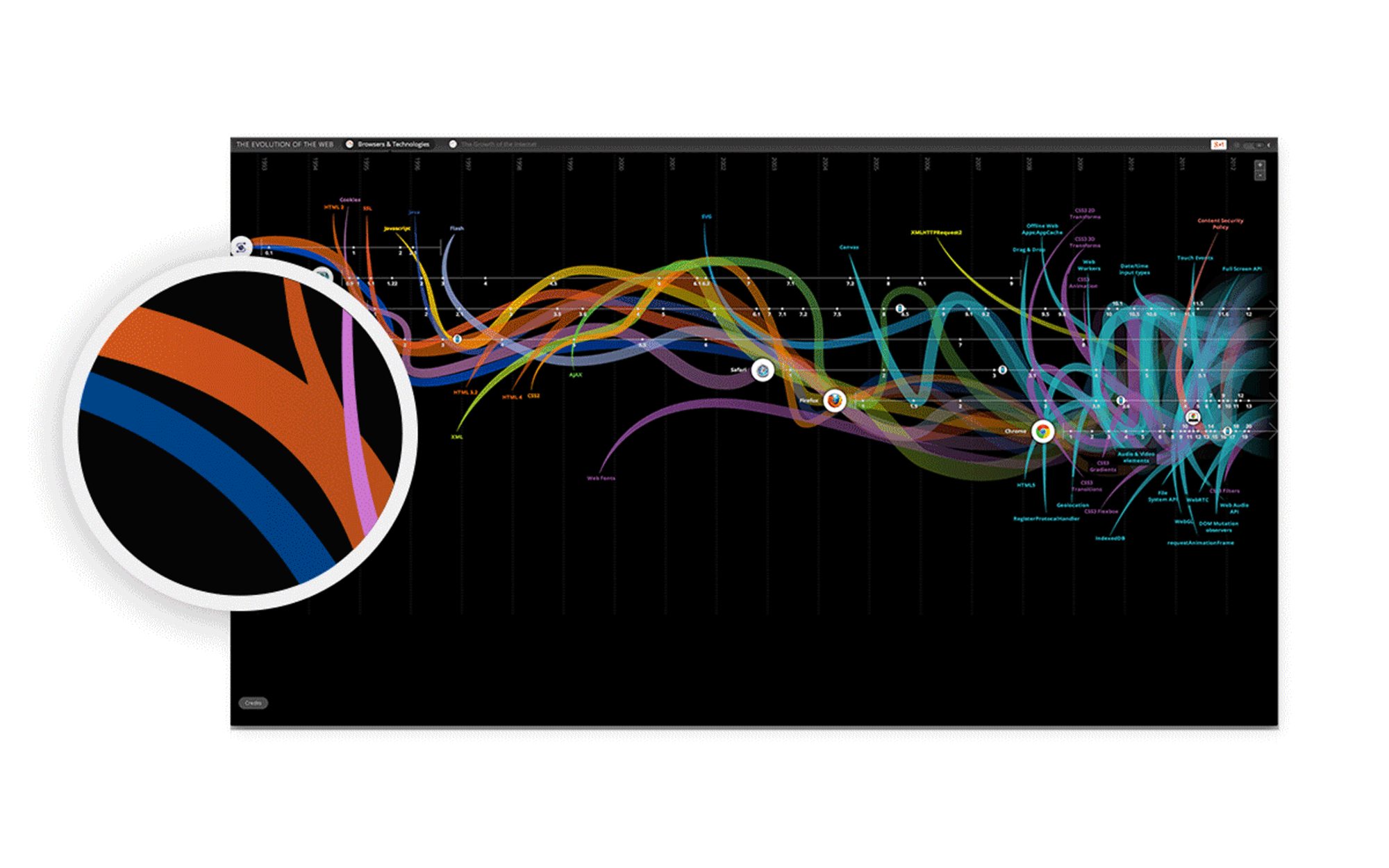
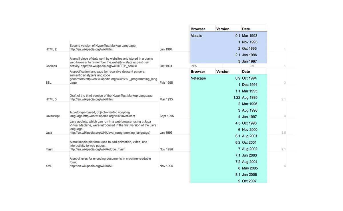
We needed to map the co-evolution and interplay of major web browsers and web technologies over a 22-year timeline. We collaborated with the Chrome team to compile the history of major web browsers and web technologies, from HTTP to CSS Filter Effects released in 2012, and wrote short descriptions for each. We also researched the interaction between the browsers and technologies: when did each web technology become integrated with the major browsers. We partnered with Vizzuality to help implement the design on a dynamic HTML5 platform with 3D visualizations, panning and zooming, SVG and canvas browser support.
Tracing web technologies
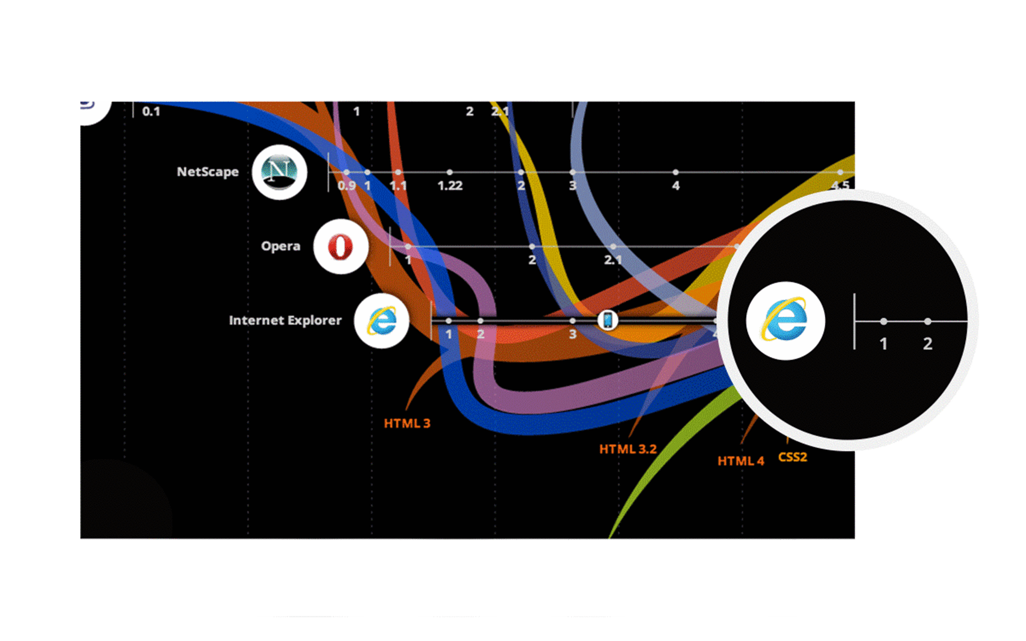
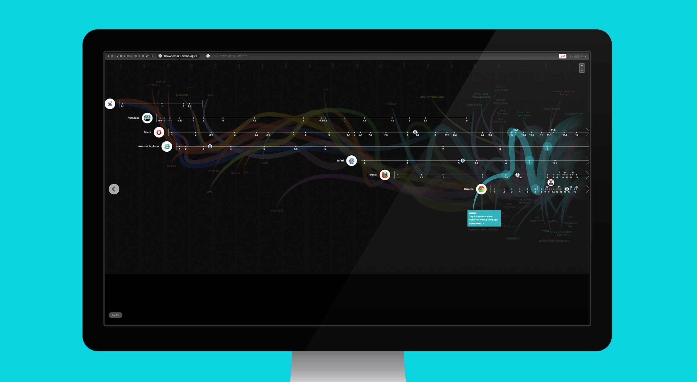
Each web technology is represented by a curved color line. Plotted against a timeline, each line intersects with browser timelines at the point in time when the browser adopted that technology. On rollover, the curves isolate to highlight individual trajectories and browser intersection points and provide a brief description of the technology.
The changing faces of web browsers
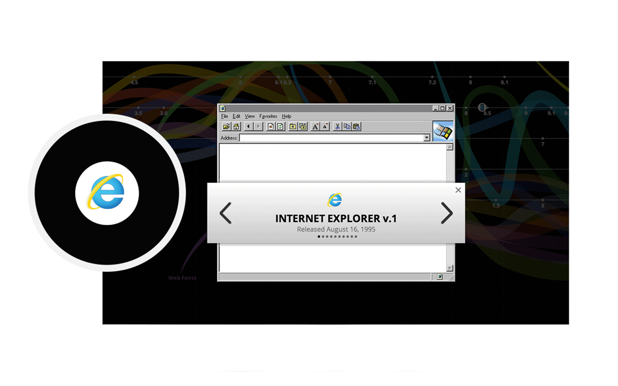
Horizontal lines, plotted against the timeline, represent each of the seven major browsers: Mosaic, Netscape, Opera, Internet Explorer, Safari, Firefox and Chrome. Each browser line is studded with points that indicate software updates. Clicking on any of the browser icons reveals the UI/UX history of browser updates for each interface.
The growth of the web
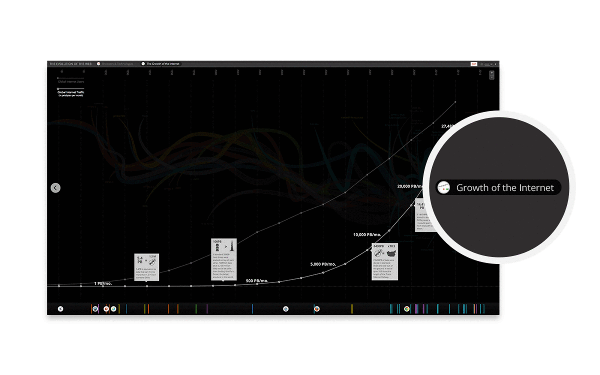
An alternate view charts the expansion of the internet as it becomes a more global network. Viewers can explore the growth of internet users and data traffic (in petabytes) plotted across the same 22 year timeline. The visualization clearly shows the mutual impact browsers and technologies have had on the internet’s evolution, and the pivotal role of Chrome has in accelerating the pace of invention.
Day and night
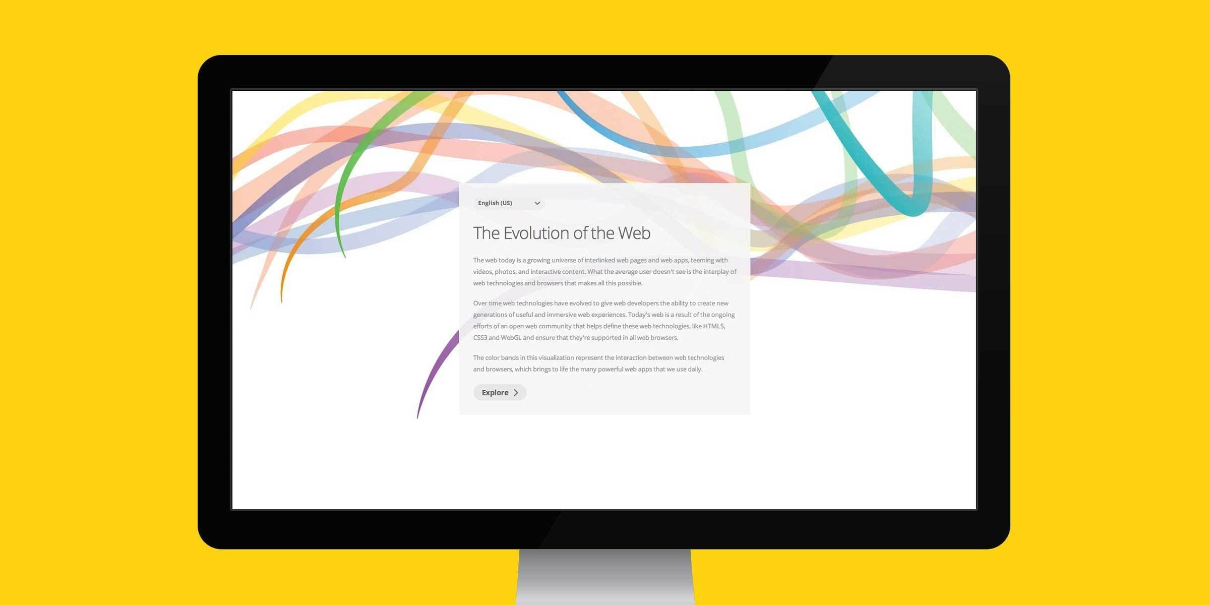
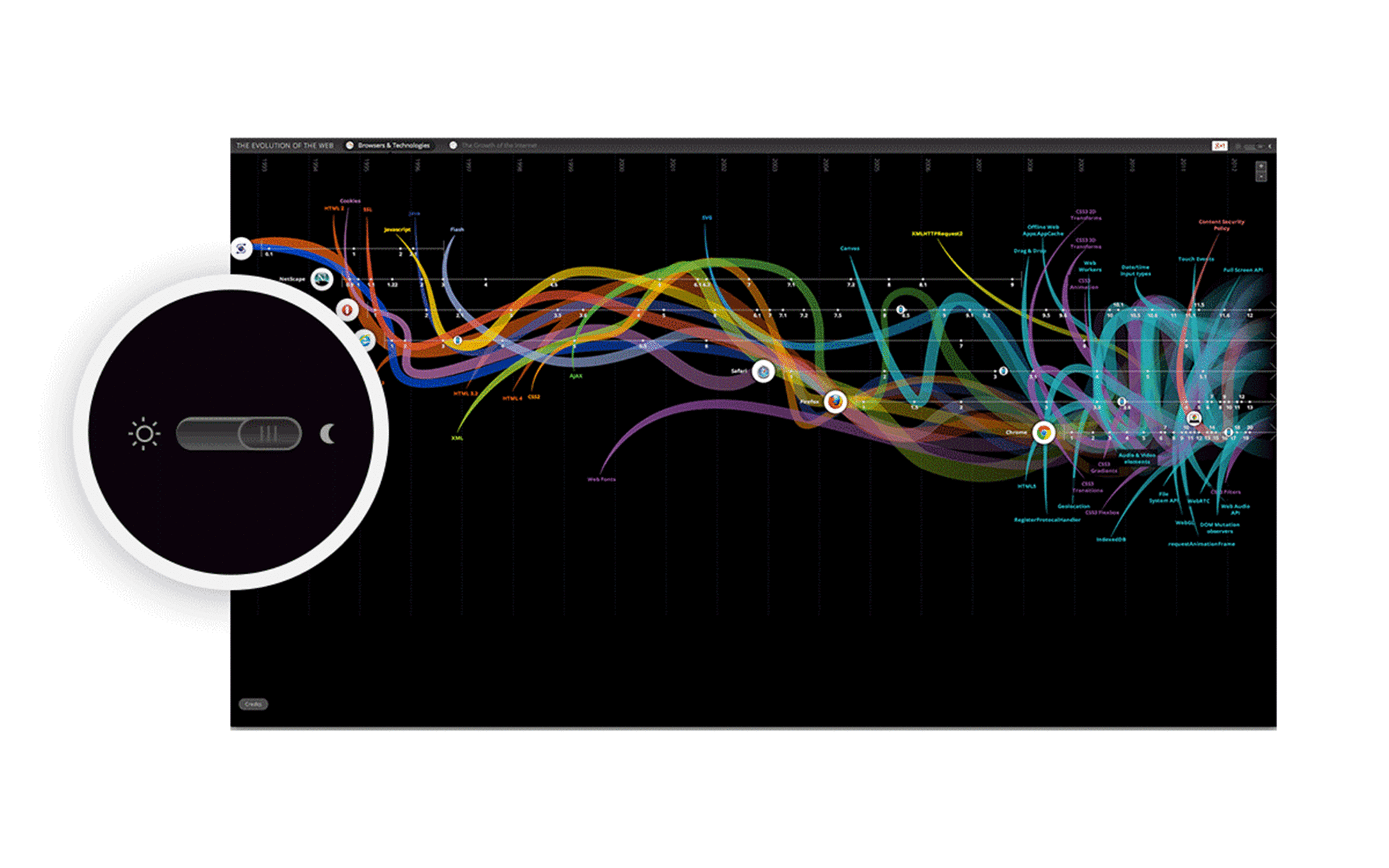
The Evolution of the Web 2.0 was unveiled at Google I/O 2012, the company’s annual developer conference. To create a large visual impact in the dark conference room, we created a “Day and Night” toggle, giving users the option to switch the background color from white to black.
News & Recognition
- Honorable Mention - Evolution of the WebAwwwards
- LIVE From Google I/O, Day 2: Google Compute Engine Takes On Amazon Web ServicesForbes
- Go look at this beautiful interactive on the evolution of the InternetWashington Post
- Die Evolution des Internets in einer Grafik20 Minuten
- INTERNET Evolution of the Web in One Interactive GraphicTIME
Project Credits
- Deroy Peraza
- Eric Fensterheim
- Ambika Roos
- Josh Smith