MTV Social Impact Squad
A family of some of the best-known names in television—from MTV to Comedy Central—leverage their platforms to promote equity and inclusion.
Background
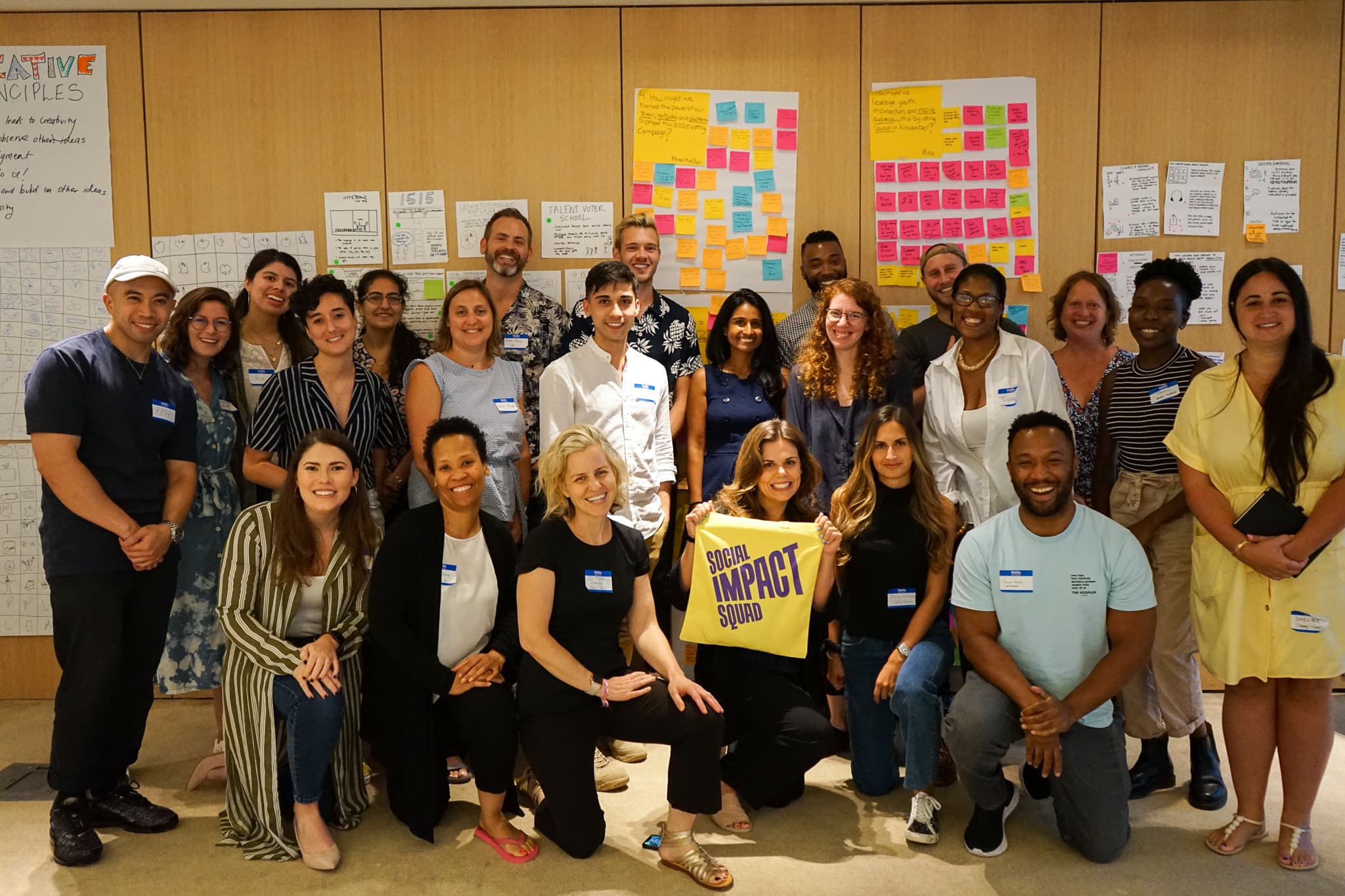
As it’s grown and evolved, the conglomerate of top-of-the-line media brands that comprise the ViacomCBS empire has continued to emphasize social impact as a core part of its identity. Fueled by the Social Impact department’s initiatives, members of the Social Impact Squad build internal momentum to amplify projects.
The challenge
Because ViacomCBS encompasses so many iconic yet diverse brands (Country Music Television + Smithsonian, anyone?), the Social Impact Squad branding needed to be simultaneously strong and flexible.
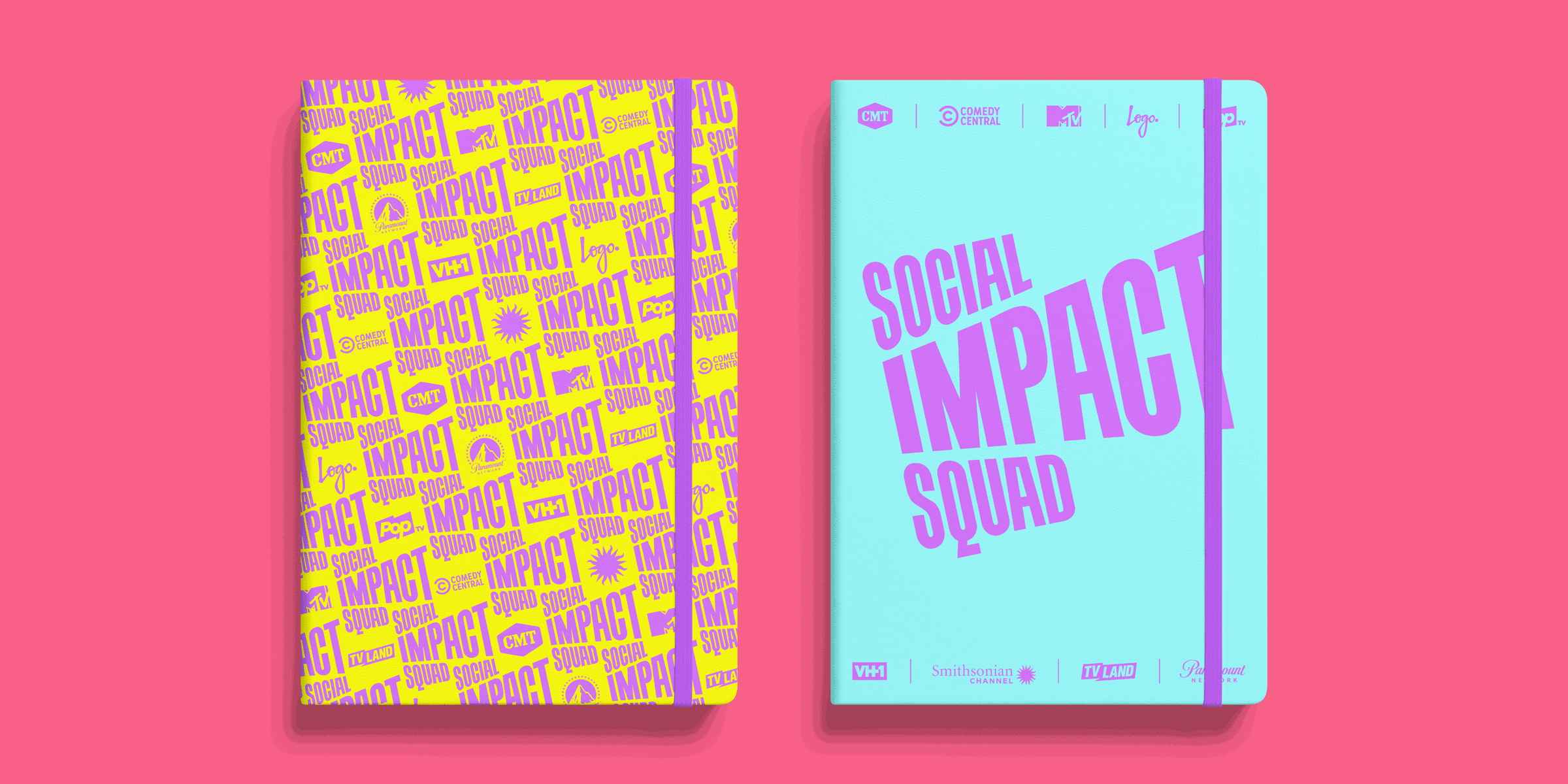
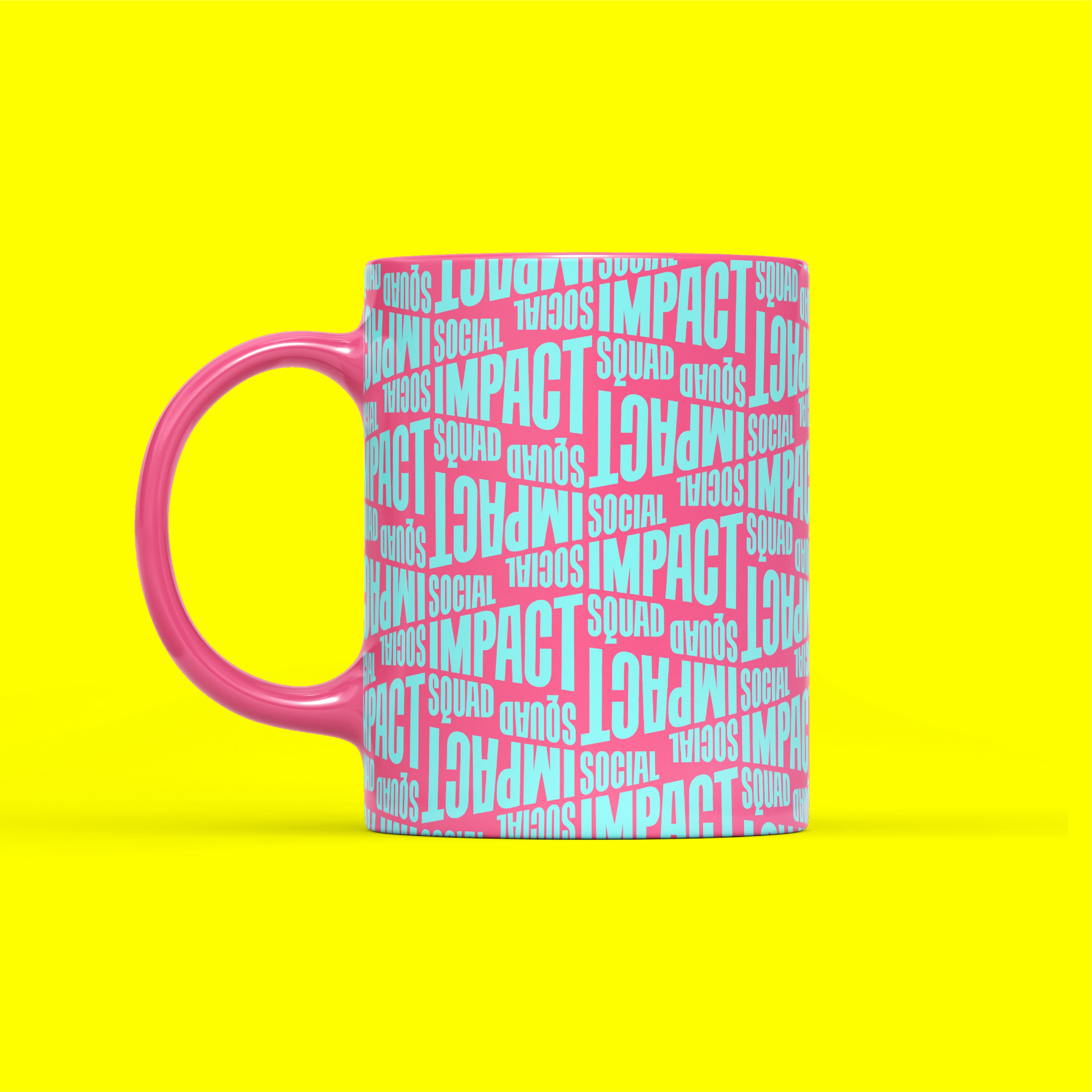
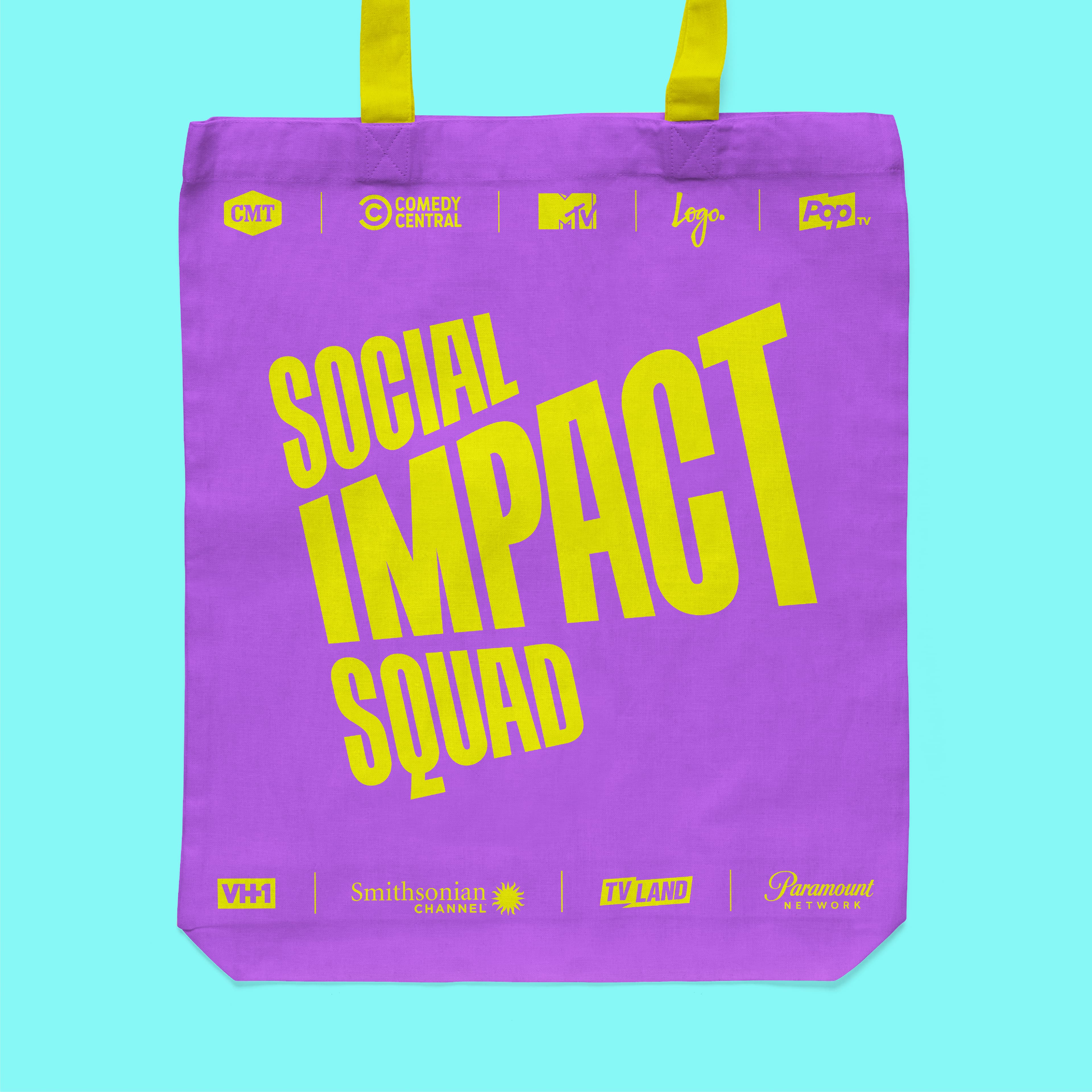
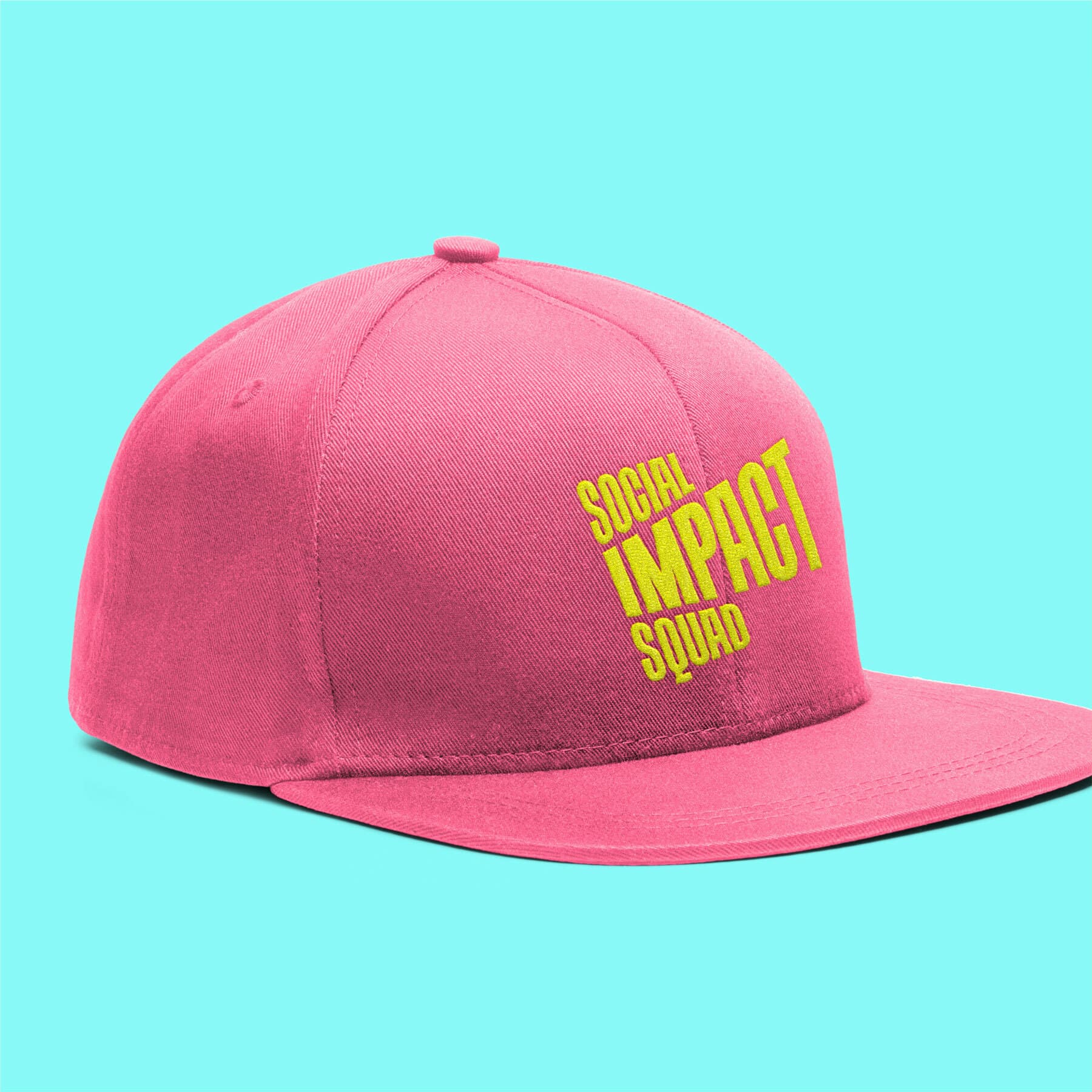
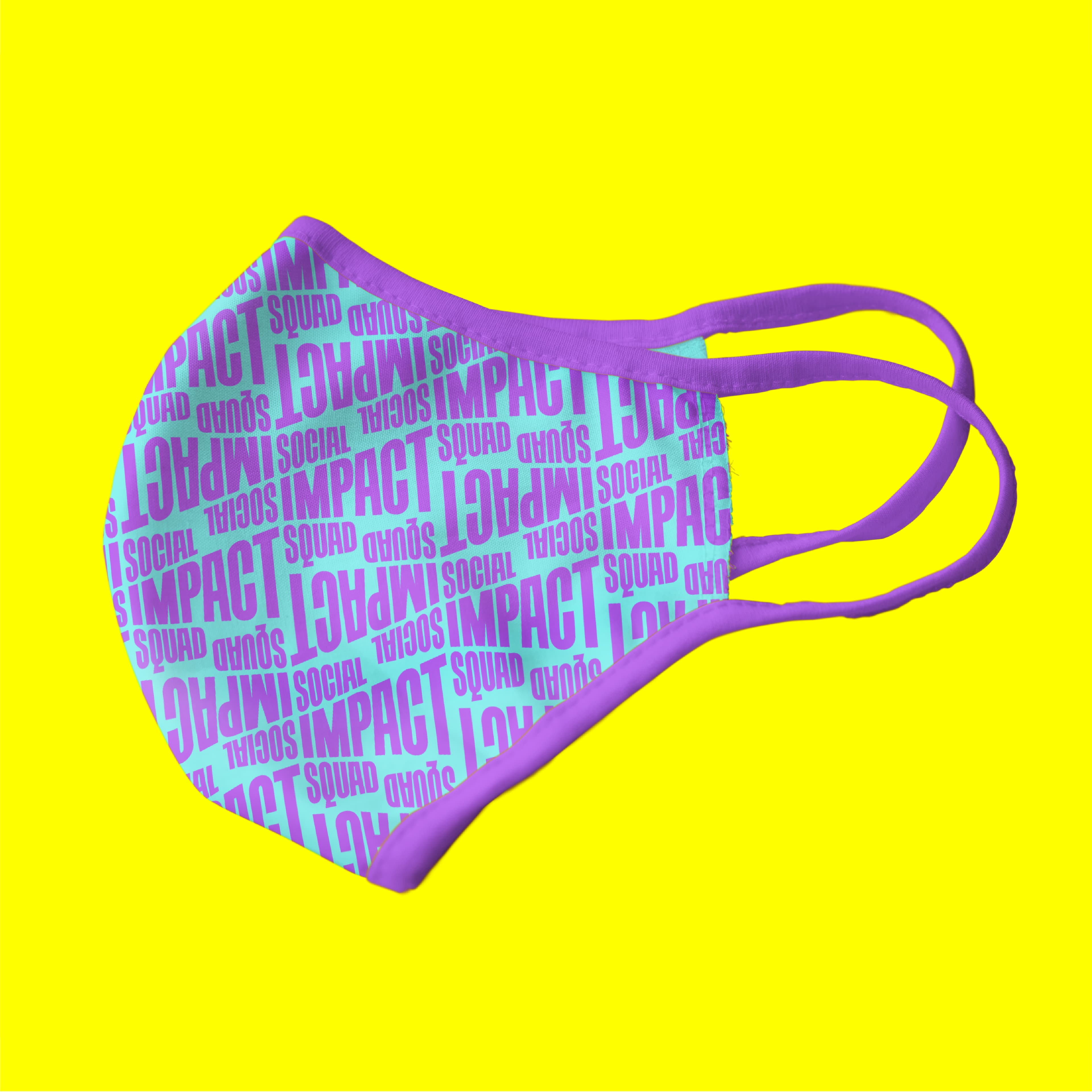
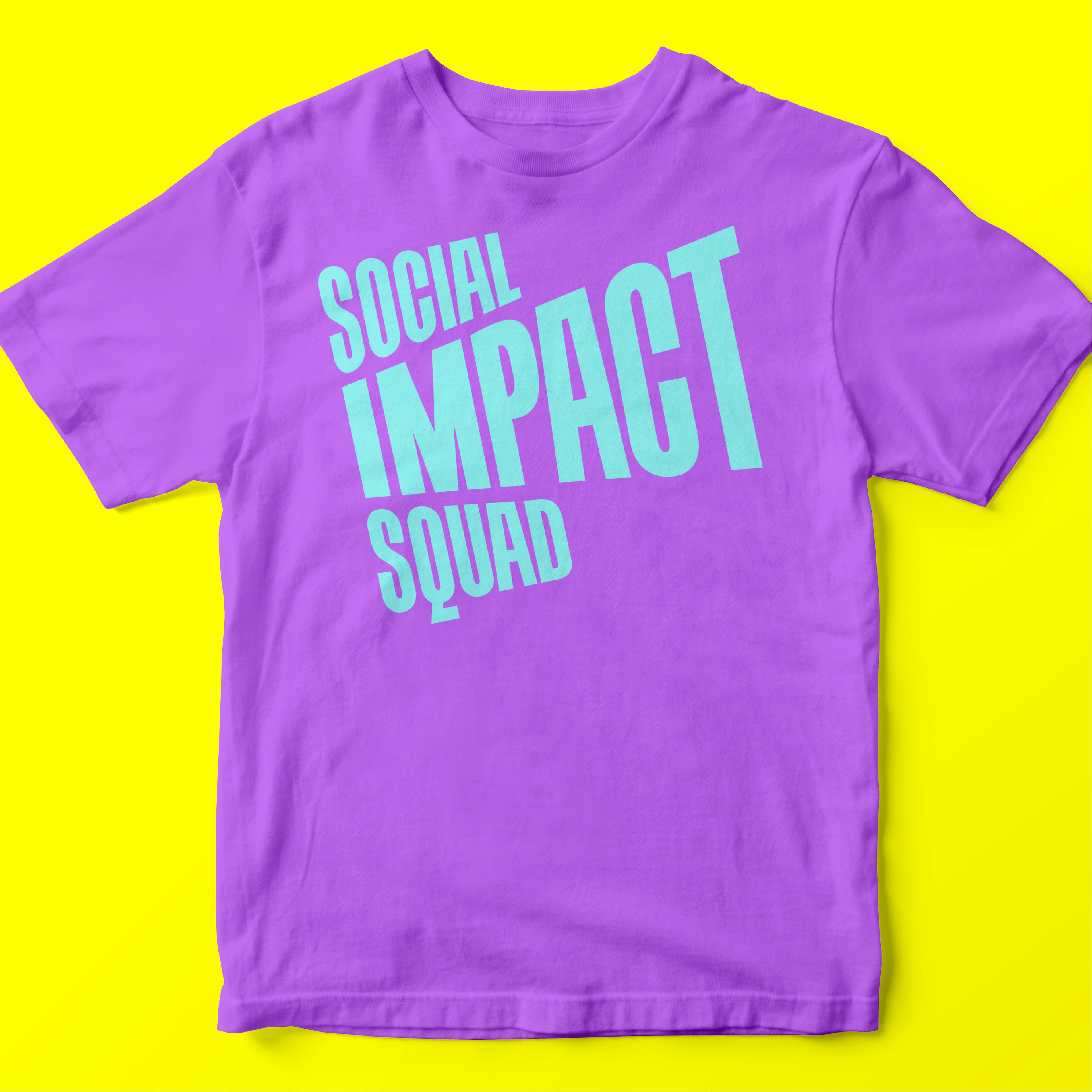
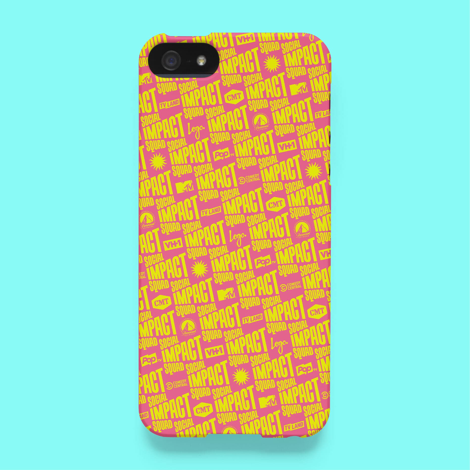
A friendly brand
To personalize the program for each brand, the SIS logo is frequently locked-up with different marks, including the Smithsonian sun, the Paramount peak, and many three-letter acronyms. We developed a social media-friendly logo whose shape evokes a megaphone, and curated a refreshing Squad color palette composed of vibrant pink, yellow, purple, and blue.
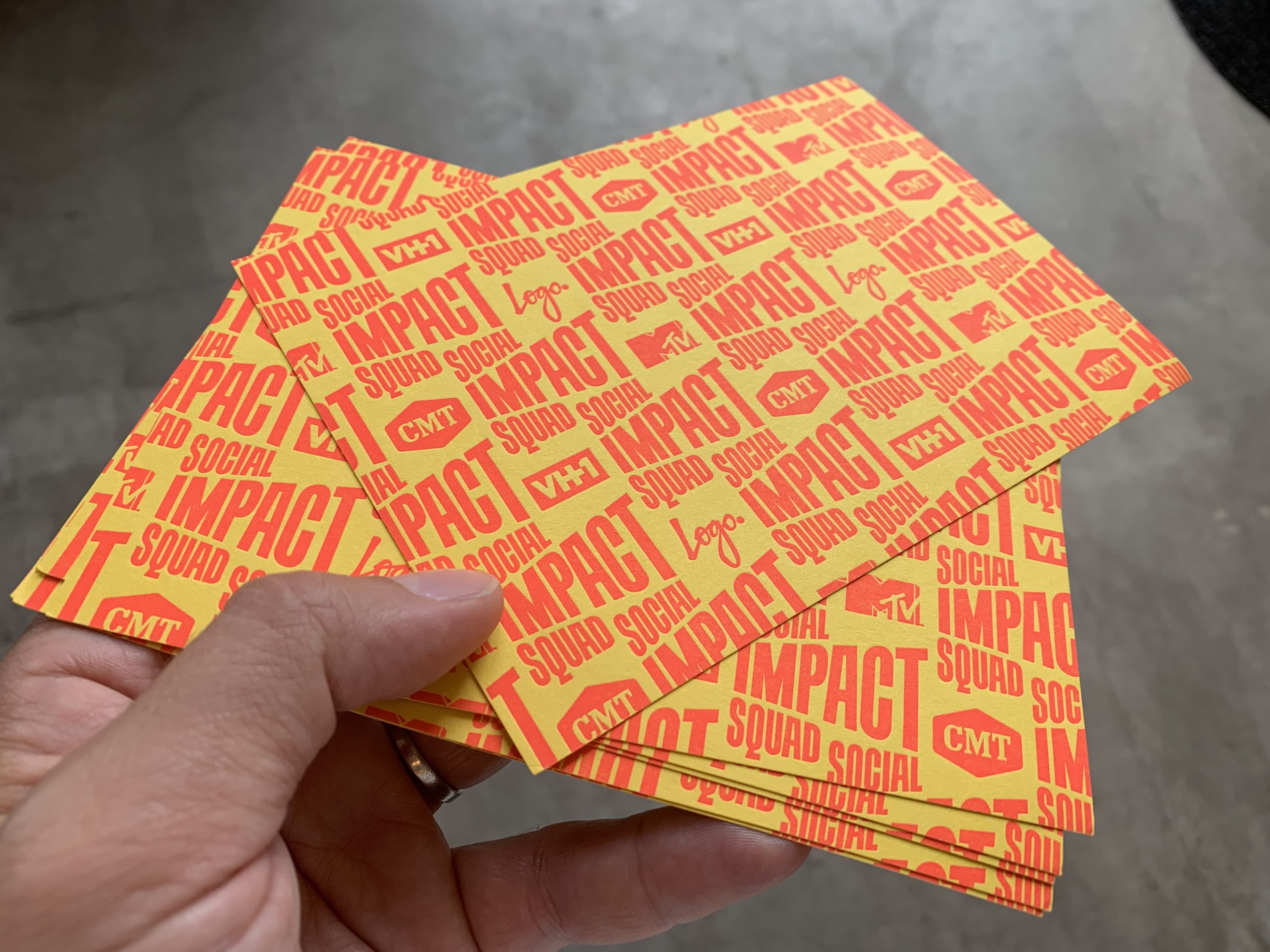
Behind the scenes
The Social Impact Squad's postcards were letterpressed across the street from Hyperakt's studio by the amazing Swayspace. Here's a look at the magic in the making.
Impact in action
In addition to our work with the Social Impact Squad, we’ve created several campaigns that serve as resource hubs for important social issues like voting, mental health, and supporting pregnant moms. All sites were designed to be mobile-first, in line with the ViacomCBS audience’s technology preferences.
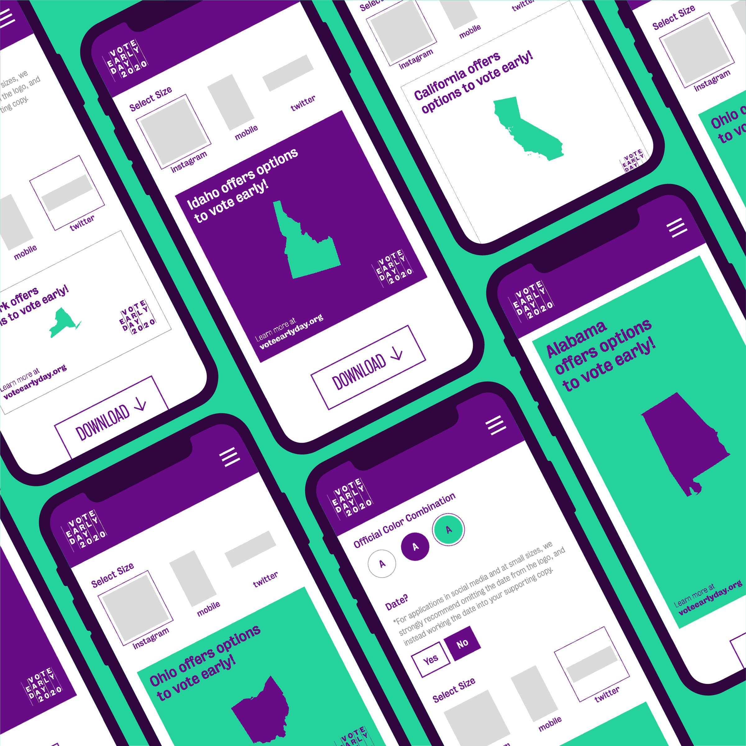
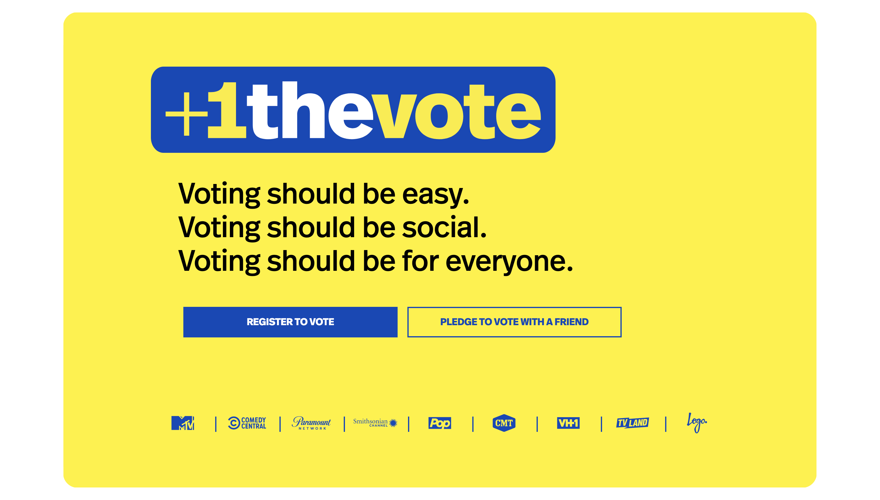
+1 the Vote
More than 4 million people turned 18 in the year leading up to the 2020 election. Teens have the opportunity to add voting to the memorable events and rituals they love, from birthdays and prom to graduation. +1 the Vote aims to help young folks celebrate this milestone in their lives, cultivating a lively social atmosphere around casting votes, while also highlighting teens' power to shape the future.
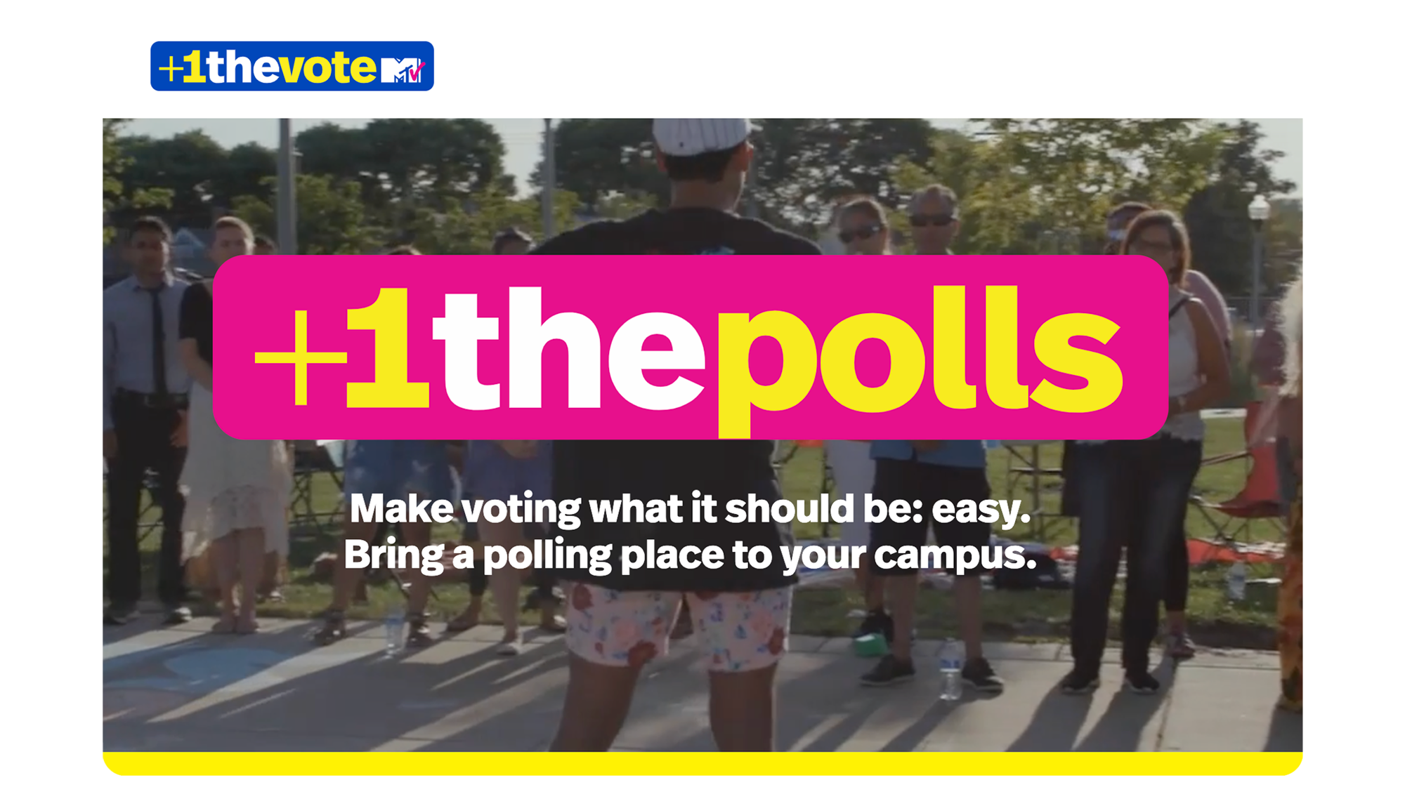
+1 the Polls
With a swath of polling place closures nationwide, +1 the Polls empowers student leaders to activate their campuses as polling places. Running with a bright and engaging client-provided brand, we led a collaborative brainstorming workshop with the team, wireframed the user experience, and developed the website.
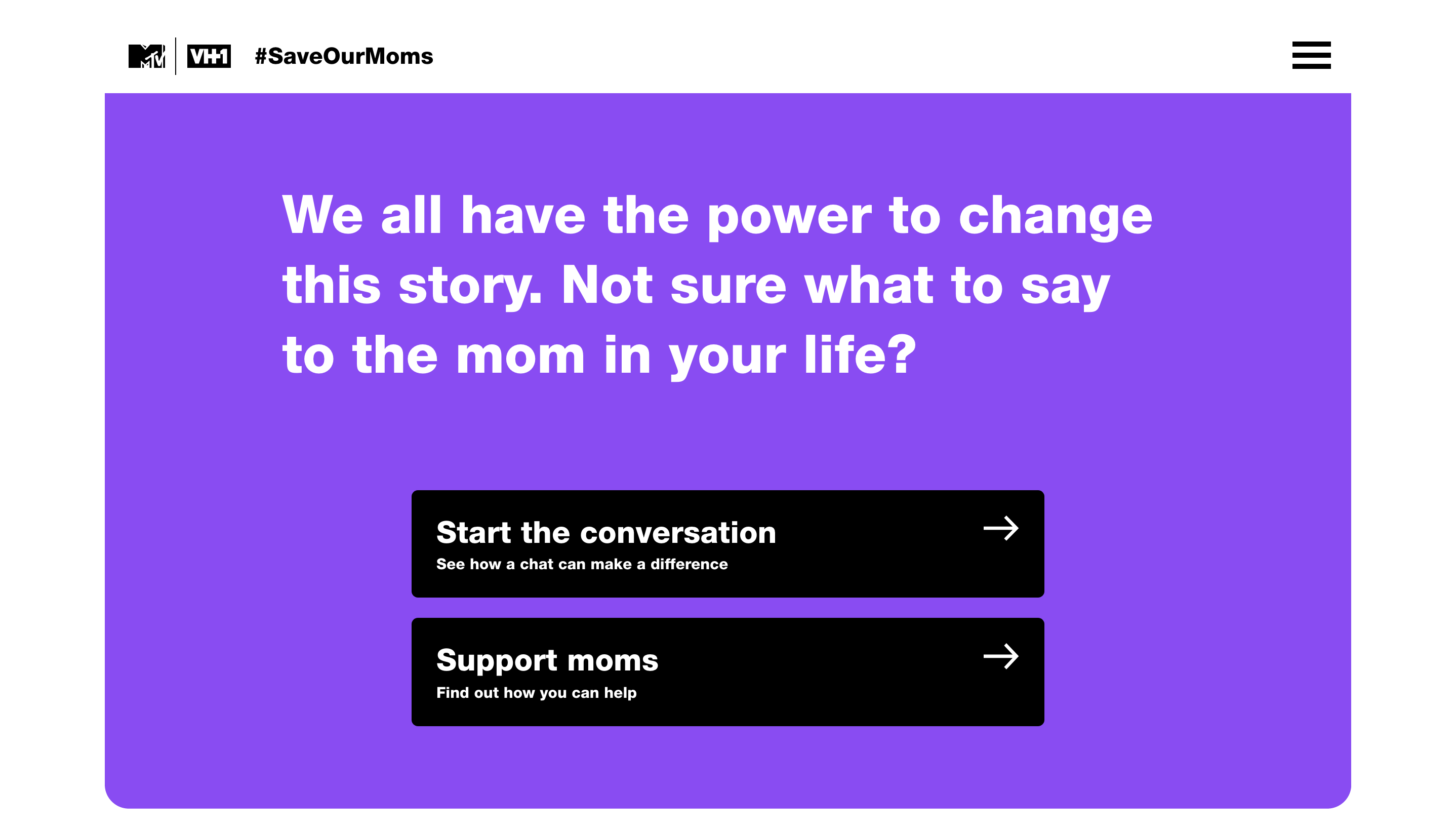
#SaveOurMoms
We centered this campaign around an engaging narrative format that echoes the patterns of today’s mode of communication: texting. Maternal health—and particularly the Black maternal health crisis—is a weighty topic, reflected in the alarming statistics that open the narrative, and the site’s toned-down black and purple color palette. But taking care of friends and loved ones can be surprisingly simple: sending texts could be a literal life-saver.
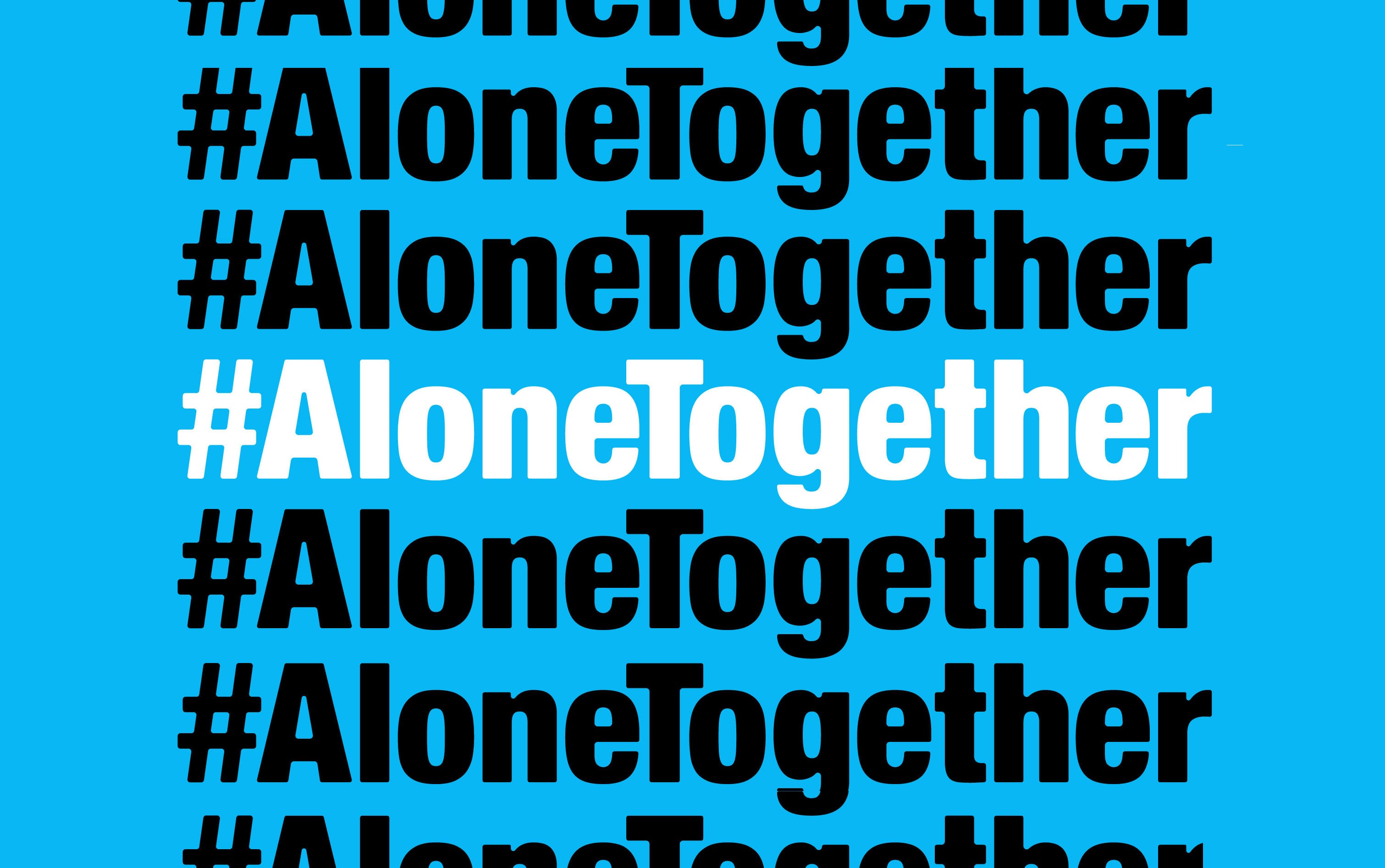
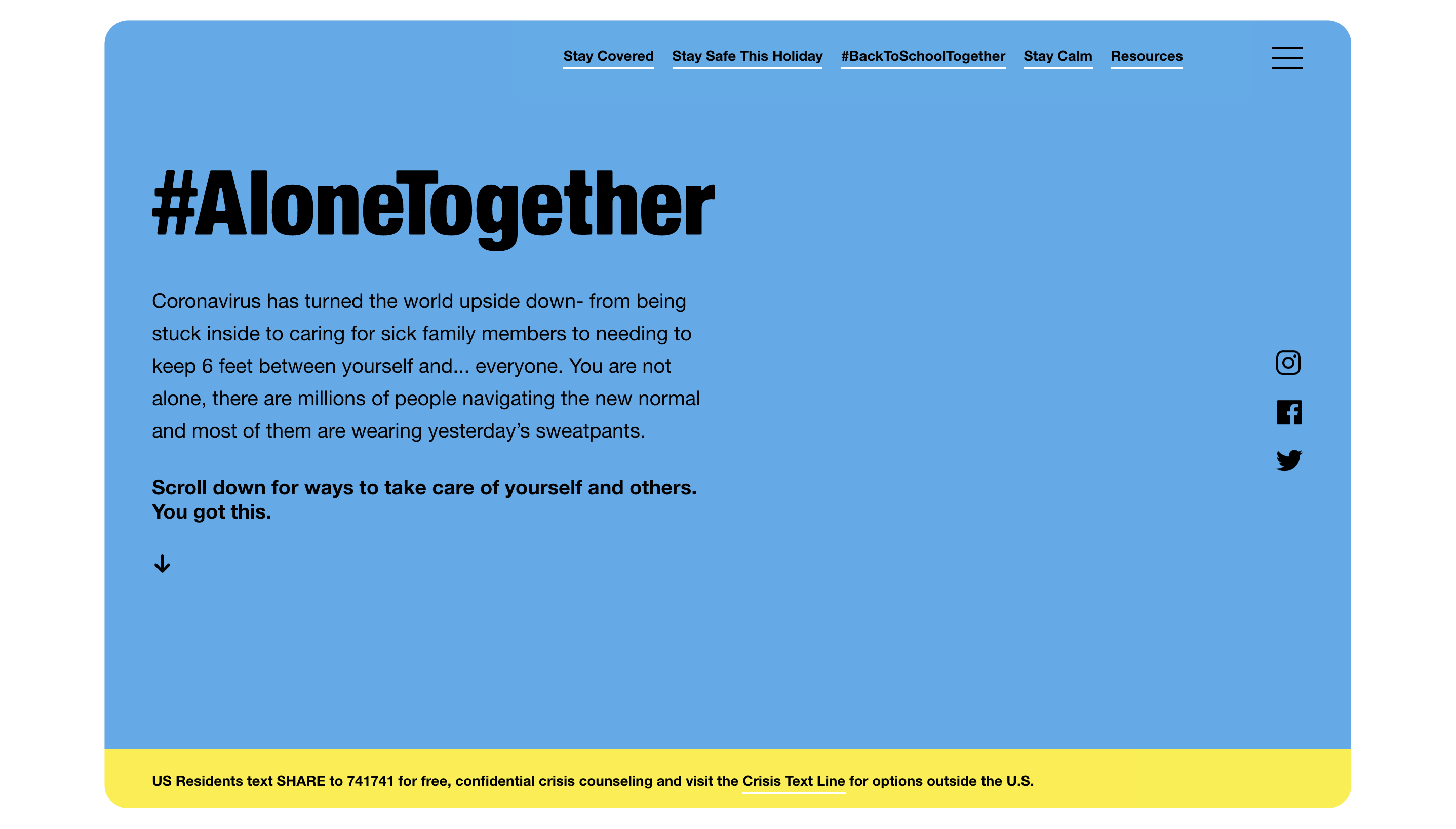
#AloneTogether
As COVID-19 rapidly descended on the U.S. in March, 2020, the impact on mental health was keenly felt, especially for young people. The Social Impact team tapped Hyperakt to design and develop a rapid-response site supporting folks through COVID-19. With a fresh, friendly color palette and simple design, we aimed to share important pandemic-specific health resources and guidelines in an accessible way.
Project Credits
- Abigail Fisher
- Deroy Peraza
- Laura Jo Hess
- Delaney Weber
- Izabella Stern