Work

NYC Mayor's Dashboard

Real-time information and immediate snapshots of the city’s performance.

A vertical series of horizontal colored bars in shades of green, yellow, and orange. Black lines divide the bars into segments, with thicker vertical black lines in the center creating a symmetrical pattern. The colors transition from green at the top to orange at the bottom.

The Challenge

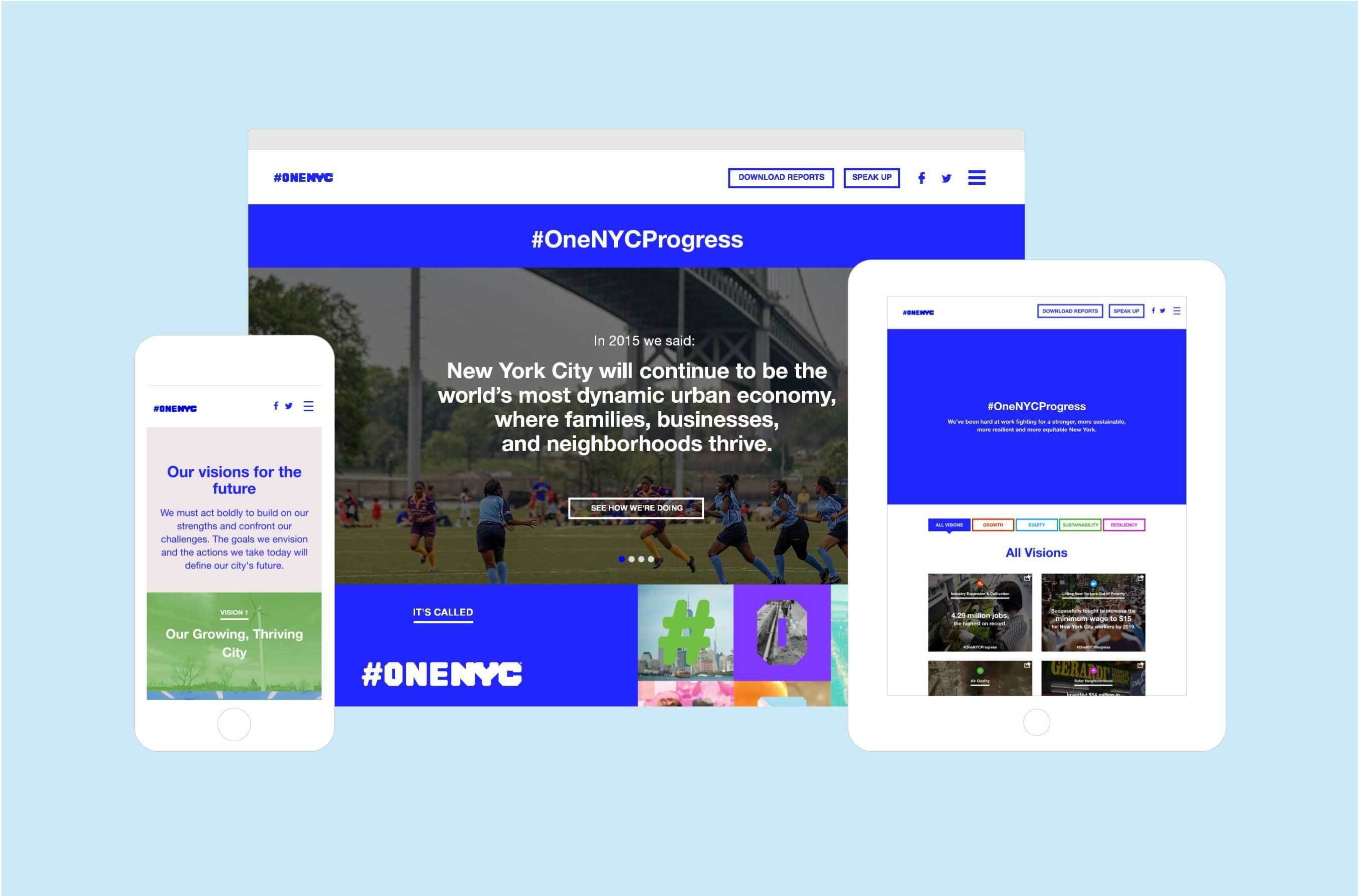
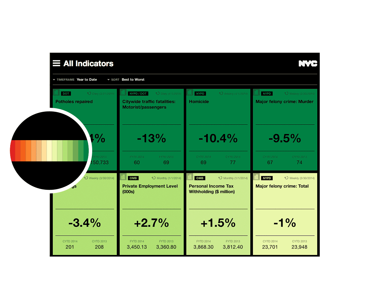
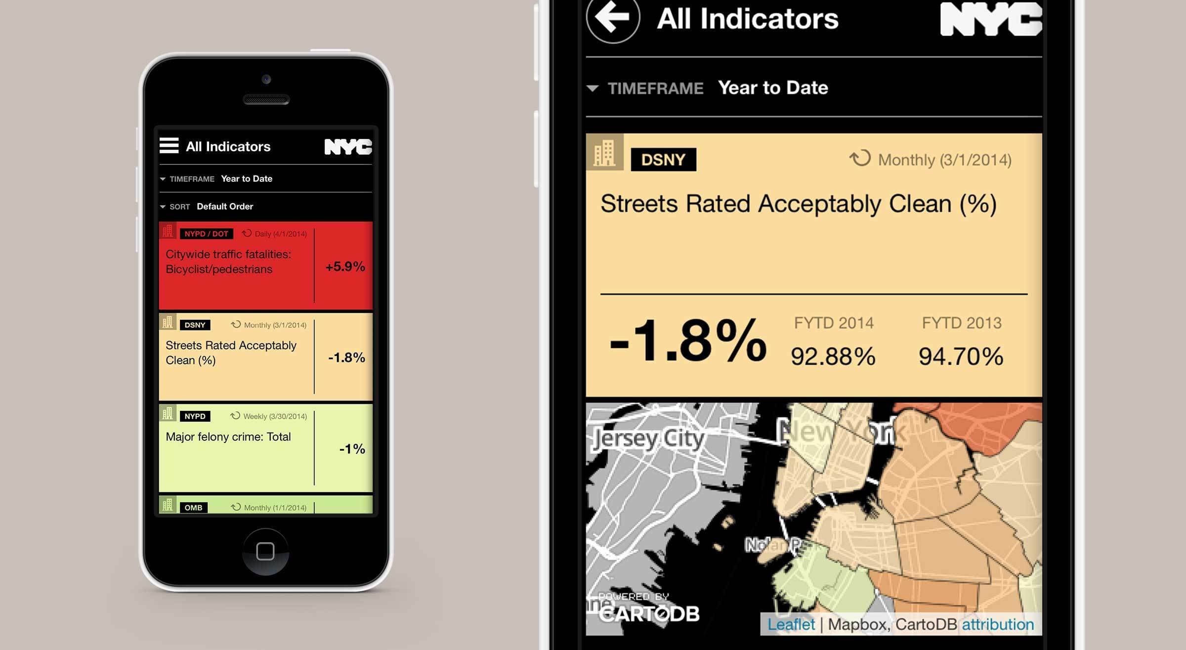
NYC Mayor Bill De Blasio came into office with an ambitious agenda to make New York City a more equitable place for all of its residents. In order to make data-driven decisions that addressed the most pressing issues facing New York City, the mayor’s team needed tools that provided real-time information and immediate snapshots of the city’s performance—ranging from pothole repairs, number of families in city shelters, major felonies and more. The Mayor’s Office reached out to Hyperakt and Vizzuality to design and develop a mobile-accessible and live dashboard of key city measures.

Two tablet screens display color-coded data tables with indicators and percentage changes. The left screen shows a list with red, yellow, and green rows, and headline "All Indicators." The right screen displays tile grids with similar data and color scheme.
A digital equalizer display with rows of bars in varying heights and colors - green at the top, transitioning to yellow, then orange at the bottom - against a black background. The bars are arranged symmetrically in two sections.
An iPhone with a black front and white back is displayed against a white background. The screen shows various app icons, including Messages, Calendar, Photos, Camera, Weather, Clock, Maps, and several others. The time on the screen reads 10:45 AM.

The Context

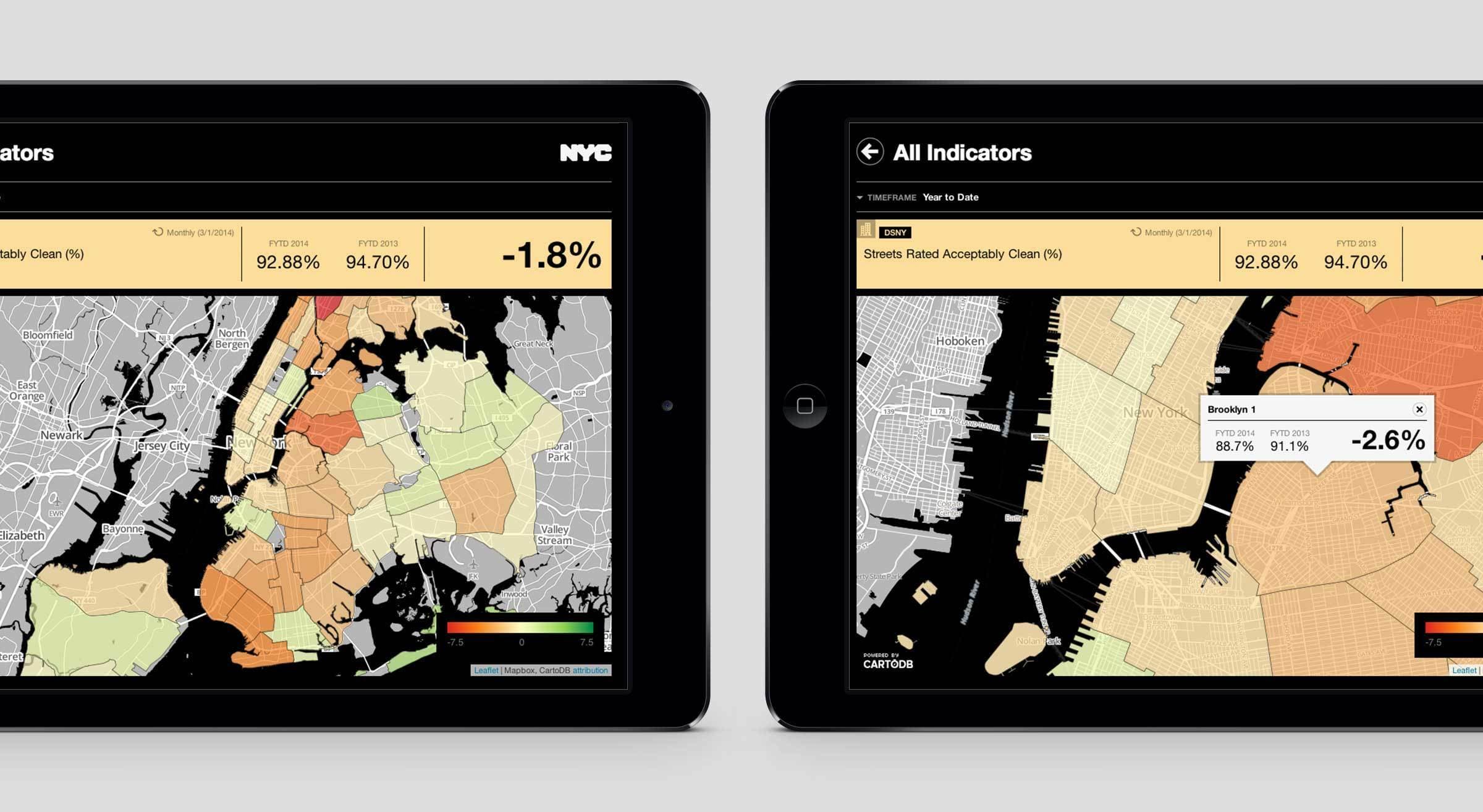
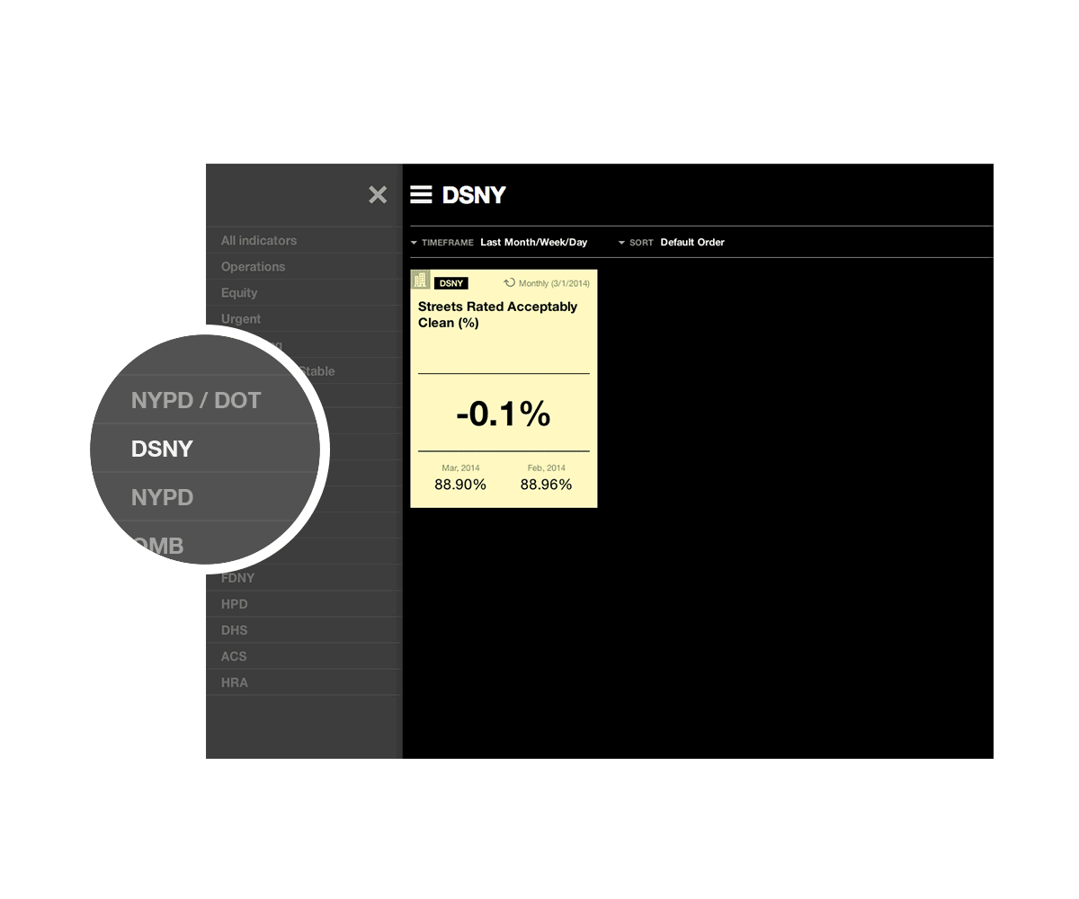
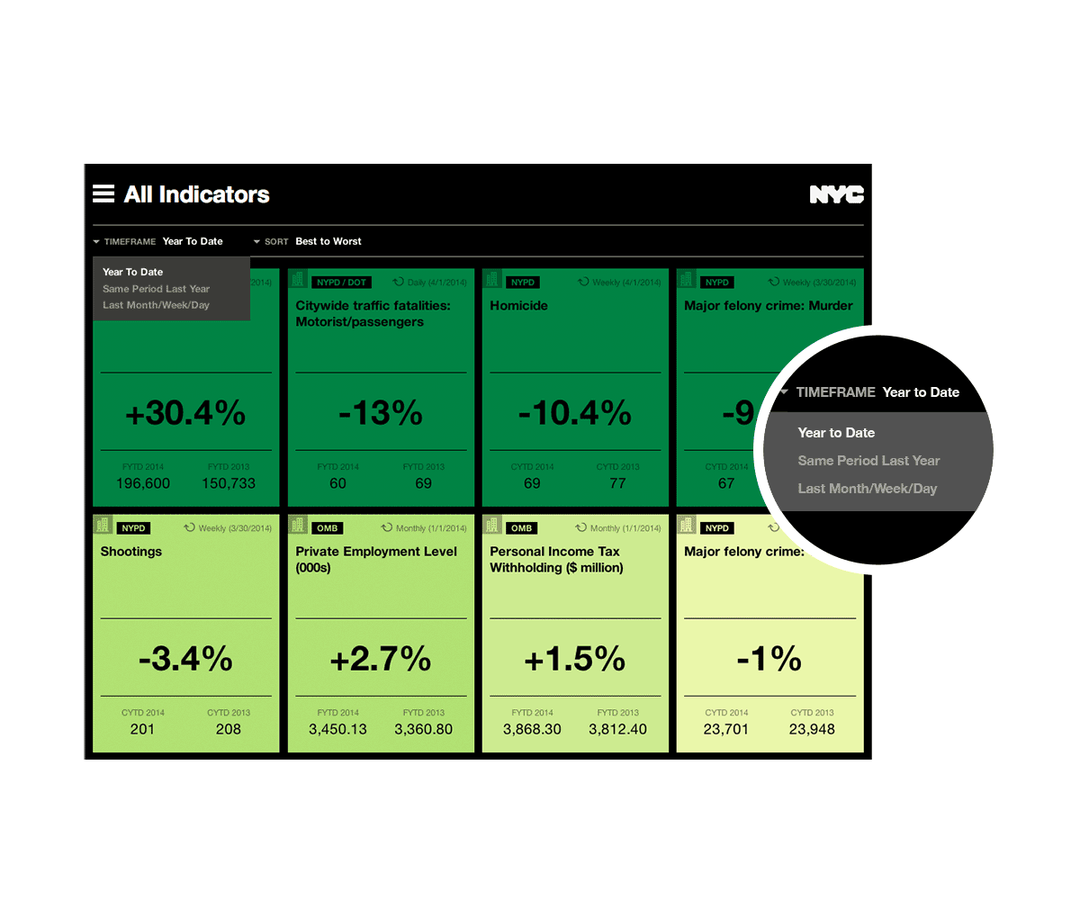
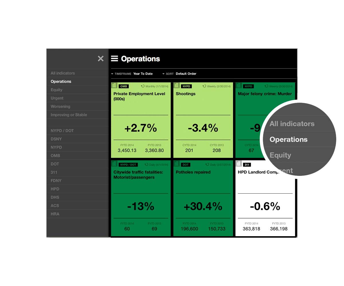
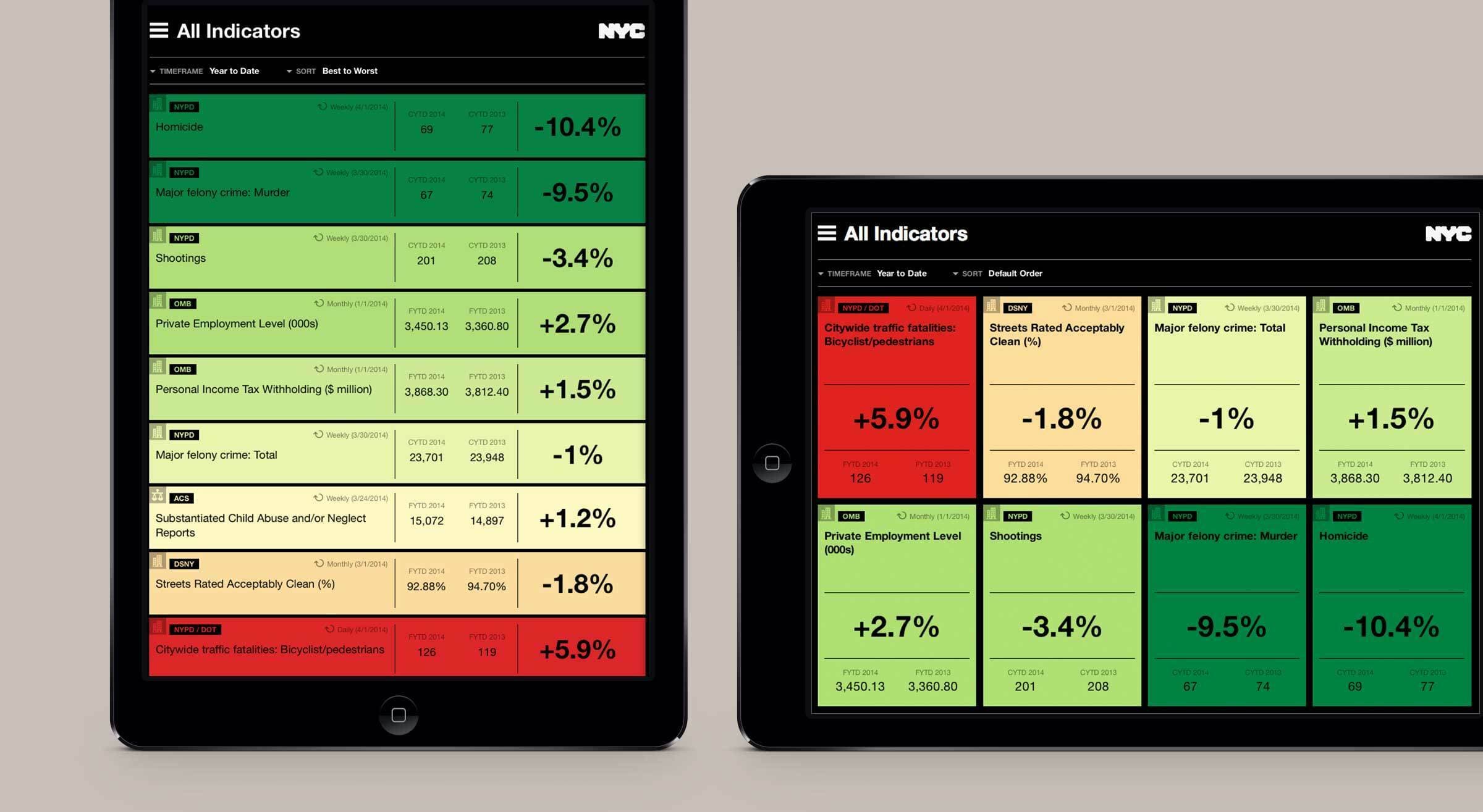
The goal was to facilitate making quick and informed decisions. Government officials needed to be able identify progress or problem areas at a glance. They not only needed to see an organized set of relevant metrics, but also understand the context and details of the data (if necessary). We knew that other departments were already interested, so we built the tool to scale when ready.

A green data card from OMB showing a 2.7% increase in Private Employment Level. Fiscal Year to Date (FYTD) 2014 is 3,450.13 and FYTD 2013 is 3,360.80. The card includes an icon of a building and notes the data is from 1/1/14.
A dashboard displaying various performance indicators for NYC, such as crime rates and traffic fatalities. A circular zoomed-in view shows sorting options: Default Order, By Department, Worst to Best, and Best to Worst. Indicators are color-coded green, yellow, and red.
A tablet screen displays a dashboard titled "All indicators" with various statistics. Categories include complaints, child abuse reports, and pothole repairs. Each section shows a percentage change and numeric data, color-coded in red, orange, yellow, or green.

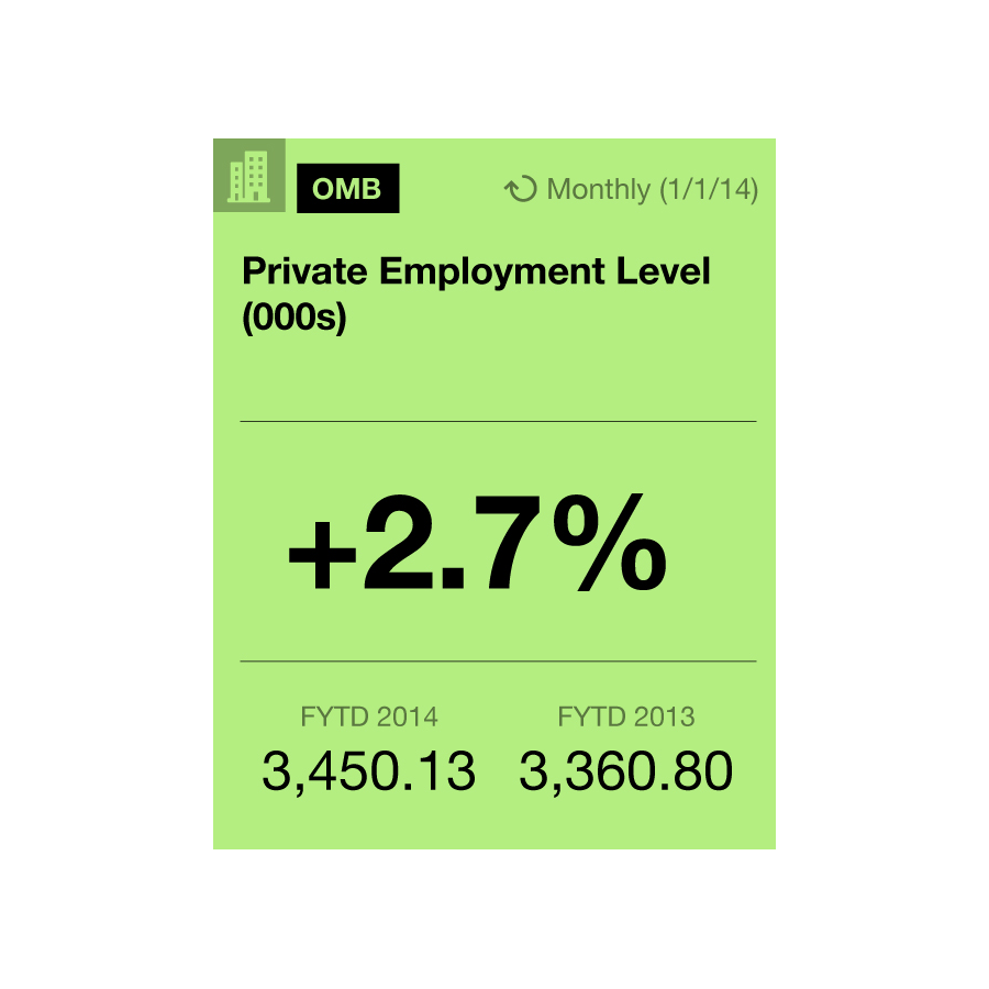
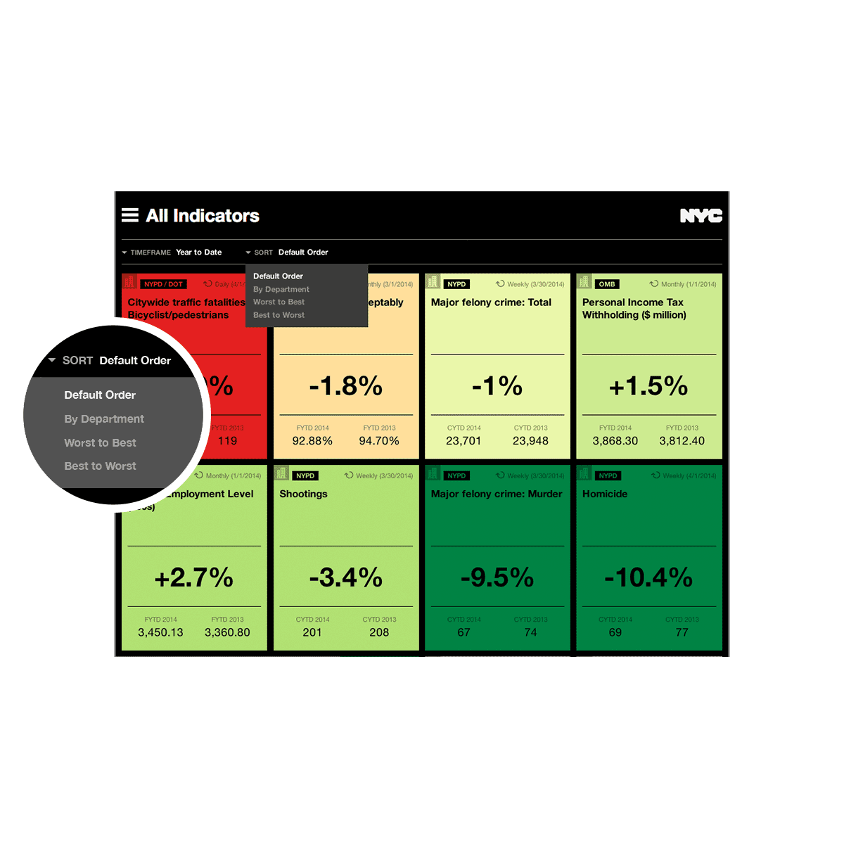
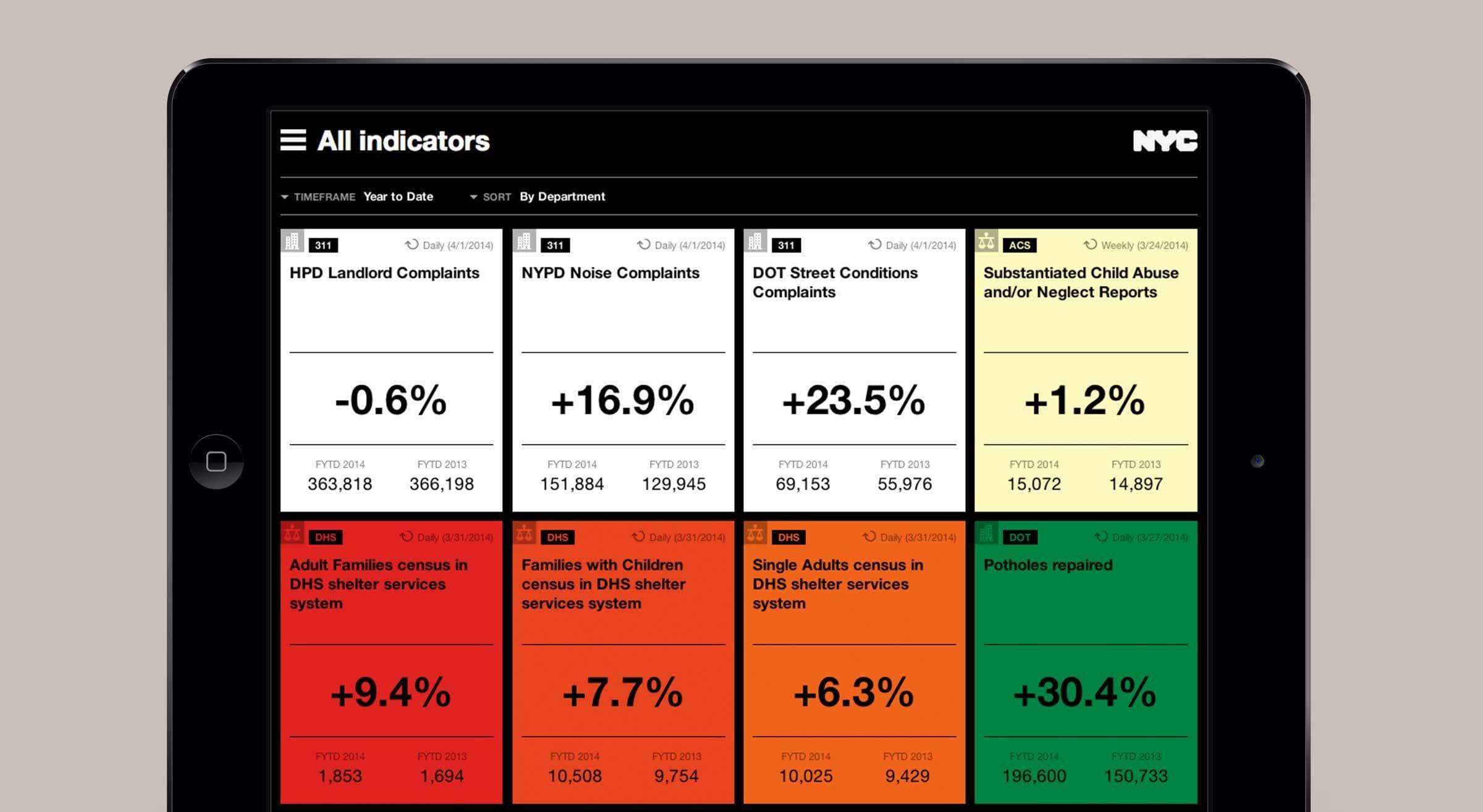
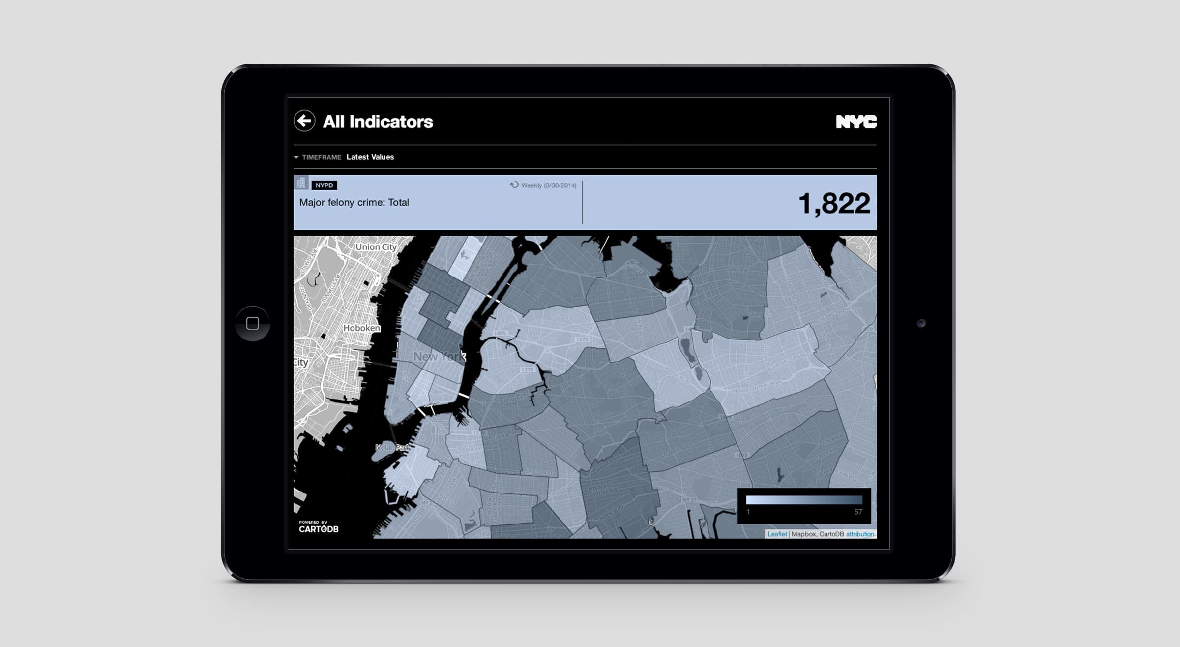
Beyond the obvious utility, the dashboard needed to be intuitive and beautiful enough to be a tool the Mayor and his team are excited to rely on every day. We partnered with our friends Vizzuality who brought our design to life and layered in rich maps that illustrate how each measure performs in different parts of the city.

Two tablets display maps of New York City showing cleanliness indicators. The left map highlights areas with different cleanliness percentages, while the right map zooms in on detailed street-level data, marking cleanliness acceptance rates with percentage changes.
A screen showing various New York City indicators in green and black. Indicators include potholes repaired, traffic fatalities, homicides, major felony, private employment level, and personal income tax withholding. Each has a color-coded performance band.
A smartphone displaying an NYC sanitation app with cleanliness ratings. The screen shows timeframes, cleanliness percentages, and a map of New York City. The streets rated acceptably clean have a metric of -1.8% with 92.88% and 94.7% cleanliness percentages for FYTD 2014.
A website interface displays a report titled "DSNY" showing the "Streets Rated Acceptably Clean (%)" with a percentage of -0.1% for April 2015 and 88.90% for both March 2015 and April 2014. A magnified side menu lists various departments including NYPD/DOT and DSNY.
A dashboard with various indicators, including motorist/passenger fatalities, homicides, and major felony crimes. Each indicator shows year-to-date data, with color-coded percentages indicating changes. A black circle highlights the "TIMEFRAME Year to Date" filter.
A tablet displays a map of New York City with shaded areas representing different data indicators. The screen shows a total value of 1,822 for major felonies. The map includes boroughs and districts, with a sidebar labeled "All Indicators" and "NYC" logo at the top.
A digital dashboard displays various performance metrics under the "Operations" tab. Indicators include employment levels (+2.7%), shootings (-3.4%), and murder rates (+13.0%). A close-up view highlights the selected "Operations" option from a sidebar menu.
Two tablets display performance metrics for NYC. The screens show various indicators in a grid format, with color codes indicating performance: green for positive, yellow for moderate, and red for negative. Indicators include employment, shootings, and crimes.

Project Credits

Project Team
Collaborators
  • Vizzuality
Ready to unlock the potential of your nonprofit's brand?
Reach Out