Osborne Association
Celebrating depth and dignity in Osborne’s century-long commitment to comprehensive services for incarcerated people and their families.


The challenge
Despite nearly a century of impactful services, Osborne’s programs had grown complex and hard to navigate, and the website’s structure failed to reflect the organization’s scope and clarity. The digital experience was muddled, making it difficult for audiences to understand or access distinct program offerings.
Original Osborne Association branding and website.
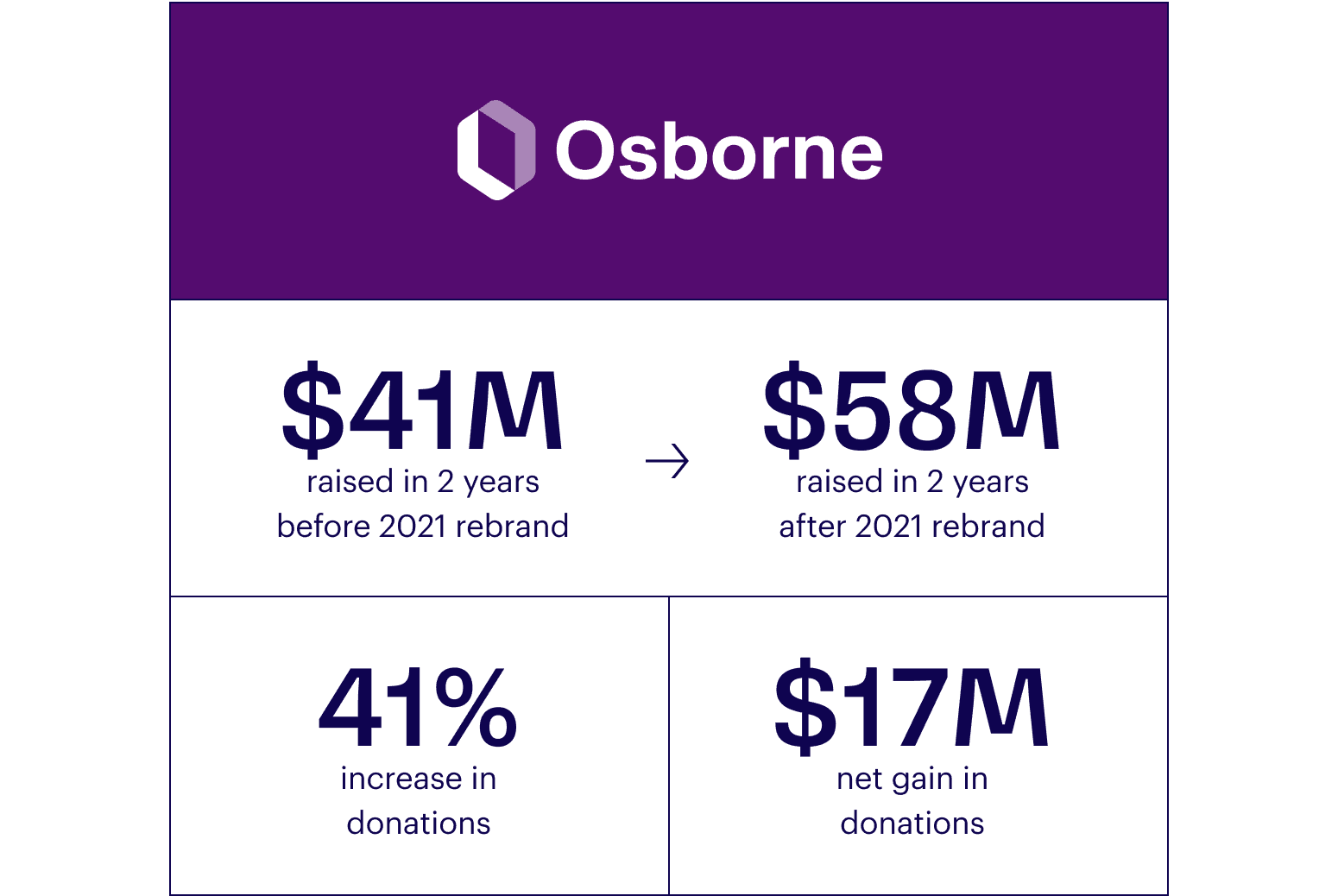
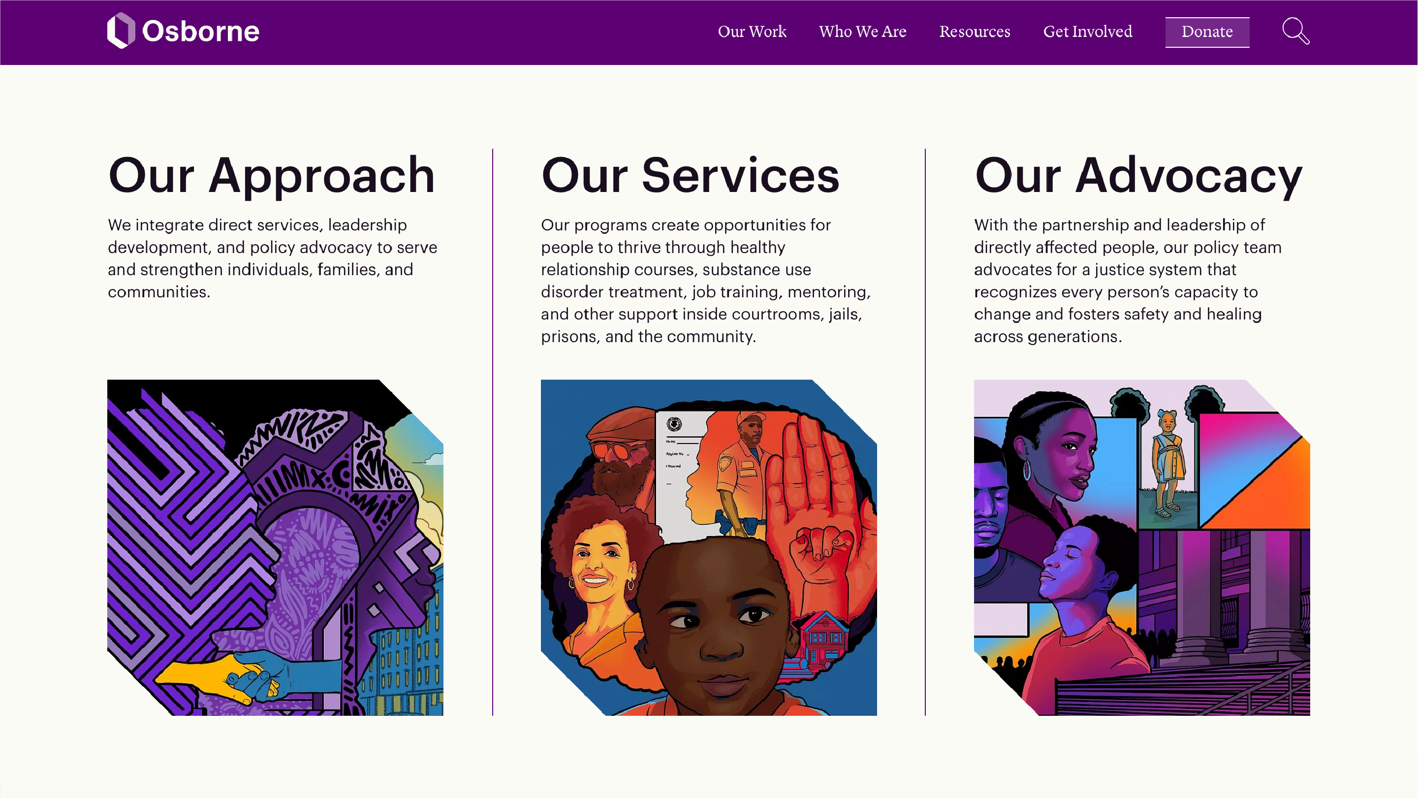
The opportunity
Osborne had a chance to modernize its brand and digital presence to better reflect its humanity, expertise, and unwavering commitment to justice. Hyperakt refined the logo to elevate the symbolism of an open door—representing access and dignity—and crafted a cohesive identity system grounded in trust, resilience, and lived experience. The result is a bold, unifying platform that helps Osborne connect more deeply with the people and communities it serves.
Stepping into a new chapter
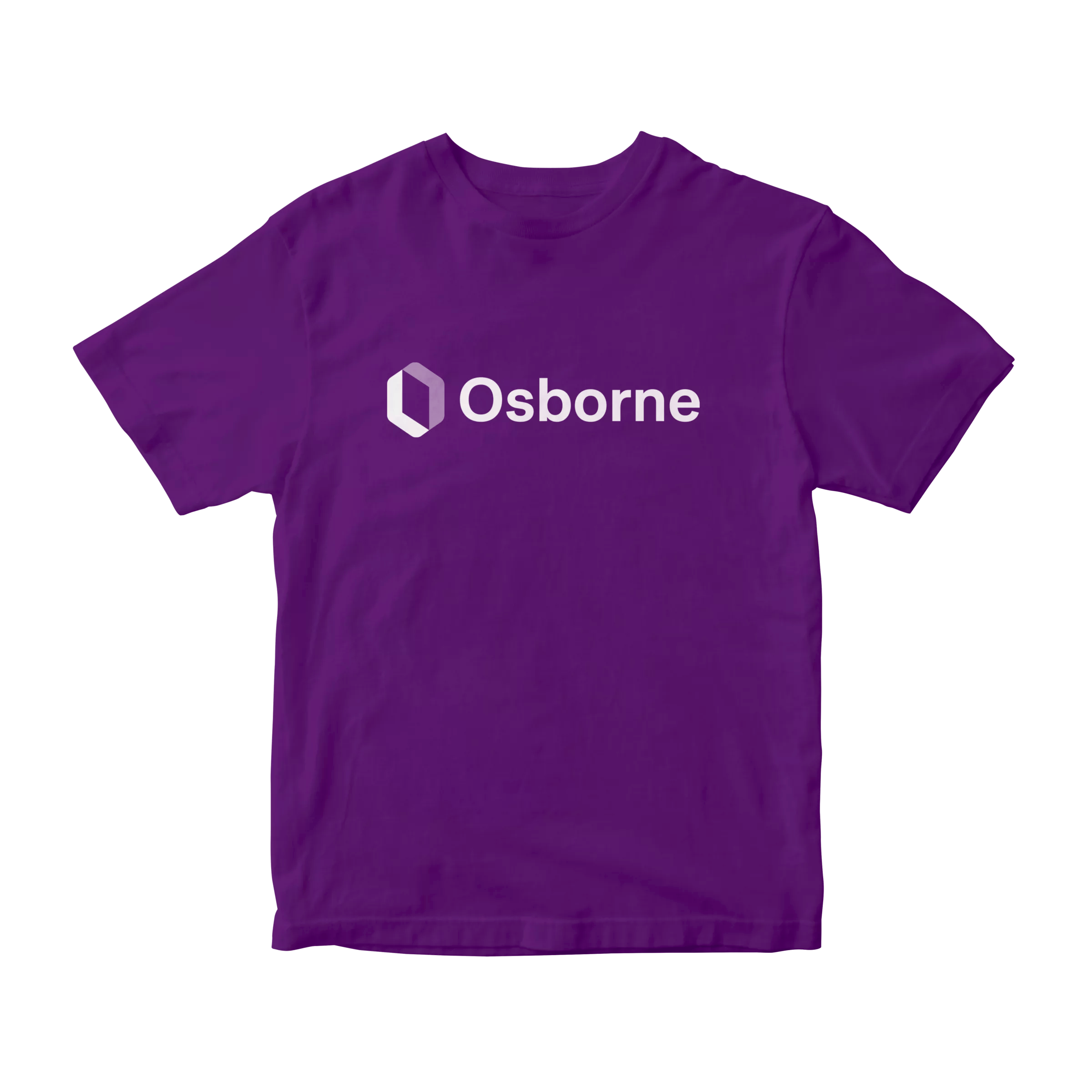
Osborne has long used an open door as a metaphor for their work, and as their primary mark. But subtle details in the legacy logo undermined the intended message. The door appeared far away, with the viewer positioned below the door and the path to the door longer than the door itself. The new mark places the door at the viewer’s level, available and ready to be moved through. Its symmetry echoes the organization’s dual support structure and wraparound services, both during and after incarceration.

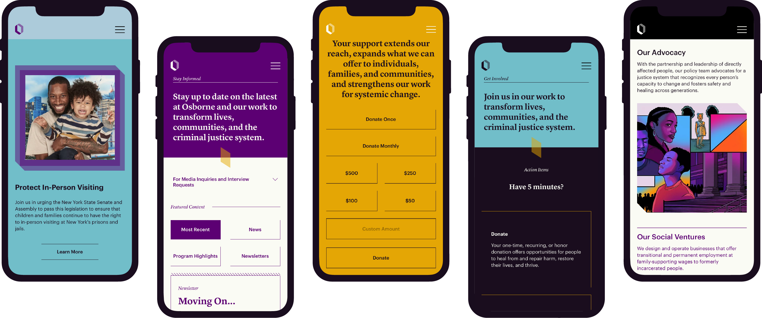
Leading with language
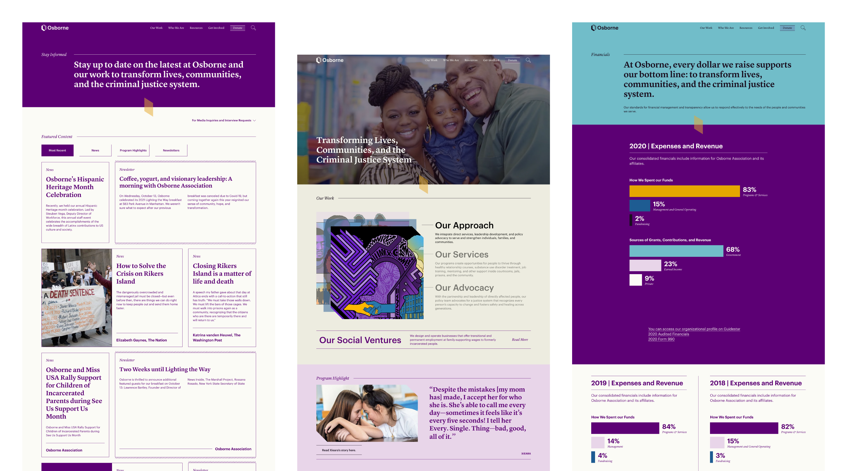
Given the organization’s emphasis on providing and sharing knowledge, pages lead with clear, authentic, and bold hero statements. The editorial feel, along with a buttoned-up type choice reflects the history and augustness of the organization and establishes trust with readers.
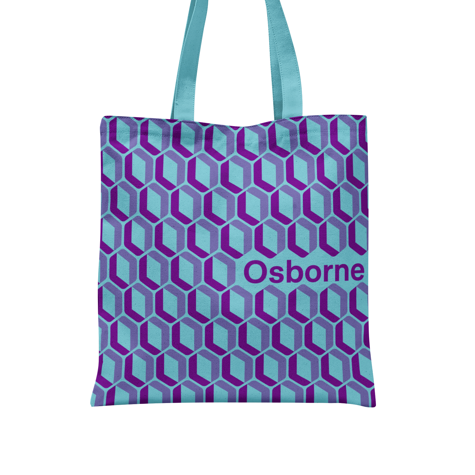
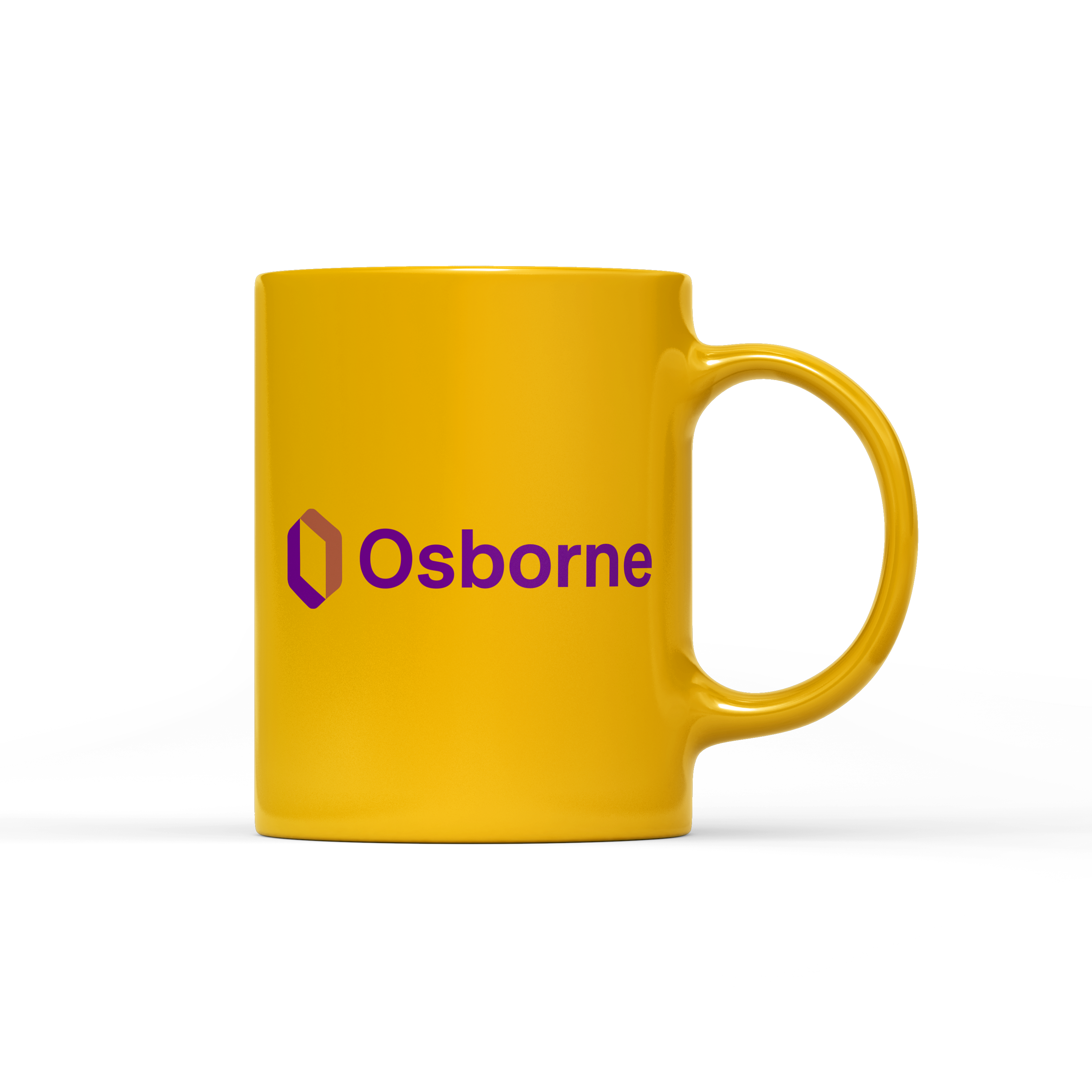
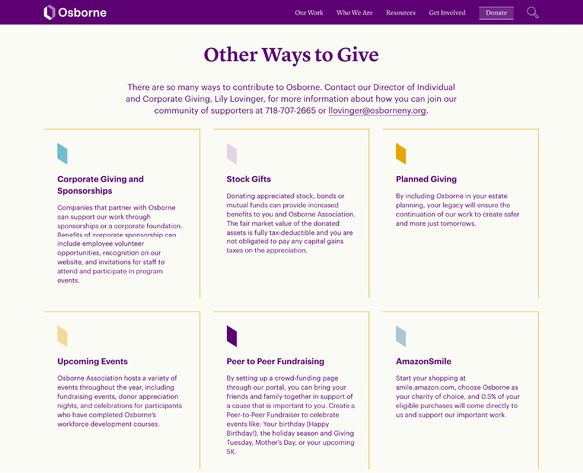
Colors convey richness and gravity
We evolved the brand’s signature purple, deepening its hue and pairing it with vibrant golds and blues to create an enveloping and immersive color palette. With the website’s depth of content, its inviting colors encourage exploration.
Architectural elements are built in
Select modules have a chiseled edge or other features of physical construction, echoing masonry and rooflines.
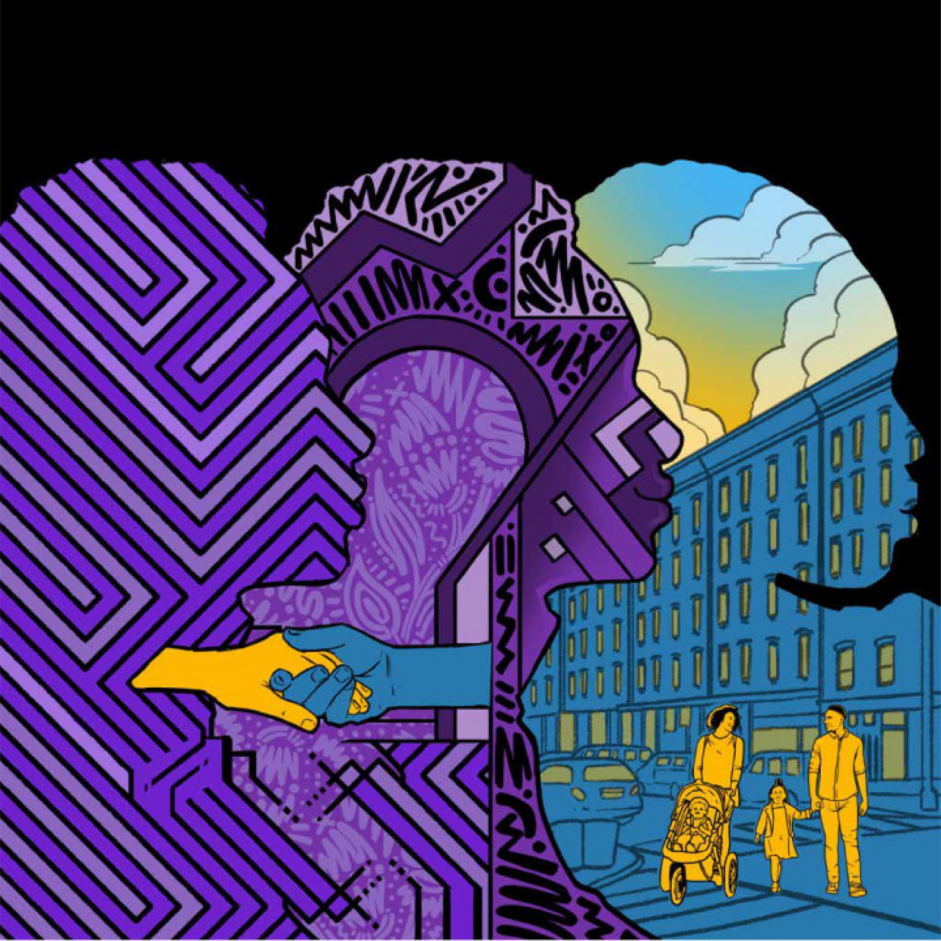
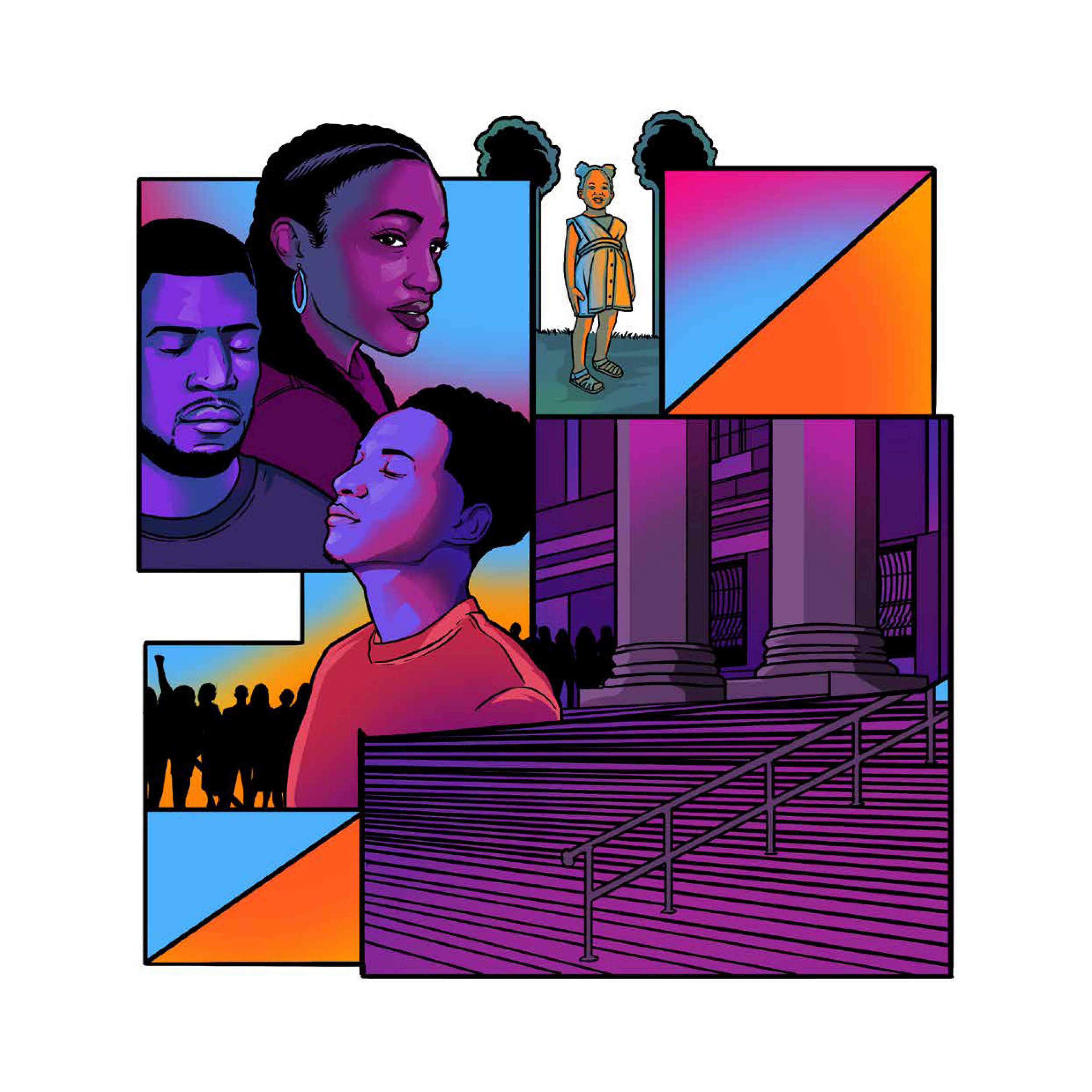
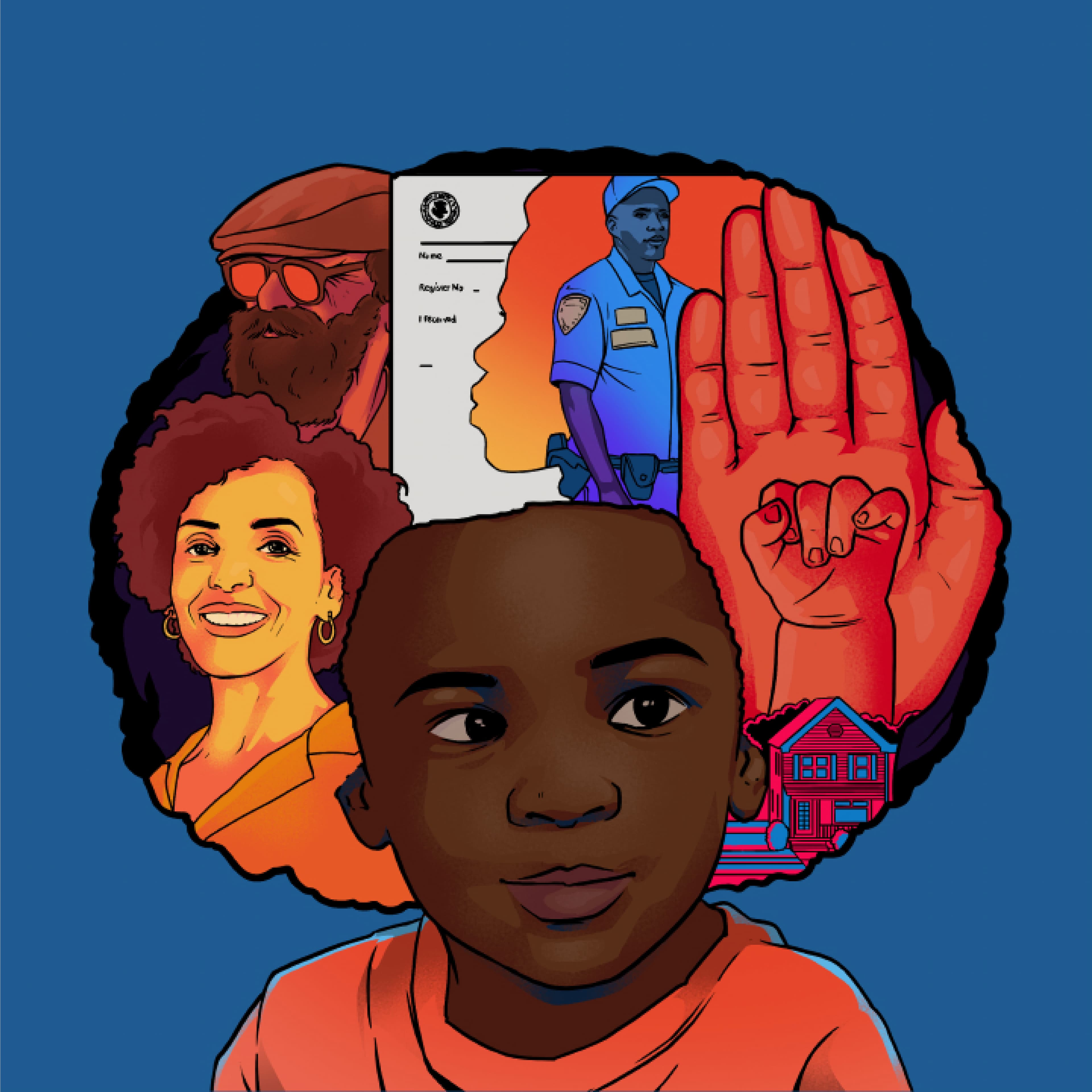
Illustrating experience
Artist Kingsley Nebechi was commissioned to bring vibrancy and life without dismissing the gravity of the content. Nebechi’s illustrations celebrate the idea of the transition out of incarceration, emphasizing the connection between incarcerated and non-incarcerated people. His work reflects the challenge of nurturing these relationships without systemic support.
Project Credits
- Sarah Hallacher
- Delaney Weber
- Deroy Peraza
- Logan Emser
- Sruthi Sadhujan
- Ballard Blair
- Izabella Stern
- Ryn Adkins