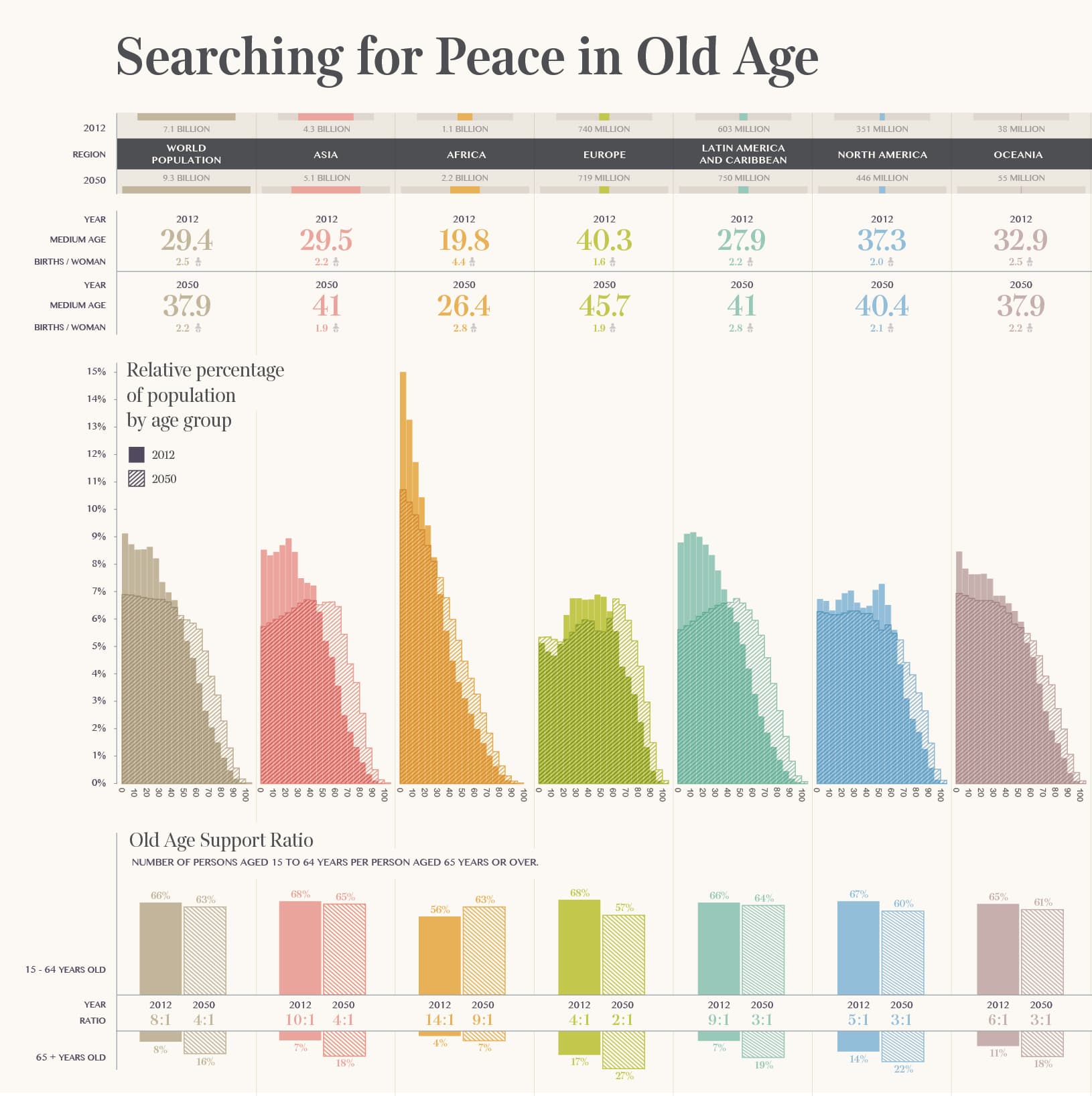
In 2012 there were approximately 810 million people over 60 years old in the world. As medical advances extend lifespans longer than ever, this number is projected to grow to more than 2 billion by 2050, at which point the elderly will outnumber children for the first time in human history. These trends mean that the old age support ratio, the number of working-age people needed to sustain an economy compared to the idle retirees that drain it, will present a serious threat to financial and political systems, especially in developed countries.
Corriere della Sera, amongst the oldest and most reputable newspapers in Italy, asked us to create a piece that visualized this story for La Lettura, their literary supplement. Italy faces on of the most alarming population aging problem in the world, so the graphic is particularly relevant for the Corriere’s readership.
We broke down age trends by global region, and illustrated them with classic histograms. We also separately visualized the projected old age support ratios of region in 2050. These clear and readable analyses work in any language, and leave no doubt about the scale of the problem.
News & Recognition
Project Credits
- Deroy Peraza
- Eric Fensterheim
- Ambika Roos