The word "Teach" is written in a white, dot-connected font on an orange background.

Challenge

Studio 360 is a Peabody Award-winning radio program from Public Radio International and WNYC. Each year, the producers of the program commission a design studio to redesign a culturally relevant topic whose visual language has grown stale. In 2011, Hyperakt was approached with the task of redesigning the brand of “teachers.” We aimed to disrupt and reimagine the current infantile iconography — apples, pencils, and abc blocks, dubbed “Apple Crapple”— and more accurately reflect the multi-faceted role of teachers and the spectrum of teachers from elementary school to higher education.

A minimalist graphic of a sunburst with a round yellow center and numerous white linear rays emanating outward in a radial pattern against a yellow background.

Approach

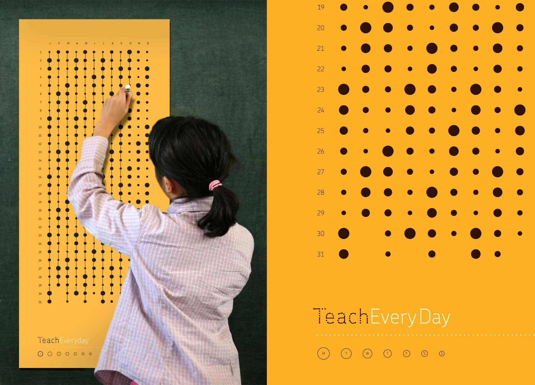
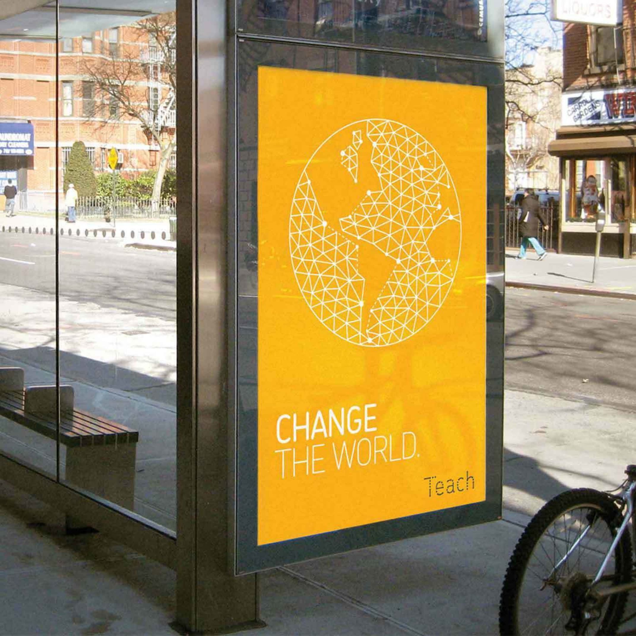
After extensive exploration, we arrived at a core idea: teachers enable potential in every student. We defined this visually as “connecting the dots.” This motif defined a new visual story for teachers, one that alluded to linking synapses, bridging gaps, and guiding students. We created an inspirational brand to instill pride in the teaching profession and to represent what 21st century learning really looks like.

A yellow background displays a white infinity symbol with two small dots on the curves. Below the symbol is a quote by Henry Adams in white text: "A teacher affects eternity: He can never tell where his influence stops.

Impact

The new brand was presented on air at Studio 360. The program was so popular, PRI followed up the radio show with a downloadable e-book, outlining our process and its outcome. Teach has won a Brand New Award, was featured in AIGA’s Design For Good blog, and in GOOD, CoDesign, and +Ed Week.

A monitor displays an orange webpage with the title "Teach" written in a unique font made of digitally-inspired elements. The site is described as a project by Studio 360 and Hyperakt to create visual vocabulary for teachers' multifaceted roles. Buttons offer further engagement.
We loved how Hyperakt’s ‘connecting-the-dots’ motif suggests teachers are guides to thinking and learning, providing students with the foundations for lifelong education as a perpetual work-in-progress. The intended end-users here were educators, and across the radio and Web platforms of the project the response has been inspiring. One 50-year veteran wrote us: ‘Your Teach designs graphically depict what I feel when I’m teaching’.
Kurt Anderson
Host, Studio 360
Two young girls wear scientist lab coats while smiling and holding a paper tube in a classroom. Behind them, colorful posters display phrases like "Nurture Brilliance" and "Change the World." The setting appears vibrant and educational with a focus on learning.
A round yellow button pin with the word "Teach" printed in black, stylized with faint dotted lines forming each letter, is displayed. The pin's back is visible next to it, showing the pin mechanism.

A brand with urgency

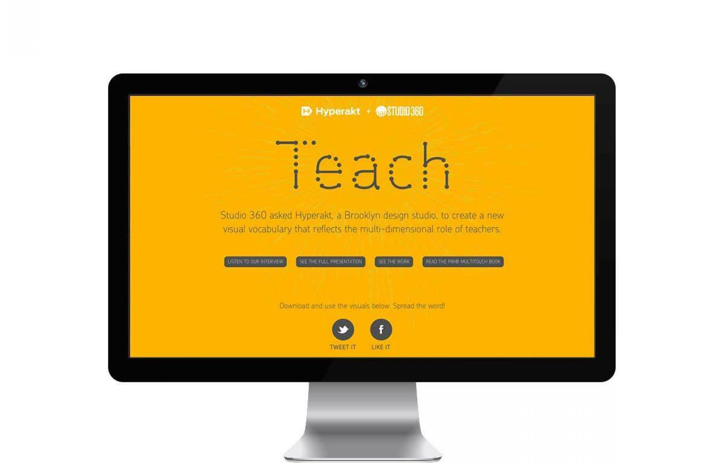
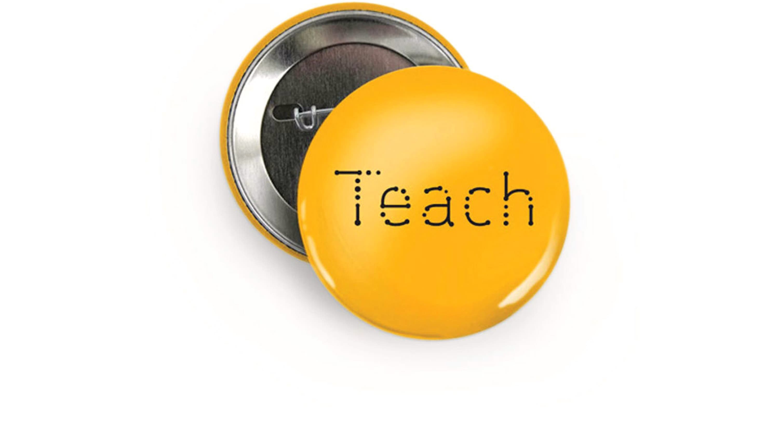
We first repositioned “teachers” to an active verb "teach." Using a verb to represent the teacher’s brand not only emphasizes that teachers are active do-ers, facilitators, and enablers, it makes the entire brand a call to action. The brand “Teach” immediately urges people to join the profession, and encourages others to acknowledge the important role of educators.

We manipulated the typeface Chevin to create a primary mark, finding a balance between connection points and linking lines to read clearly and boldly, “Teach.”

A student with black hair in a ponytail stands in front of a blackboard, working on a large yellow sheet displaying mathematical patterns with various dots. The right side of the image features a similar yellow background with a patterned dot design and the text "Teach Every Day.

Elevating teachers

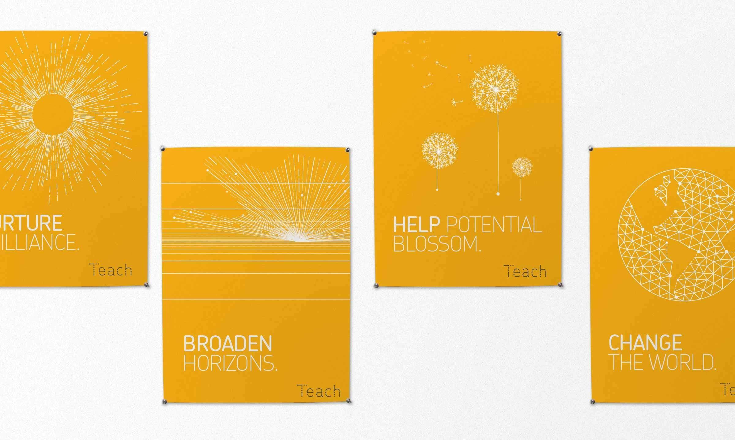
Across posters and advertisements, the Teach brand is designed to elevate the role of teachers, invite respect, and inspire the best and brightest to pursue the profession. Each poster has a unique “connect-the-dot” illustrations— a visual language that is already used for learning, from word mapping to flow charts. A vibrant yellow color links the brand back to educational motifs of pencils and school buses and keeps a friendly and optimistic feel.

Four orange posters with white text and designs are pinned on a white wall. Text on the posters: "Nurture Brilliance," "Broaden Horizons," "Help Potential Blossom," and "Change the World." Each poster features a unique line or dot pattern associated with its message.

A space for Innovation

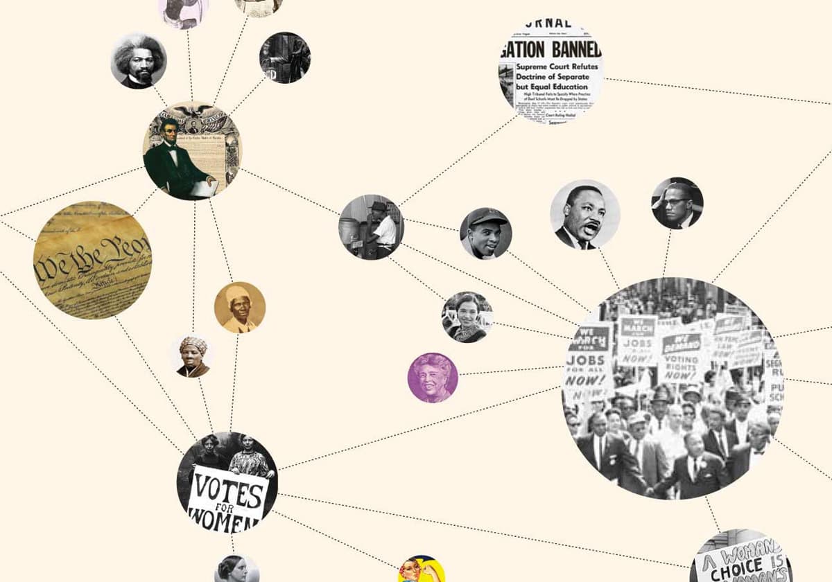
We transformed the perception of teachers at school and in the classroom by replacing a childish visual vernacular with sophisticated design. The designs speak to teachers in an intellectual and mature way. Using the same language of circles and connecting lines, teachers can link together stories — How do you catch the flu? What is the history of airplanes and spaceships? — in a visual way.

An image with nine sections, each representing a different educational subject. The sections are labeled: Teach Language, Teach Science, Teach Social Studies, Teach Math, Teach History, Teach Health, Teach Biology, Teach Economics, and Teach Technology.
A person with curly hair is writing equations on a blackboard, with mathematical symbols and a graph in the background. The words "Teach LOGIC" are prominently displayed in the bottom right corner.
Two hands are holding and interacting with a tablet displaying a TeachScience app. The screen shows a network of interconnected circular images, including a rocket launch and an aviator. One finger is about to touch one of the circles.
A close-up of a child looking into a microscope, with the words "Teach CURIOSITY" overlaid on the image. The text is decorated with various orange and white circles of different sizes.
An orange, wireframe illustration of a globe showing Europe, Africa, and part of Asia. The continents are formed by connected lines and dots, creating a geometric, networked appearance on a white background.

Open to all educators

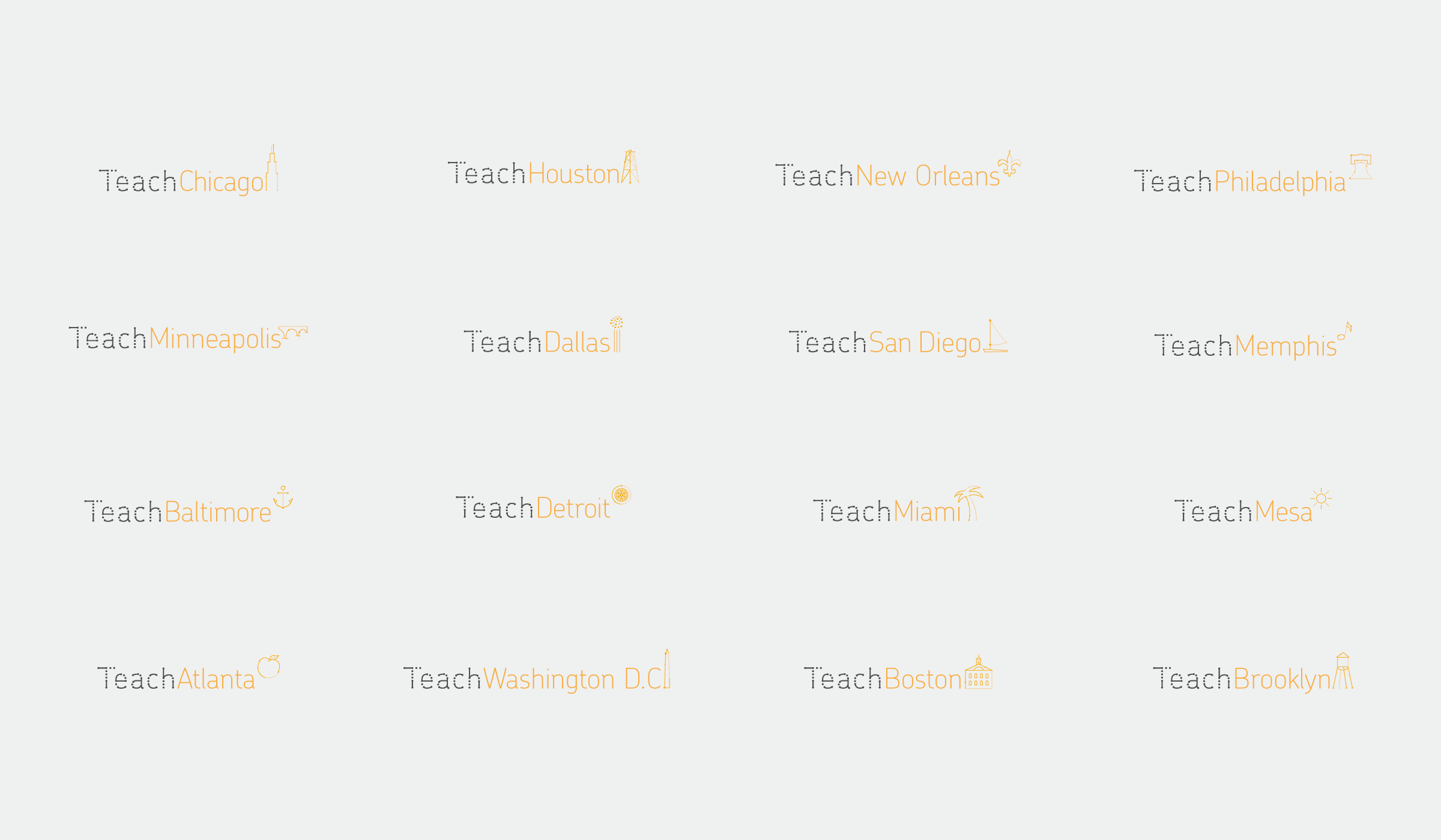
In response to requests from teachers, we created the website InspireTeachers.org under a creative commons license, making all Teach branding materials publicly available. To date, the site has been visited by people in over 100 countries, with over 3,000 downloads and counting. We've been touched by how the visual language has been adopted and transformed by teachers around the world in their classrooms.

A person wearing a black V-neck T-shirt featuring a stylized world map. The map depicts migration routes with yellow lines and dots connecting various global locations. The text "TeachHumanMigration" is printed below the map in yellow.
A bus stop ad in a city displays a bright yellow poster with a geometric globe illustration and the text "CHANGE THE WORLD" in white, and "Teach" in smaller white text at the bottom. Nearby, buildings and a bicycle are partially visible.
A grid displays 12 city names with simple yellow icons: Chicago, Houston, New Orleans, Philadelphia, Minneapolis, Dallas, San Diego, Memphis, Baltimore, Detroit, Miami, Mesa, Atlanta, Washington D.C., Boston, and Brooklyn.
Three notebooks lie on a gray background. Two notebooks are closed, with a black cover featuring a yellow design that reads "I [heart] science" with a heart symbol and an atom. The third notebook is open, showing blank lined pages.
A yellow, pentagon-shaped school zone sign with an abstract design of connected dots forming a network above the word "SCHOOL" in black, mounted on a post with trees and a clear sky in the background.
Text on a white background reads, “The art of teaching is the art of assisting discovery. - Mark Van Doren.” Above the text is a minimalistic design of interconnected orange dots and lines forming an abstract shape.
A collage-style image depicting key figures and documents from social justice movements, interconnected by dotted lines. Includes historical photos of individuals, protest signs like "Votes for Women" and "Jobs and Freedom," and a section of the U.S. Constitution.

Project Credits

Project Team
Collaborators
  • Jenna Shapiro
Ready to unlock the potential of your nonprofit's brand?
Reach Out