The Refugee Project
Millions of people are displaced from their home due to war, persecution, or violence every year. Explore the causes of the world’s largest forced migrations over the last half century.
Our approach
Inspired by UNHCR’s work, Hyperakt took on the challenge of creating a powerful design-driven narrative from 40 years of their refugee data. Working with technologist Ekene Ijeoma, we created an interactive experience that illuminates where and when refugees emigrate, as well as the complex stories of political, social and economic turmoil behind each displacement. By adding historical context to the shifting patterns of forced migration, we highlight the impact each crisis has on people’s lives.
Experimenting with prototypes
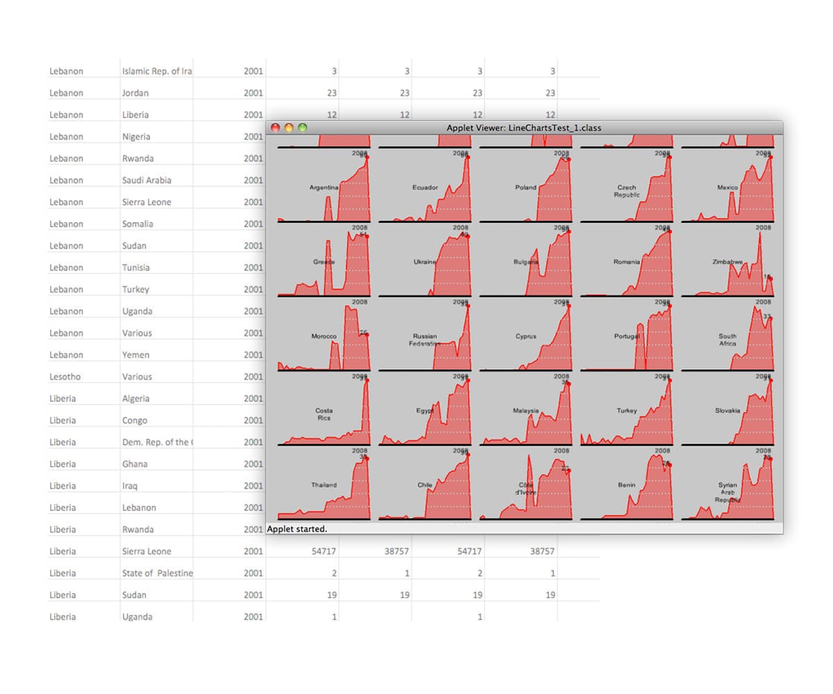
When we began this collaboration with Ekene, we had 150,232 rows of refugee migration data starting from 1975. The data provided the total number of refugees seeking asylum in each country and, conversely, the number of refugees originating from each country in any given year. From this raw data, we worked together to create a beta application to test different ways to map patterns in the data. The process required a lot of trial and error to make sure we were creating an experience that invited exploration rather than one that overwhelmed and added to confusion.
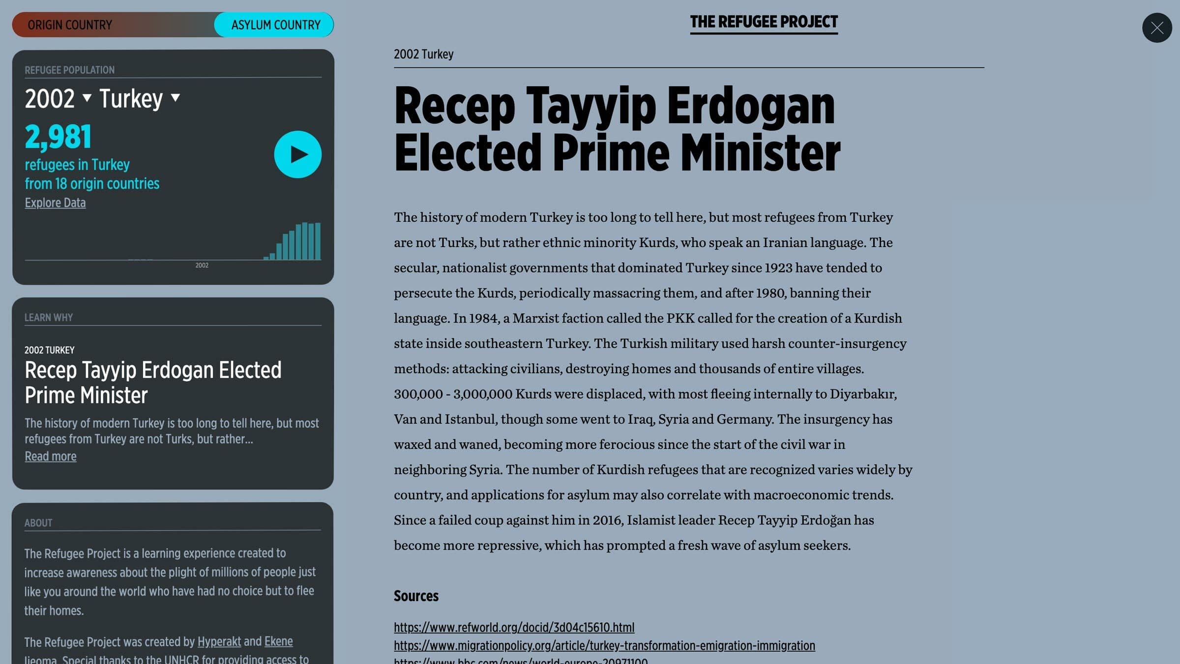
Highlighting the essential
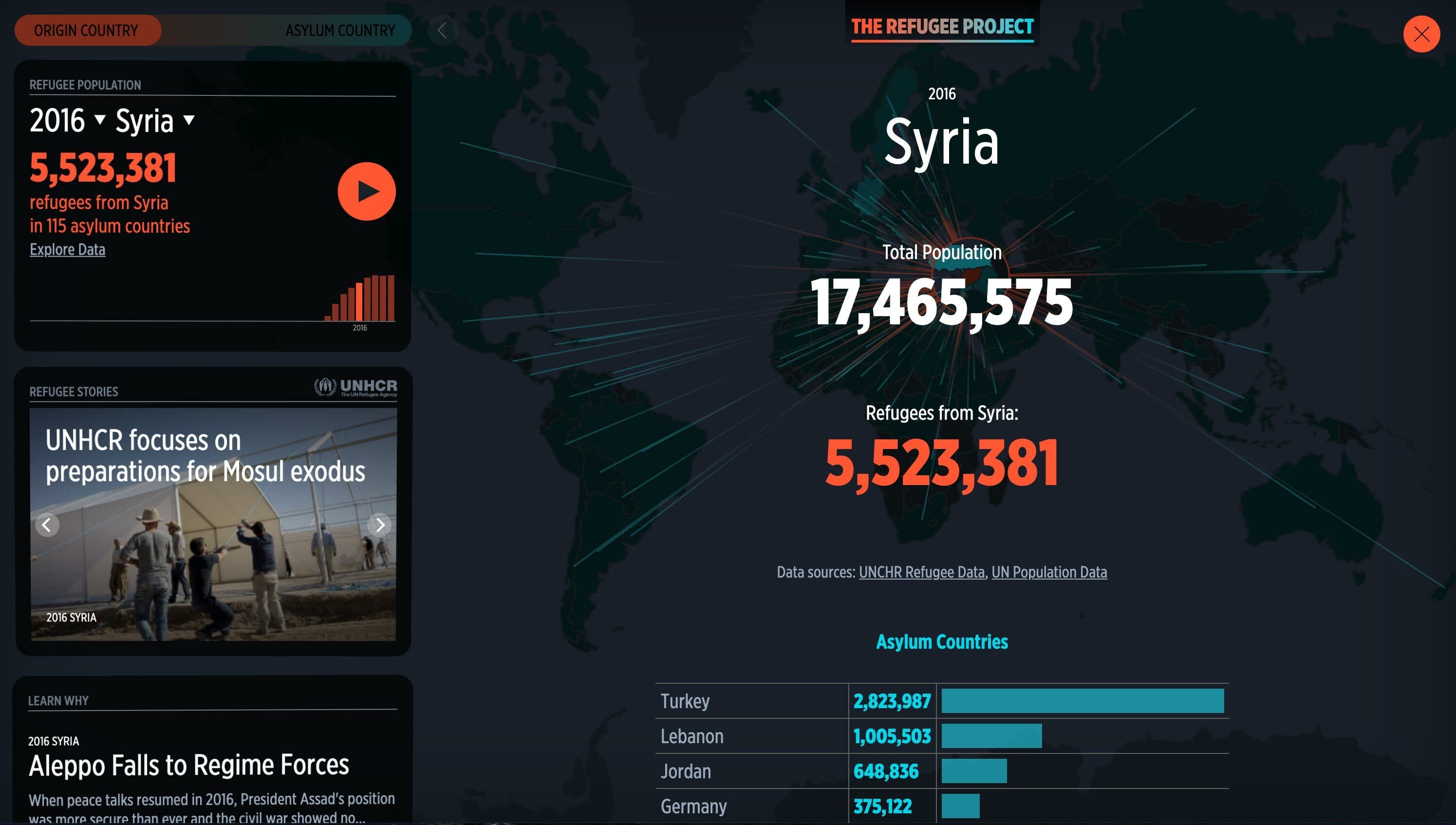
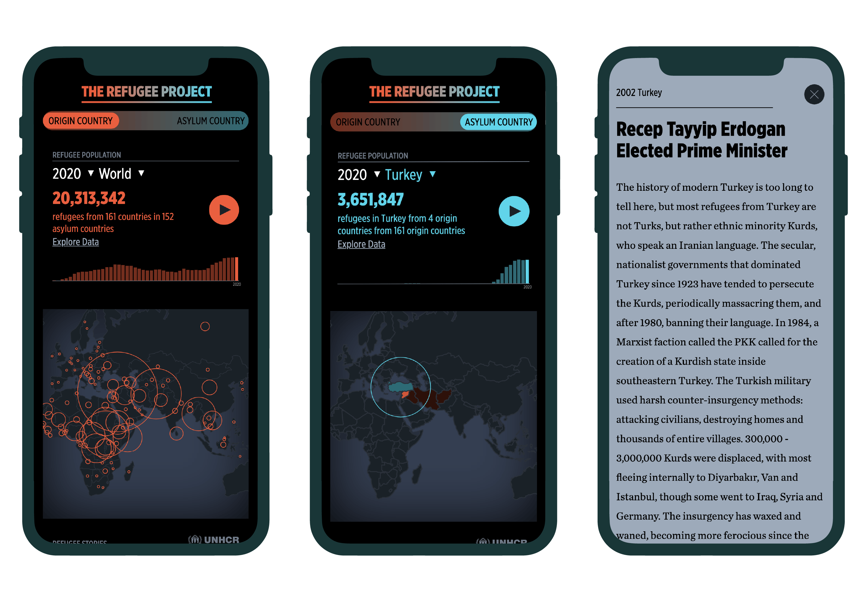
Working iteratively, we created an interface that provided a global overview of refugee migrations and highlighted key information. We kept the UI simple, composed of three variables: a world map, an information dashboard and a bar chart timeline, and headlines linking to stories for each year.
Red circles centered on each country visualize the total number of refugees originating from that country in each given year. These circles grow and shrink over time as conflict begins and subsides.
Understanding the data
The UNHCR's numbers only show the total number of refugees each year, rather than those who fled in that particular year. This means that some seemingly stable countries might show large numbers of refugees years after the events that prompted their flight, as these populations are still living as refugees in asylum countries. Shrinking numbers year over year can be attributed to a number of factors including, refugees returning to their home country, refugee deaths, or refugee naturalization in asylum countries.
Country of origin vs. country of asylum
Toggling the Origin/Destination button on the information dashboard switches the display between origin mode (red circles) and asylum mode (blue circles). The data shifts correspondingly from reflecting the origin countries of refugees to the countries where refugees have sought asylum.
Tracing migration paths
Radiating lines between countries show where refugees have sought asylum. We color-coded each line to reflect the direction of movement. For example, the movement of 3 Zimbabwean refugees to the UK in 1990 is depicted with a line between the two countries that is red at the African end and blue at the other.
Why is someone forced to flee?
Each wave of refugees reflects a wave of oppression, violence or chaos in their home countries. We researched and wrote 83 original stories to explain the political and social context behind major refugee movements. We wrote one or more headlines for each year, highlighting some of the key world events in that year impacting refugee crises. Stories are linked between related crises in neighboring countries or between years in a single country to provide a more complete picture of history.
Impact
The Refugee Project has accrued over 15 million page views since launching in January 2014, most of which originated at universities and high schools. It has been shared on Twitter to millions of viewers by global humanitarian organizations like UNHCR, Human Rights Watch, Oxfam International, UN Global Pulse and Amnesty International.
- 15MPageviews since launch
- 27Pages per session
- 7:20Average time on site
Museums and galleries in New York, London, Los Angeles, Istanbul, and Hamburg have featured The Refugee Project. MoMA featured the project in its Design & Violence digital exhibition and accompanying book curated by Paola Antonelli. The DesignMuseum London featured in its 2014 Designs of the Year. It was featured at the Istanbul Design Biennial and at the Annenberg Space for Photography in Los Angeles. In 2021, it was featured at the Museum Für Kunst Und Gewerbe Hamburg.
In 2014, The Refugee Project was awarded a prestigious Malofiej International Infographic Awards Silver Medal in a competition dominated by journalism giants like the New York Times, Washington Post, and The Guardian. The same year it received a Gold Medal in the Interactive category at the Information Is Beautiful Awards organized by David McCandless.
News & Recognition
- 11 Maps That Will Help You See the World in a Whole New Light featuring The Refugee ProjectFodor's Travel
- Understanding the World: The Atlas of InfographicsTASCHEN Books
- The Refugee Project featured in Philanthropy News DigestPhilanthropy News Digest
- Capturing the Faces of the Global Refugee CrisesHyperallergic
- The cartography of control: Mapping the Calais refugee campQuartz
- Beazley Designs of the Year 2016The Design Museum
Project Credits
- Deroy Peraza
- Dylan Viola
- Izabella Stern
- Eric Fensterheim
- Ambika Roos
- Josh Smith
- Ekene Ijeoma
- Ted Cava
- Oak Studios