Work

UNICEF: State of the World's Children

Inspiring innovation for every child.

Two young women stand in front of a colorful graffiti wall. The woman on the left wears a denim vest and has long, light brown hair, while the woman on the right has shoulder-length dark hair and wears a floral top. Both look confidently at the camera.

Challenge

Each year, UNICEF’s flagship publication, The State of the World’s Children, examines key issues affecting children and mothers in developing countries. In 2015, for the first time in digital native format, UNICEF wanted to shine a light on innovation and technology that is inclusive of the needs of poor and marginalized children and families. The challenge was to design an interface that could formally present UNICEF’s perspective, give voice to a dozen real-life stories of innovation, and to invite the public to share their own social innovations.

A computer monitor displays a UNICEF website page with the title "Reimagine the future." The screen shows a group of smiling children of diverse ages standing closely together outdoors under a cloudy sky.

Approach

Hyperakt worked with UNICEF to define a clear content strategy that revolved around the core pillars of information: an institutional report, forty essays from child and expert innovators, and an interactive map. These three sections defined three levels of interaction, allowing the viewer to, respectively, observe, discover and share. Through consistent taxonomies and iconography, we linked the three sections together to provide a richer experience. We pushed the UNICEF brand to allow for a big and impactful visual experience to showcase the young voices of innovation.

Two tablets display an interface for organizing and viewing stories. The left screen shows a list of tags for categorization, with "Partnership" highlighted in green. The right screen shows a selection of stories filtered by the selected tags, including titles and thumbnails.

Crafting the narrative structure

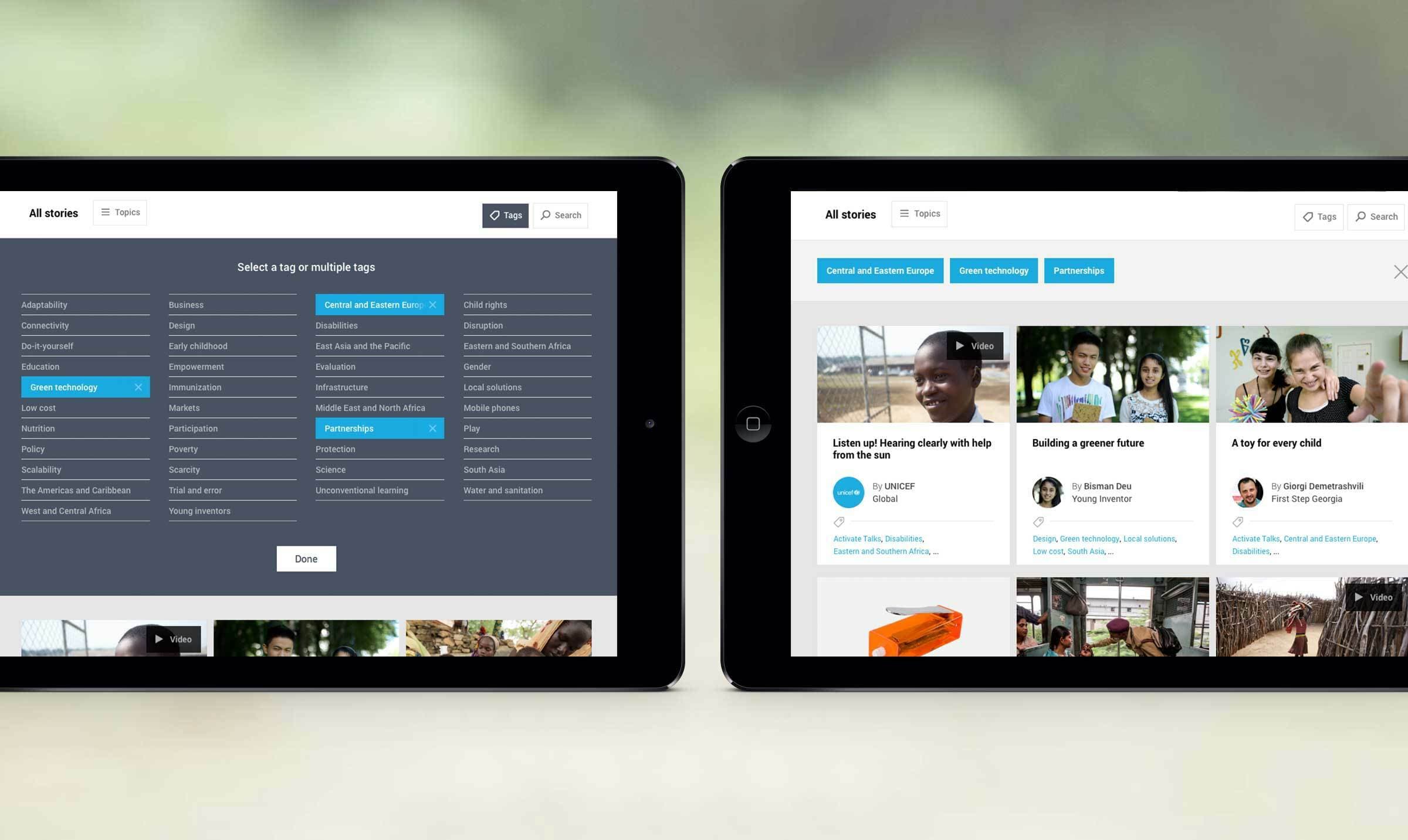
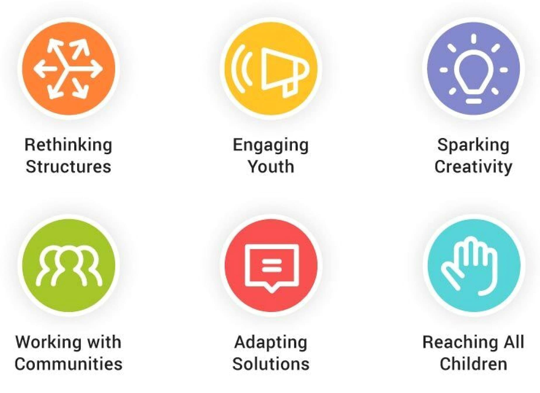
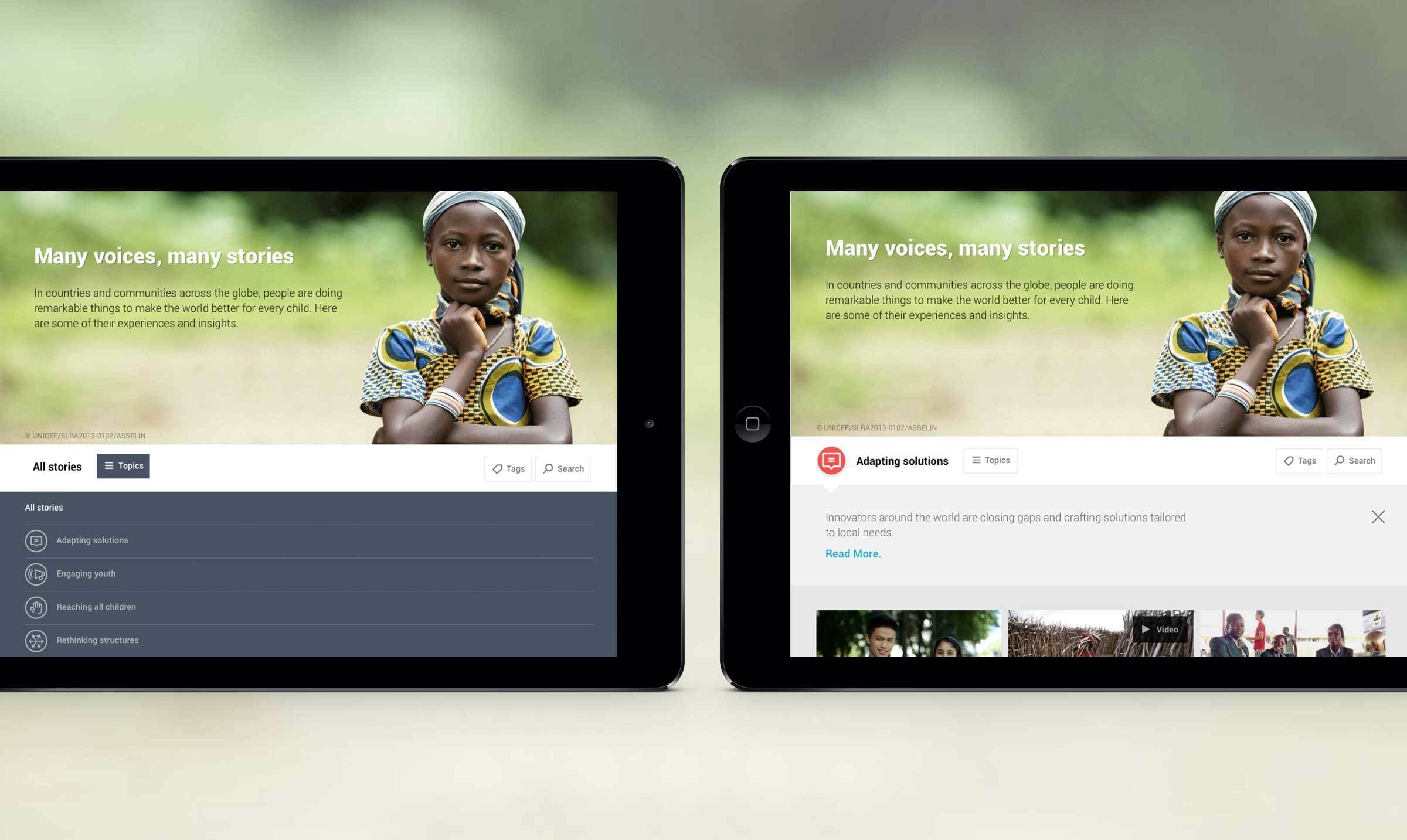
Hyperakt led a collaborative content strategy workshop at UNICEF aimed at developing tags and a taxonomy that categorized forty essays into six coherent categories. Essays were grouped by the substance of their content rather than type. The categories became the thematic backbone of the website, forming links between the different sections. A custom set of six icons associated with each category are used consistently across text callouts, filtering systems and as markers to provide a cohesive visual experience.

An image featuring six icons with accompanying text. The icons and text are as follows: Orange with arrows, "Rethinking Structures"; Yellow with a megaphone, "Engaging Youth"; Purple with a light bulb, "Sparking Creativity"; Green with three people, "Working with Communities"; Red with a speech bubble, "Adapting Solutions"; Blue with a hand, "Reaching All Children.
Screenshot of UNICEF's website displaying three columns. The left column features stories about children, the center highlights an article about a computer helping Syrian refugees learn, and the right focuses on U-report aiding in the fight against Ebola in Liberia.

Easy browsing

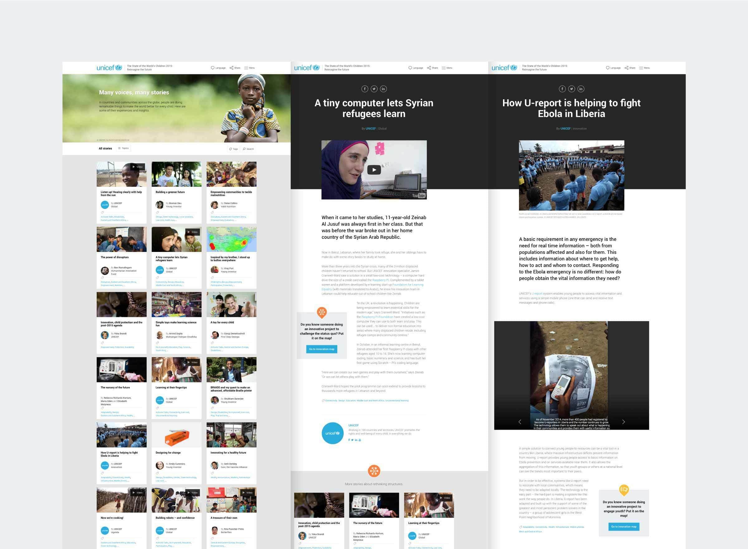
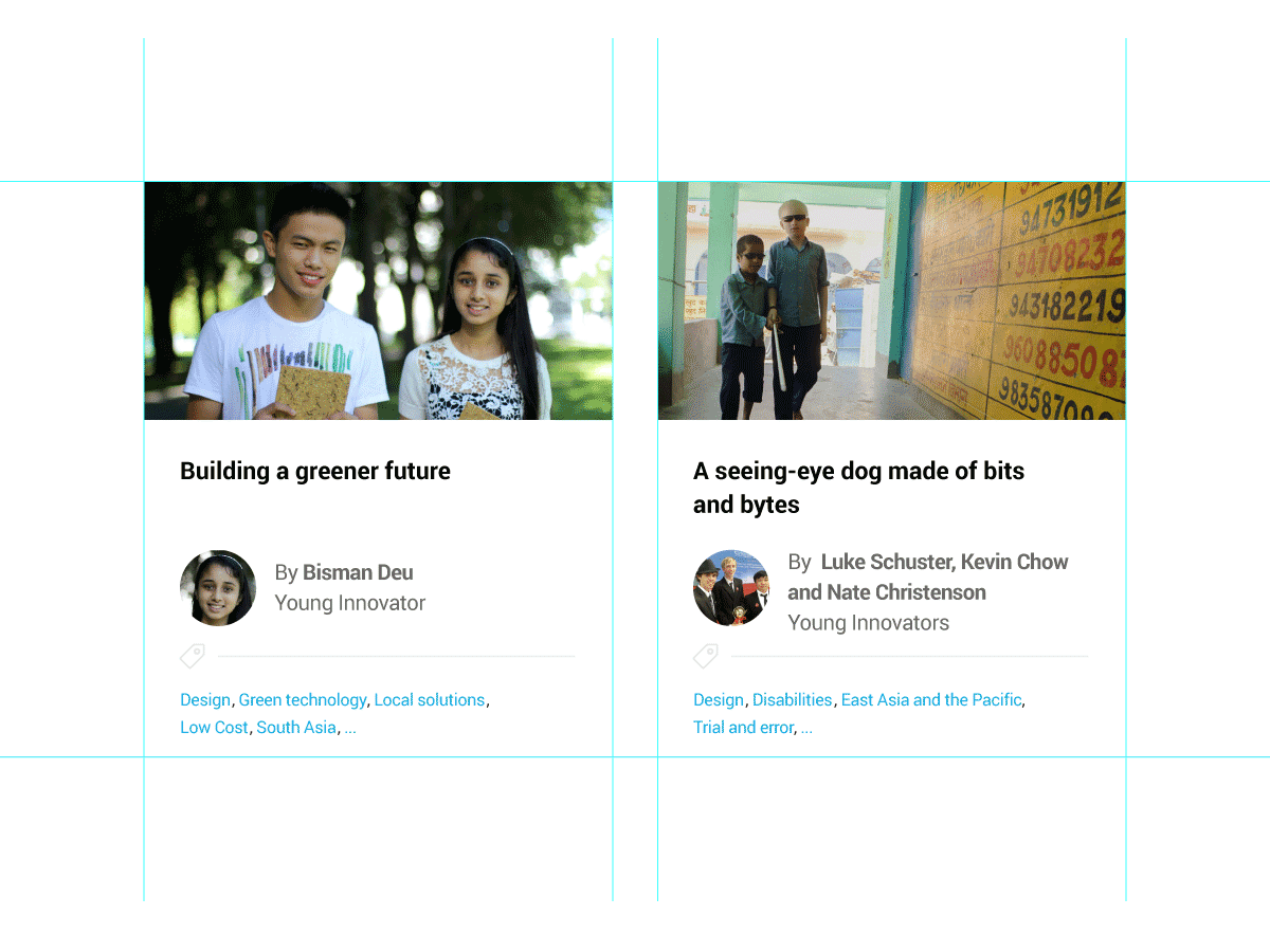
With 40 essays to navigate through on the “Stories of Innovation” landing page, viewers need to quickly be able to browse through key information at a glance to make a selection. Each essay is represented by a card containing a key image, essay title, author name and picture and tags associated with the content. Viewers can sort essays by category, tags and the search functionality.

Two side-by-side cards featuring projects by young innovators. Left card: A young man and woman smiling, titled "Building a greener future" by Bisman Deu. Right card: Two young boys walking with a teacher, titled "A seeing-eye dog made of bits and bytes" by Luke Schuster, Kevin Chow, and Nate Christenson.
Two tablet screens displaying a website with the header "Many voices, many stories." The left screen shows categories like "Adapting solutions" and "Regreening Africa," while the right screen highlights a featured article under "Adapting solutions" with a "Read More" link.

Bold and Immediate

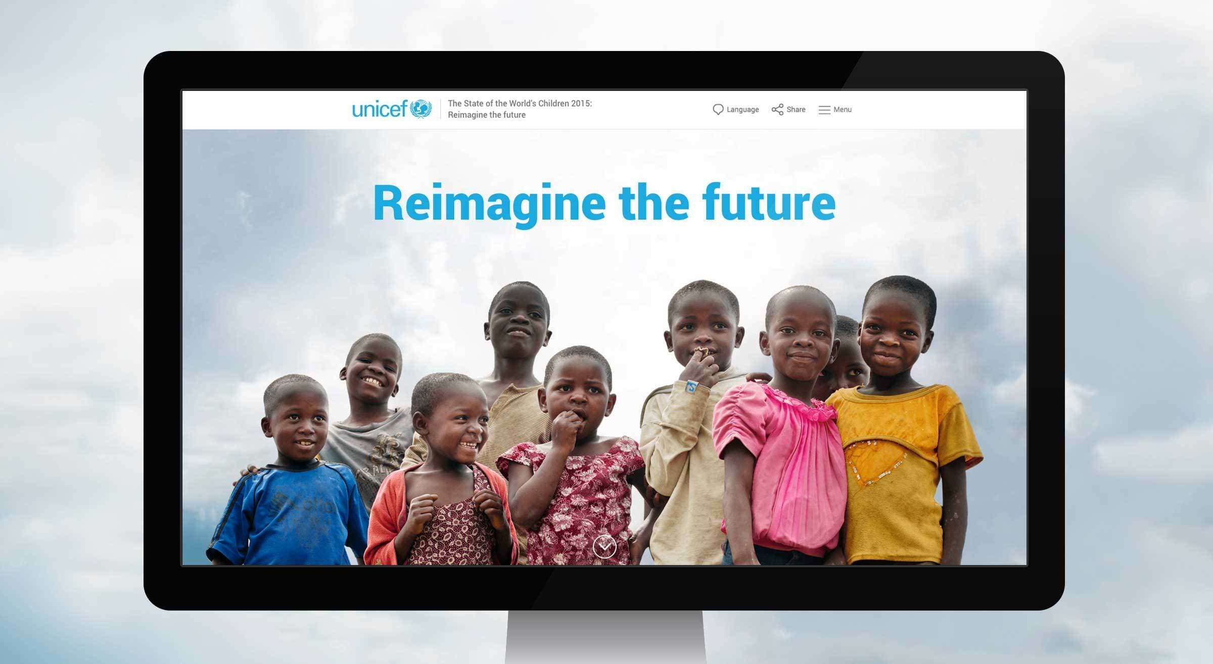
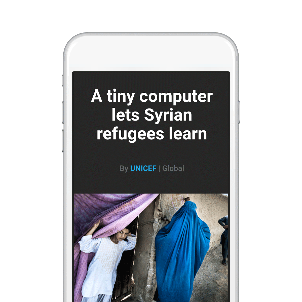
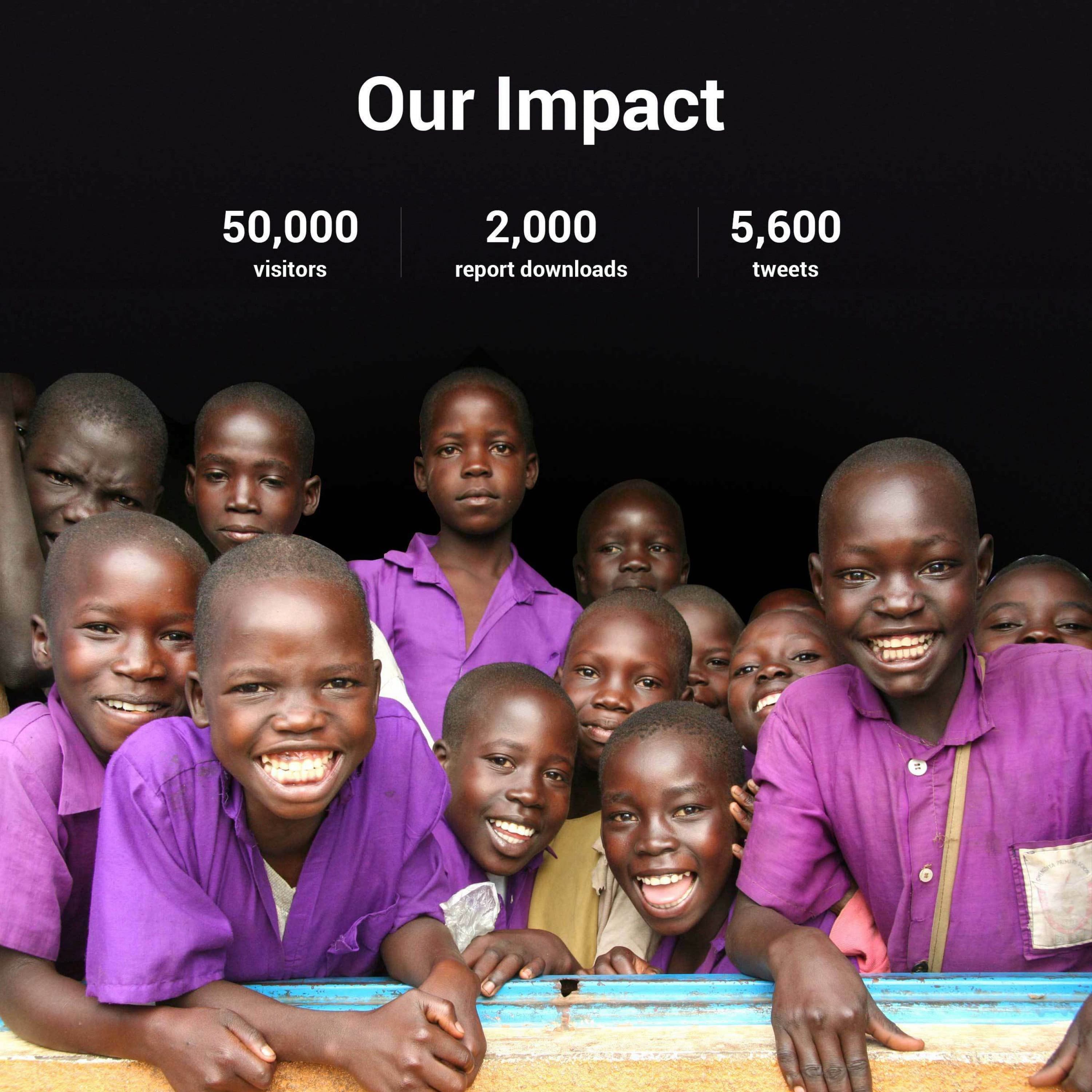
UNICEF is a big organization tackling massive issues. The State of the World’s Children is full of inspiring stories of hope and resourcefulness. We designed the site so that typography, photography and user interface elements are big and bold, allowing the content to be king and ensuring ease of legibility for all. The scale of the site and it’s documentary-style photography strike a confident editorial tone emphasizing the immediacy of the stories.

A mobile phone screen displays the text, "A tiny computer lets Syrian refugees learn," by UNICEF Global. Below the text, there is an image of two people walking, one draped in a blue garment, and another carrying a purple cloth. The background is green.
A group of smiling children, predominantly wearing purple shirts, gather closely together and look at the camera. Above them, a black background features the text "Our Impact" along with statistics: 50,000 visitors, 2,000 report downloads, and 5,600 tweets.

A Collaborative Resource

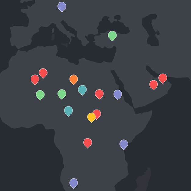
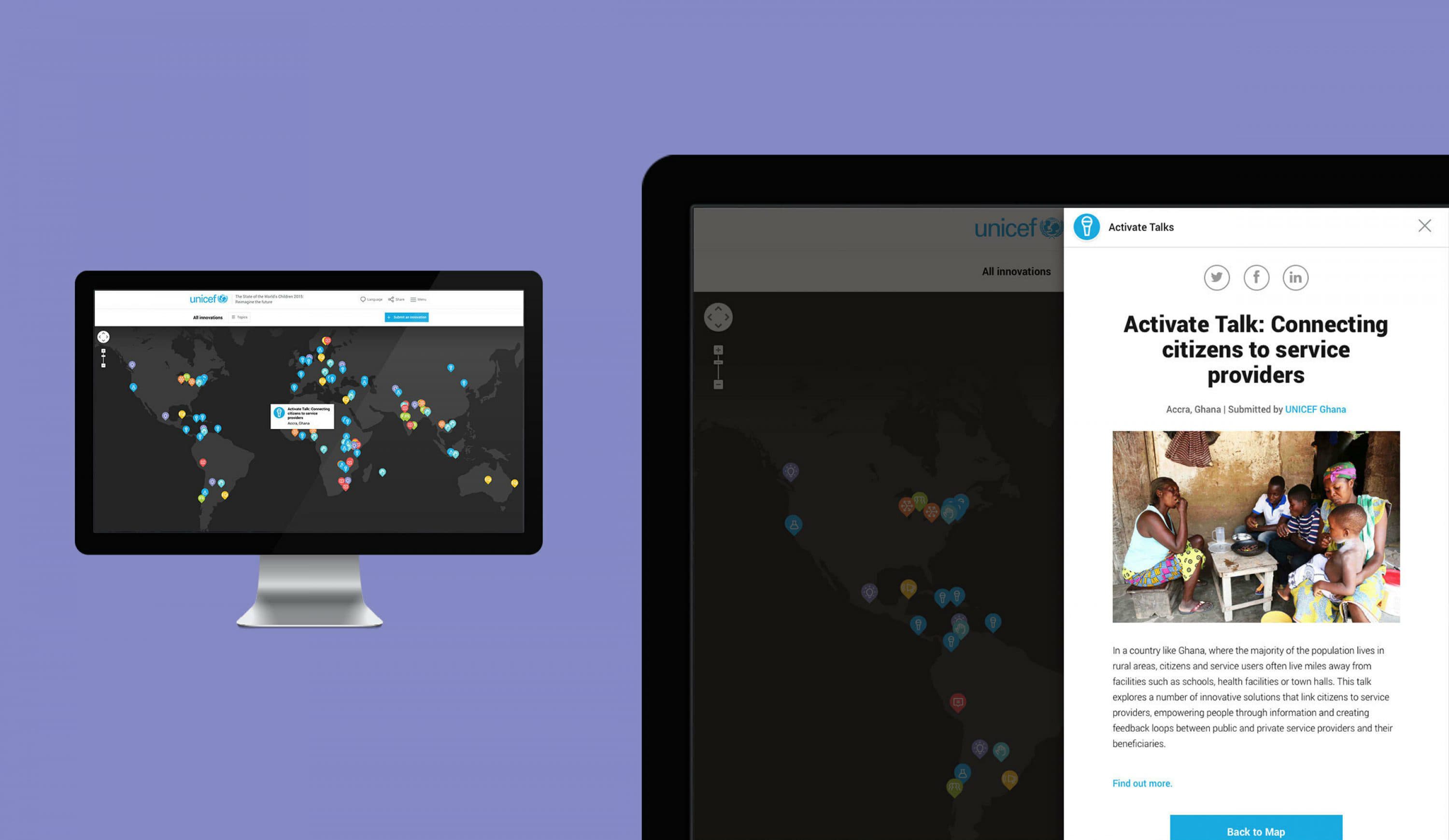
The Map of Innovation is an interactive resource that emphasizes the global reach of social innovation. The map includes all of the innovations written about in the State of the World's Children, but it also invites the public to contribute their own stories of innovation through a simple form. Viewers can easily browse hundreds of inspiring stories around the world and share them via social media.

A dark-themed world map features various colored location pins concentrated in Africa, the Middle East, and Southern Europe. Pins are red, green, blue, yellow, light blue, and orange, indicating different points of interest or data.
A computer monitor and tablet display a UNICEF Activate Talk webpage. The monitor shows an interactive world map with colorful markers, while the tablet screen presents a close-up of a webpage featuring a story about connecting citizens to service providers in Ghana.

Project Credits

Client
Year of Completion
Issues
Project Team
Ready to unlock the potential of your nonprofit's brand?
Reach Out