Work

ClimateWorks Reports

Challenging policymakers to confront climate chaos.

A grayscale cityscape illustration featuring various buildings and structures, including public transport, a monument, and a power station. Hexagonal icons overlay the image, symbolizing different amenities such as water, electricity, transportation, housing, and facilities.

The challenge

How can more people gain access to secure, reliable, and affordable energy without exacerbating air pollution and the carbon dioxide emissions that cause climate chaos? How can world leaders help lift the next billion people out of poverty while conserving the natural resources needed for our survival?

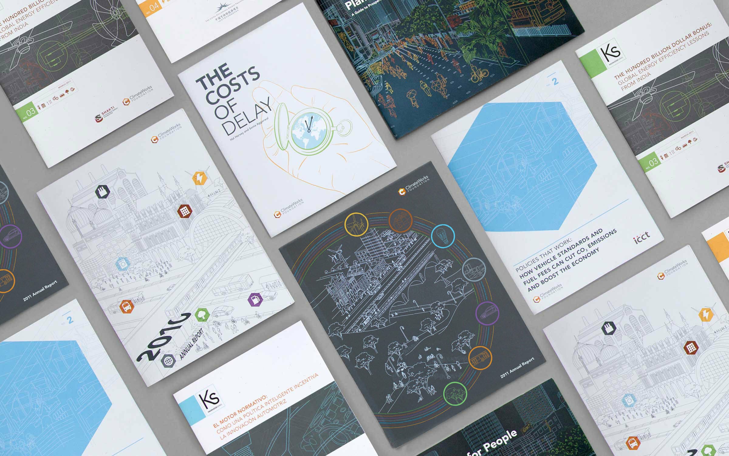
These are the questions that the ClimateWorks Foundation seeks to answer. Founded in 2009, ClimateWorks is an international network that works to increase public understanding of climate chaos and to reduce carbon emissions. Over three years, Hyperakt worked with the foundation to translate its complex information into clear, policy-oriented design.

A top-down view shows an array of colorful and monochromatic books and reports spread out on a flat surface. The covers display various illustrations, diagrams, and text, focusing on topics like cost analysis, planning, and development.

The opportunity

Hyperakt helped ClimateWorks define their visual voice across a half-dozen print publications spotlighting thinking from the world’s leading experts. Our graphic approach centered around visualizing Climate Works’ ultimate policy goal: to make our world a better place to live in. We designed a brand language that mirrored this utopic vision: clean, efficient, sustainable and equitable.

A vibrant city scene depicted in colorful line art, showing people walking, biking, and holding umbrellas on a busy street. High-rise buildings, trees, and buses are visible in the background, illustrating an urban environment filled with activity.

A pathway for the future

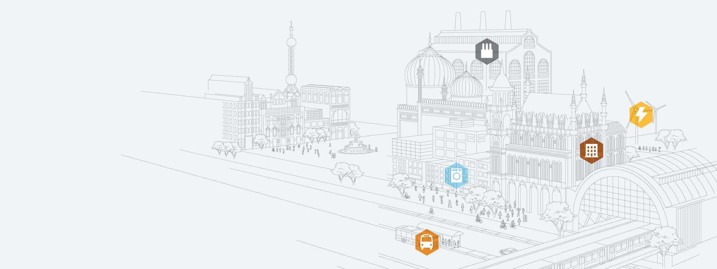
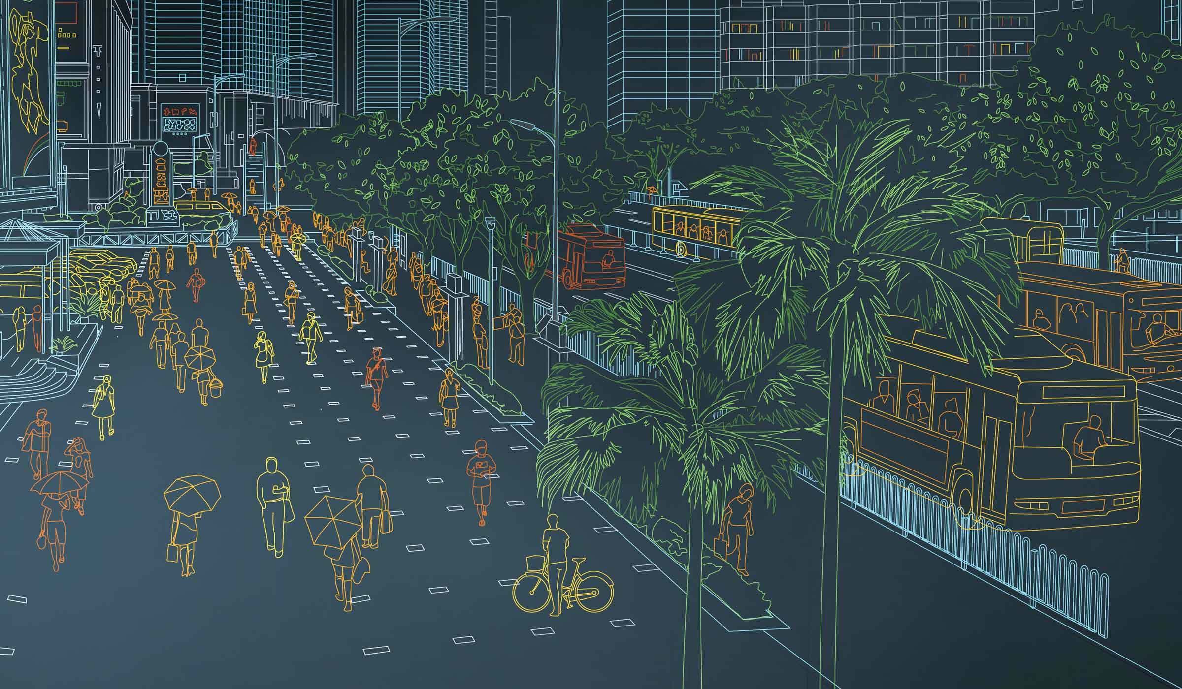
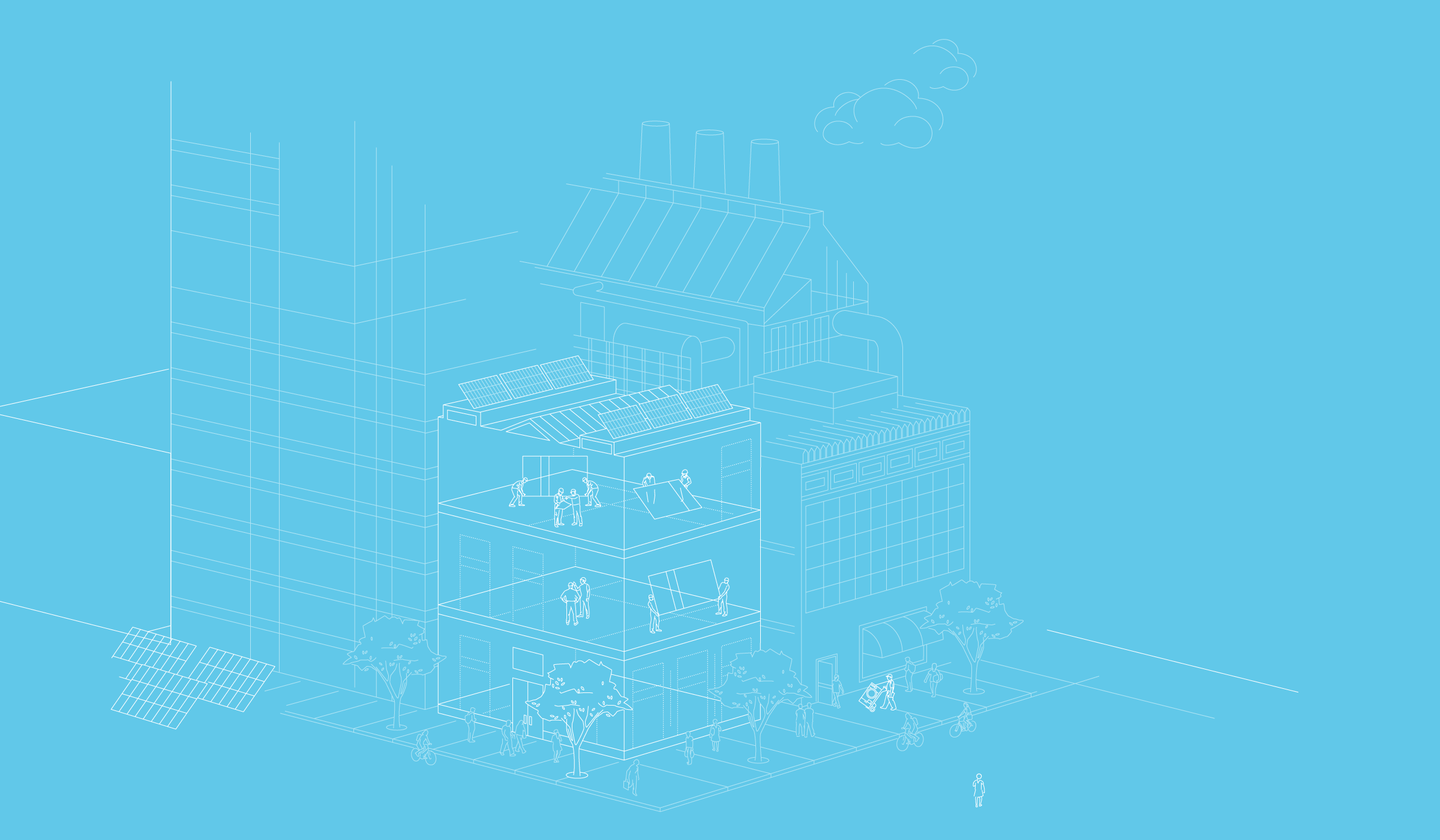
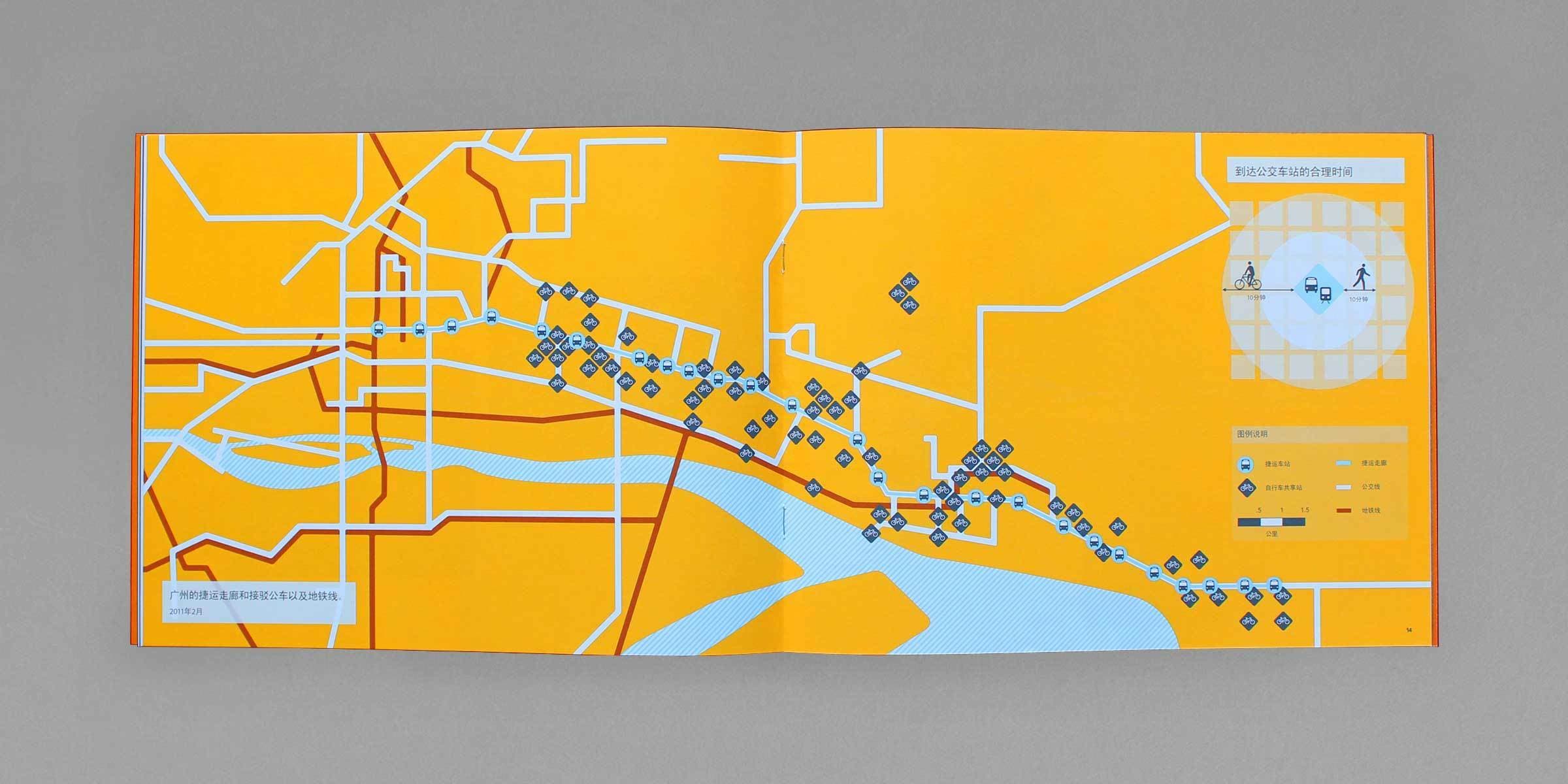
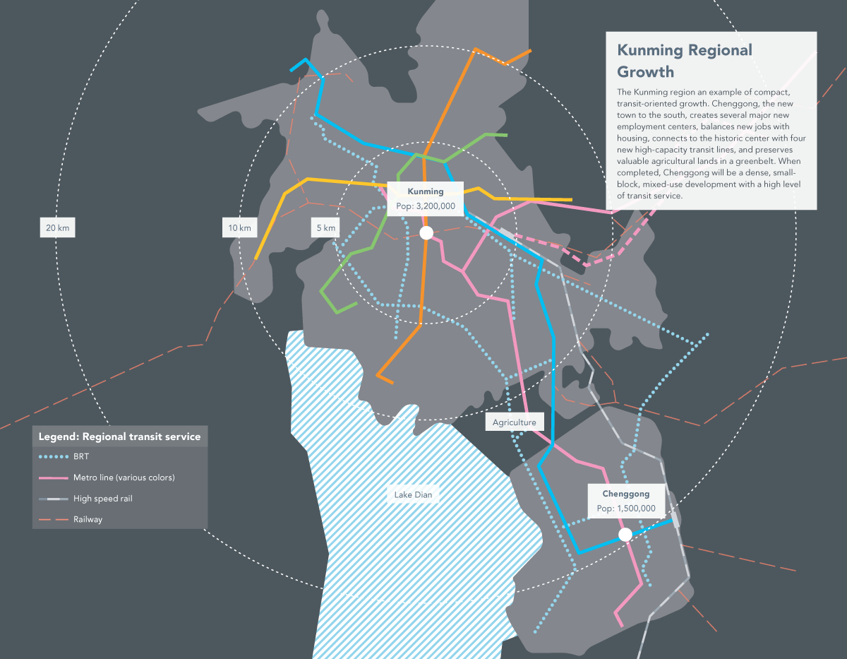
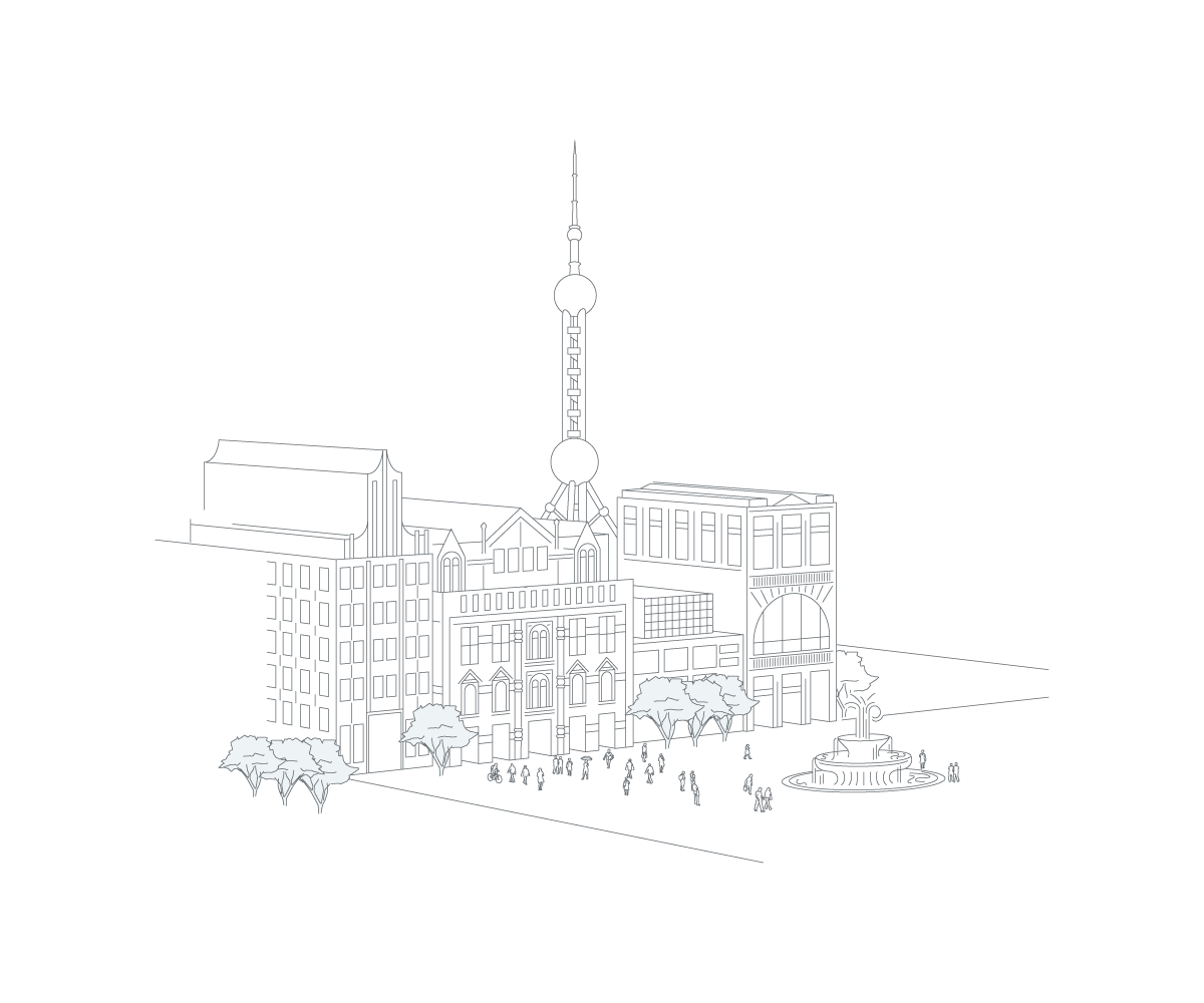
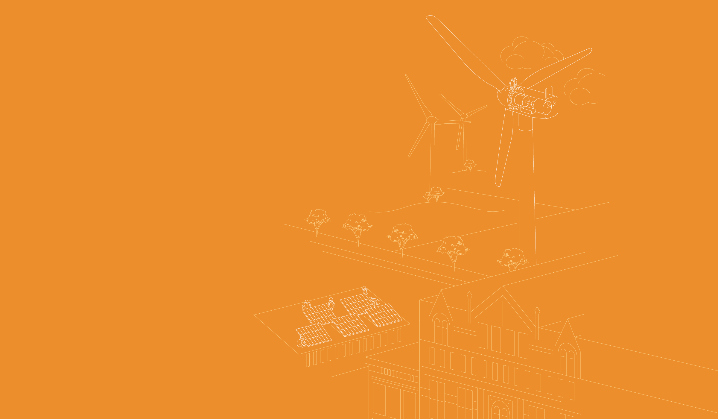
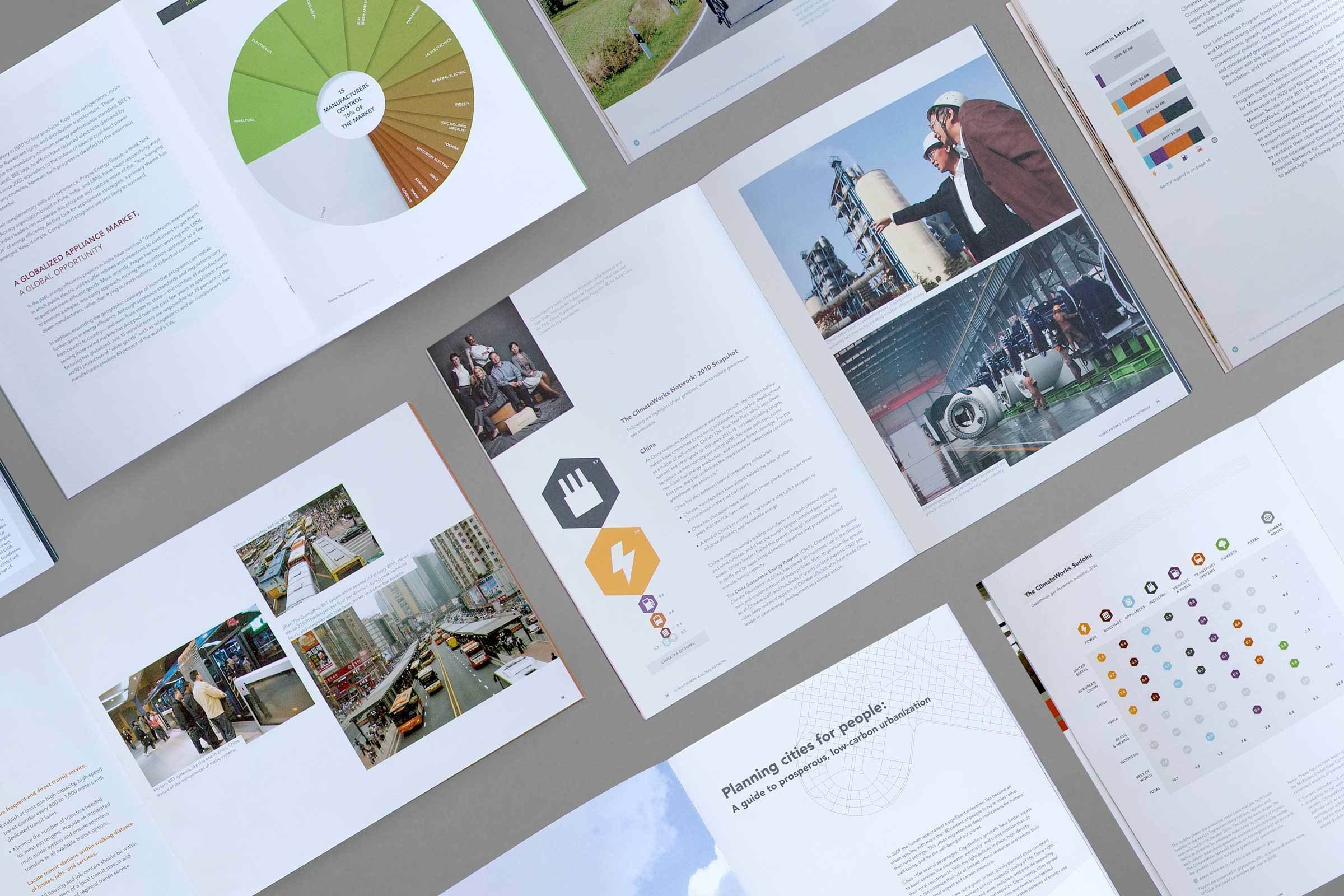
We used line drawings as a defining feature of ClimateWorks’ brand and communications, creating blueprints of ideal, sustainable cities and technologies. These illustrations combine architecture from around the world — merging train stations in Germany, skyscrapers in China, domed mausoleums in India with bus lanes, urban parks and bike paths. The functional and flexible style extends across multiple reports.

A minimalistic, architectural blueprint-style illustration of an urban scene. The image depicts a building with solar panels, trees on the sidewalk, a few people standing around, and a factory with chimneys in the background. The illustration is rendered in white lines on a blue background.

Focus on solutions

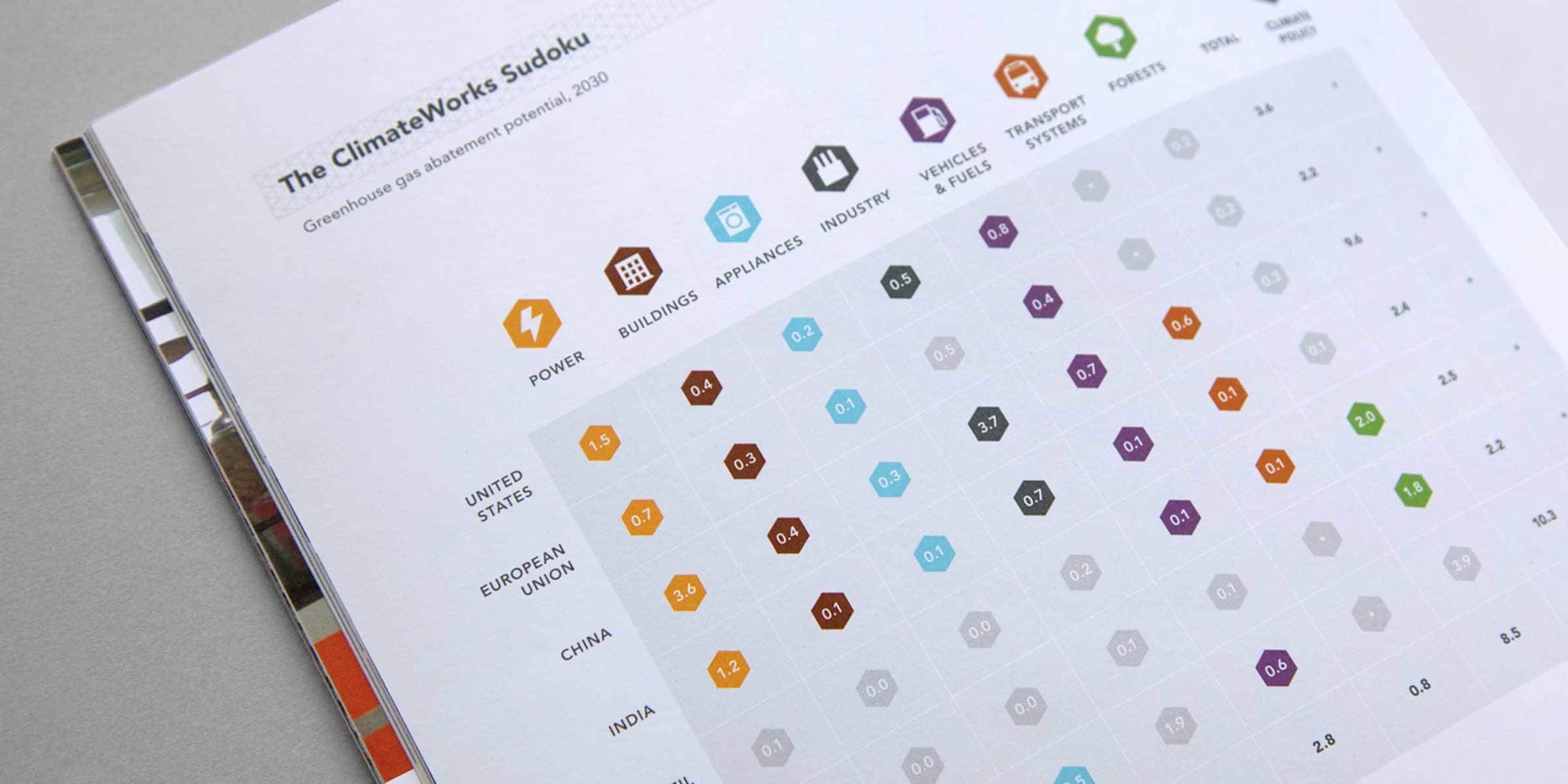
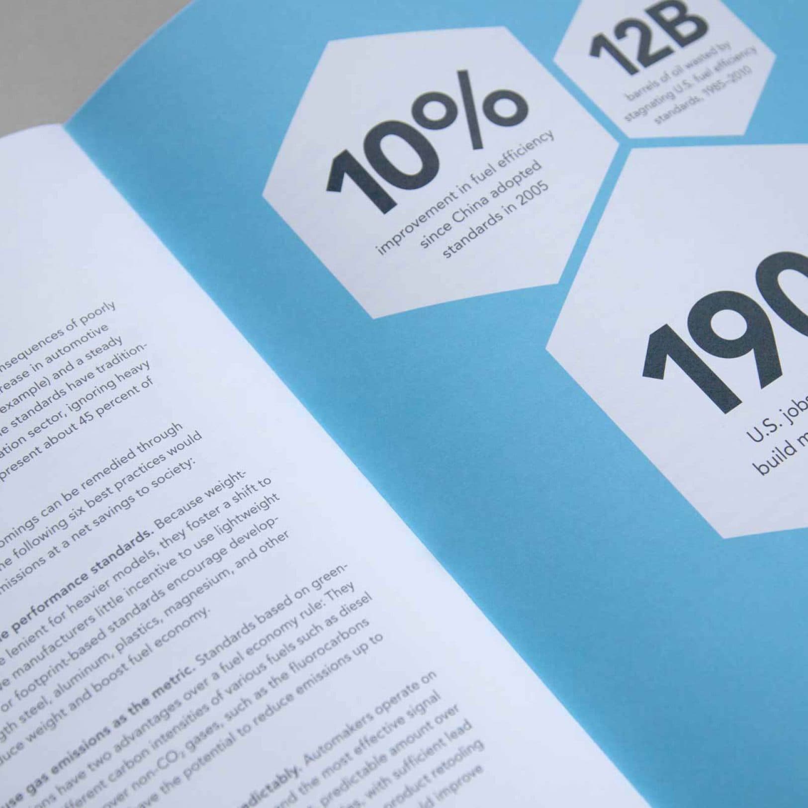
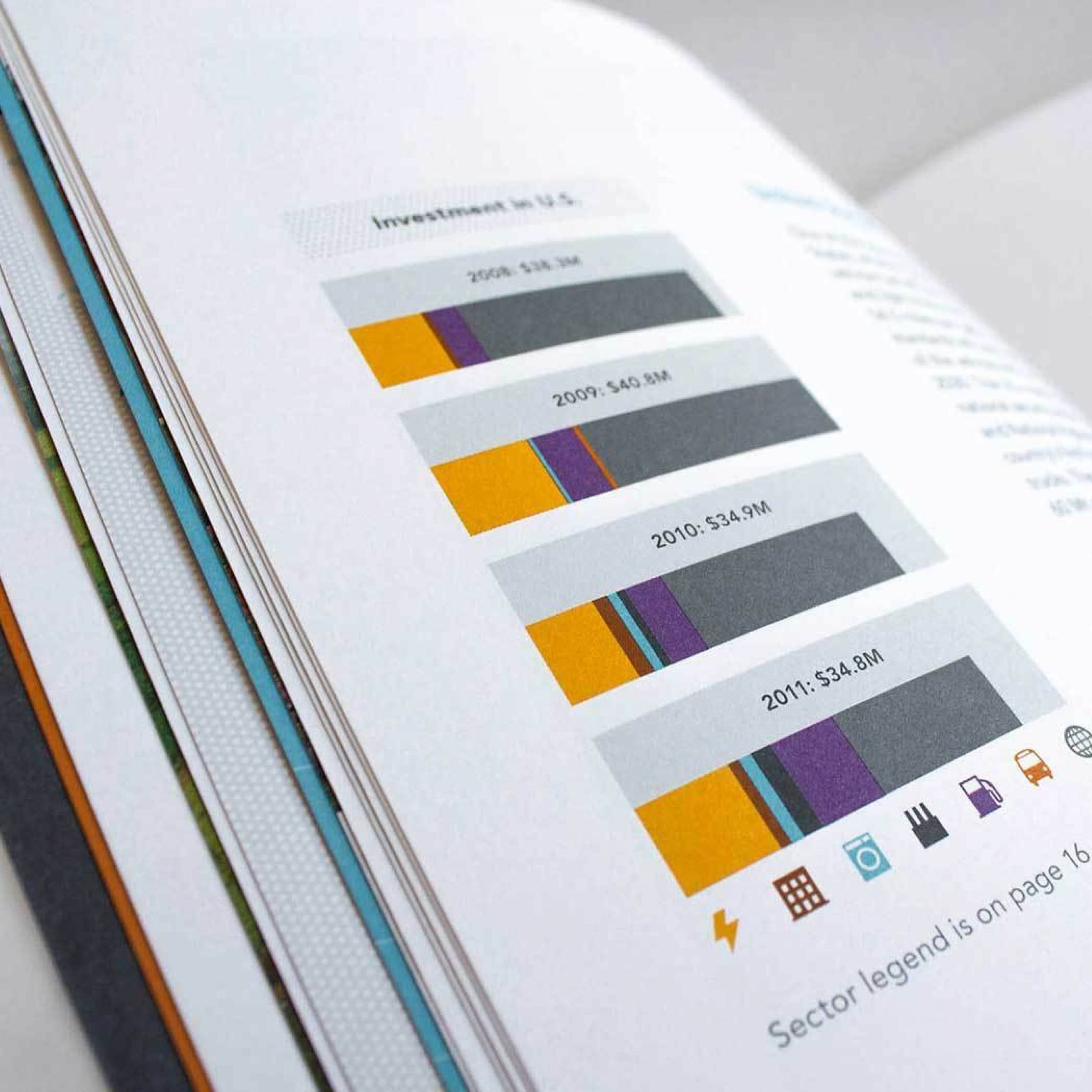
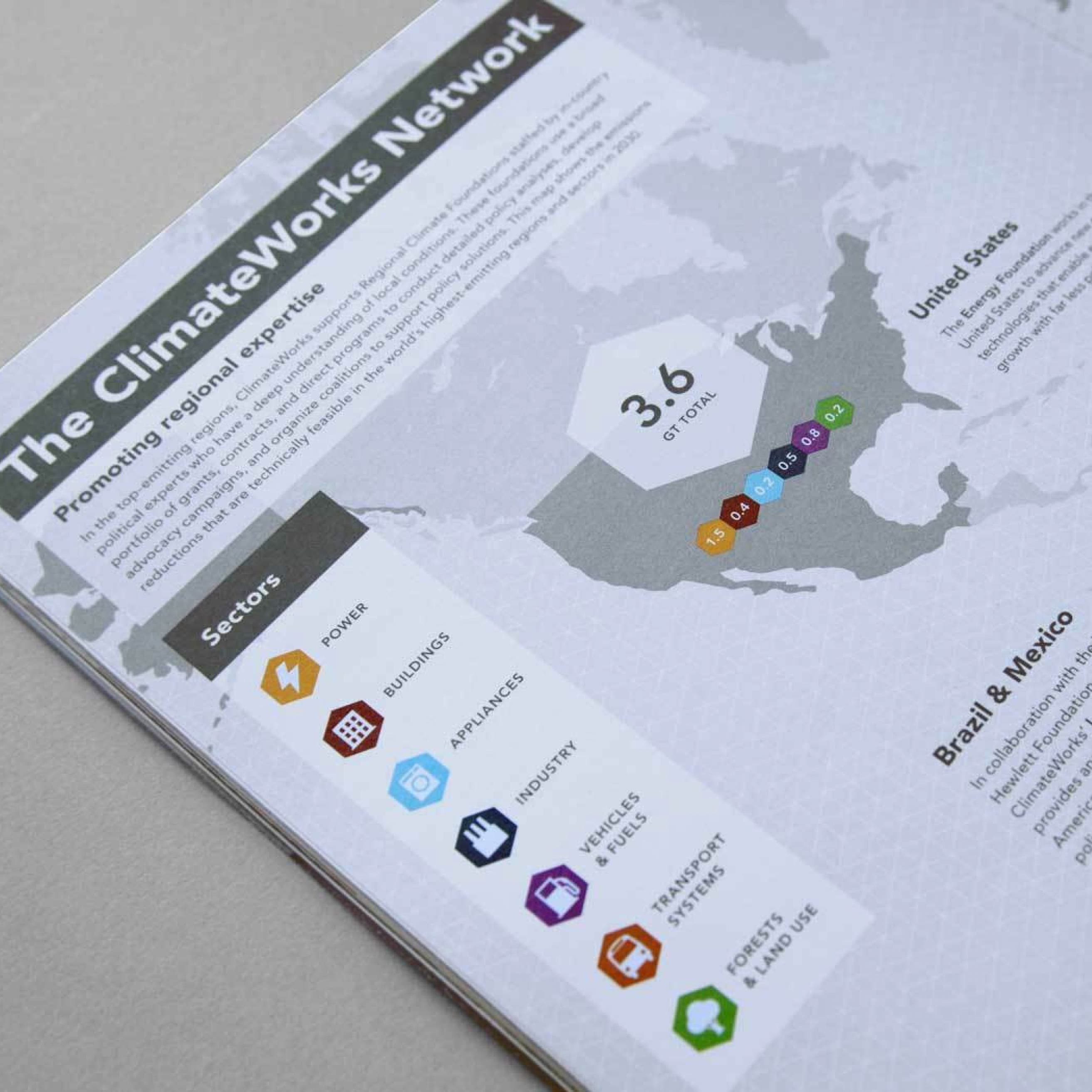
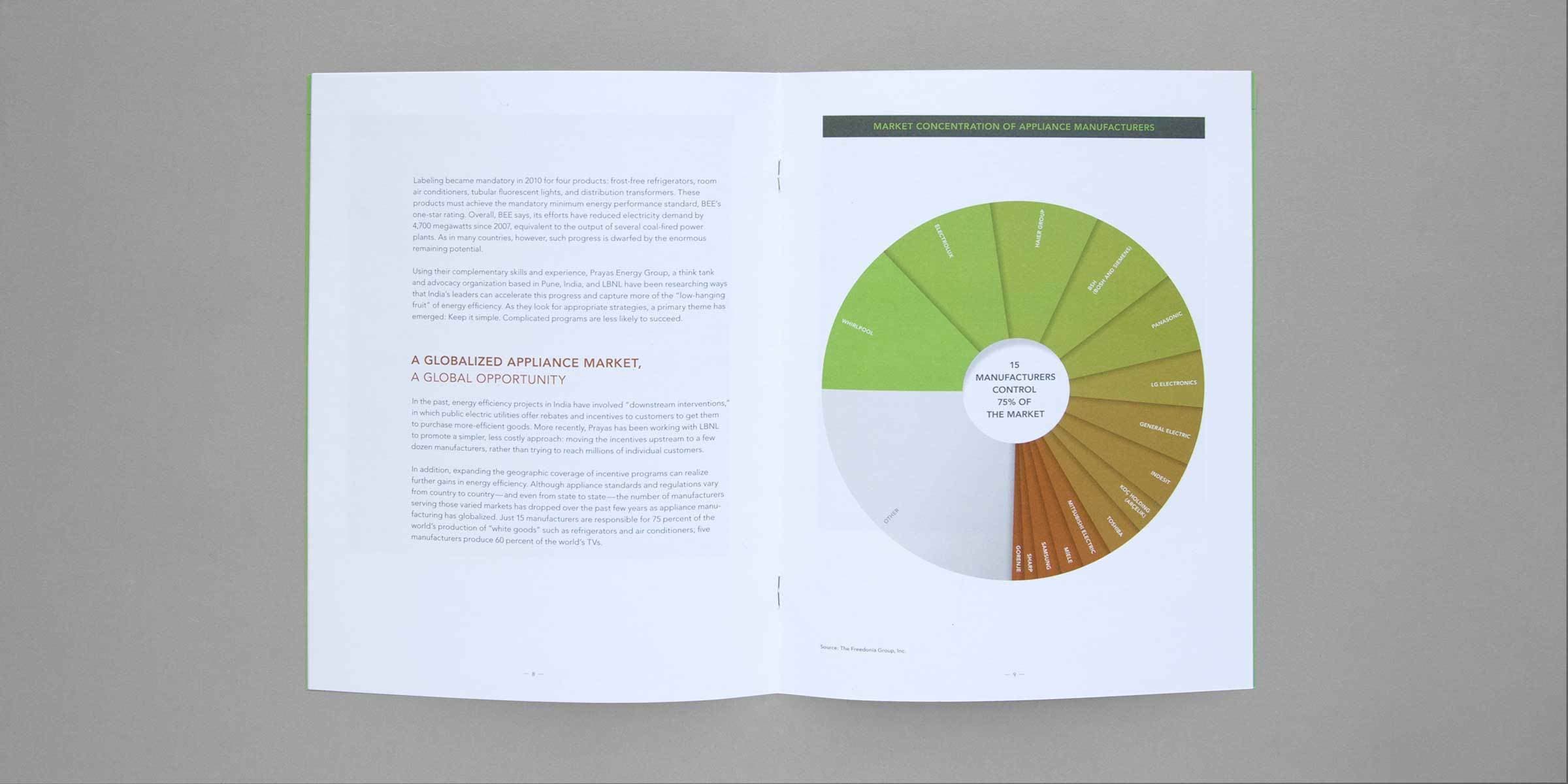
We defined ClimateWorks’ visual language with a set of custom icons and color palettes for each of their seven areas of focus. This unified vocabulary was applied across all of the foundation's documents. We used the seven icons to fully articulate what became a favorite teaching tool of ClimateWorks' founder Hal Harvey: ClimateWorks Sudoku. The chart shows the emissions reductions that are technically feasible in the world’s highest-emitting nations, regions, and economic sectors in the year 2030.

An open document titled "The ClimateWorks Sudoku" displays a chart with colored icons across the top representing different categories like power, buildings, appliances, industry, vehicles & fuels, and transport systems. Rows indicate regions with numerical values.

An advocate’s voice

The foundation needed to have a voice that could be loud and urgent, but also technical, digestible and inspiring. We worked within the organization’s typeface Avenir to find this balance. Our page layouts create visual hierarchy, emphasizing key findings with bold headlines and colors. Environmental policy never looked so fresh.

A two-page spread focuses on increasing mobility by regulating parking and road use. The left page includes text and images of parking lots. The right page has bold orange and black sections with large numerical statistics related to road pricing and mobility in cities.
A close-up of a page in a document showing a large, stylized green number "4" on the left side. To the right, partial text in black reads, "The system can sp..." The partial text is cut off and illegible. The page background is white.
Close-up of a page in a booklet with text in large, bold green and white letters. The text reads: "the current emissions rate, the world will burn through its carbon budget in 20 years." The background is dark grey, and the text is spread across two pages.
A close-up of an open booklet, displaying text and statistics on a blue background. Prominent text includes "10%" referencing fuel efficiency improvement, "12B", and "190K U.S. jobs". The page on the left has several paragraphs of smaller black text.

Ode to simplification

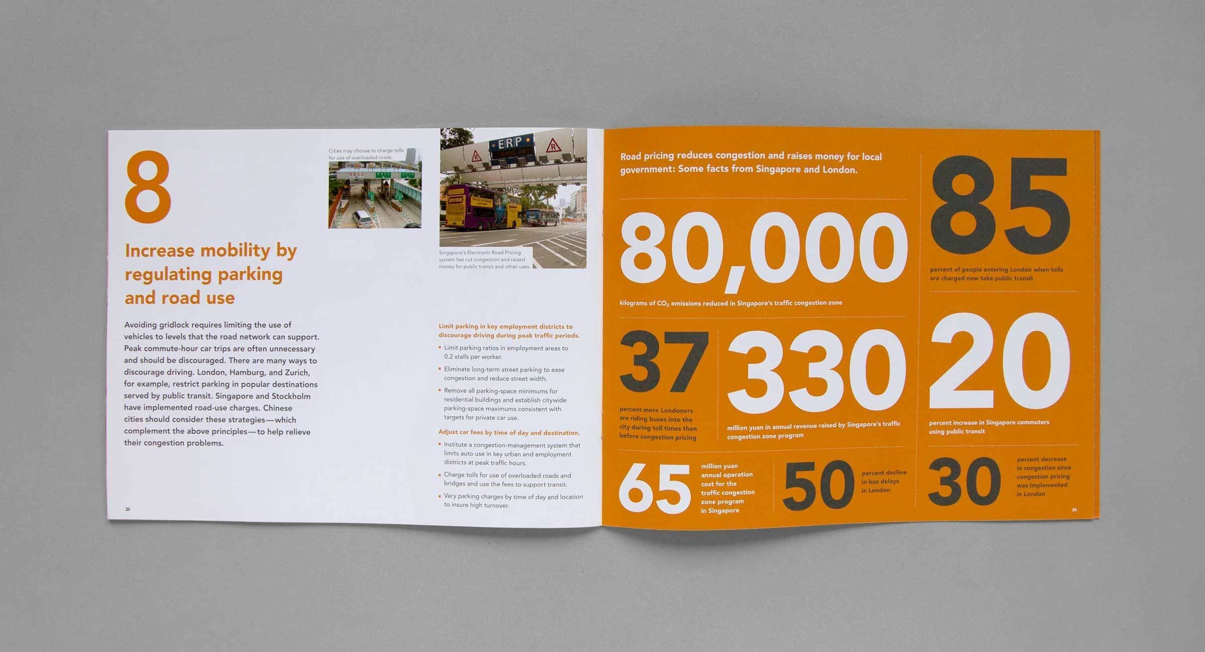
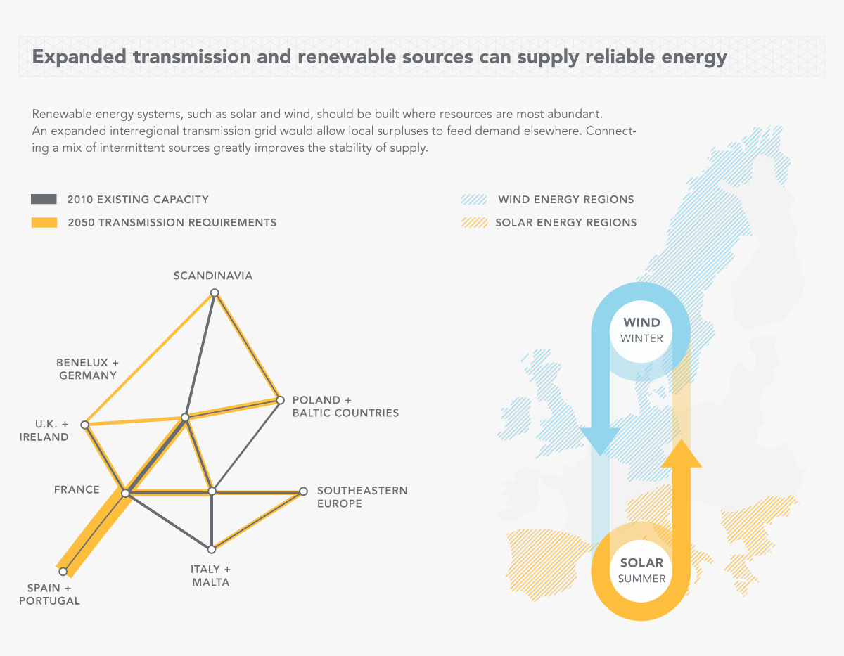
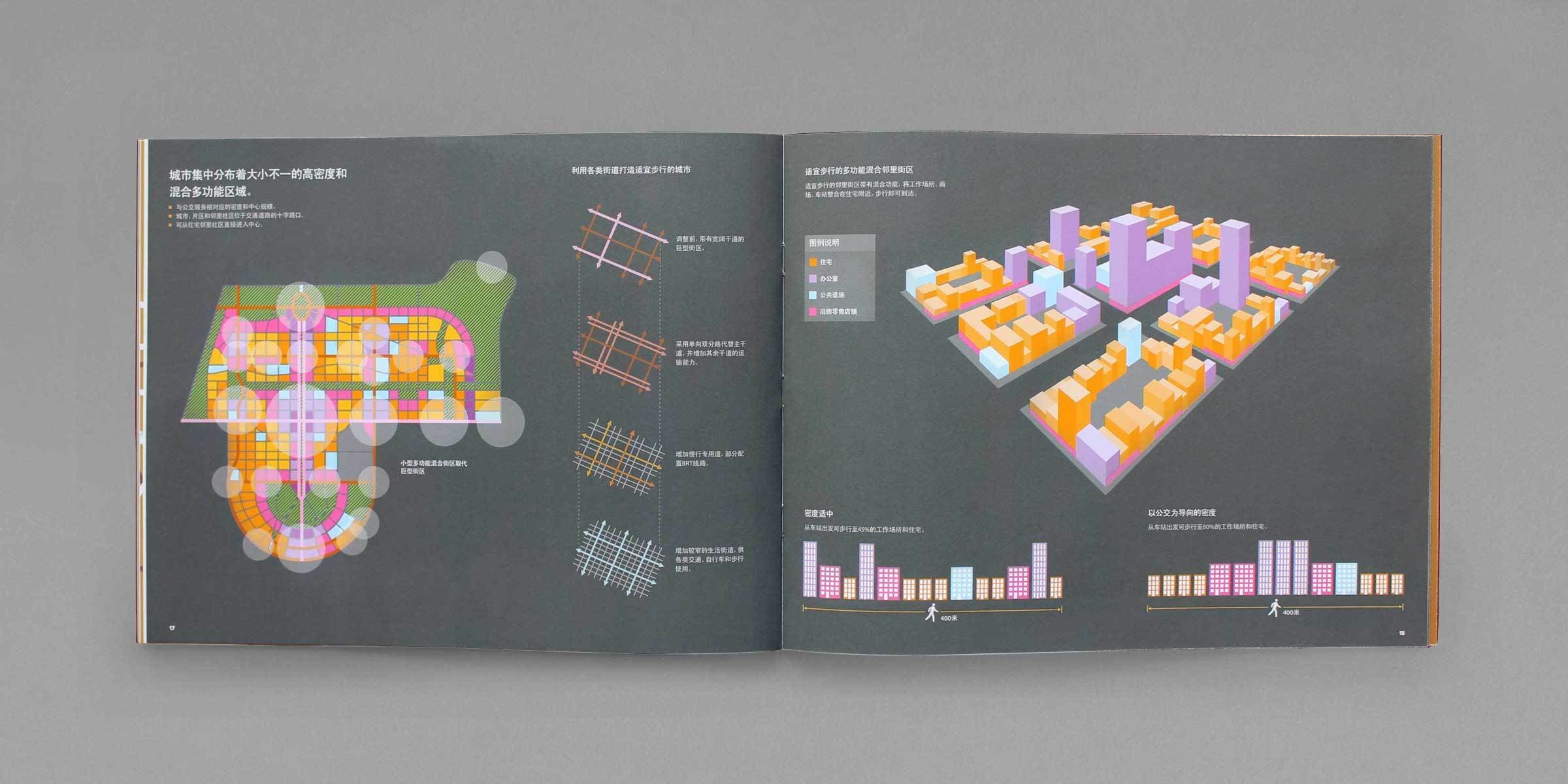
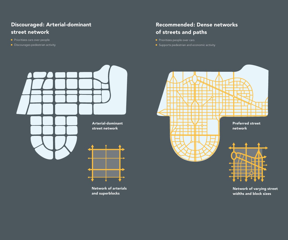
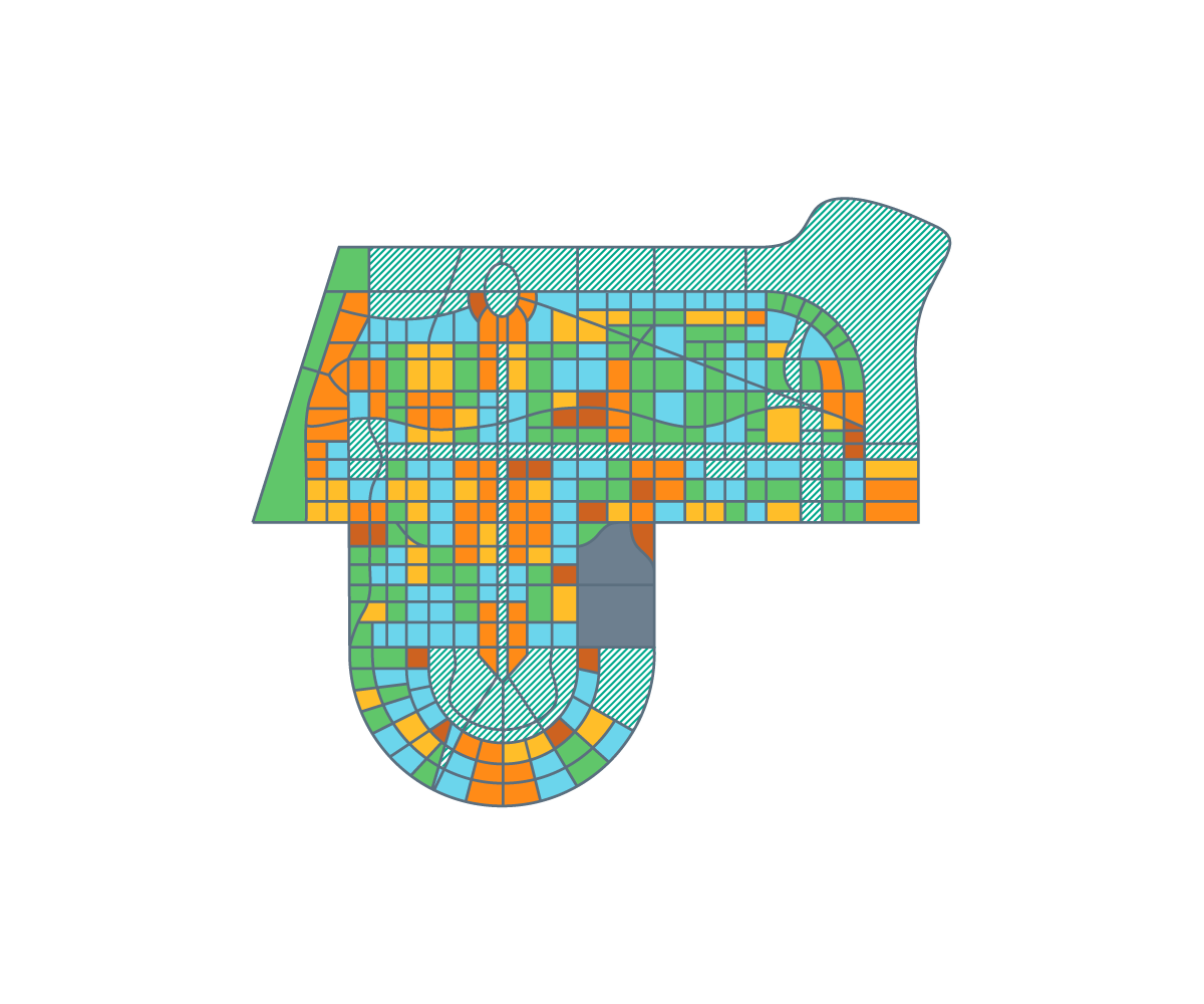
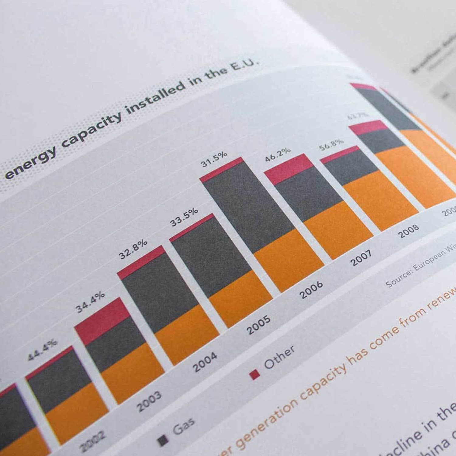
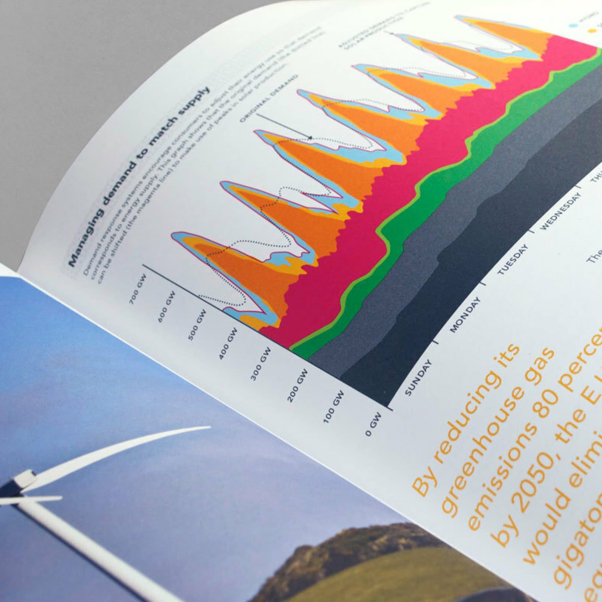
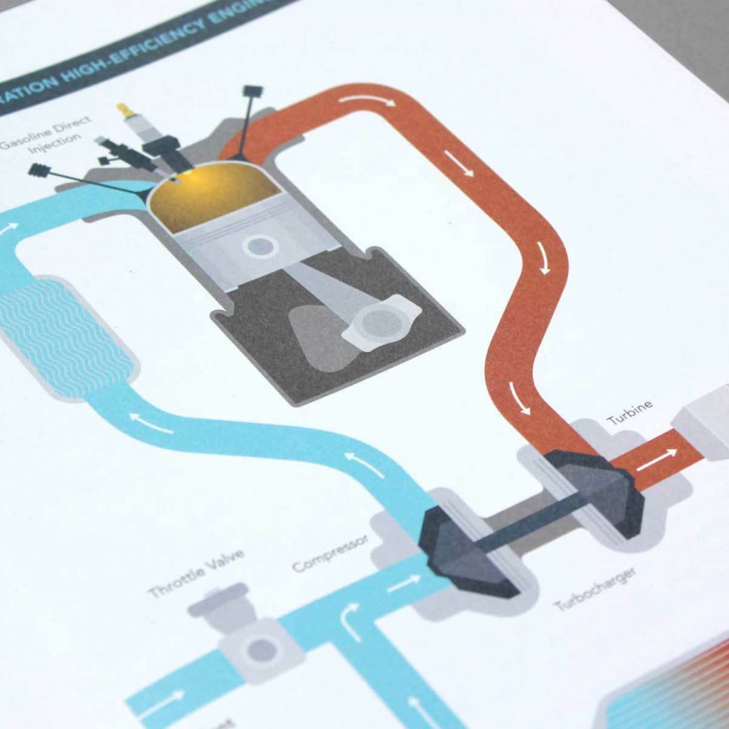
Perhaps our greatest challenge was in creating a unified style for ClimateWorks charts, graphs and system plans — and we designed over 100 of them. We worked with Climate Work’s partner experts to interpret technical drawings and system maps into accessible information. We brought forward key information, removed all non-essential data and combined multiple maps and charts into streamlined visualizations.

A yellow map with white lines depicting a city's street layout. Blue icons along a central route indicate specific locations. A river flows horizontally through the map with bridges crossing over it. A legend and inset map are on the right side. Text in Chinese is present.
A map of Europe shows regions for wind and solar energy with a focus on Scandinavia, Benelux & Germany, U.K. & Ireland, France, Italy & Malta, Poland & Baltic countries, and Southeastern Europe. Existing transmission lines (2010) and future requirements (2050) are highlighted.
Map illustrating the Kunming region in China, highlighting regional transit services and population growth areas. It features multiple metro lines, high-speed rail, BRT, and railway routes. Key areas noted include Kunming (pop. 7,200,000) and Chenggong (pop. 1,500,000).
A minimalist line drawing depicts an urban scene with various buildings, including a tower with spherical structures, and a fountain surrounded by people and trees in an open square.
An open book showcases colorful, schematic diagrams of urban planning. The left page features a top-down view and grid overlays, while the right page presents 3D block models of a city layout with charts and color-coded legends.
An infographic showing two street network designs: the left discourages pedestrian activity with wide arterials and superblocks, while the right encourages it with dense networks of streets and paths. Diagrams below illustrate each network's components.
A colorful, abstract map of a planned urban area on a white background, featuring various geometric shapes and zones in green, orange, blue, and gray. The map includes a semicircular section at the bottom and a combination of grid-like and irregular patterns throughout.
Minimalist illustration on an orange background showing wind turbines and buildings with solar panels. Trees are scattered throughout the landscape, emphasizing renewable energy sources and eco-friendly architecture.
An open book displaying a page with a bar graph titled "Investments in $." The graph shows investment data for the years 2009-2011 represented by stacked bars in gray, purple, yellow, and teal. Sector legend icons are partially visible at the bottom right.
A document titled "The ClimateWorks Network" showing a global map with different regions highlighted, numerical data, and icons representing sectors such as power, buildings, transport, appliances, industry, forestry, and agriculture. Sections for the United States and Brazil & Mexico are visible.
A bar graph on a page shows the energy capacity installed in the EU from 2000 to 2008. Each bar is divided into sections representing different energy sources: renewable, gas, and other. The graph illustrates trends and growth in energy capacity over the years.
An open book with text on the left page and a chart on the right page. The text discusses the globalized appliance market. The chart is a green pie chart illustrating the market concentration of appliance manufacturers, labeled "Top 15 manufacturers: 73% share of the market.
An open book displaying a chart on greenhouse gas emissions by region on the left page, featuring lines in different colors and patterns. On the right page, there is a blue map showing the United States, the European Union, and other regions, with text descriptions.
An open booklet displaying a colorful line graph showing electricity demand across the days of the week, along with a photo of a wind turbine on the left page. The text beside the wind turbine discusses greenhouse gas reduction goals.
An illustration diagram of a high-efficiency engine system. It shows parts including a turbine, compressor, turbocharger, and a throttle valve. Arrows indicate the flow of an orange intake and a blue exhaust path through the system.
A collection of opened magazines and brochures lays on a surface. They display graphs, charts, text, and photographs of urban scenes, industrial settings, and people in professional environments. The documents are arranged in various orientations, showcasing diverse content.

Project Credits

Project Team
  • Deroy Peraza
  • Wen Ping Huang
  • Jason Lynch
  • Eric Fensterheim
  • Aymie Spitzer
Ready to unlock the potential of your nonprofit's brand?
Reach Out