A blue image with the text “Gotham Writers” in white, left-aligned and right-aligned with a circular logo in the center containing the intertwined letters "G" and "W" in white.

Background

Gotham Writers Workshop has helped a generation of New Yorkers express themselves. The school offers rigorous academics and invites people from all walks of life into its community. In recent years, however, the creative writing school found that its outward identity did not reflect its true vibrancy — this was having an impact on class enrollment. Hyperakt was asked to evolve the Gotham Writers Workshop brand and turn around its web presence in order to broaden its reach.

An image showing a logo redesign for Gotham Writers' Workshop. The "Before" side features a black ink bottle icon with the name in black serif font. The "After" side displays a modernized blue circular icon with the initials "GW" and "Gotham Writers" in sans-serif font.
A flat lay of branded office supplies featuring the logo "GW". Items include a notepad with a pen, a flyer placed beneath the pen, a blue brochure with the phrase "Start every...", a dark blue business card, and a white business card with yellow accents.

The challenge

The new voice of Gotham Writers Workshop needed to inspire younger writers to join the community, while leveraging the school’s proud reputation and preserving its NYC heritage.

Image showing a spread of open design books. The first and second books focus on typography, with bold white text reading "Type". The third book's page displays "Eames Century Modern" typography. The fourth book focuses on color, with bold text reading "Color".
Our new branding made a big impact on how our company was perceived all over the world, directly increasing our revenue and recruiting, and lifting the spirits of all who worked with us.
Alex Steele
President, Gotham Writers
Four magazines are displayed against a gray background. Each cover features different imagery and the word "WRITE" prominently. From left to right, the covers showcase a city street, a person on a bicycle, an abstract design, and autumn leaves.

Finding the essence of the brand

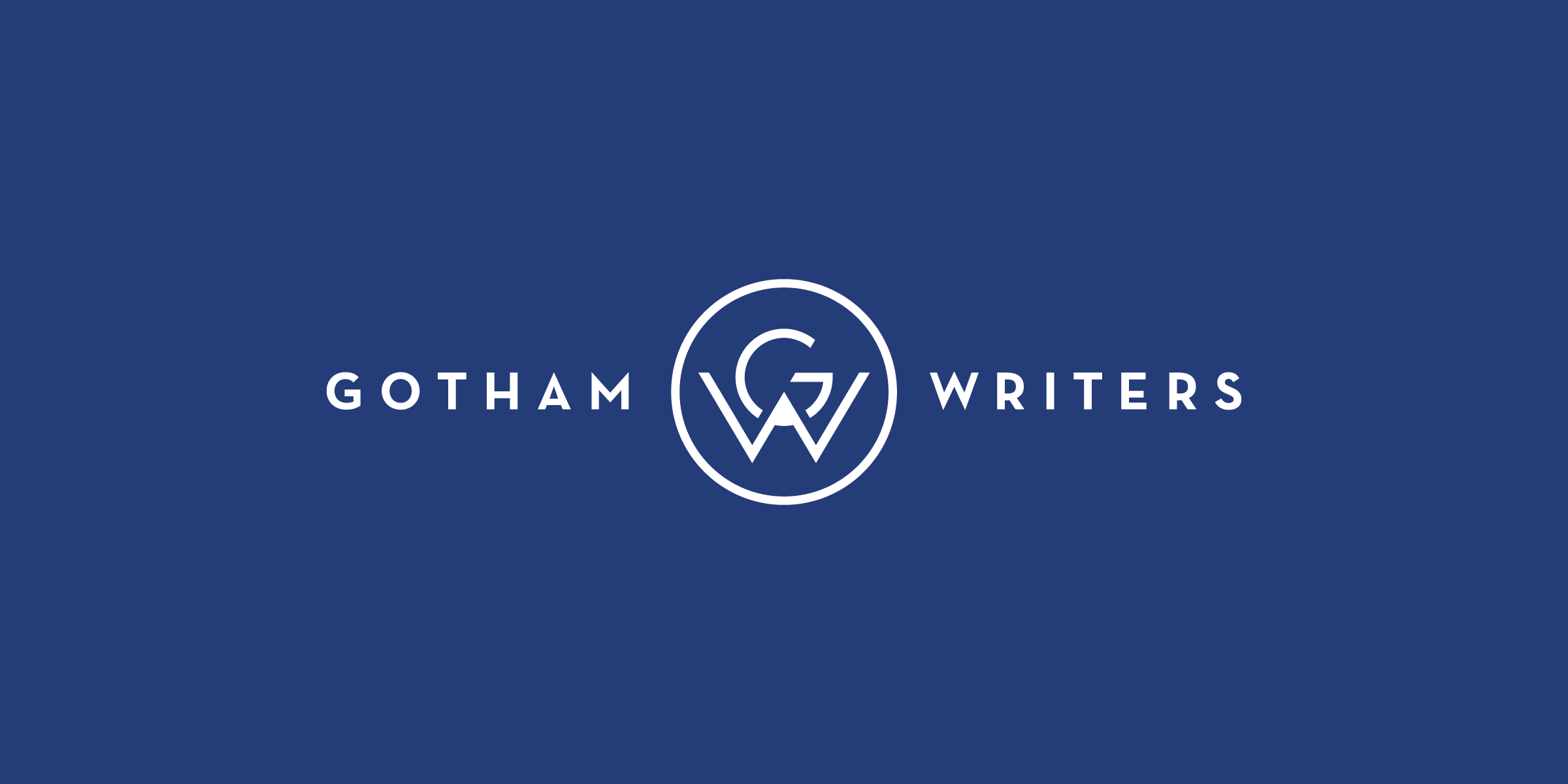
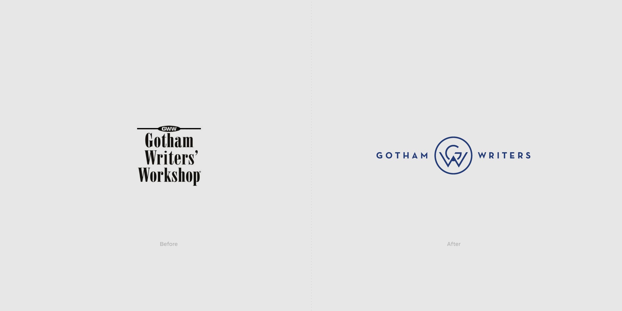
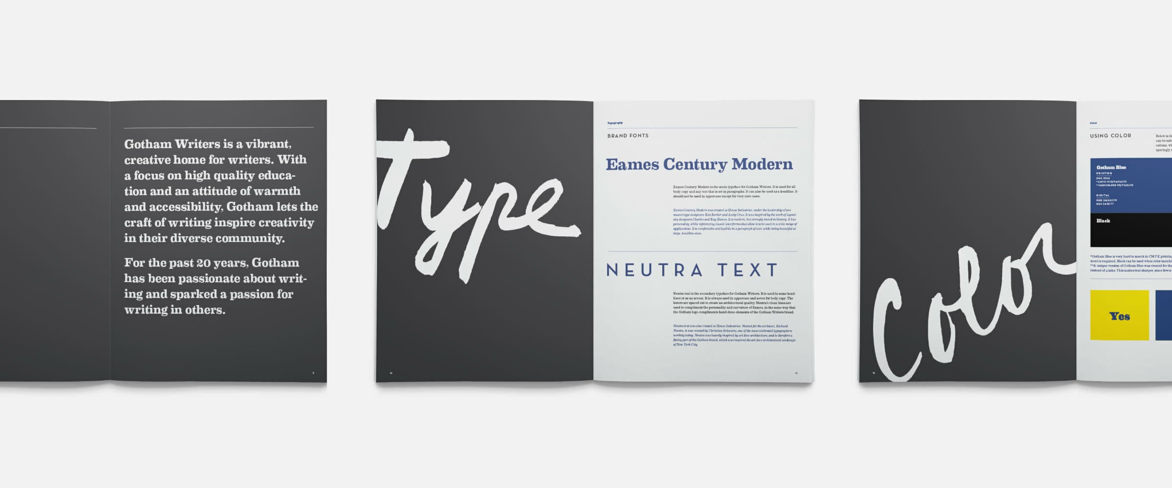
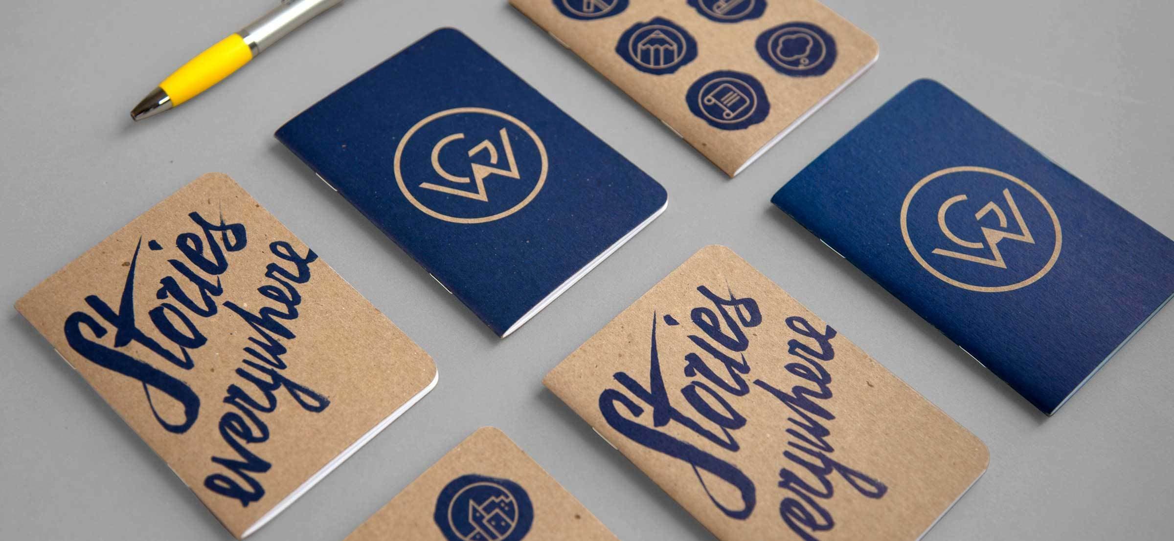
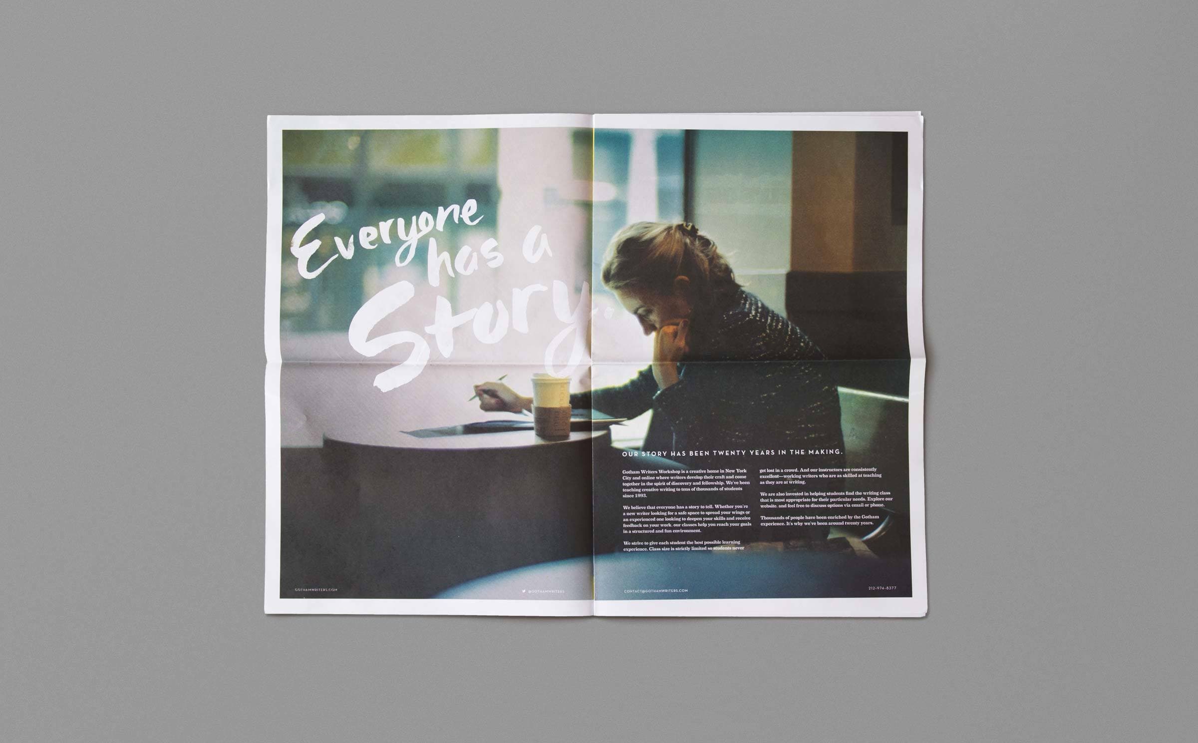
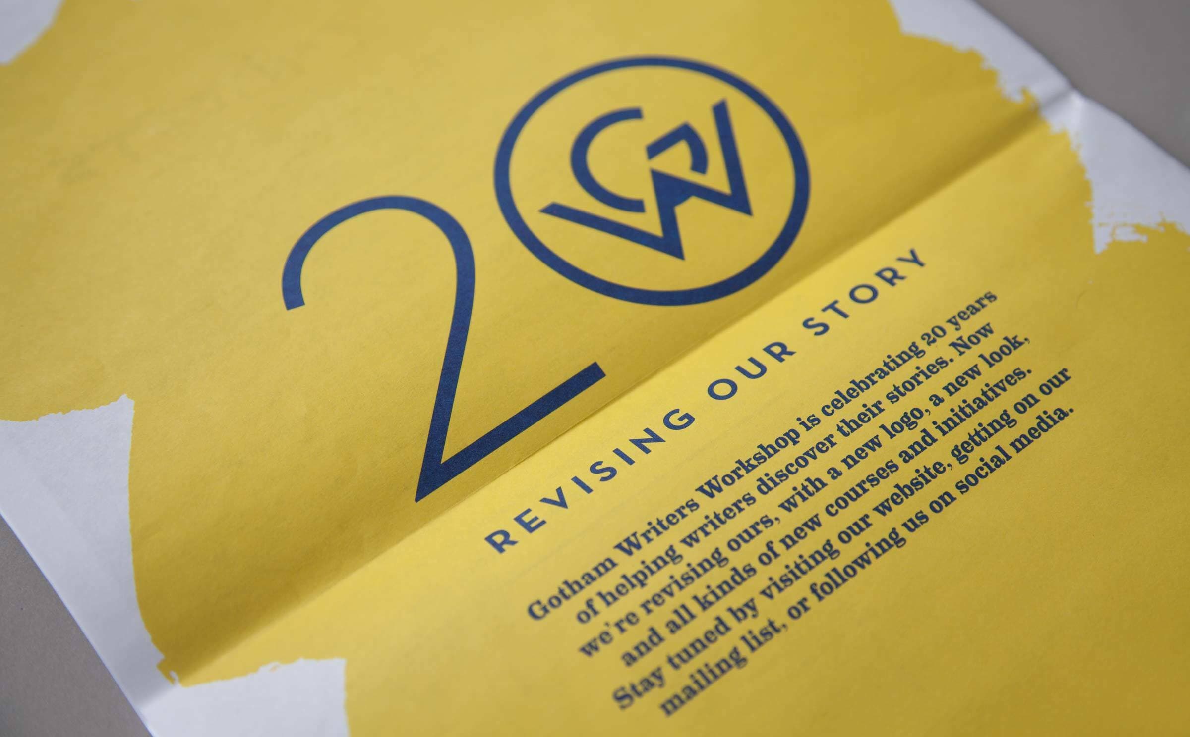
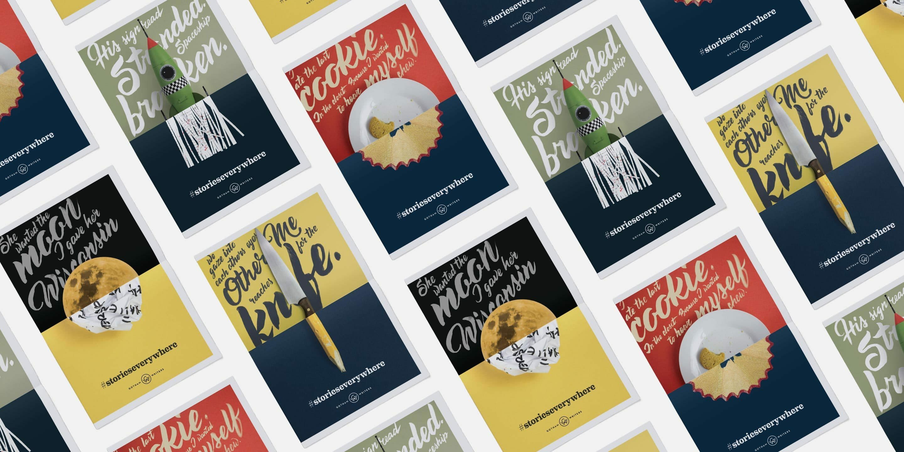
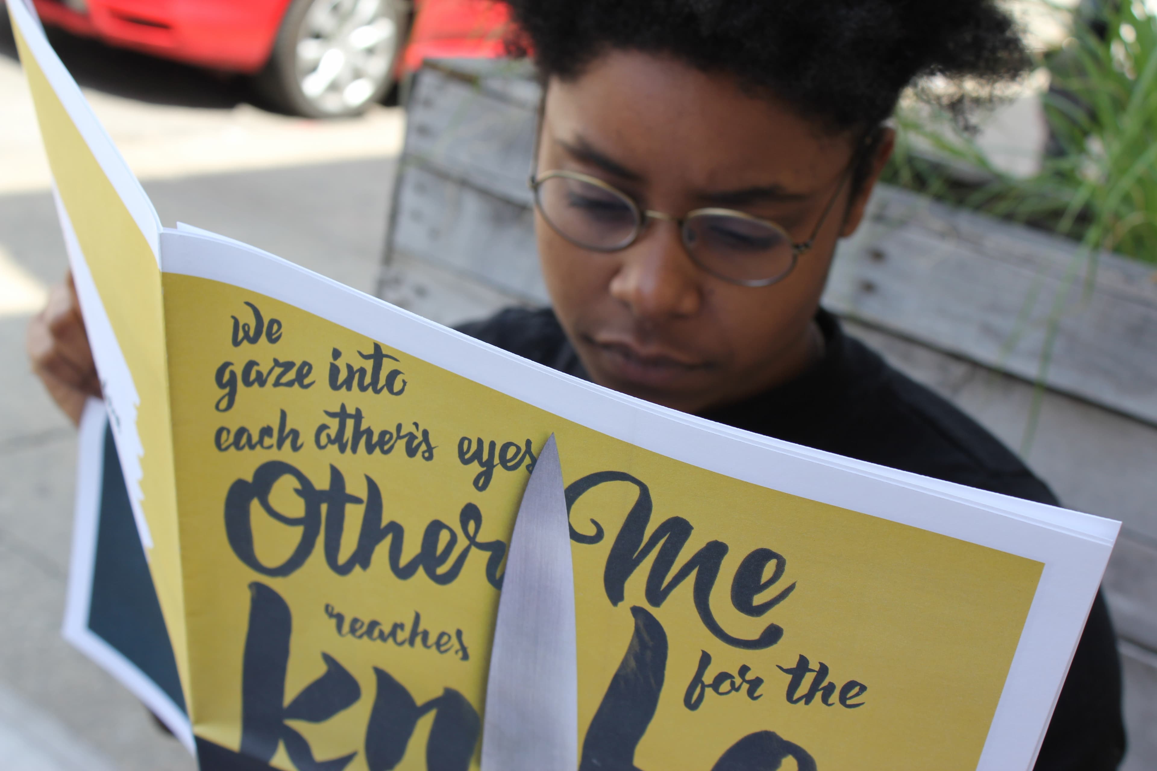
After conducting in-depth research and workshops we arrived at the essence of Gotham Writers Workshop’s brand: “craft igniting creativity.” We repositioned the name of the brand from Gotham Writer’s Workshop to Gotham Writers, a shift that better represents the school’s community of writers and promotes a sense of belonging. We created a brand language that expresses itself as a harmonious balance between the vibrant muddle of the writing process and the sharp precision of a finely crafted piece. The tone of the imagery is introspective, thoughtful and intimate – evoking the perfect environment for creative writing.

A simple image of a hand-drawn, thin, double-lined circle centered on a white background. There are no other elements or details visible in the image.

A seal of authenticity

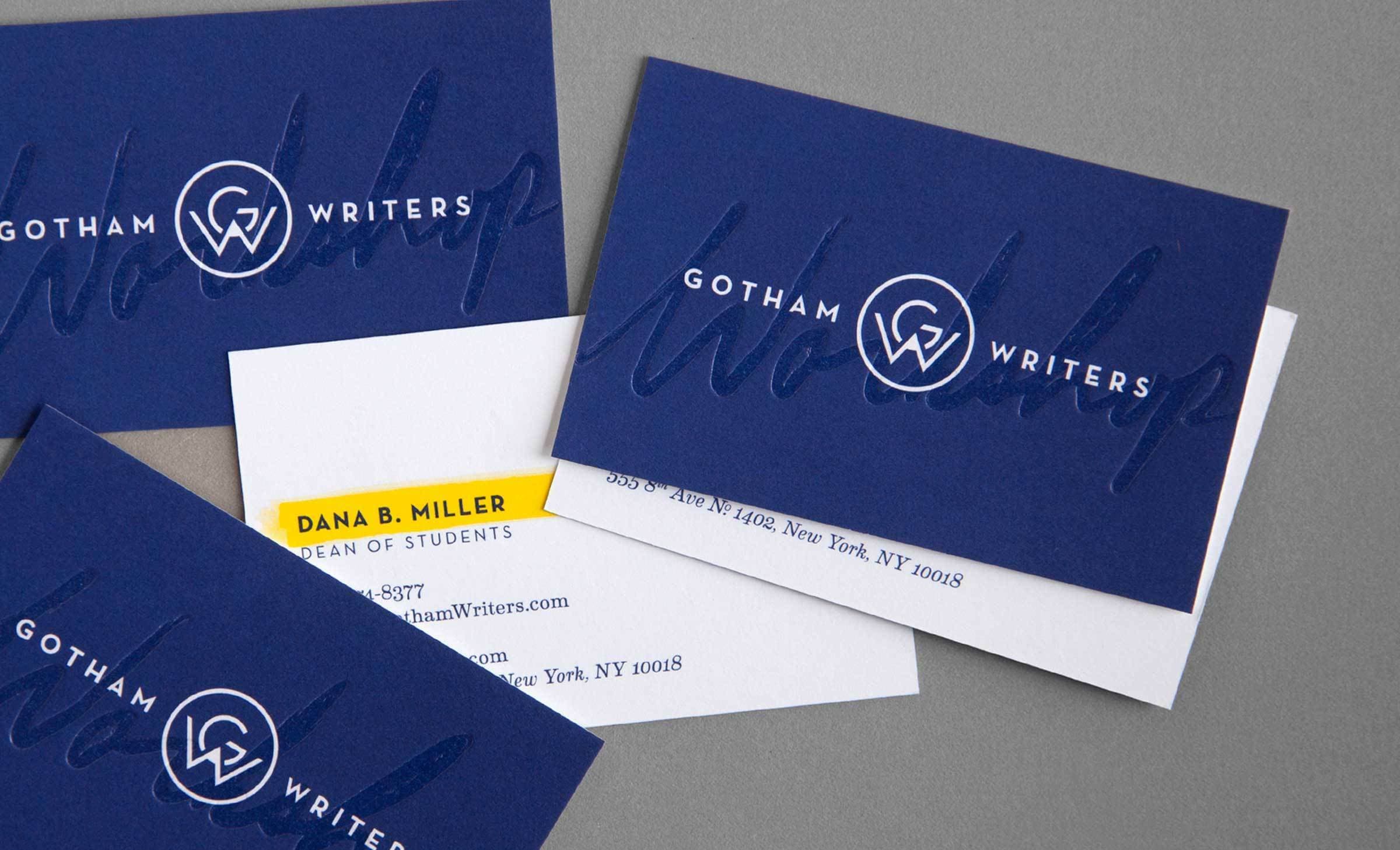
Gotham Writers' new mark says more with less. The interlocking "G" and "W" reveal the tip of a pencil, suggesting the craft and meditation at the heart of good writing. The emblem projects the confidence and maturity of an institution that has been honing its craft for 20 years. The geometric purity of the forms are an homage to the art deco heritage of the city we call Gotham – New York City.

A spread of blue Gotham Writers business cards with embossed logos, along with a white contact card for Dana B. Miller, Dean of Students. The contact card displays a phone number and an address in New York, NY. The blue cards also feature the Gotham Writers logo.
An artistic design featuring handwritten words and phrases in blue and yellow: "stories everywhere," "Tell me about it!," "What's your story?," "be daring," "WRITE," "Be honest," "creativity," and "Incite EVERYONE.
Six icons on a green background, each within a yellow circle: a thought bubble, a speech bubble, a scroll, a microphone, a briefcase, and a staircase with an upward arrow.
Two open sketchbooks showing colored sketches of urban architectural scenes. On the left, a yellow building with plants and handwritten text in blue. On the right, city buildings with a large yellow circular symbol and text in blue and black.

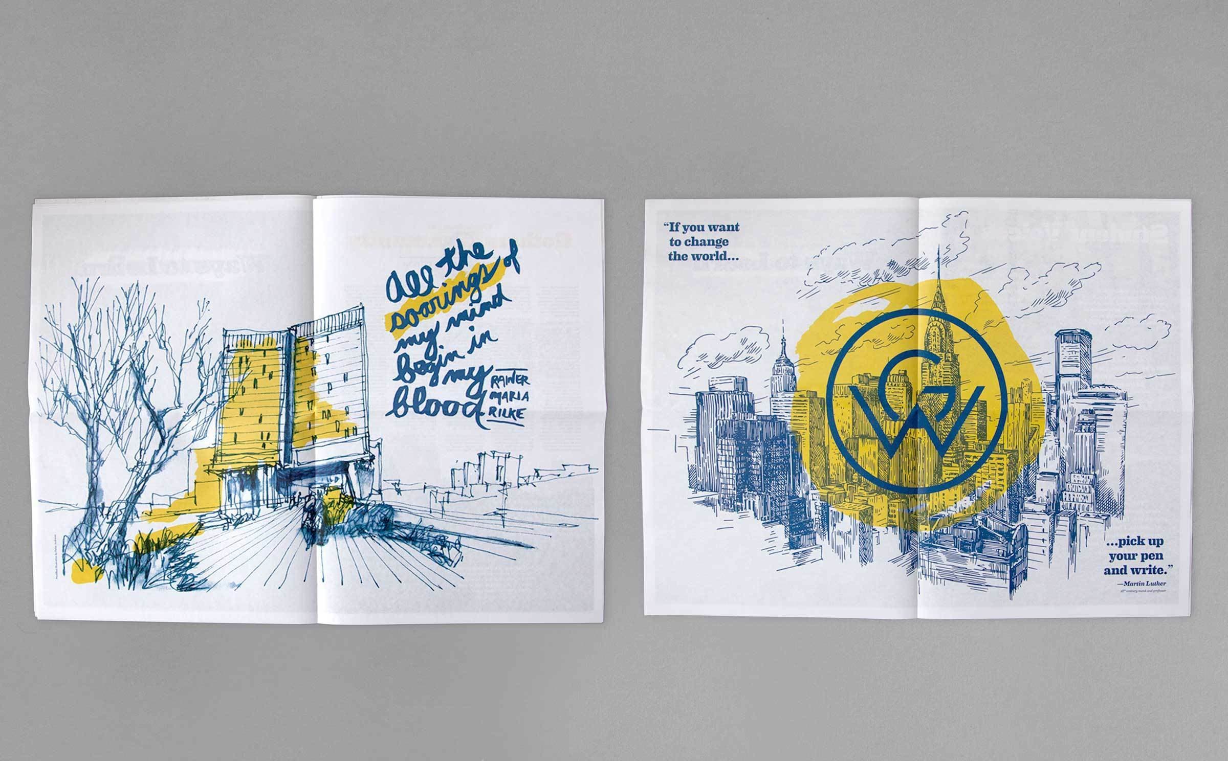
Craft ignites creativity

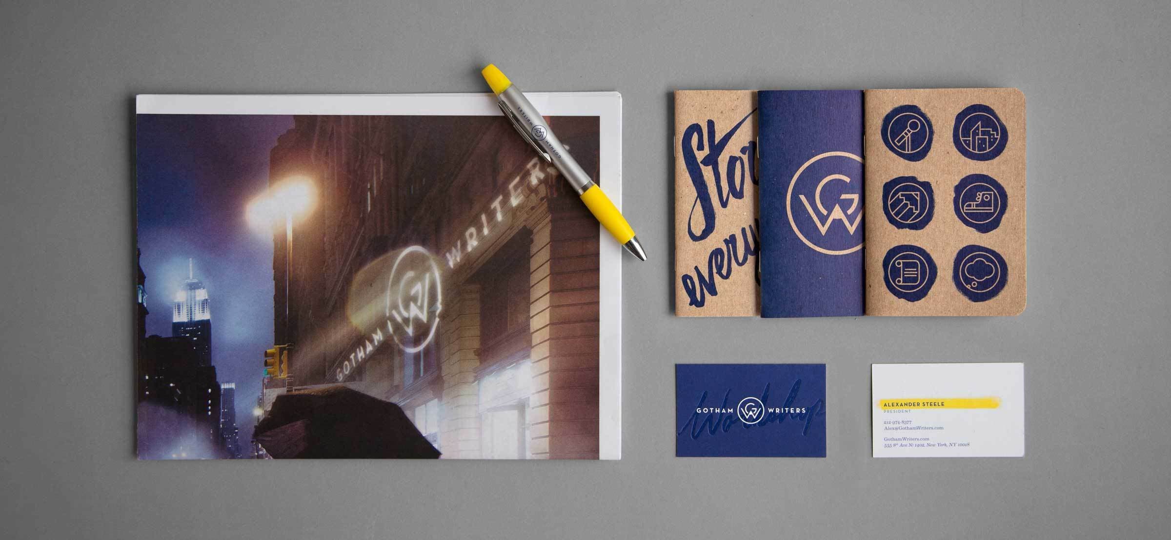
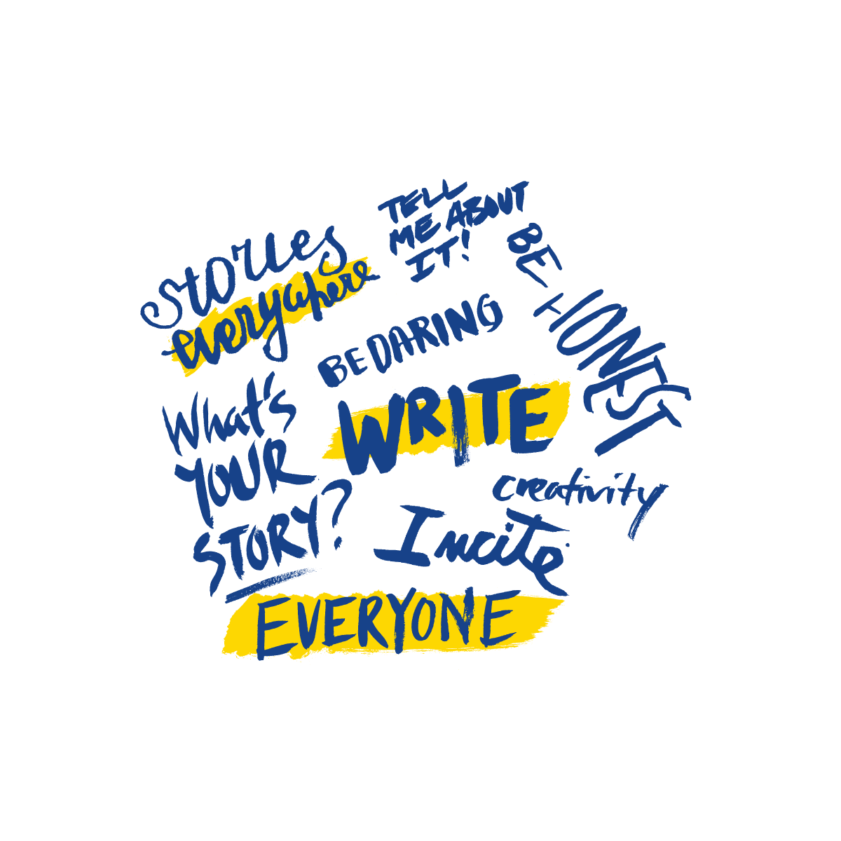
Against the precision of the monogram we contrast the inherent vibrancy of the creative process with myriad handwriting styles that reflect the unique voice of each writer. The brand includes highlighter marks to illuminate key ideas, alluding to the process of editing and iterating involved in perfecting a well-crafted piece of writing.

A set of notebooks is laid out on a gray surface. Some have brown covers with the words "Stories everywhere" in blue script, while others have blue covers with various icons or circular logos. A yellow pen is positioned at the top left of the image.
A tablet displaying a "Community News" webpage with various articles and announcements. The layout features a mix of yellow and blue sections, images, and text boxes. Visible topics include songwriting, writing tips, a contest, and a Dear Gotham advice column.
The image shows two laptop screens displaying a webpage for Gotham Writers Workshop. The left screen shows a menu with class categories, including humor writing and fiction, while the right screen highlights "All NYC Classes" with details of offerings like humor writing and article writing.

Reinventing Gotham online

Hyperakt worked closely with Gotham Writers to radically rethink their information architecture and build a beautifully navigable, brand-relevant website. Gotham Writers' website needed to clearly guide readers through a lot of information: online classes, course catalogs, event calendars, faculty bios, writing tips, and book promotions from the Gotham Community.

Two tablets display a website for creative writing classes. The left screen shows a person writing outdoors with text reading "CLASSES." The right screen highlights class options: "Take a class in NYC" and "Take a class online," along with icons and additional details.

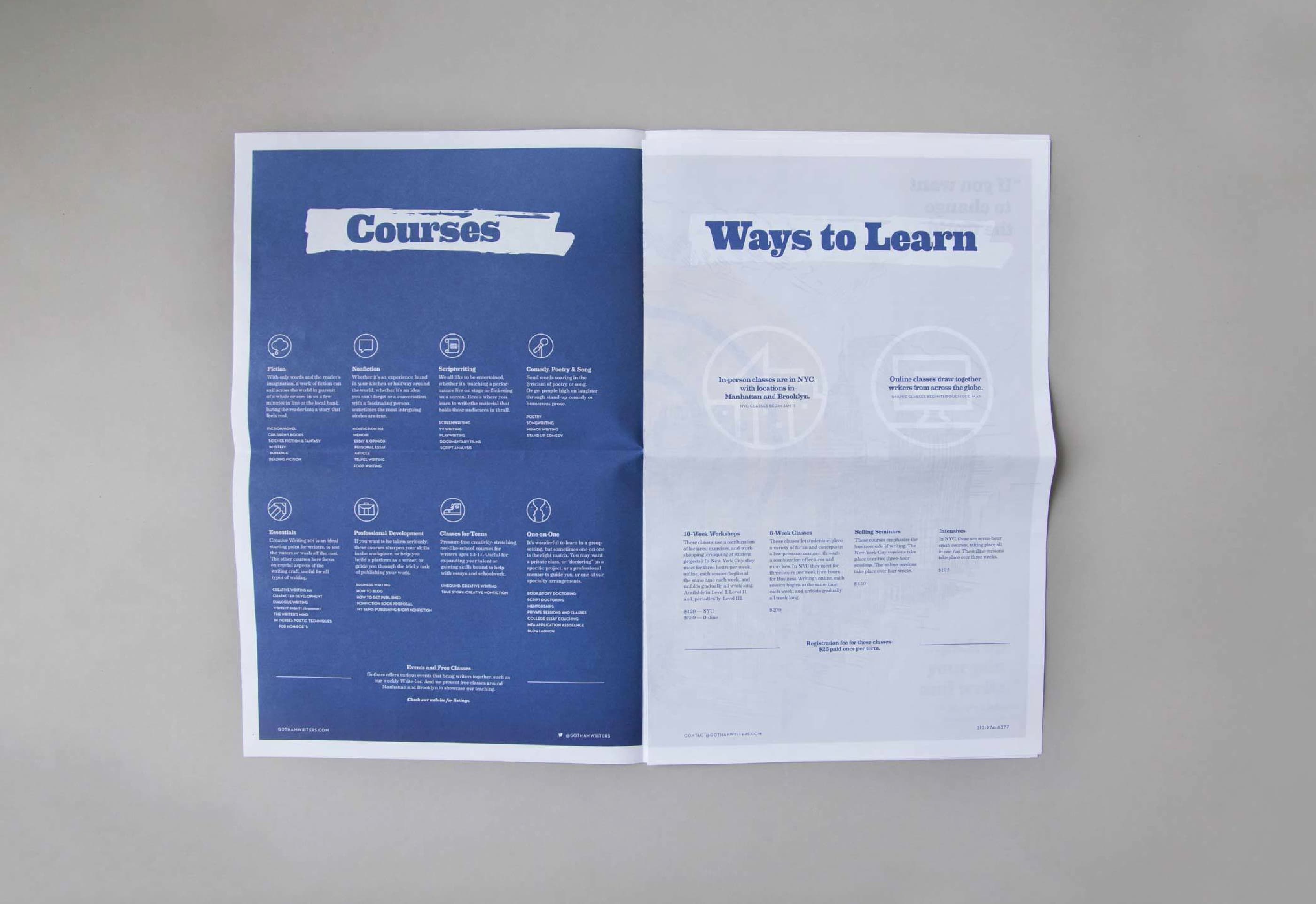
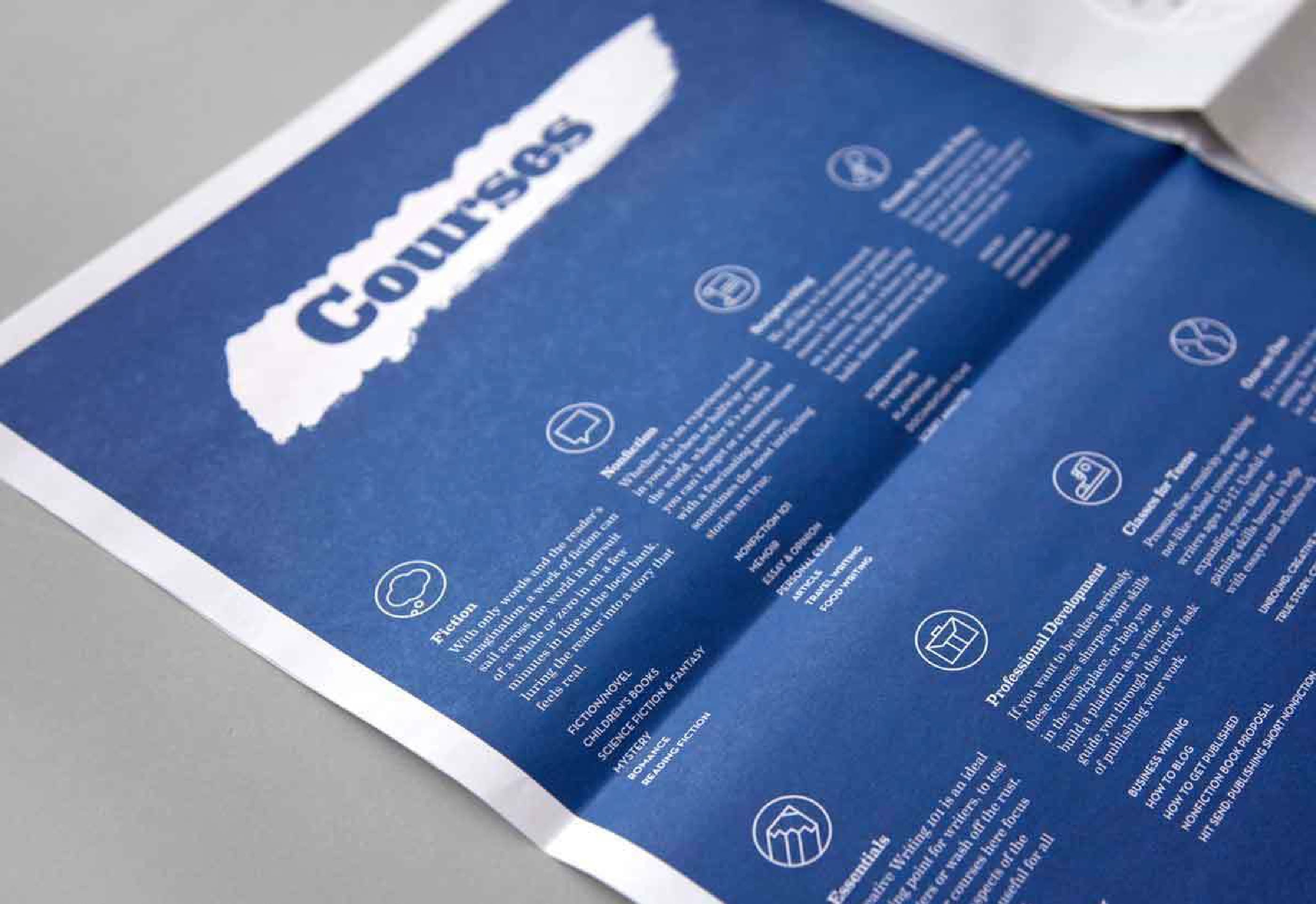
What class is best for you?

The new site guides each student to find a class that’s right for them. To facilitate browsing, we created clear entry points to online and NYC classes and Gotham Writers' community-driven or specific offerings, like one-on-one classes or events. We also categorized Gotham Writers' 50+ classes into six types, each with a custom icon: fiction, non-fiction, scriptwriting, humor & poetry, professional writing and essentials.

A newspaper spread with two pages. The left page, under the heading "Courses," lists various courses with icons and descriptions. The right page, titled "Ways to Learn," outlines different learning methods. The background is white with blue text and graphics.
A blue pamphlet titled "Courses" lays flat on a surface. It features multiple sections, each with an icon and descriptive text under different course headings, providing detailed information about various educational offerings.
A collection of postcards is arranged on a light grey surface, featuring various images with the word "Write" and the phrase "Stories. Everywhere." Examples include a person writing in bed, bicycles and leaves, and a person carrying an umbrella in a city.
Our new branding is, as hoped, sensational.
Alex Steele
President, Gotham Writers
A magazine spread showing a woman sitting at a table in a café, reading or writing with a drink beside her. The text on the left page reads "Everyone has a Story" while the right page contains a column of text.
An open magazine spread featuring a page titled "Student Voices" on the left with a photo of a student reading a book outdoors and an article on the right titled "Gotham Faculty" with a prominent section showing a photo of a man in yellow.

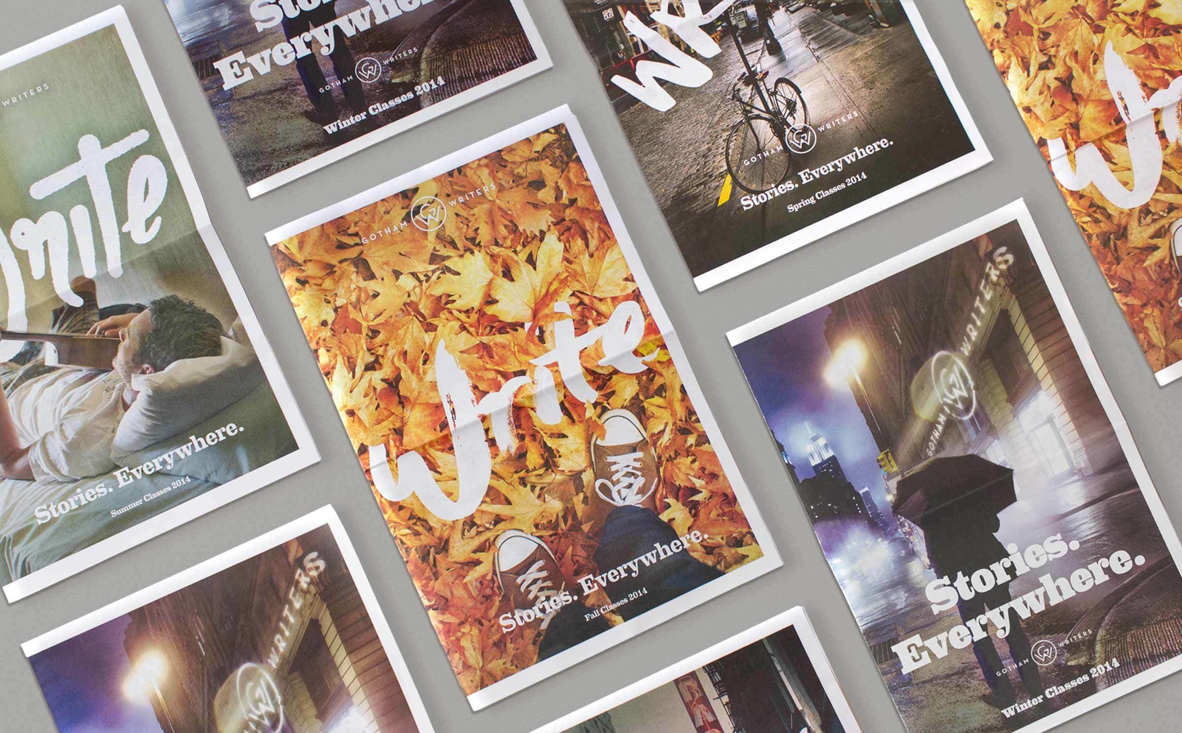
Reaching new demographics

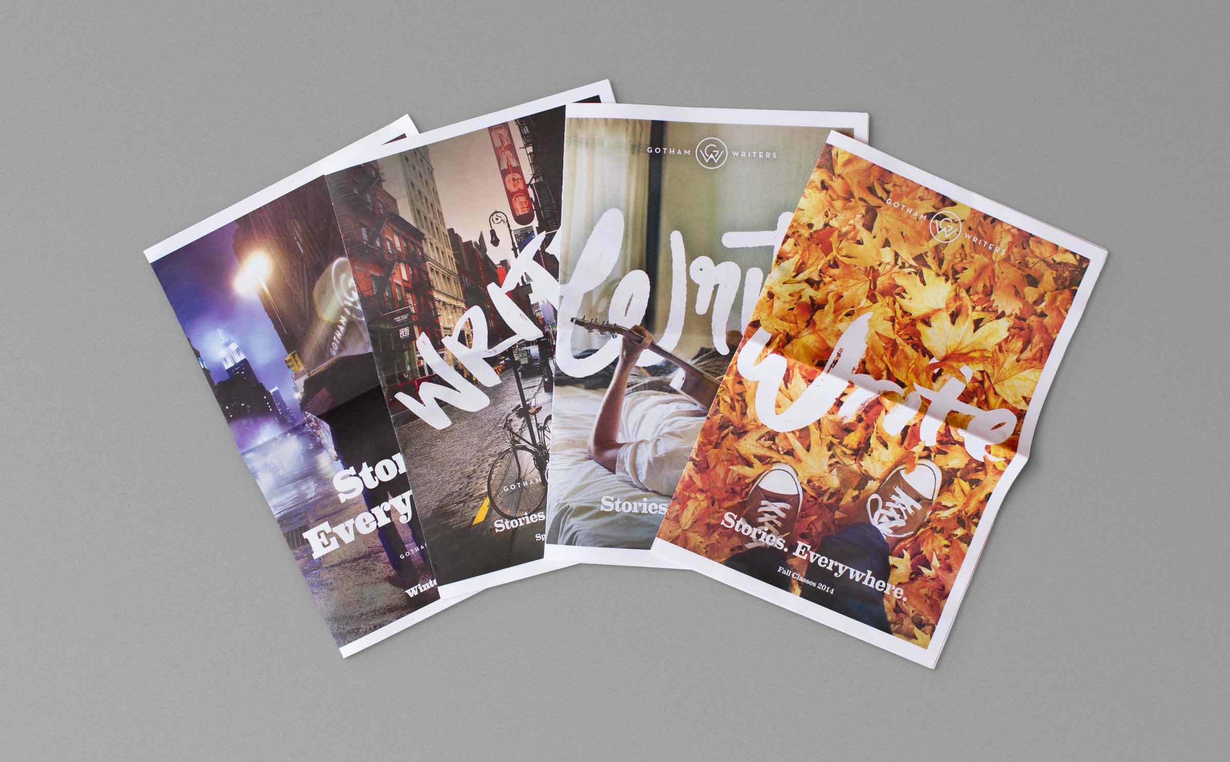
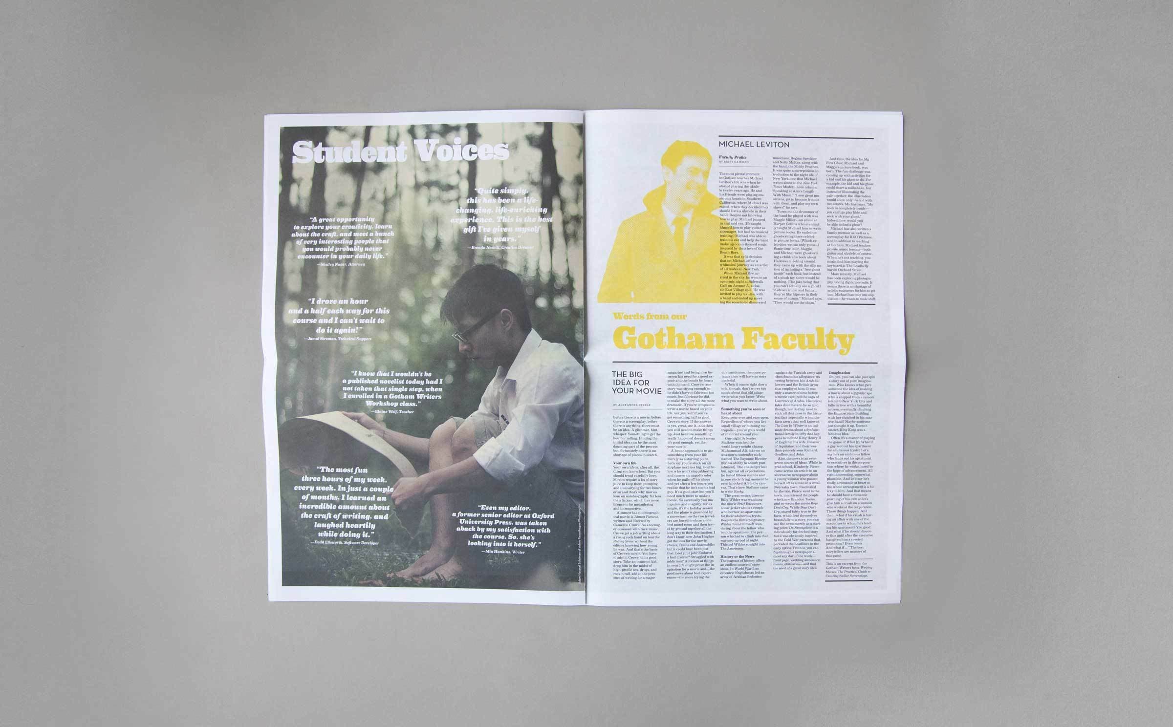
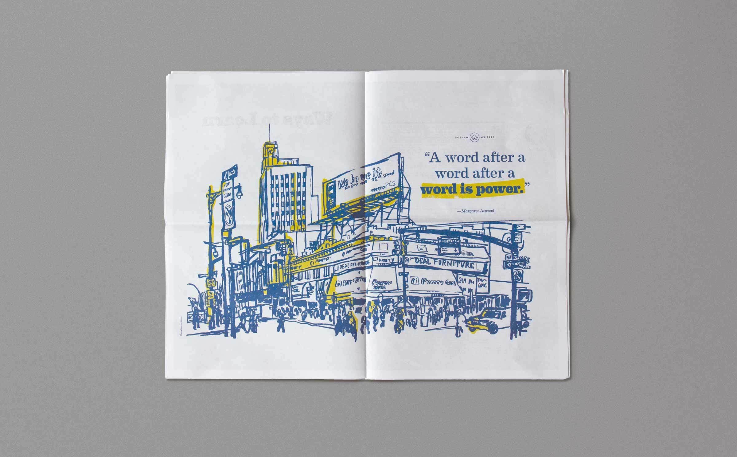
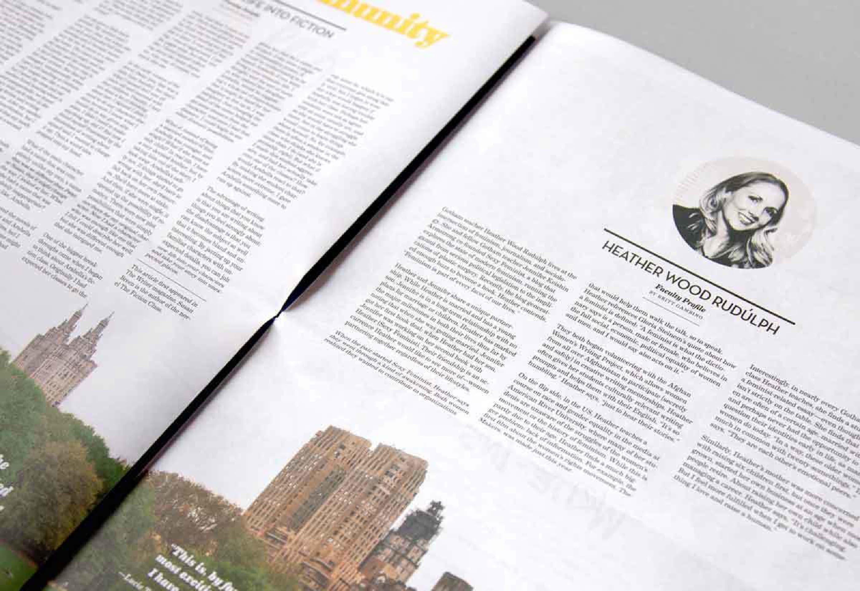
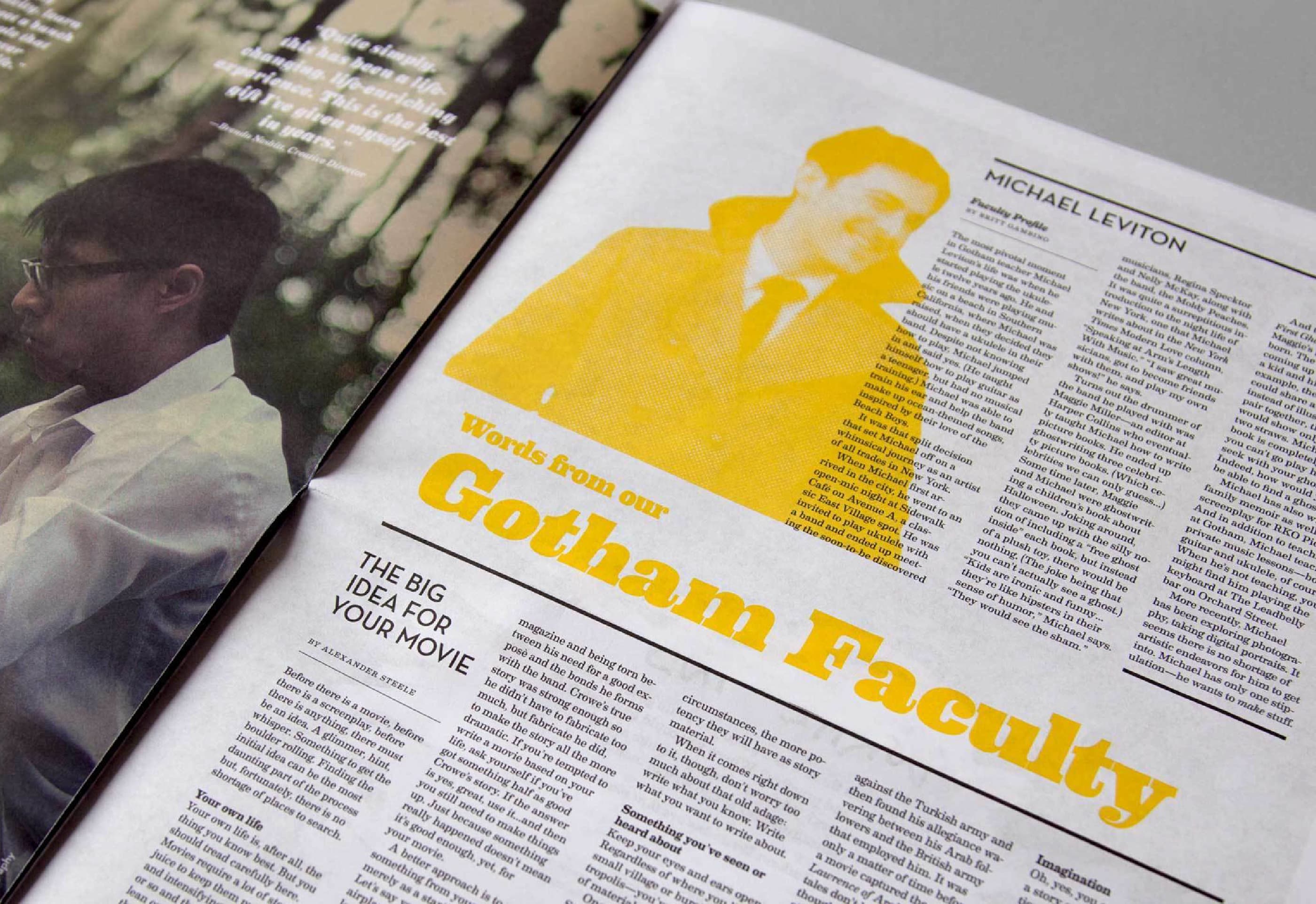
Gotham Writers is best known around New York for the bright yellow boxes that stand on street corners all over town and contain the school's quarterly course catalog. We revamped the monochrome catalogue into a colorful newsprint magazine appealing to pedestrians. Besides up-to-date class information, lush photography and expressive illustration, the new publication also features the original voices of students and teachers in the community – the Gotham Writers.

A collage of images featuring a writing workshop. People are seen participating in discussions and activities, wearing workshop-themed shirts. One image shows a woman standing outside, holding a drink, while another shows notebooks and materials from the workshop.
An open book showing an illustrated street scene with buildings, signs, and billboards. A quote on the right page reads, "A word after a word after a word is power." —Margaret Atwood. The drawing is in blue and yellow ink on a white background.
Image of a magazine spread featuring an article with several columns of text. On the right page, there is a small circular headshot of a person beside their short bio and name, "Heather Wood Rudolph." The bottom section of both pages shows photos of buildings.
A newspaper spread featuring an article titled "Words from our Gotham Faculty" with a section focused on Michael Leviton. The article includes a monochrome yellow-tinted photo of a man in a coat and tie. Another article titled "The Big Idea for Your Movie" is partially visible.
A poster with a yellow background displaying a large "20" with interlocking "G" and "W" letters, signifying Gotham Writers Workshop's 20th anniversary. Below, text reads: "REVISING OUR STORY" and includes information on their new logo, updated website, and mailing list.

Project Credits

Project Team
Collaborators
  • Teke Busk
  • LE Design Team
Ready to unlock the potential of your nonprofit's brand?
Reach Out