Work

Ford Foundation

With its new brand, one of the most influential funders in the world cedes the spotlight to its grantees who advance justice.

Background

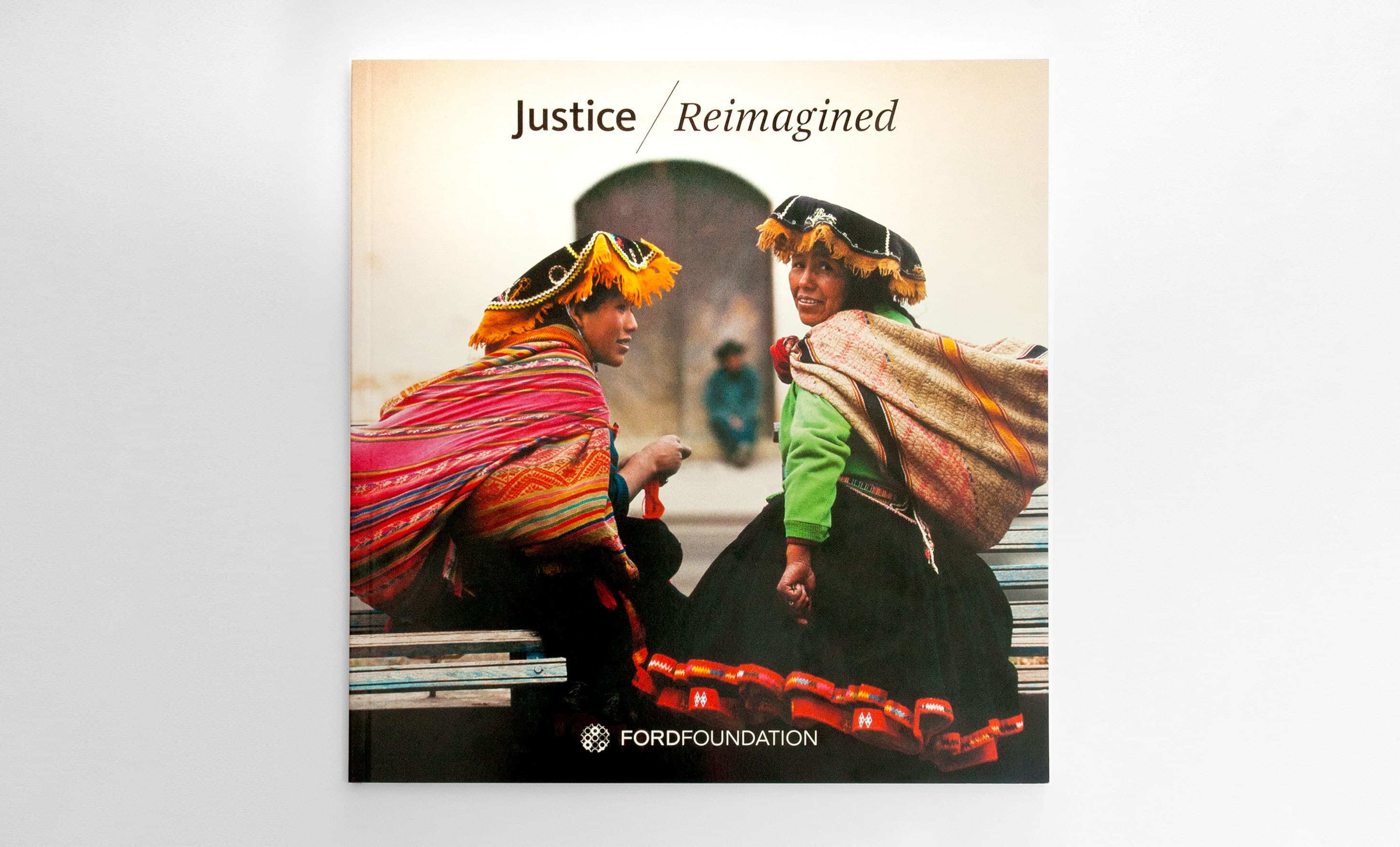
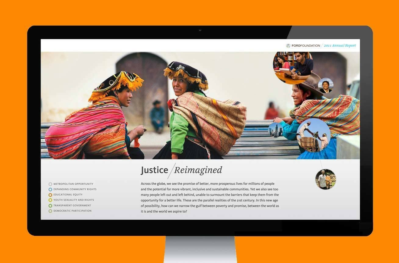
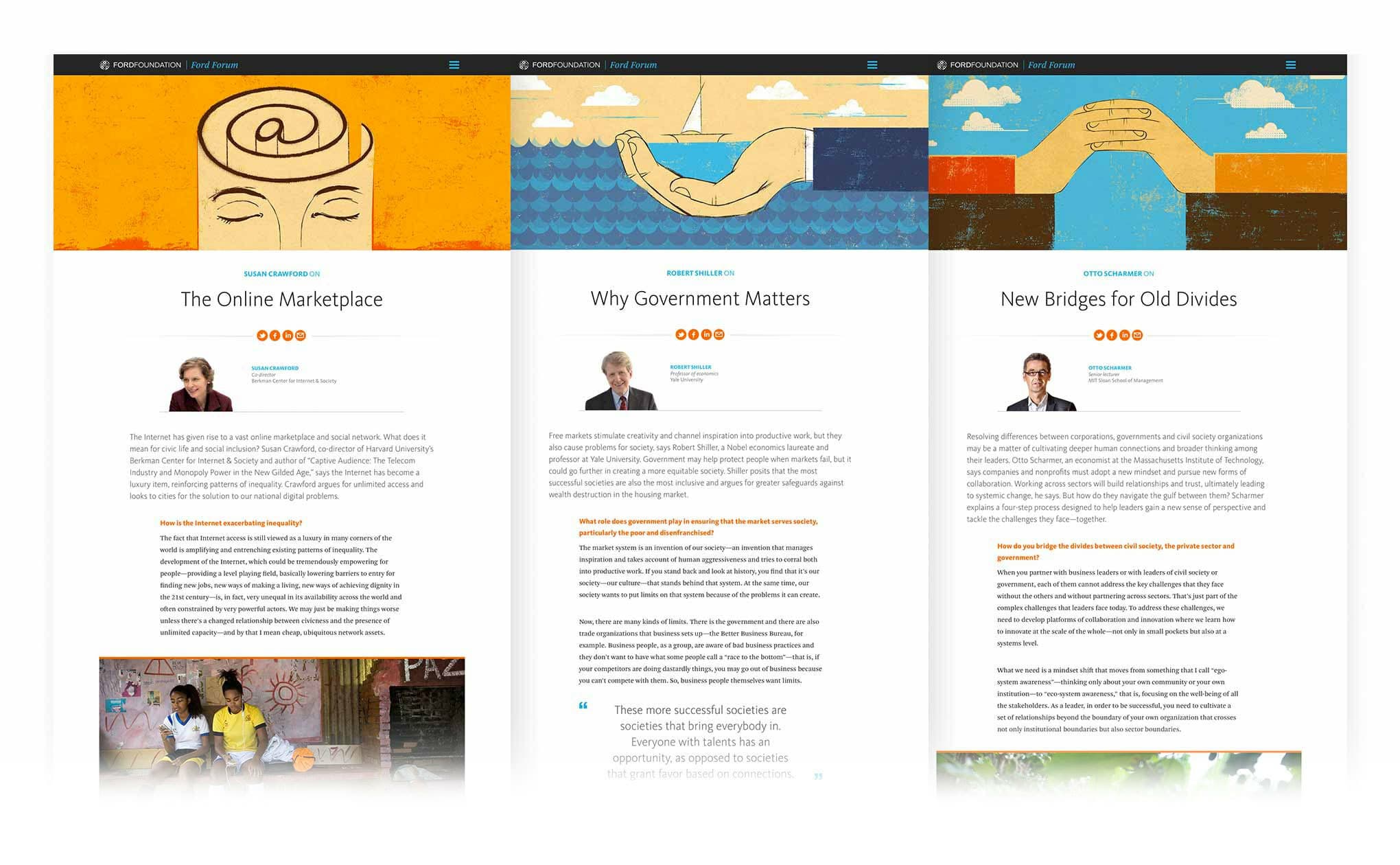
Ford Foundation has a long history of providing essential funding for social justice movements and creative expression. Ford was instrumental in supporting litigation during the American civil rights era of the 1960’s, founding PBS and Sesame Street, establishing the field of legal aid, and advancing rights for historically excluded communities. Today, with an endowment of billions of dollars and offices in various continents, Ford continues to provide steadfast support for innovative ideas, individuals, and institutions that strengthen democratic values, reduce poverty and injustice, promote international cooperation, and advance human achievement—all with a focus on ending inequality.

A collage of various Ford Foundation logos, reports, and publications in different styles and colors, highlighting the evolution of the organization's branding over the years. Logos and typefaces range from modern to vintage.

The challenge

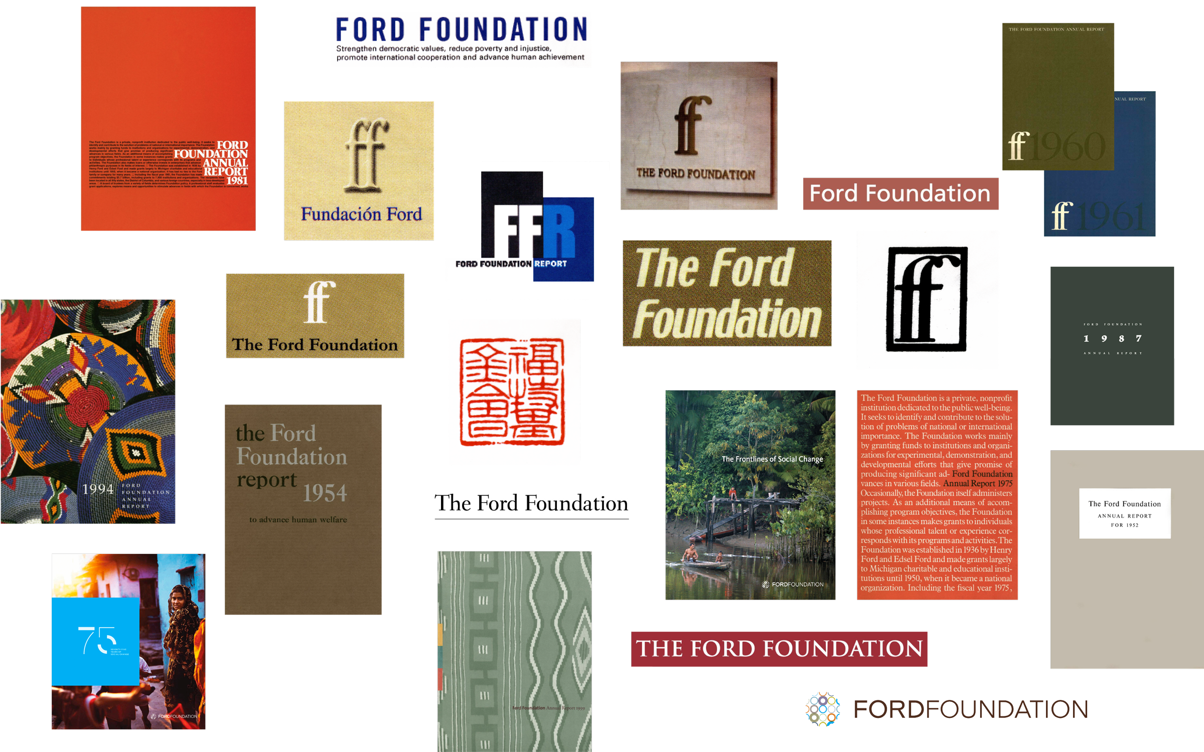
Ford Foundation recognized that their brand identity, last updated in 2008, needed to be redefined to reflect their values and work as an organization rooted in social justice and fighting inequality. In a world reeling from multiple crises, where inequality continues to rise and democratic values and human rights are under threat, they needed their brand to clarify their position and focus on uplifting the stories of their grantees, their innovative solutions, and the communities they serve. They also wanted their brand to adapt for digital expression. Our team was asked to create a modern, digitally native brand with an emphasis on accessibility that would lift up the grassroots work of the grantees they support.

Collage of four images: top-left shows a speaker in traditional attire at the UN Climate Change Conference UK 2021, top-right features protesters with signs, bottom-center highlights a masked person holding an "I AM NOT INVISIBLE" sign, and bottom-right depicts an elderly man smiling.

The opportunity

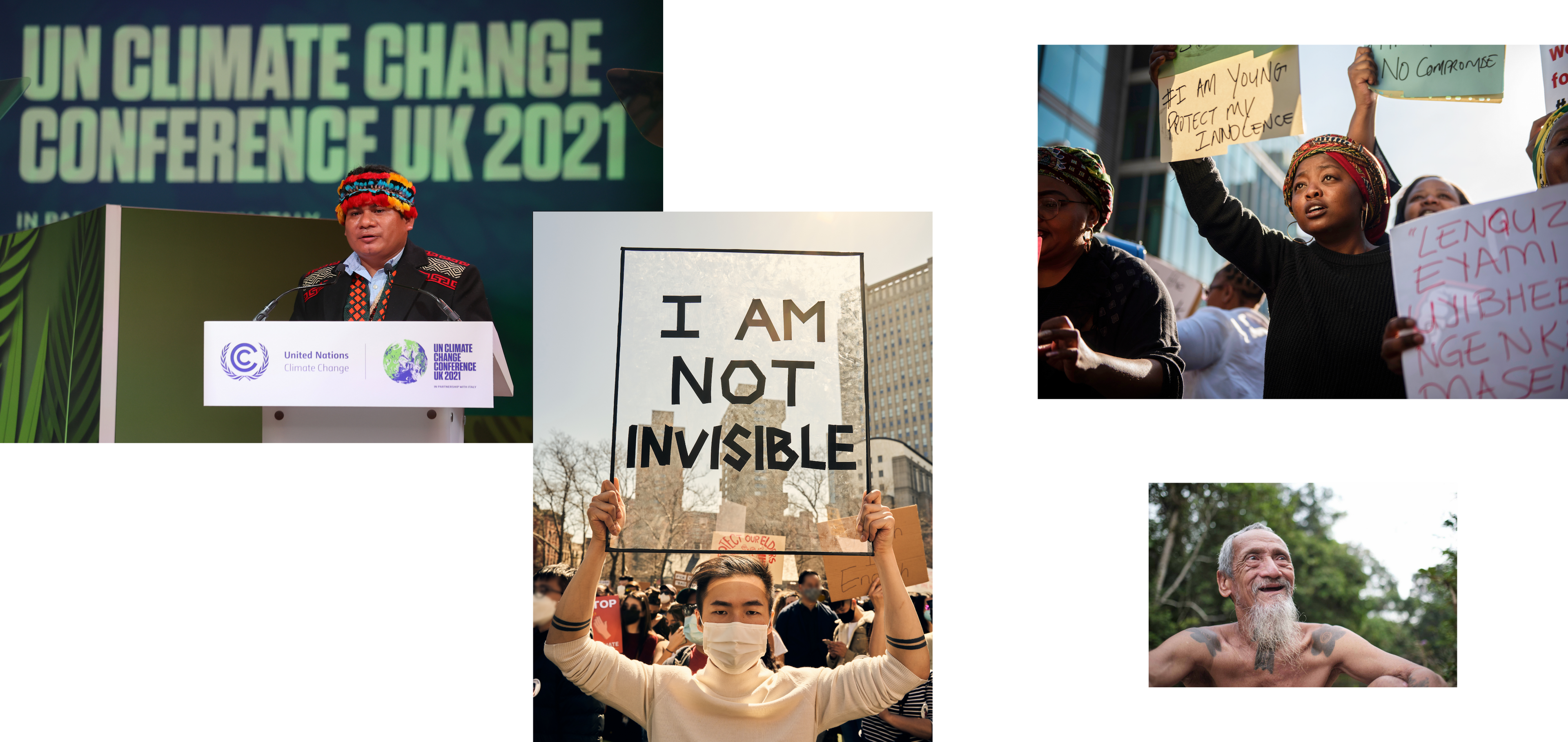
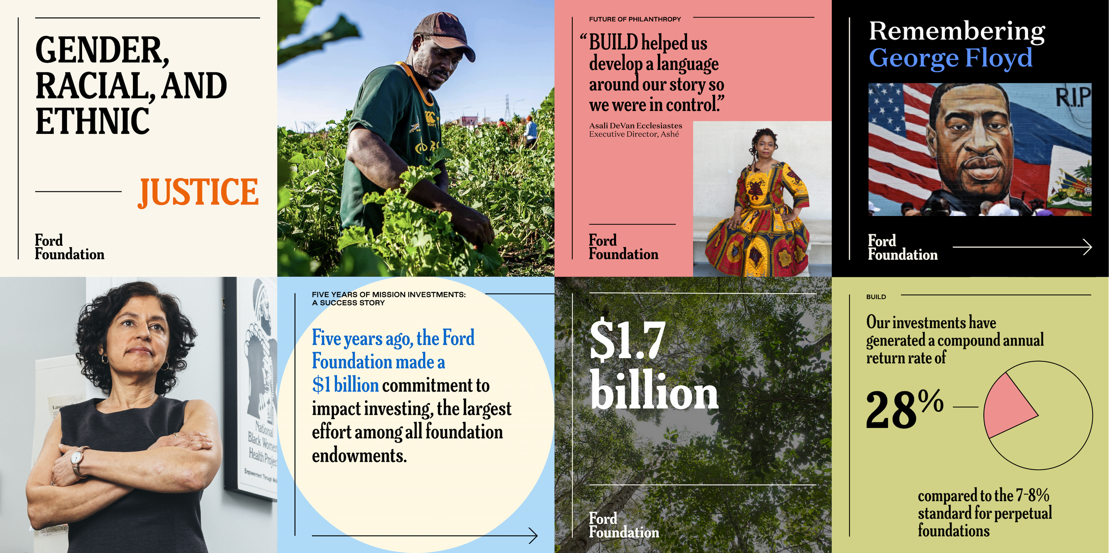
Our work aimed to transform Ford's identity from one of a legacy institution to one that is a supporter and partner to social justice activists and organizations across the world. The world Ford operates in is neither simple nor static. It is a system characterized by chaos and unpredictability, constantly in flux. The players are moving at various speeds, bouncing off each other, cooperating, competing, and approaching challenges from different perspectives. Together, Ford and its grantees are part of the larger mosaic of actors who all work for justice. The new brand focuses on revealing that mosaic by lifting up the stories of Ford’s grantees—the visionaries on the frontlines of social change—and their efforts to end inequality.

The world has forever changed, and the Ford Foundation needed a visual identity that reflects this moment. Our new design system draws on the rich visual history of social justice movements, the complexity of the world we live in today, and the future we—together with our grantees—are building: a future grounded in justice and brimming with hope and opportunity.
Victor Ng
Creative Director, Ford Foundation
Through their insightful interviews and subsequent brand rollout, Hyperakt uncovered a shared understanding of brand and reputation within the foundation.
Victor Ng
Creative Director, Ford Foundation

Introducing Ford Foundation's new brand identity

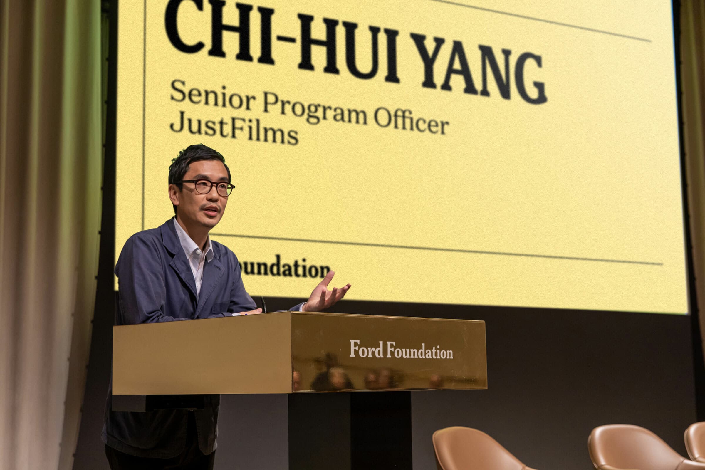
Unveiling Ford's new brand was a great opportunity to remind the world about their role in the ecosystem of social movements. Ford steadfastly supports the work of visionaries on the frontlines of social change. They are committed to sharing their first-hand stories with the world as a reminder that change is possible. We worked with the great folks at Reed Words on scriptwriting, and with our longtime collaborator, Christian Mroczka on animation and sound production.

The core brand idea

After many fruitful conversations and workshops with the Ford team, we landed on a core brand idea for our work: Ford mobilizes ideas, individuals, and institutions to advance justice and hope in multitudes. This phrase is not intended as a mission statement, but rather as a guiding concept for the brand’s visual expression. Ford works with diverse actors and organizations, across different geographies and theories of change, to exponentially multiply justice.

Diagram of a molecular structure showcasing a ring consisting of 6 carbon atoms, numerically labeled 1 through 6 in red. Various hydrogen and hydrocarbon substituents branch off, forming a complex organic compound.

1. Mobilizes
An expansive and energetic verb to symbolize all the diverse ways in which Ford funds, convenes, facilitates, and transforms.

2. Ideas, Individuals, and institutions

The three dimensions across which Ford works.

3. Advance

The arc of the moral universe bends towards justice and Ford plays an active role in pulling that arc forward, supporting the frontline, and advancing it.

4. Justice
The end-game, the north star that drives all that Ford do: “justice starts where inequality ends.”

5. Hope

The most scarce currency of all, critical to fueling the long-game.

6. Multitudes

The exponential impact Ford has, the multiplier effect created by the combination of their unique differentiators.

A storytelling approach

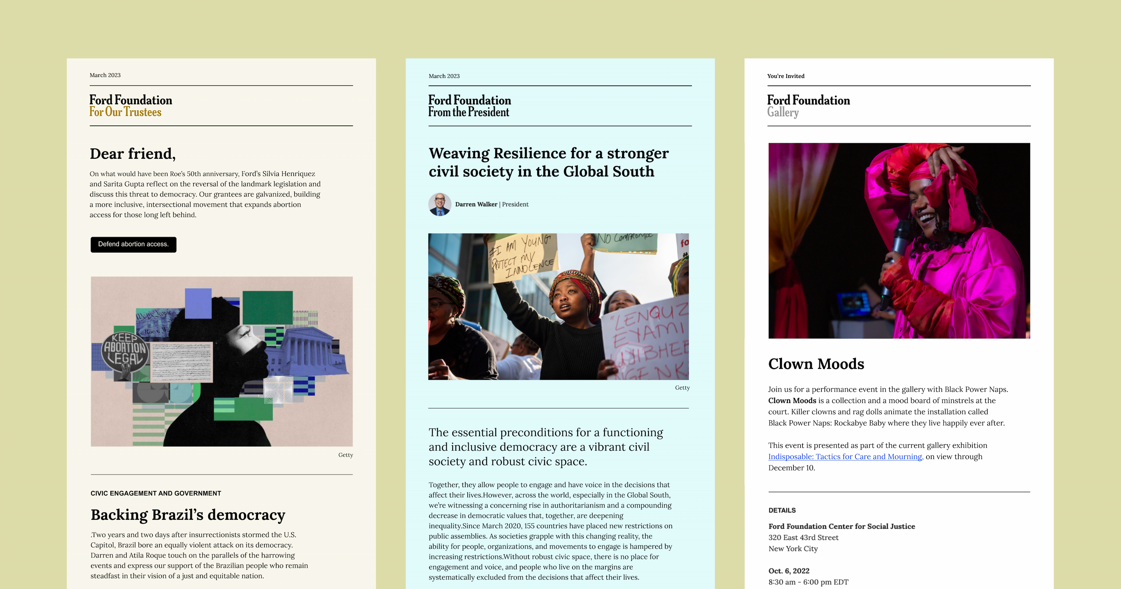
Ford brings unwavering focus, discernment, and steadiness to the complex work of justice. Ford’s brand serves as a platform to broadcast the inspiring stories of grantees working in their local geographies to demonstrate, day in and day out, that change is possible. The brand’s visual language aims to project the gravitas and integrity social justice movements deserve.

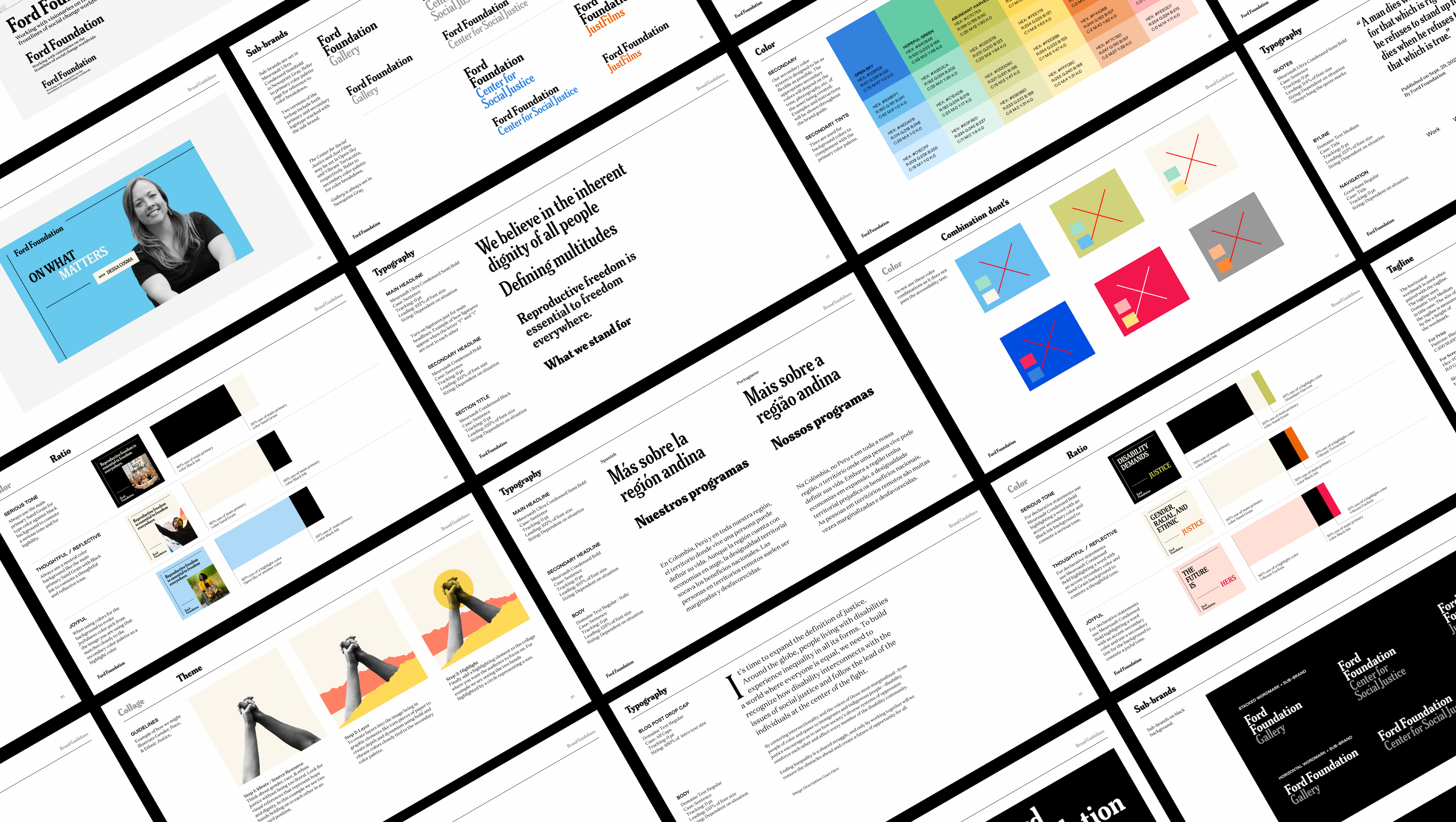
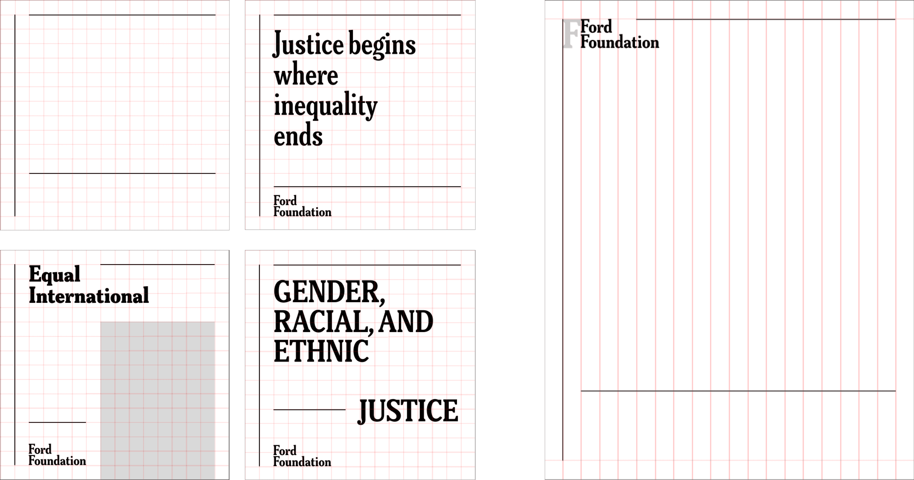
A confident new logo

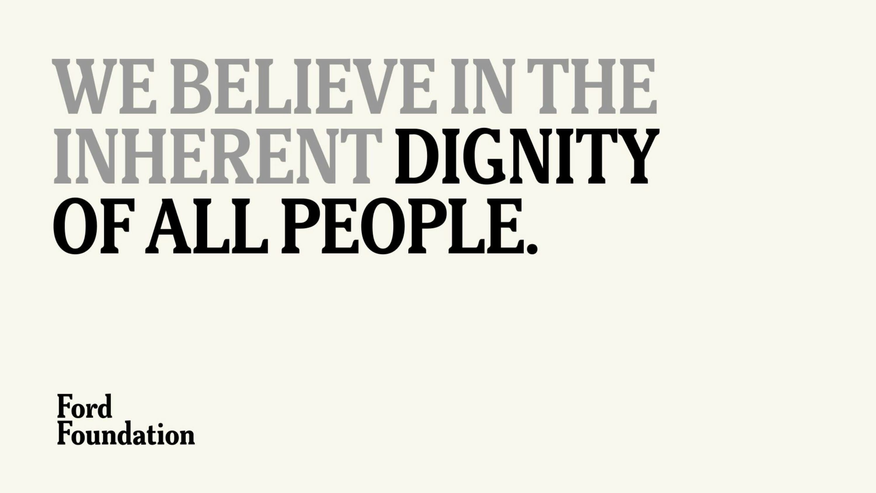
Ford Foundation’s new logo conveys the dignified restraint of a timeless institution. The word mark strips away the UN-like trappings of Ford’s former logo and confidently relies on the power of the organization’s name to communicate its identity. The condensed serif typeface is highly legible in small digital contexts as well as large physical ones.
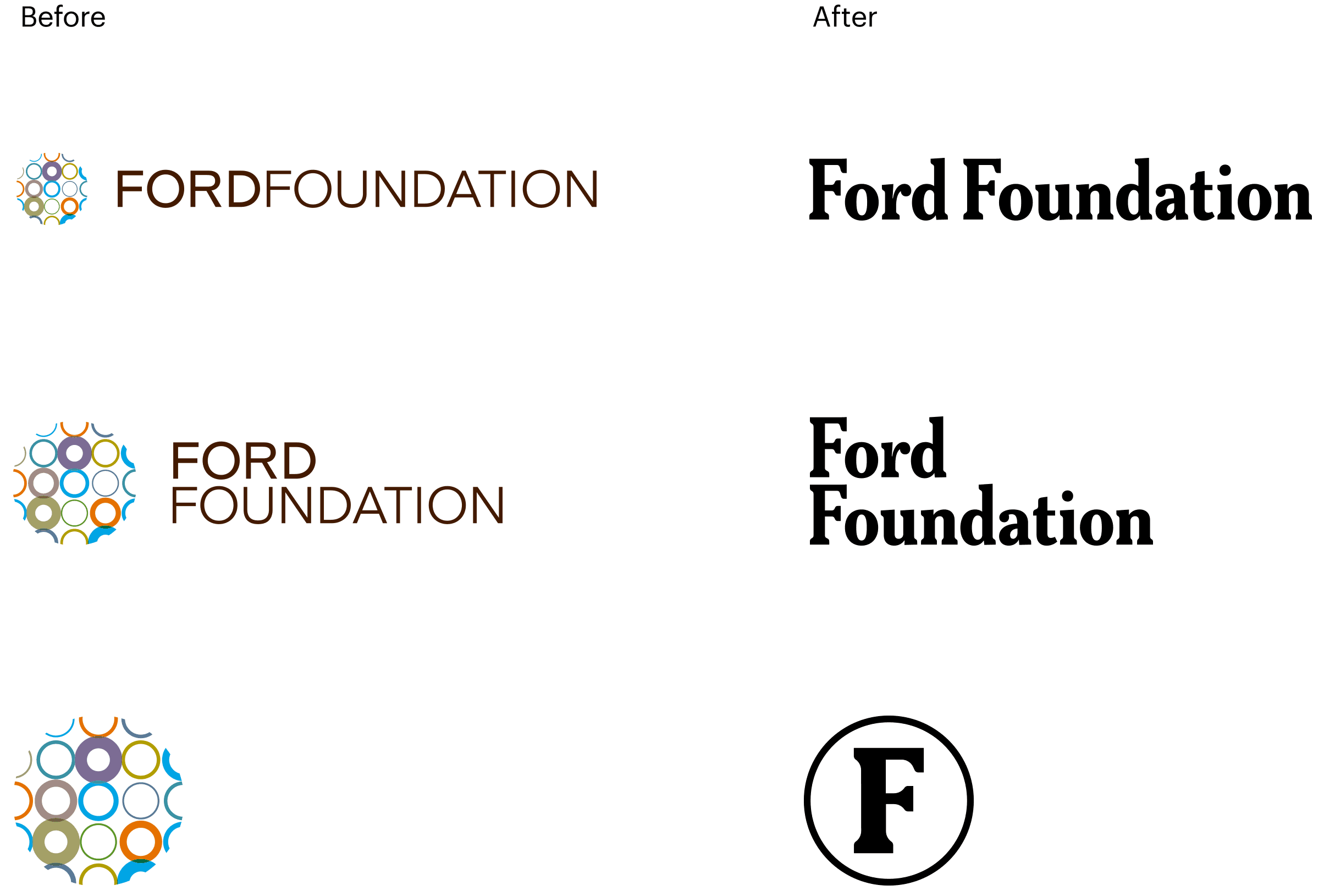
Various Ford Foundation logo designs are shown. The designs feature the text "FORD FOUNDATION" in different configurations and colors, some accompanied by a multicolored circular emblem.

The Ford monogram

For very small uses and social media avatars, we modified the letter “F”, adding balance and sturdiness, to create a monogram.
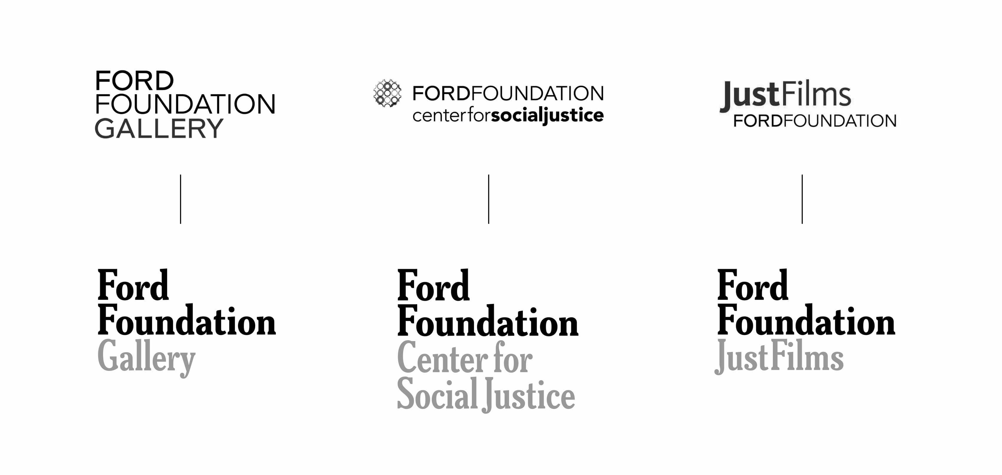
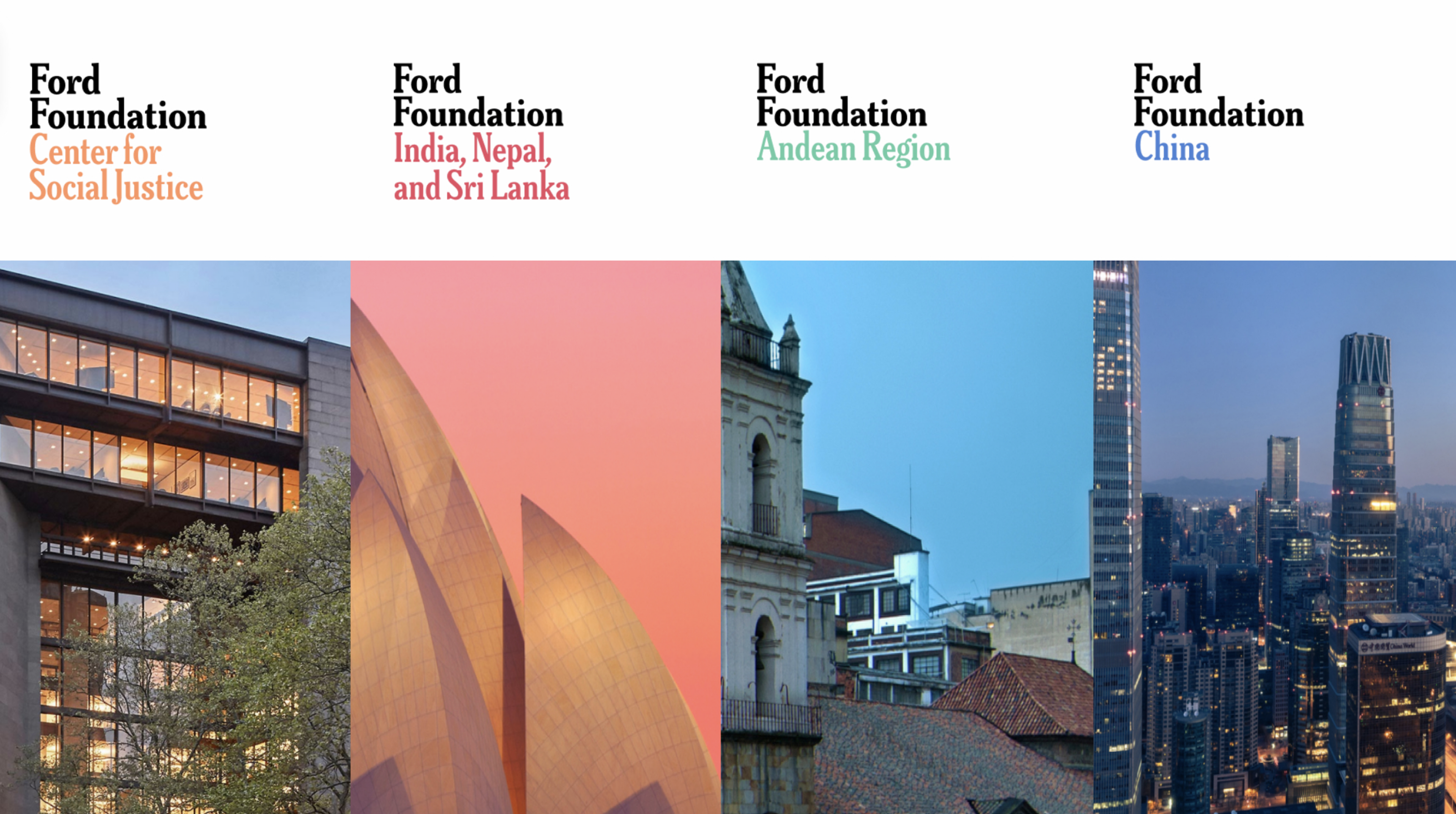
Image showing two letters "F" side by side. The left "F" has a notch at its top and bottom, indicating a change, while the right "F" is plain. Above them is a magnified view of the same notch area.
Stacks of color-coded brochures on a light surface, some depicting images of people engaged in various activities like photography and holding gears. Text on the brochures reads, "Working with frontline communities to change the world" and features a logo with an "F.
Three social media posts from the Ford Foundation side by side. The first highlights Gender, Racial, and Ethnic Justice; the second shows a Fireside Chat with Sarita Gupta; and the third features a talk on reproductive justice with Hilary Pennington and Dr. Herminia Palacio.

Brand Architecture

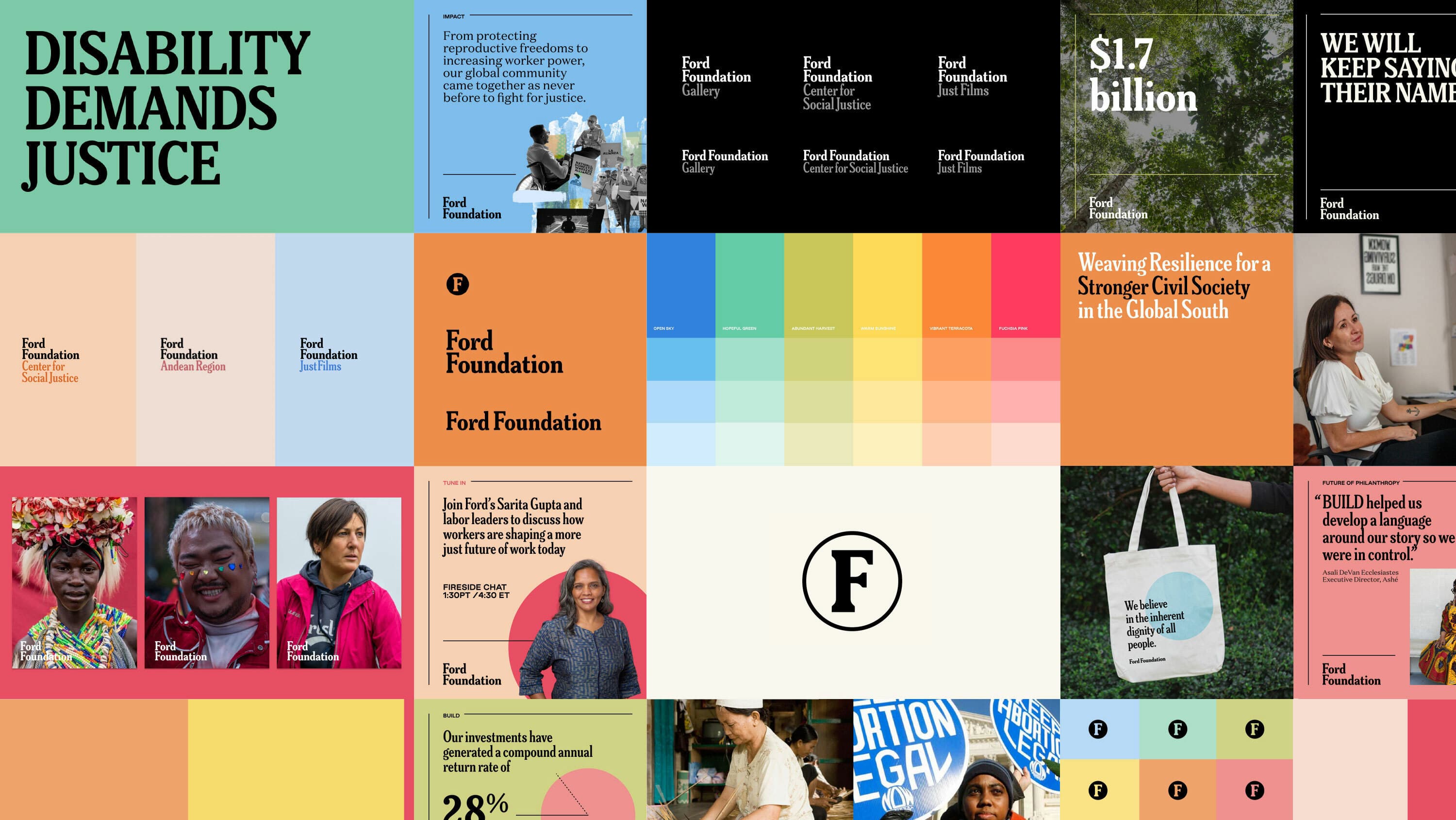
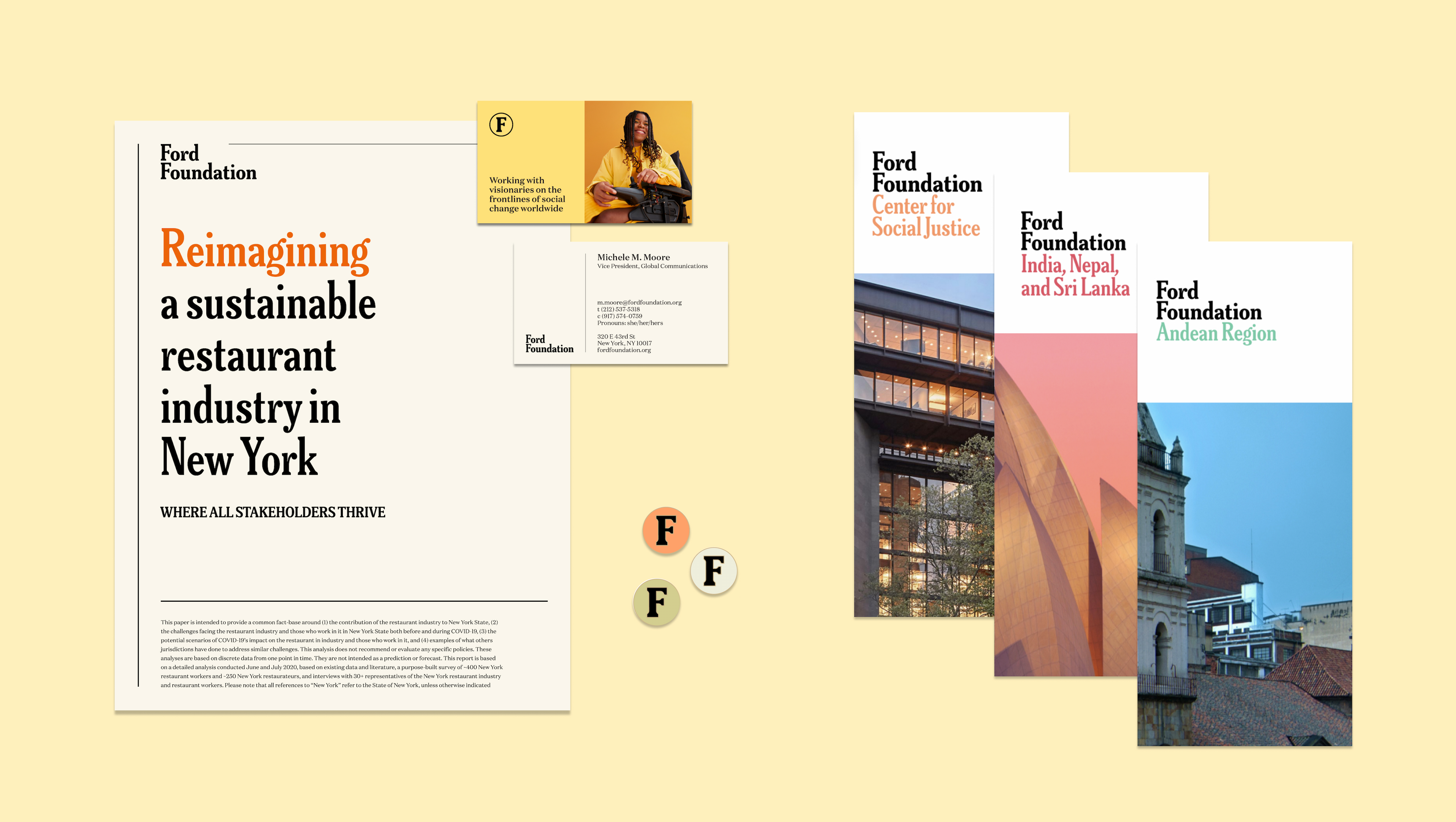
The understated logo allows for Ford to easily extend its brand to meet the demands of its different initiatives, creating a consistent brand architecture.
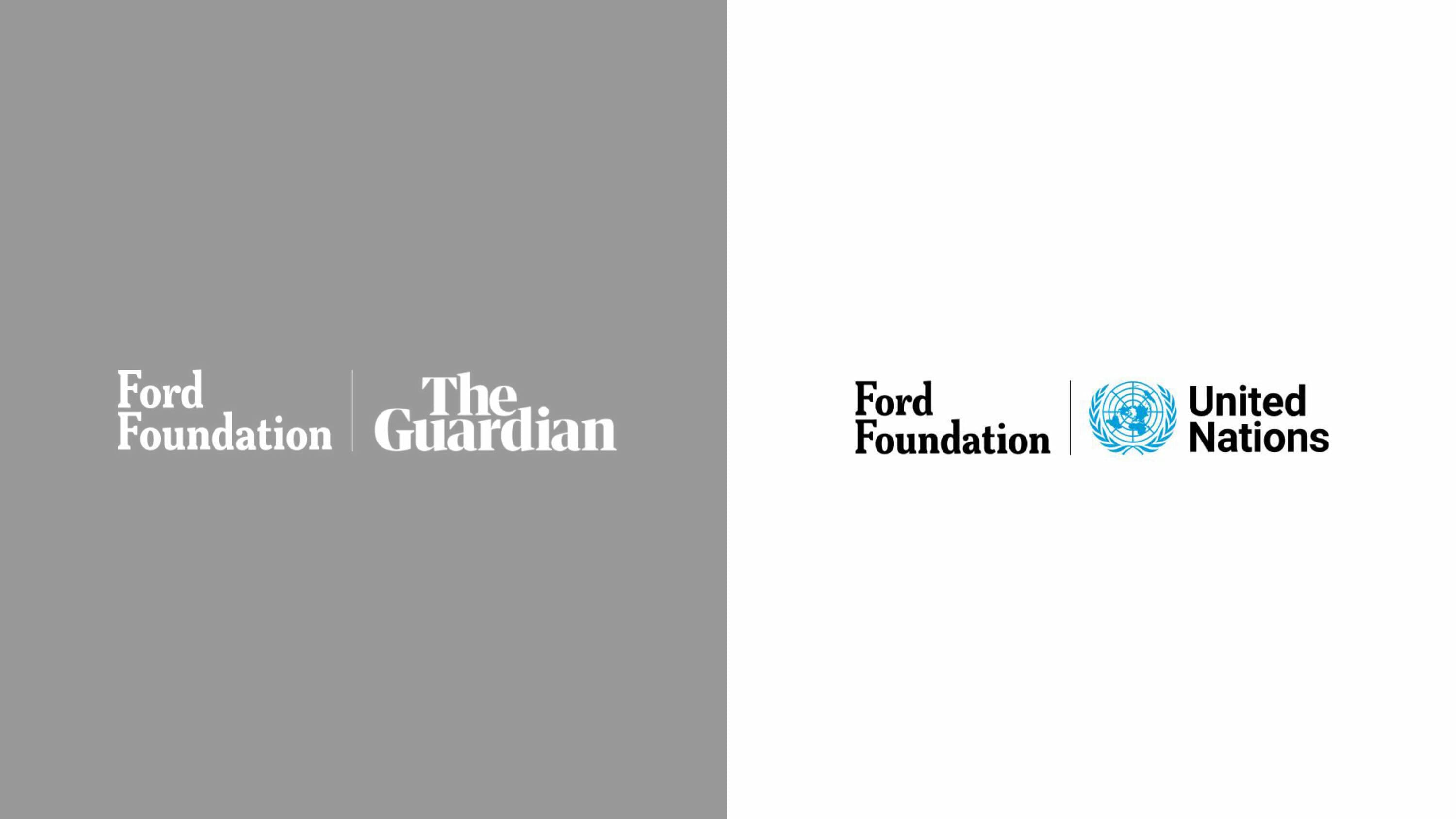
Three logos for various Ford Foundation initiatives. The first reads "Ford Foundation Gallery." The second reads "FordFoundation Center for Social Justice." The third reads "JustFilms FordFoundation." Each logo is accompanied by a corresponding visual icon.
A person wearing a red coat walks past the entrance to the Ford Foundation Gallery. The entrance features glass doors flanked by an art installation of colorful, patterned bundles. The gallery's name and description are displayed on the white wall next to the door.
An image showing four sections representing different regions of the Ford Foundation: Center for Social Justice, India, Nepal, and Sri Lanka, Andean Region, and China. Each section includes corresponding images of architectural landmarks or buildings for each region.

Cobranding

Ford Foundation partners with many organizations to further the work of its grantees. Ford's new logo makes it easy to visually communicate balanced partnerships.

Split image with two logo combinations. Left side on a gray background: "Ford Foundation" and "The Guardian." Right side on a white background: "Ford Foundation" and "United Nations" with the UN emblem.

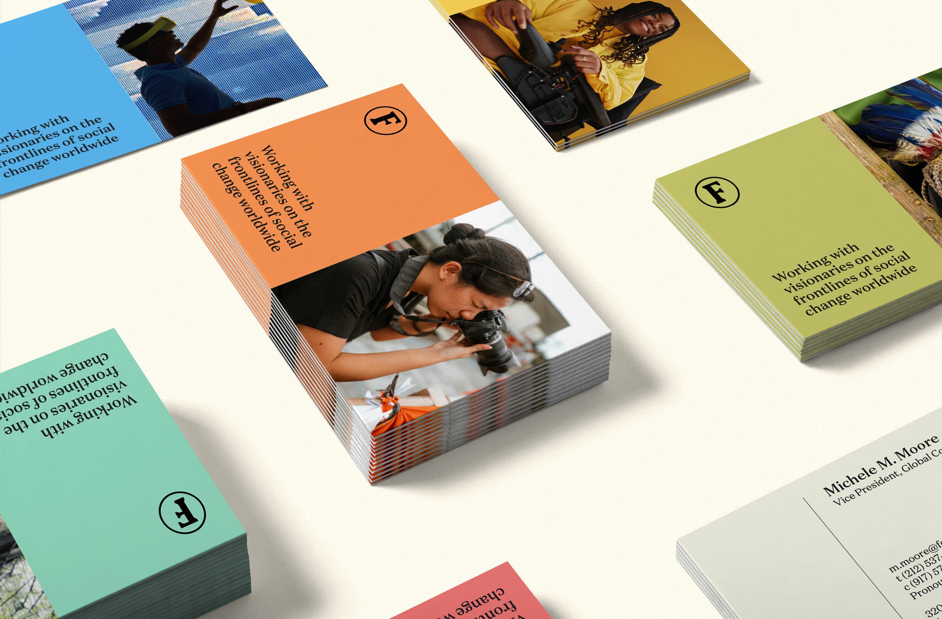
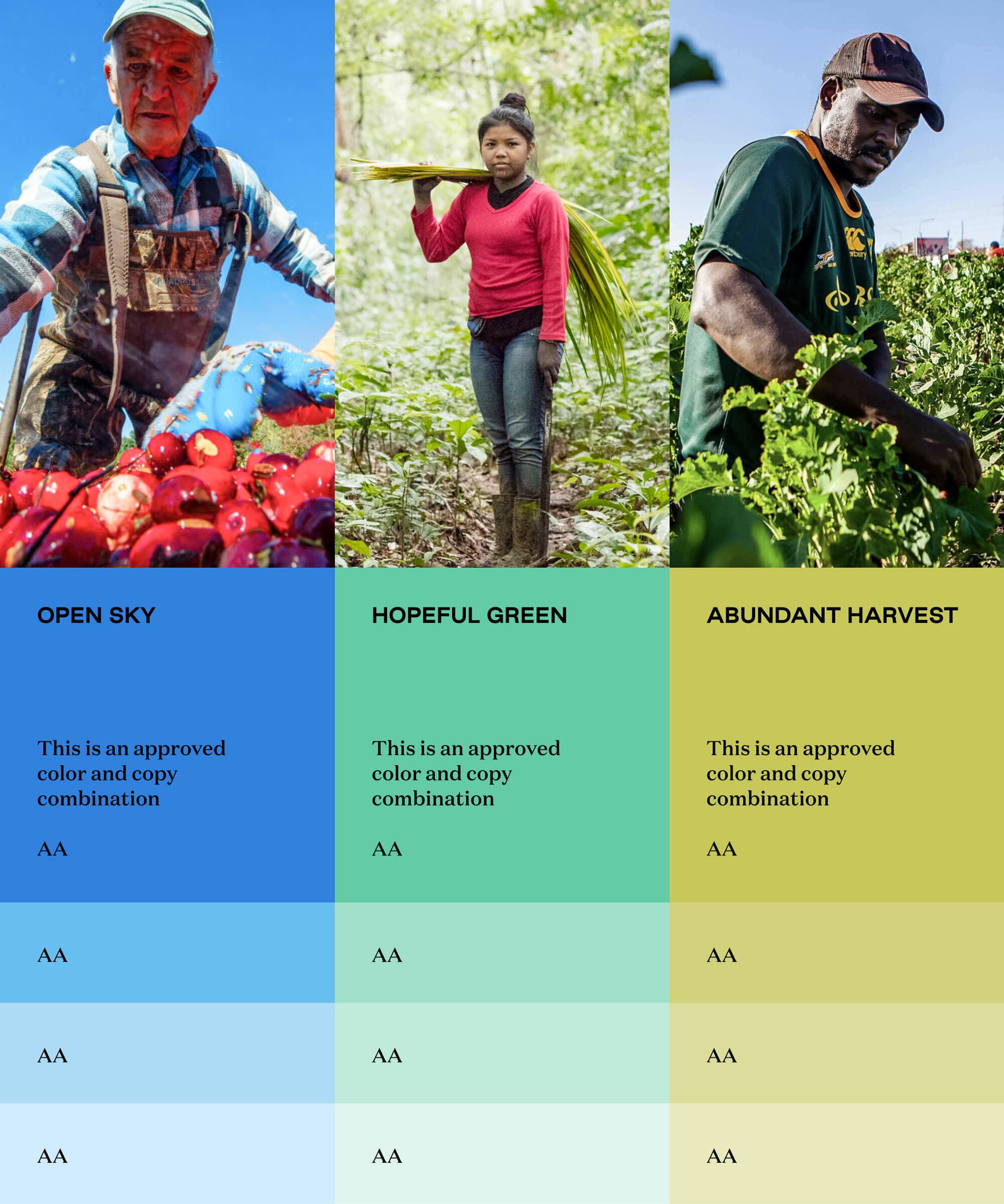
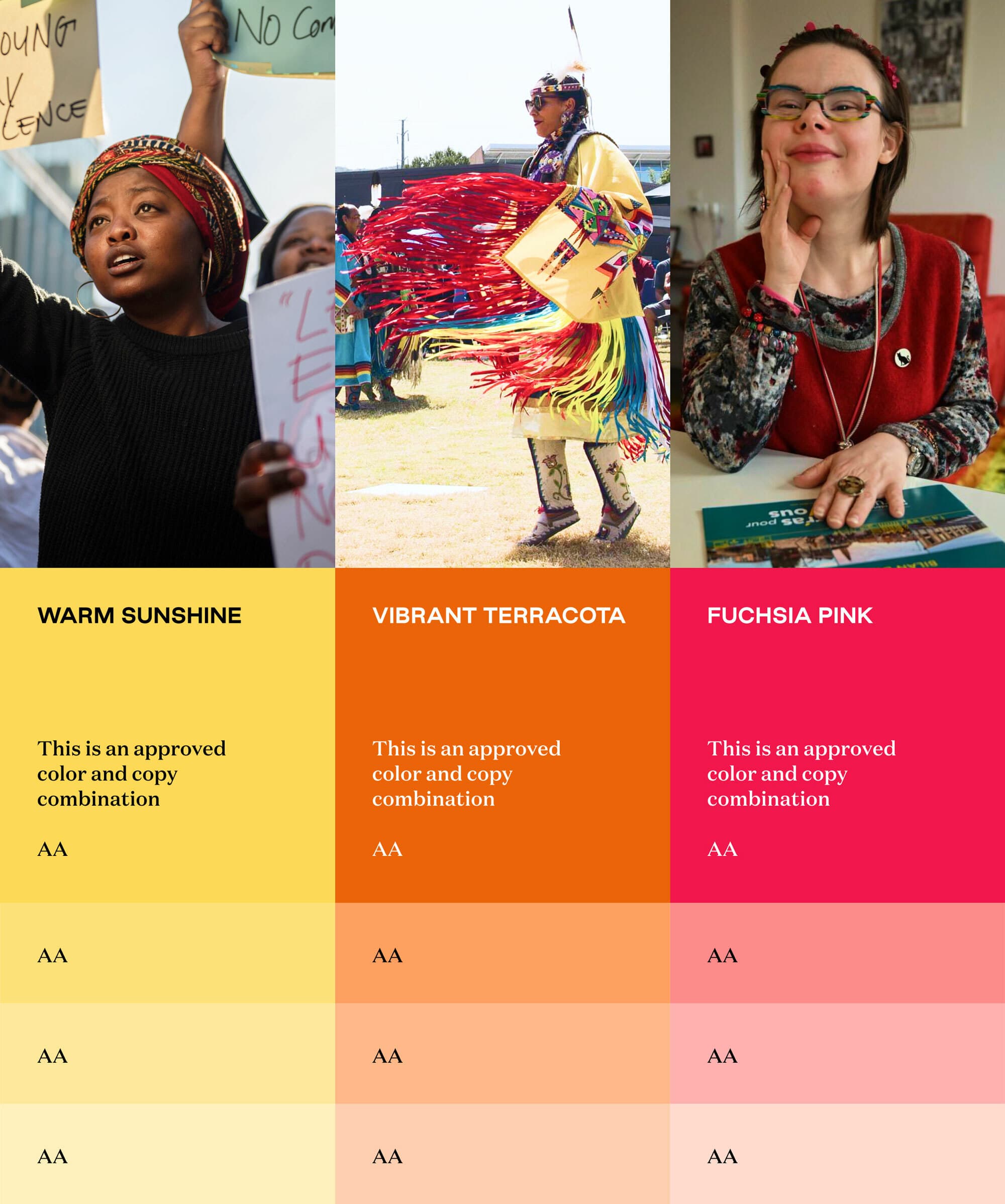
An abundance of color

Ford’s color palette was drawn from the abundance of nature, adding warmth and vibrancy to the brand’s visual language and reflecting the physical world in which the work happens. The neutral colors in the palette were inspired by the world of journalism. Special care was placed on selecting colors that allowed for a broad variety of accessibility-friendly combinations.

A visual comparison of three color and copy combinations for a project. The combinations are labeled "Open Sky," "Hopeful Green," and "Abundant Harvest," each with a background of field workers: a man with apples, a woman carrying produce, and a man in a leafy field.
Three columns with diverse individuals. First column features "WARM SUNSHINE", second has "VIBRANT TERRACOTA", and third shows "FUCHSIA PINK". Each person appears engaged in different activities. The text below each color states, "This is an approved color and copy combination".
A person with a wide smile sits at a table with several cups and a bowl. They are wearing a patterned shirt and have short, dark hair. The setting appears to be indoors, possibly a café or dining area. The person looks happy and engaged in a pleasant moment.
A grid of six diverse professionals is shown against different colored backgrounds. Top row: blond woman (coral), Black woman with curly hair (green), and Asian woman with a scarf (yellow). Bottom row: Black man in a suit (orange), person with locs and scarf (blue), and Asian man in a white shirt (cream).

Typography with gravitas

The brand’s type specimen includes three families: Meursault by Universal Thirst, designed to be used as headline type in newspapers and magazines; Domaine Text by Klim Type Foundry, an elegant, contemporary serif for highly legible body copy; and Good Sans by Good Type Foundry, a mid-century neo-grotesque sans serif for subheads and calls to action.

A mosaic of slides showcasing various design concepts, guidelines, and principles. Each slide contains text, images, color schemes, and graphic elements, reflecting diverse aspects of branding, typography, and layout design.

Ford’s theory of change

The circle motif, present in the monogram and throughout the brand language provides a visual throughline from Ford’s previous identity. In order to illustrate their theory of change—investing in ideas, individuals, and institutions—the circle shape is employed to illustrate the multiplier effect of Ford’s approach.

A mosaic of social justice leaders

The idea that Ford and their grantees are pieces in a larger, layered mosaic of social change work, is alluded to in the visual identity. By zooming out and seeing the variety of actors Ford supports, the visual language helps to convey Ford’s broad perspective of social justice ecosystems.

Hyperakt challenged Ford to clarify our purpose for a broader audience, avoiding insider lingo and internal organization that could create distance between the brand and its audience.
Victor Ng
Creative Director, Ford Foundation

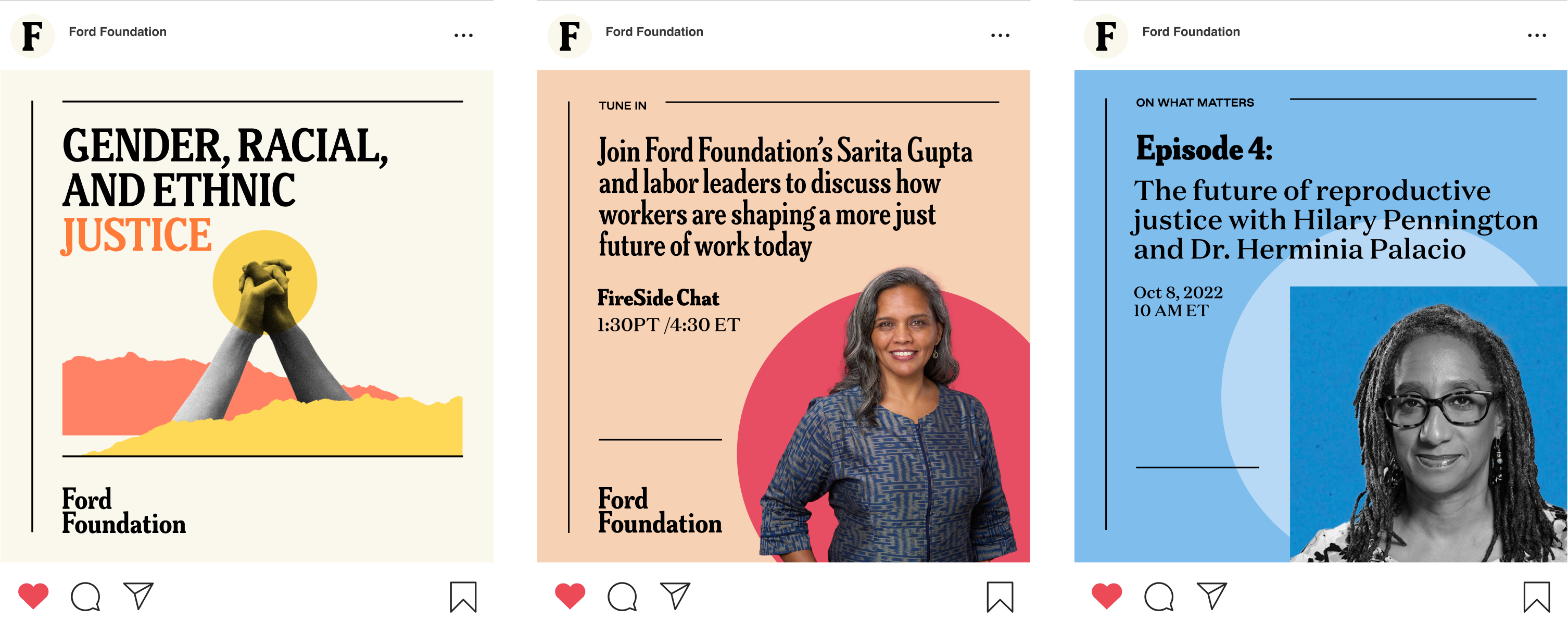
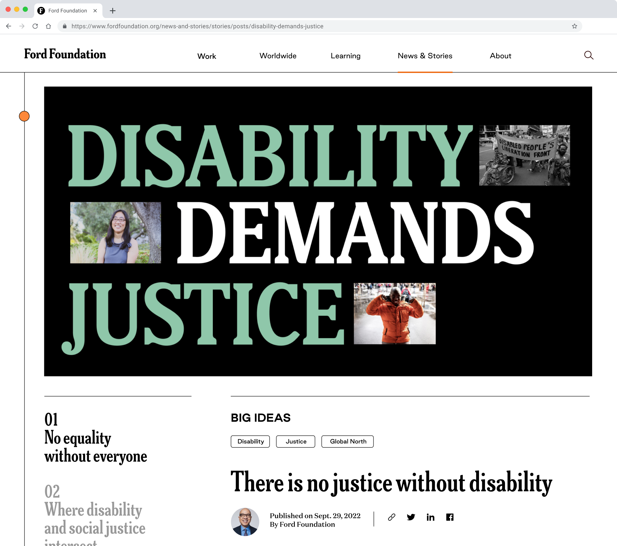
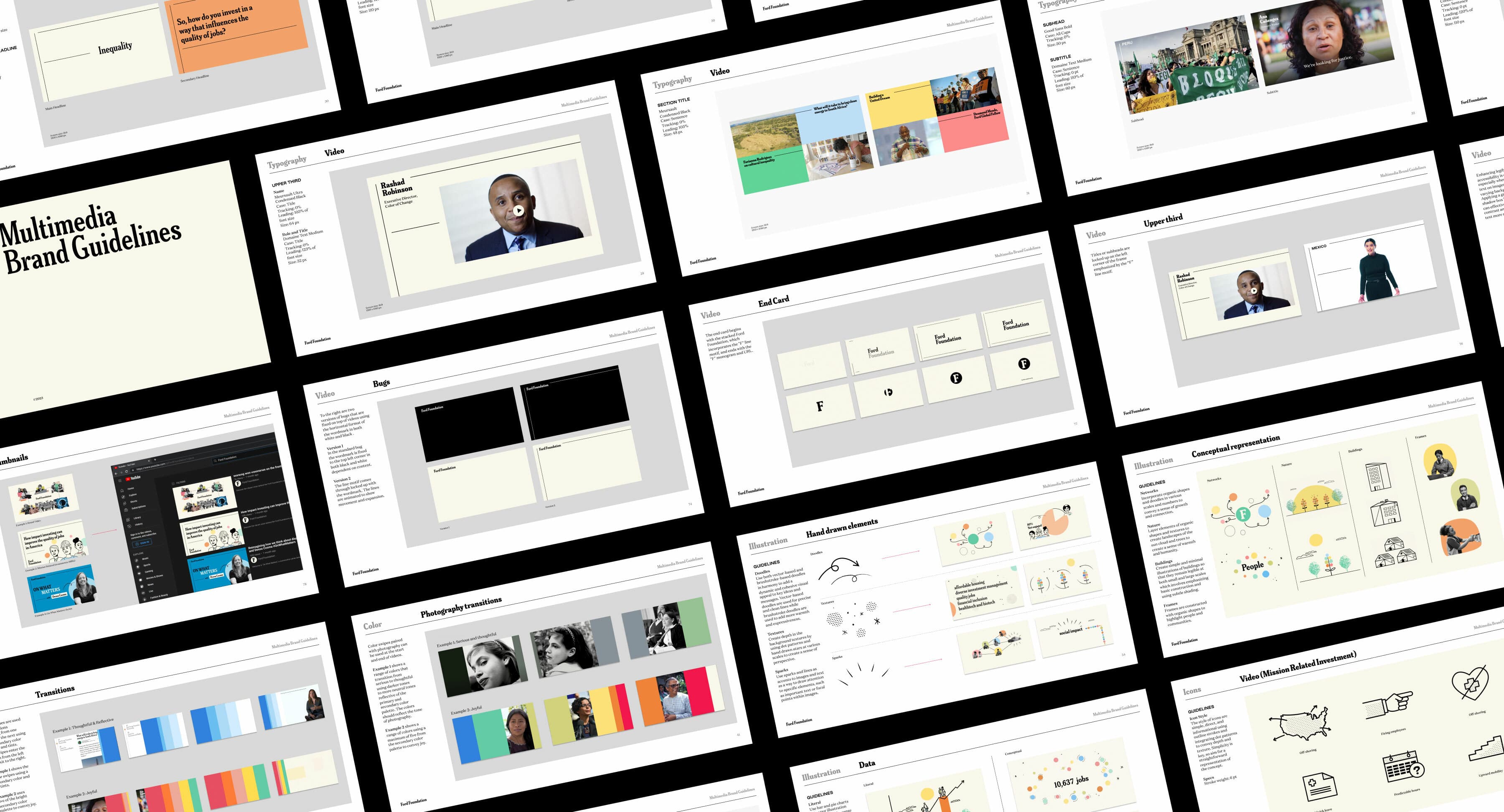
A flexible design system for digital storytelling

The brand's layout system for print, digital, and video communication is flexible and evocative of newspaper design. It features a clear text hierarchy and a line motif resembling the letter "F" that guides the viewer's gaze and creates a dynamic feeling of connection.

The image shows four rectangular designs with text on grid-like backgrounds. Phrases include "Justice begins where inequality ends," "Equal International," and "Gender, Racial, and Ethnic Justice." Each design features the Ford Foundation logo.
A collage of images and text blocks showcases various social justice and investment initiatives by the Ford Foundation. Topics include racial justice, honoring George Floyd, a $1 billion climate investment, and generating a 7% annual return compared to 28% standard for peers.

Starting with Accessibility

Building a new system with accessibility and inclusion at the forefront were non-negotiable for Ford going into the rebrand. Accessibility specialists The Constellation Collective collaborated with us and Ford on a number of initiatives: formalizing the communication team's approach, providing training and tools, and setting expectations and standards for the visual design. Readability, clarity, contrast, alt text, video strategy, layout, and photography were all taken into consideration throughout the brand development process. The result is a brand system that is accessible by design — but the process of launching and maintaining accessible communications will be an ongoing effort.

A colorful collage featuring graphics and photos related to the Ford Foundation. Text elements include phrases like "Disability Demands Justice," "We Will Keep Saying Their Name," and "Weaving Resilience for a Stronger Civil Society in the Global South.
Hyperakt's work played a critical role in helping us to articulate and communicate our brand in a way that resonated with stakeholders across the foundation. This trust is essential to express our brand identity, which relies heavily on storytelling and uplifting those on the frontlines of social justice.
Victor Ng
Creative Director, Ford Foundation
Screenshot of a webpage from the Ford Foundation. The title reads "Disability Demands Justice" with four images above the headline. Below, the subheading "There is no justice without disability" is followed by publication details and social media icons.

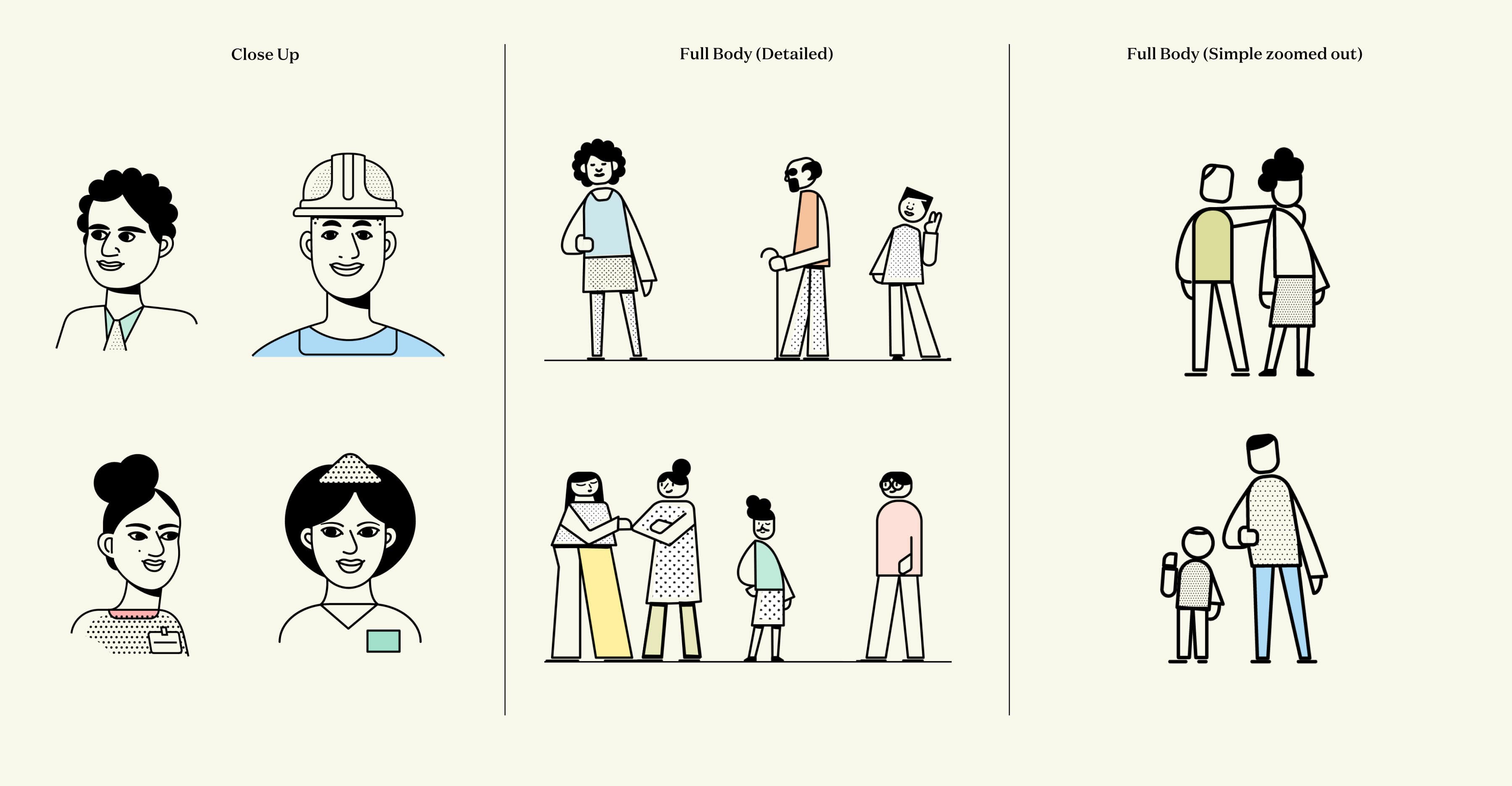
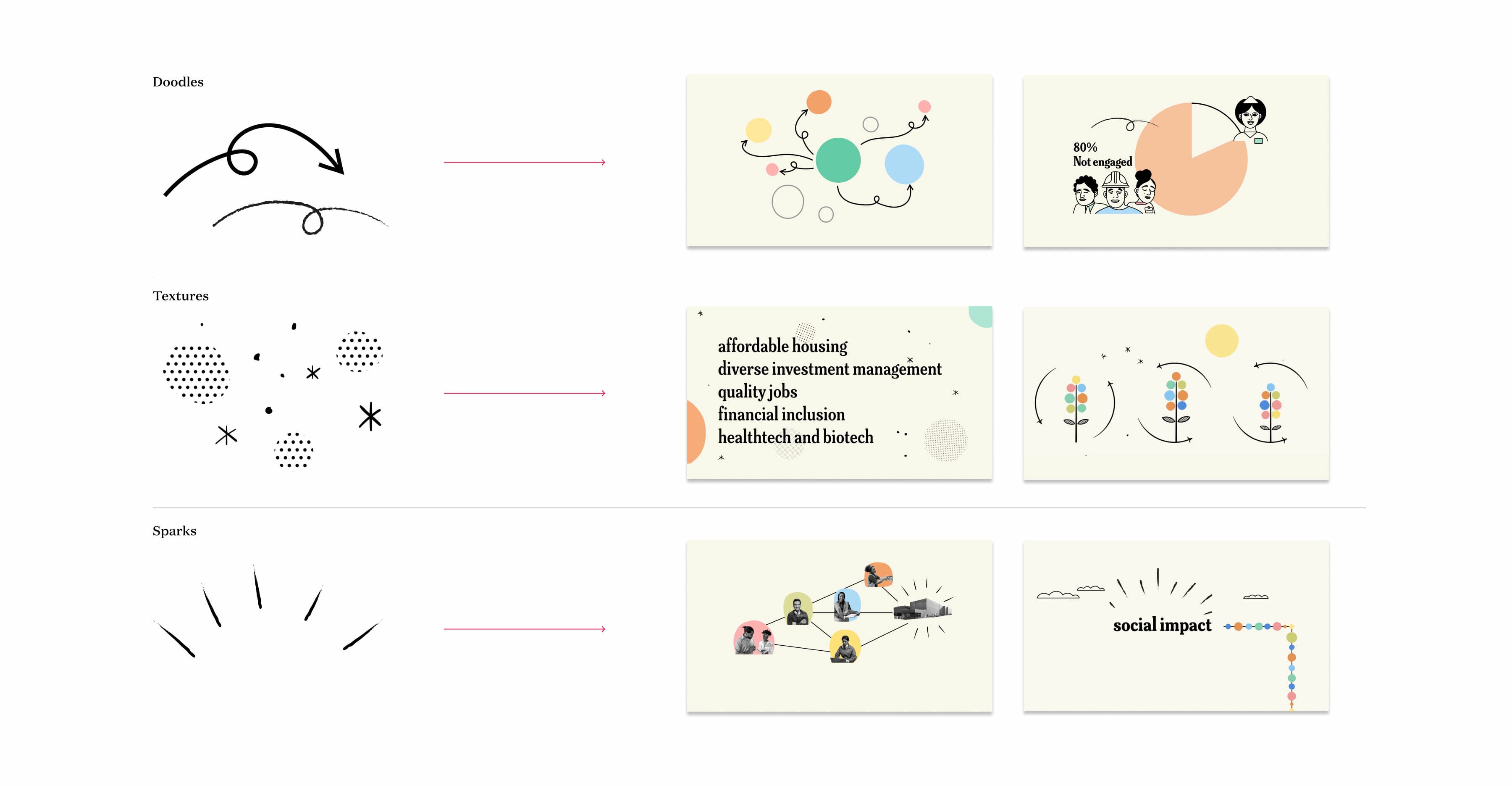
Illustrating the complexities of Ford’s work

Ford uses illustrated explainer videos to explain its complex social justice funding and strategic initiatives. We created a unique illustration style that allows for flexible storytelling spanning between abstract and concrete depictions of the concepts they want to convey and the people affected by them.

The image is divided into three sections. The left section contains close-up line drawings of people. The middle has detailed full-body line drawings of various individuals. The right side shows simple, zoomed-out full-body line drawings of people.
A visual diagram with three rows representing design elements. Row 1 shows a doodle transforming into a whimsical graphic. Row 2 has textures evolving into a text-based image. Row 3 features sparks developing into a layered social impact graphic.
An infographic divided into four sections: Networks (icons and a green "F"), Nature (trees and bushes illustrated), Buildings (outlined drawings of various buildings), and Frames (three framed pictures of diverse individuals using technology).

.
Image showing a grid of slides from multimedia brand guidelines. Slides include sections on typography, color palettes, image usage, mockups, video layouts, and iconography. Various examples and diagrams are displayed throughout the slides.

A multitude of brand applications

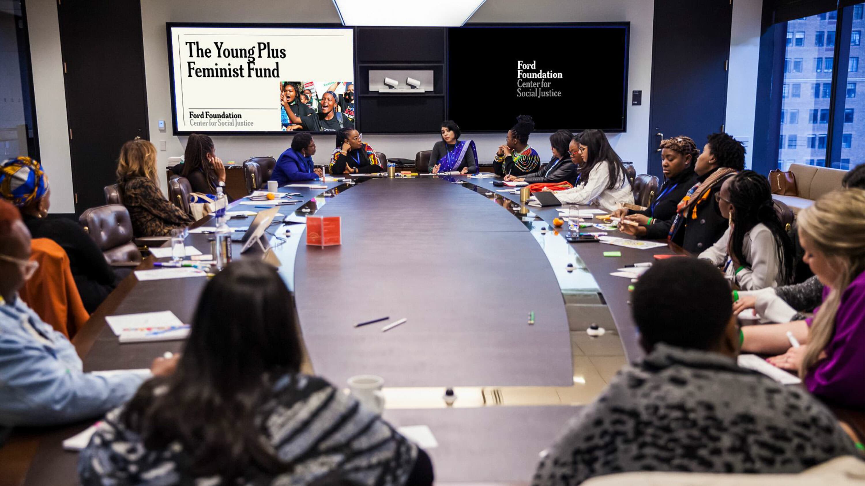
Rolling out a new brand for an institution with hundreds of employees and offices around the world is no small task. From small applications like business cards and letterheads to large ones like office signage and environmental graphics, and from functional applications like maintenance staff uniforms to fun swag for staff, Ford Foundation’s brand has been fully transformed.

Hyperakt was patient and iterative, helping Ford gain confidence in our brand identity, ultimately helping the foundation to connect more deeply with its stakeholders for years to come.
Victor Ng
Creative Director, Ford Foundation
An assortment of marketing materials from the Ford Foundation is displayed, including brochures, a business card, buttons, and a magazine titled "Reimagining a sustainable restaurant industry in New York". They feature a consistent design theme and branding.
A diverse group of people are seated around a large conference table in a modern meeting room. Two large screens display "The Young Plus Feminist Fund" and "Ford Foundation Center for Social Justice." Pens, papers, and laptops are scattered on the table.
A collage of three sections from the Ford Foundation website. The left section contains a letter, the middle section highlights a civil society initiative in the Global South, and the right section advertises a performance titled "Clown Moods" by Black Power Naps.
A person dressed in a blue blazer and striped tie adjusts their collar with one hand, showcasing a silver ring and an "F" badge. Next to them is an ID badge on a black lanyard with a photo and the name "Pat Uttamabol.
Chi-Hui Yang, identified as a Senior Program Officer for JustFilms, stands at a podium with "Ford Foundation" labeled on it. He is speaking with a large screen behind him displaying his name and title in large text.
Text in the image reads, "We believe in the inherent dignity of all people." The text is in large, bold, sans-serif font, with "dignity" in a darker shade. In the bottom left corner, "Ford Foundation" is written in smaller, bold, sans-serif font.

Project Credits

Ready to unlock the potential of your nonprofit's brand?
Reach Out