Work

Percapita

Creating an inclusive financial service brand for the underbanked

A storefront with a blue sign above the door. The sign displays a logo consisting of circular dots arranged in a grid pattern next to the text "percapita" in modern, lowercase white letters. The building exterior is light-colored with large glass windows.

Background

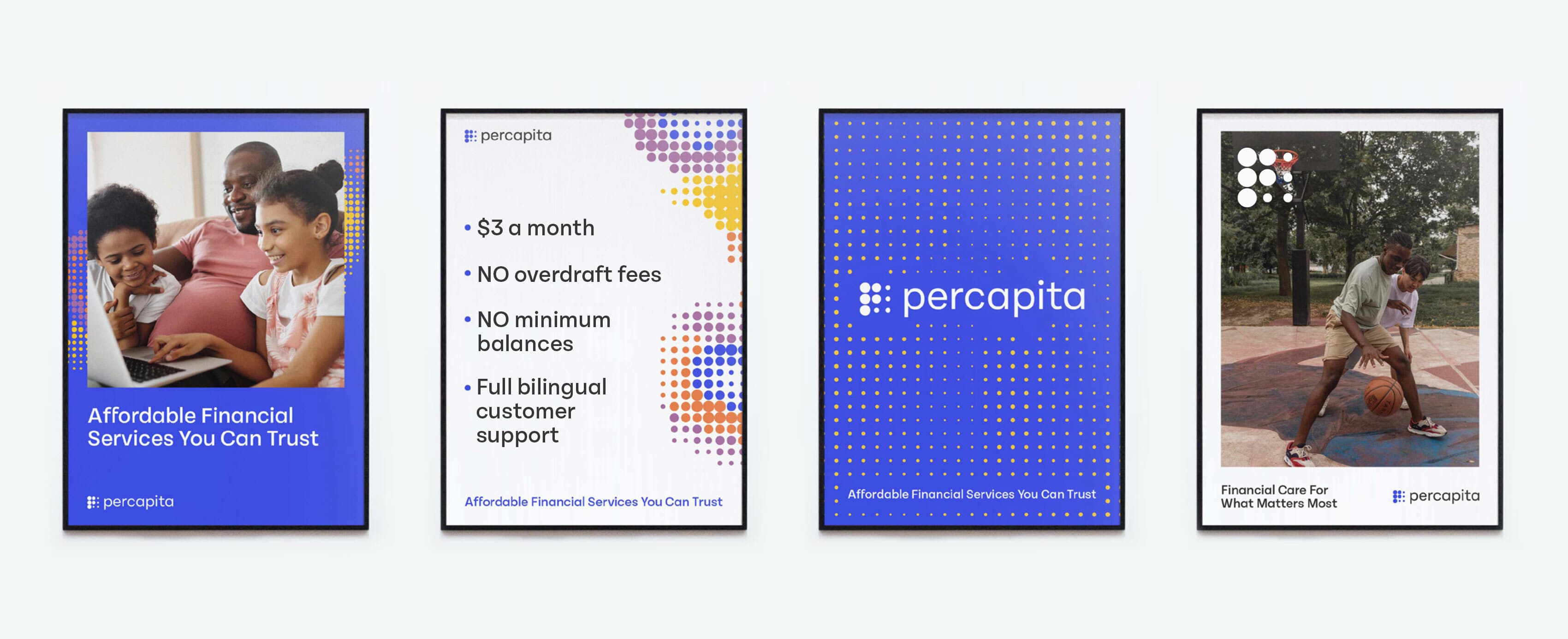
Traditional financial institutions have left many out – with millions in America going unbanked or underbanked. Percapita has set out to change this by establishing basic financial services that are affordable and accessible for all.

Four posters for Percapita, a financial services company. The first shows a family using a tablet, the second lists benefits: low fees, no overdraft, no minimum balance, bilingual support. The third has the Percapita logo, and the fourth shows two people playing basketball.

The challenge

New upstarts were beginning to offer similar services as Percapita. Yet, these institutions lacked Percapita’s vision of truly tackling inequity and distrust in banking. Percapita’s brand had the opportunity to help them cut through the crowd and show the historically underbanked that they were there for them.

An infographic featuring the message "Money is personal. So are we." in large blue text. It includes sections on the left with a mission statement and vision, and on the right, a column listing company values: Transparency, Humility, Compassion, and Personal Relationships.

The opportunity

Percapita sets itself apart from other financial institutions by collaborating with their members – viewing them as competent individuals, not as a market opportunity. Percapita’s brand is built on this unique humanity, compassion and reciprocity.

A blue and a black VISA credit card are overlapping each other on an orange background. Both cards display the card number, the name "Person Name," and an expiration date. The blue card has yellow dots on the right side and the logo "percepita" at the top left corner.
A royal blue T-shirt on a yellow background features the word "percapita" in white lowercase letters centered on the chest. Above the text, there is a logo consisting of nine dots arranged in a 3x3 grid, also in white.
Four pamphlets with colorful covers are arranged on a flat surface. They are labeled: "Planning For Your Financial Future?", "Why Planning Is Important?", "Grow Your Money!", and "Mapping Your Financial Goals." The pamphlets feature dotted and geometric designs.

Designed for each person

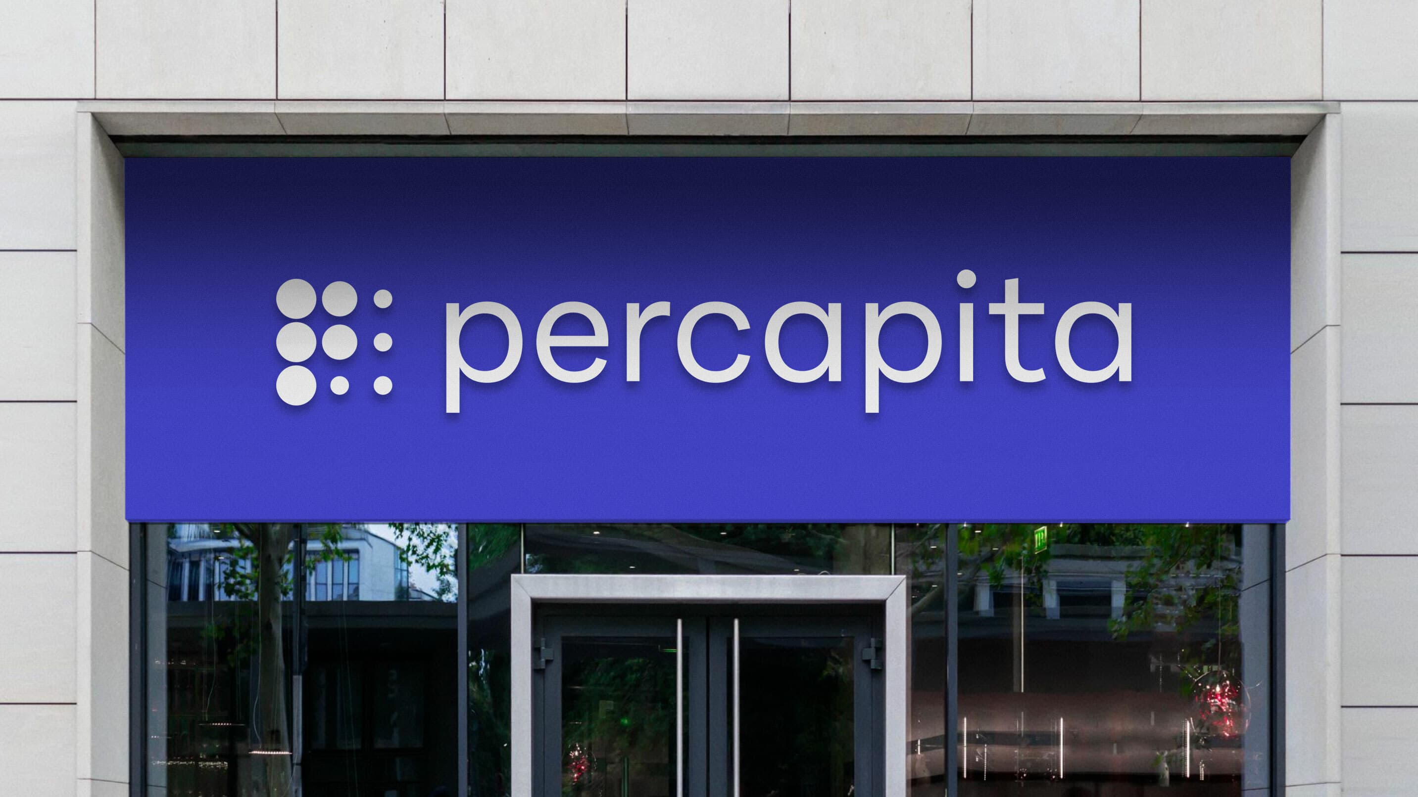
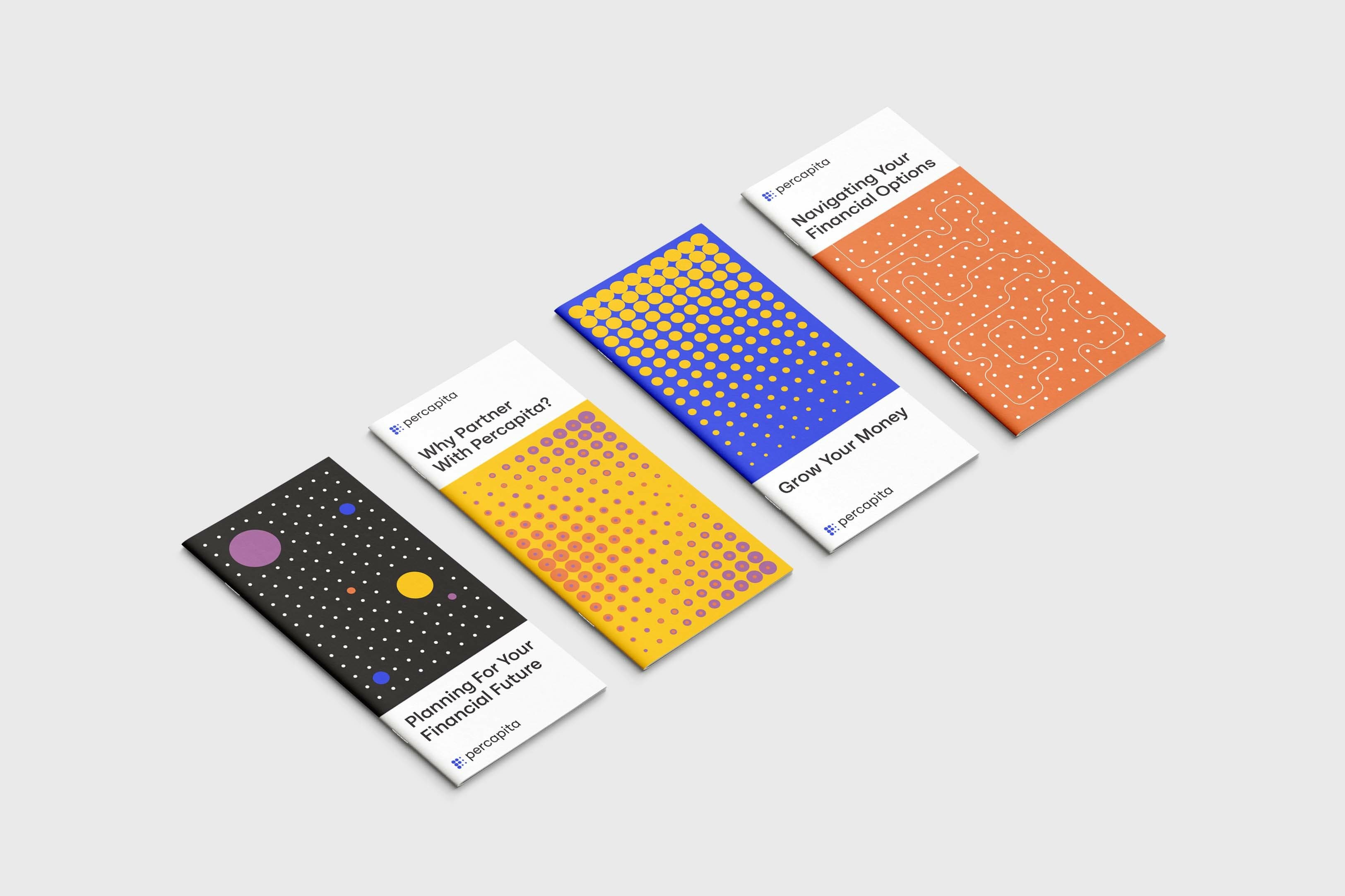
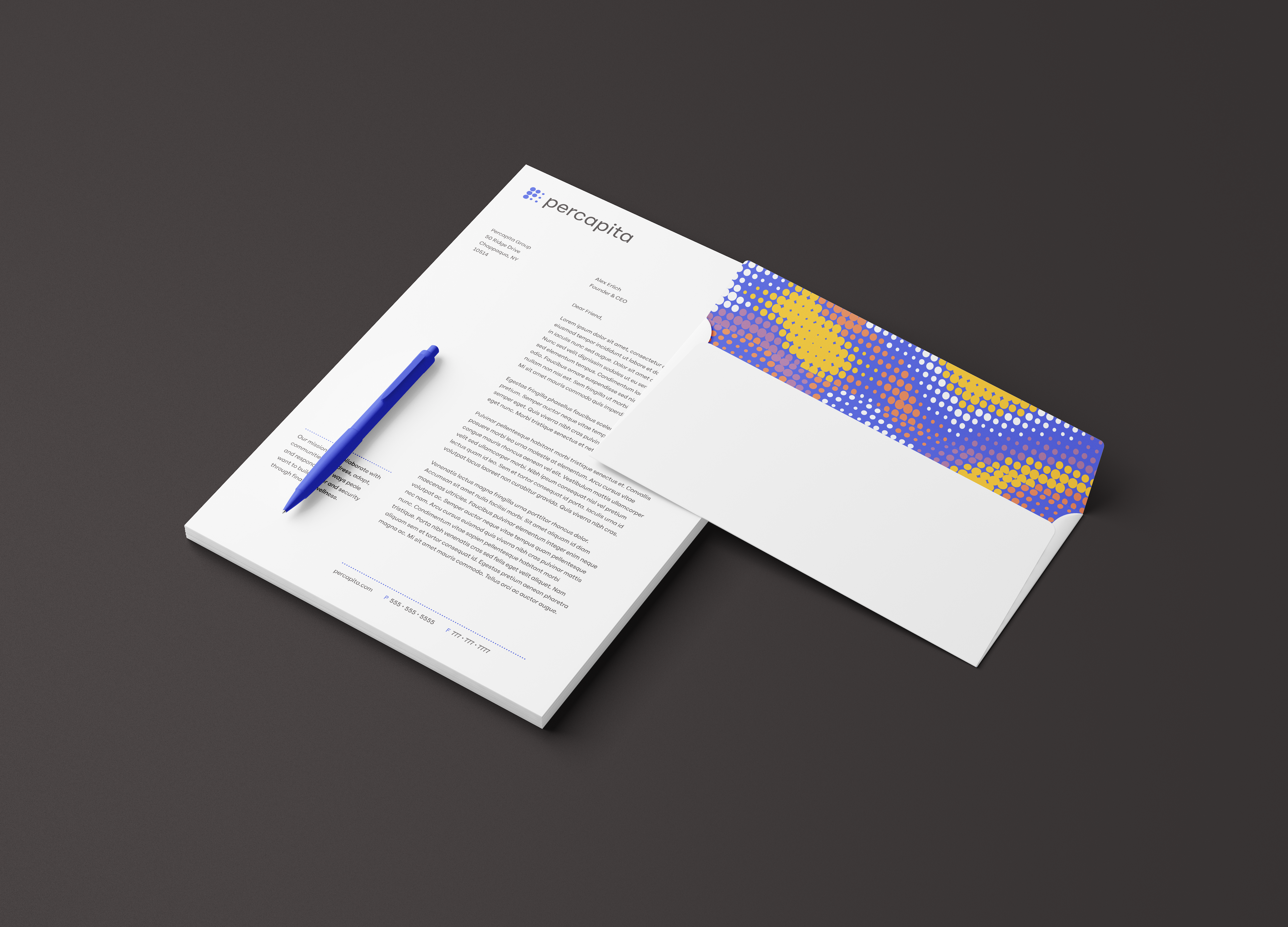
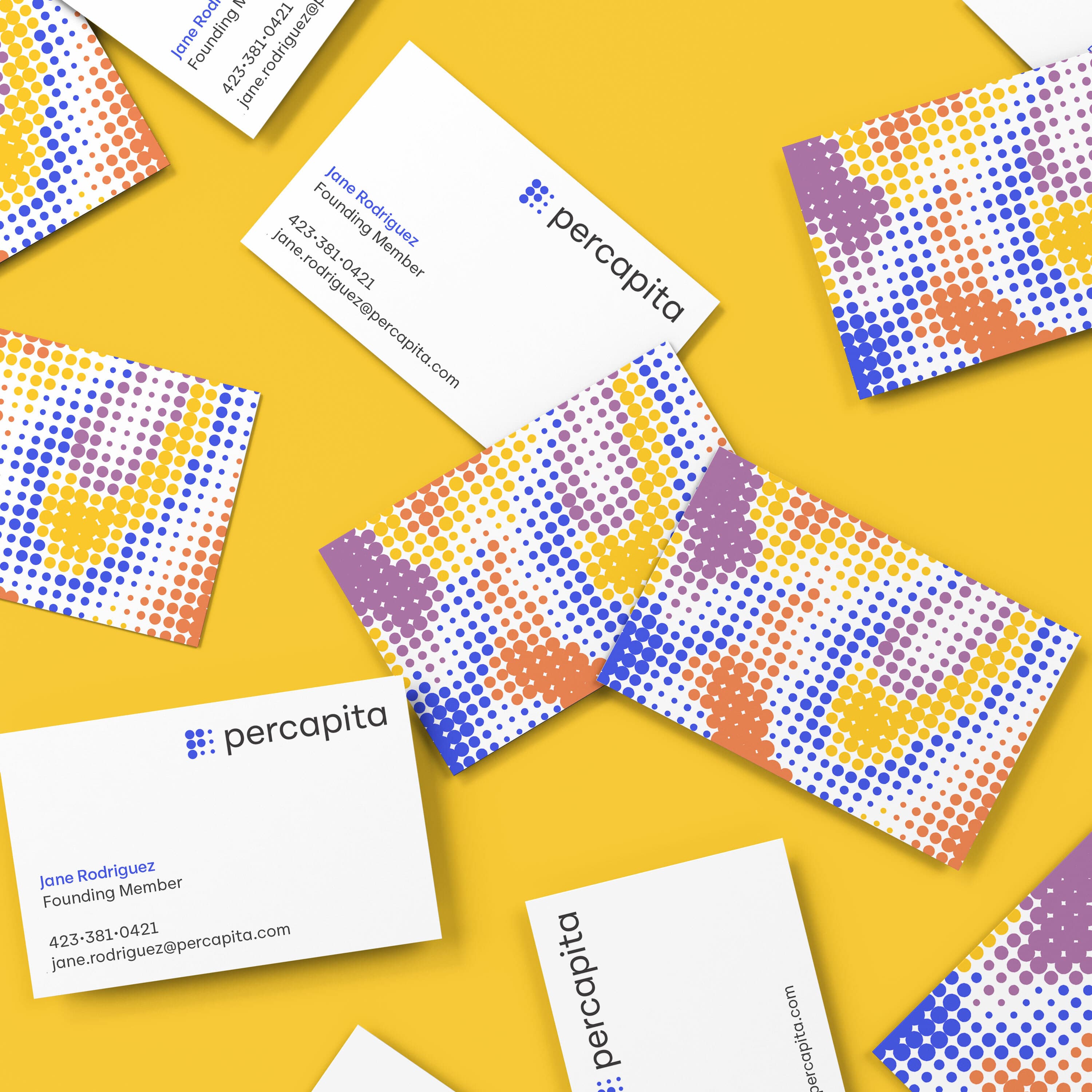
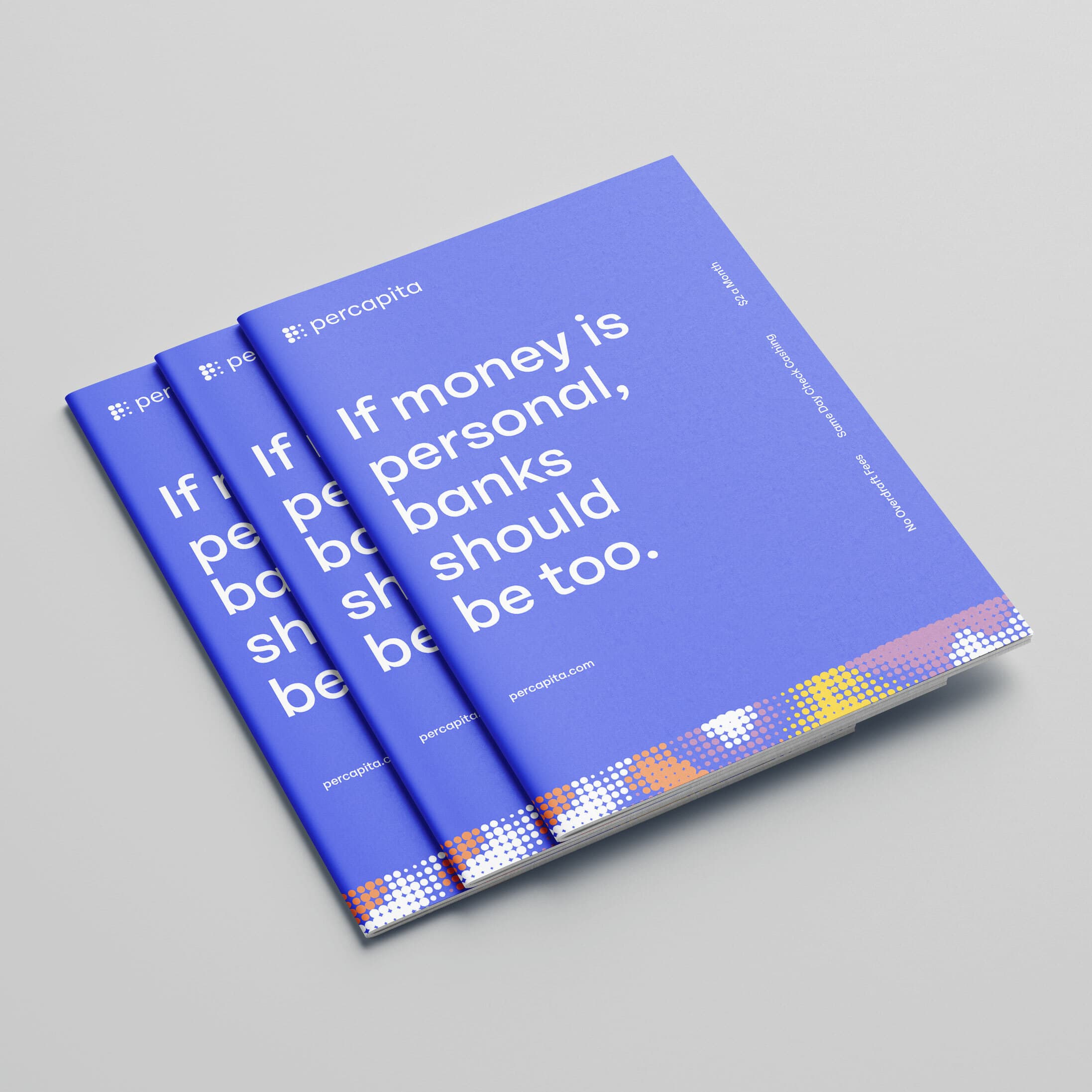
Percapita’s visual identity is rooted in individuality and community. Dots are used to represent each person that together, make up a whole community. Each dot is distinct – acknowledging the uniqueness and importance of lived personal experience and Percapita’s commitment to listen to that experience and support people in their own vision of financial wellness.

Five abstract square designs are displayed in a row, each composed of small, multicolored dots forming diverse patterns. The color palette includes blue, orange, and yellow dots. Below each design is a series of colored dots as a key, explaining the colors used.

A pointed identity

This identity is inspired from post-impressionist art, pointillism, ceramic mosaics, and the cosmos —all visuals that hold the macro and the micro in equal balance and suggest the limitless and iterative possibility that true financial wellness can bring.

A tote bag with a colorful pixelated design in yellow, blue, purple, and white dots on an orange background. The bag has blue handles and the brand name "percapita" is printed in white at the bottom right corner.

A dynamic logo

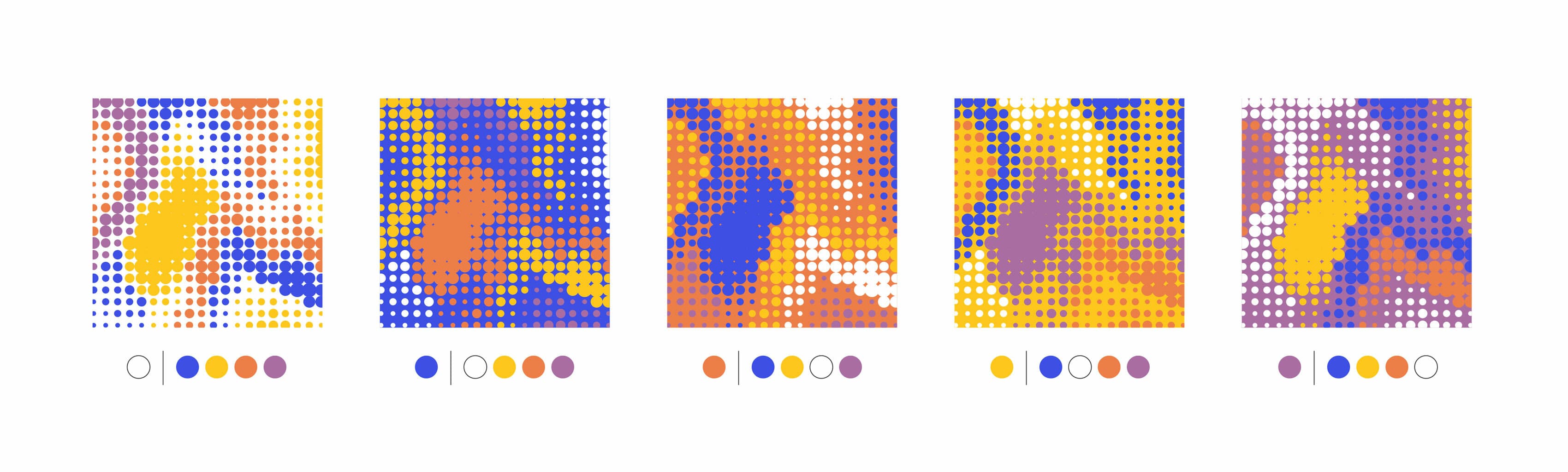
Percapita’s logomark builds on this micro and macro idea. Five of the circles are in the process of growing, increasing in size from right to left, ultimately creating the letterform “P” within the grid of dots.This movement suggests the gathering of many into one—individuals into community with one another. The four remaining circles reduce in size—suggesting a focus on the individual and the personal. In totality—the Percapita icon captures the dynamic and essential relationship of the individual to the community, the part to the whole.

A blue background with the text "percapita" written in white. To the left of the text, there is a design consisting of nine white dots arranged in a 3x3 grid pattern.
Percápita logo featuring a modern, black sans-serif font on a bright yellow background. To the left of the text, there is a grid of nine black dots arranged in a 3x3 square pattern.
A logo on a dark gray background featuring a grid of nine white dots forming a square on the left and the word "percapita" in white, modern, lowercase letters on the right.
The image features the logo of "percapita" on a purple background. The logo includes the name "percapita" written in white lowercase letters and a design to the left consisting of nine white dots arranged in a 3x3 grid pattern.
Scattered business cards on a yellow background. The cards feature a colorful dot pattern in purple, yellow, and red on one side, and text details on the other. Key information includes a name, position, phone number, and email address, alongside a logo with "percapita.
A set of three identical brochures are fanned out on a white surface. The cover image shows a man holding a basketball, standing outdoors with a cityscape in the background. The text on the brochure cover reads, "Affordable Financial Services You Can Trust" followed by a logo and the word "percapita.

A sense of motion

When the dots are in motion, they have the ability to grow and converge—building visual density in a way that mirrors how individuals build power and support—together.

Three blue booklets with the title “If money is personal, banks should be too” are stacked on a light grey surface. The booklets have the company name "percopita" in the top left corner and a design with white, orange, and yellow squares at the bottom.
Two annual reports from "percapita" lie on a white marble surface. The top report, for 2021-2022, features a smiling person in a knitted sweater with colorful pom-poms. The bottom report shows a person reading with a child, both looking content.
A smartphone displaying apps such as Phone, Mail, Safari, Maps, Audible, Music, and Messages on the home screen. To the left of the smartphone is the Percapita logo on a blue background, consisting of nine white circles arranged in a square grid. The background is yellow.

Cohesive iconography

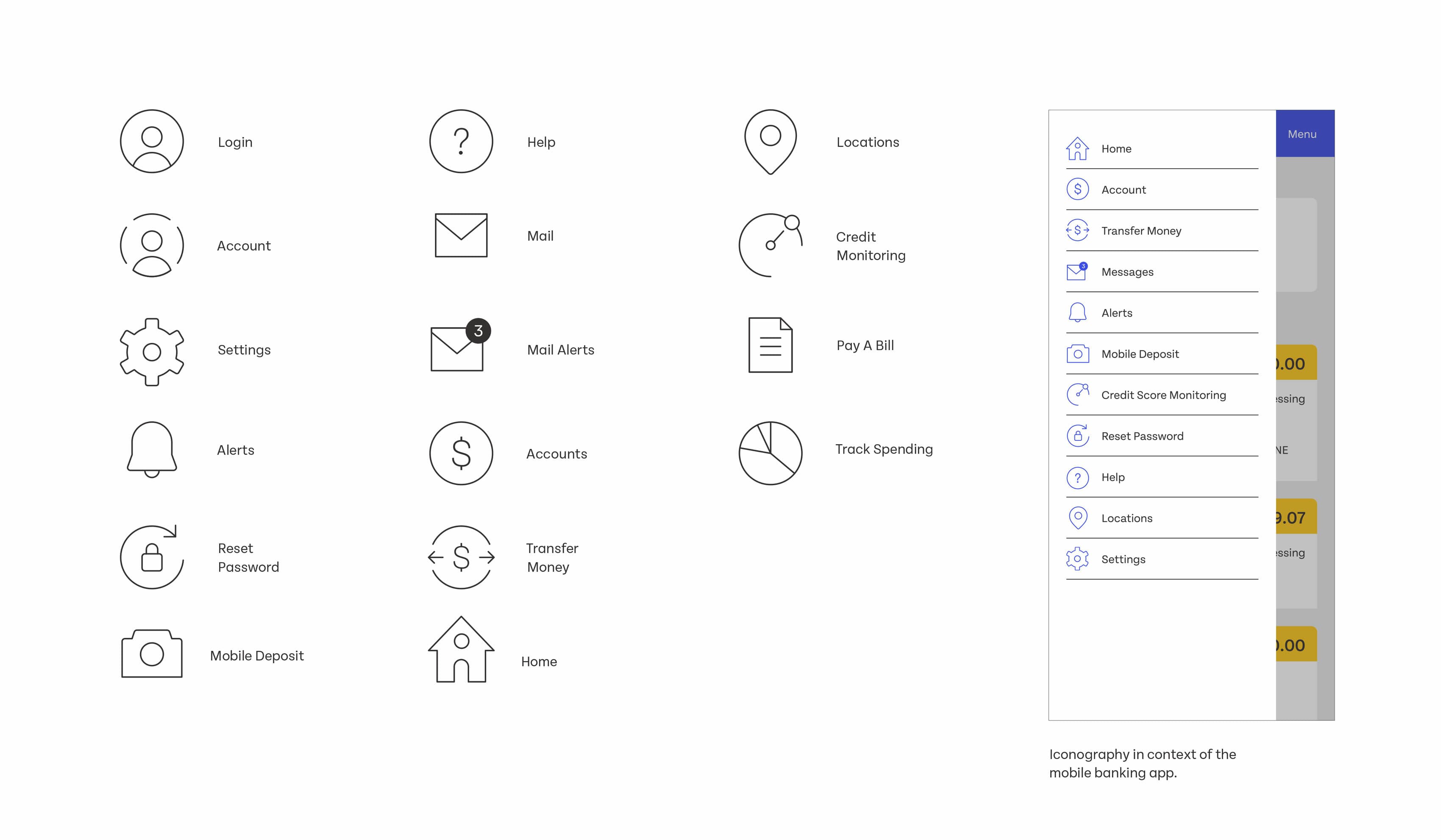
In designing Percapita's iconography, the emphasis on simplicity and clarity led to minimalist icons with consistent "holding shapes" and uniform negative space. Using a standard artboard size and the Tenon Sans typeface for any text elements ensured that the icons were both cohesive and web-ready, providing a seamless user experience across the platform.

A grid showcases various icons, including login, account, settings, alerts, reset password, mobile deposit, help, mail alerts, accounts, transfer money, home, locations, credit monitoring, pay a bill, and track spending. A sidebar menu lists similar icons.
A series of three Instagram posts on a dark background. The first post features a blue grid with text on the left about job openings. The second post shows two men at a barbershop. The third post features a yellow background with a quote: "If money is personal, banks should be too.

Project Credits

Ready to unlock the potential of your nonprofit's brand?
Reach Out