Work

Pete for America

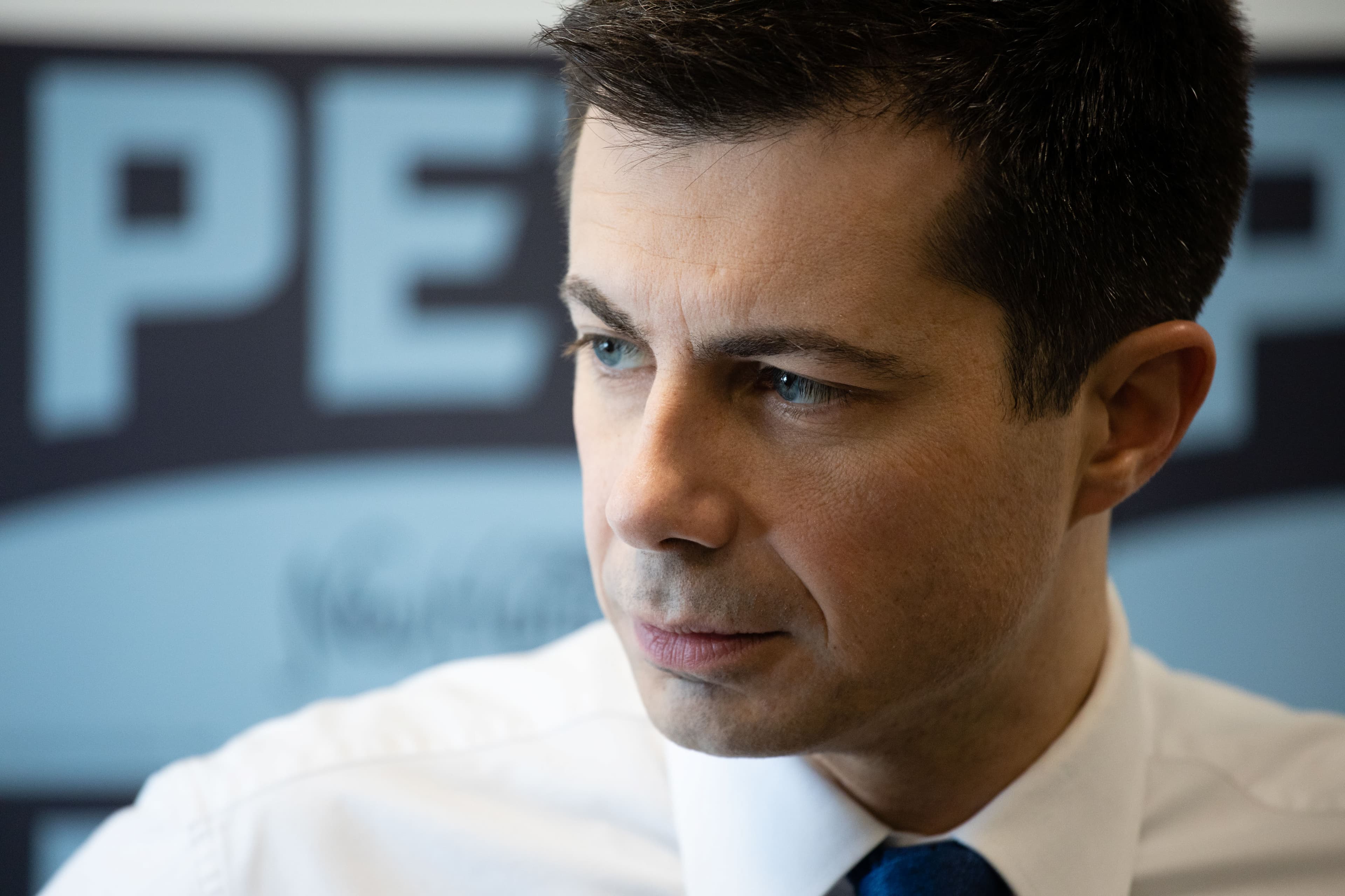
2020 Democratic presidential candidate Pete Buttigieg was uniquely positioned to bridge the divides tearing the country apart.

A speaker stands on a stage addressing a large, enthusiastic crowd in a warehouse. Attendees hold up American flags and signs that read "PETE 2020." Several media cameras are set up, recording the event. The atmosphere is lively with patriotic symbols prominently displayed.

Background

For the last century, presidential campaigns have relied almost exclusively on red, white, and blue. This election presented a different opportunity. Several candidates, primarily the women in the race, leveraged their personal identity to drive their visual brand. Pete’s fresh vision for the future of America called on us to reimagine what was possible in presidential campaign branding.

The Opportunity

With a trail-blazing candidate ready to rise from virtual unknown to nationally recognized, Pete’s brand worked as a narrative storytelling vehicle. We intentionally crafted every aspect of the brand to reveal something about Pete. From his accessible intellectualism, to his roots and life in a small Midwestern rust belt city, to his military background and love of sports, Pete’s story was quintessentially American.

Our challenge was to get it done in the 11 days we had from project kickoff to presenting for Pete Buttigieg and his core campaign team.

The minute I saw that GIF of the Jefferson Boulevard Bridge I knew that some real experts were involved.
Michael Bierut
Partner, Pentagram
A night view of a bridge illuminated with vibrant blue and purple lights, reflecting off the calm water below. Trees and buildings can be seen in the background, and additional light sources create a colorful and serene ambiance.

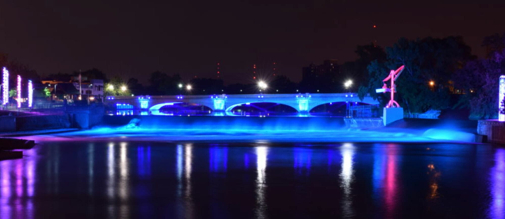
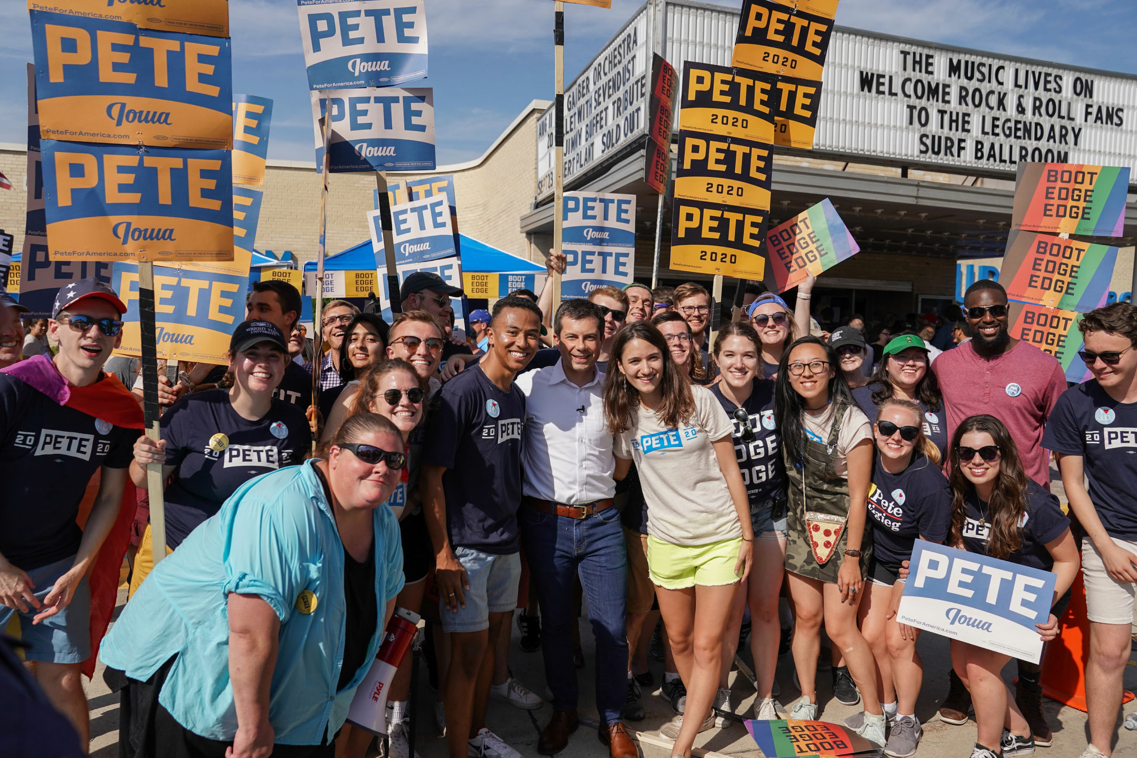
Photo Credit: Lydia King

A tale of bridging divides

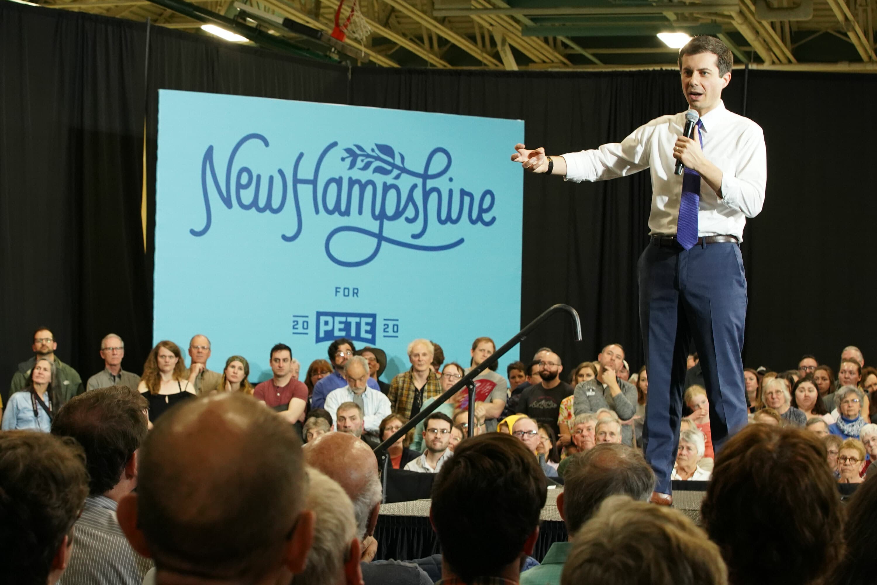
South Bend’s Jefferson Blvd. Bridge is a local landmark that connects the city’s past and present. It is over 120 years old, but the interactive light sculpture that illuminates it at night is a symbol of the city’s reinvention. As a mayor and presidential candidate, Pete has been adept at bridging the divides between blue collar and white collar, between heartland conservatives and coastal progressives, between millennials and baby boomers, between the past and the future. In a time of great division, we wanted to highlight his strength as a unifier. The metaphor of the bridge, grounded in the arc of the Jefferson Blvd Bridge is the heart of our brand story.

A crowd of people holding up signs reading "PETE 2020" at a rally. The background features American flags and a large banner with "PETE" and "2020" visible. The atmosphere suggests a political campaign event.
A man stands at a podium on a stage, speaking to a crowd holding small American flags and signs with "PETE" on them. Behind the speaker, an American flag and "PETE 2020" signs are displayed. The location appears to be an indoor event space with exposed beams.
Without a doubt, this is the best Presidential candidate campaign this time around ... and I would say possibly ranks among the best ever.
Armin Vit
Co-Founder & Critic, Brand New
A diverse group of supporters is shown at a political rally. One person holds a sign reading "Nevada for Pete 2020," while another holds a "Pete 20" campaign sign. A person in the background holds a flag with pastel blue, pink, and white stripes.
Close-up of a man with short dark hair, wearing a white shirt and blue tie, looking intently to the side. The background features a blurred sign with large text.

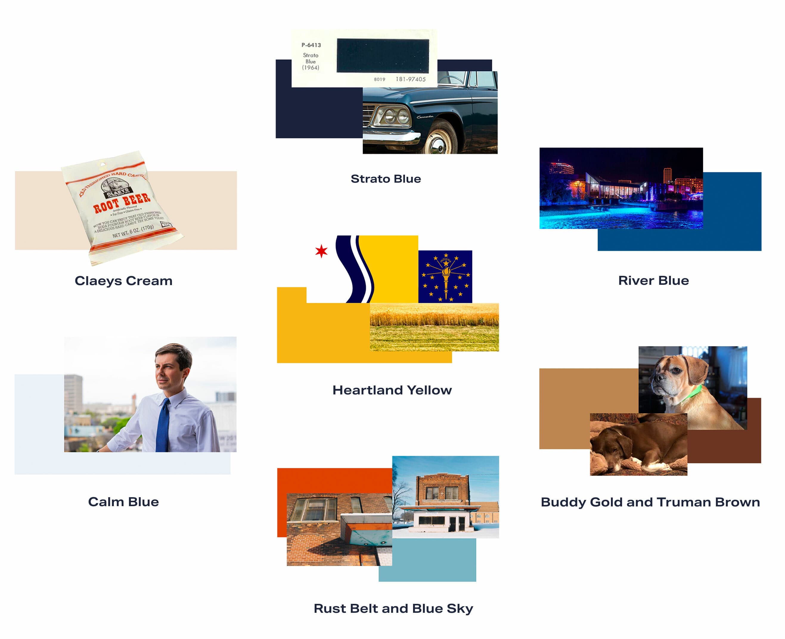
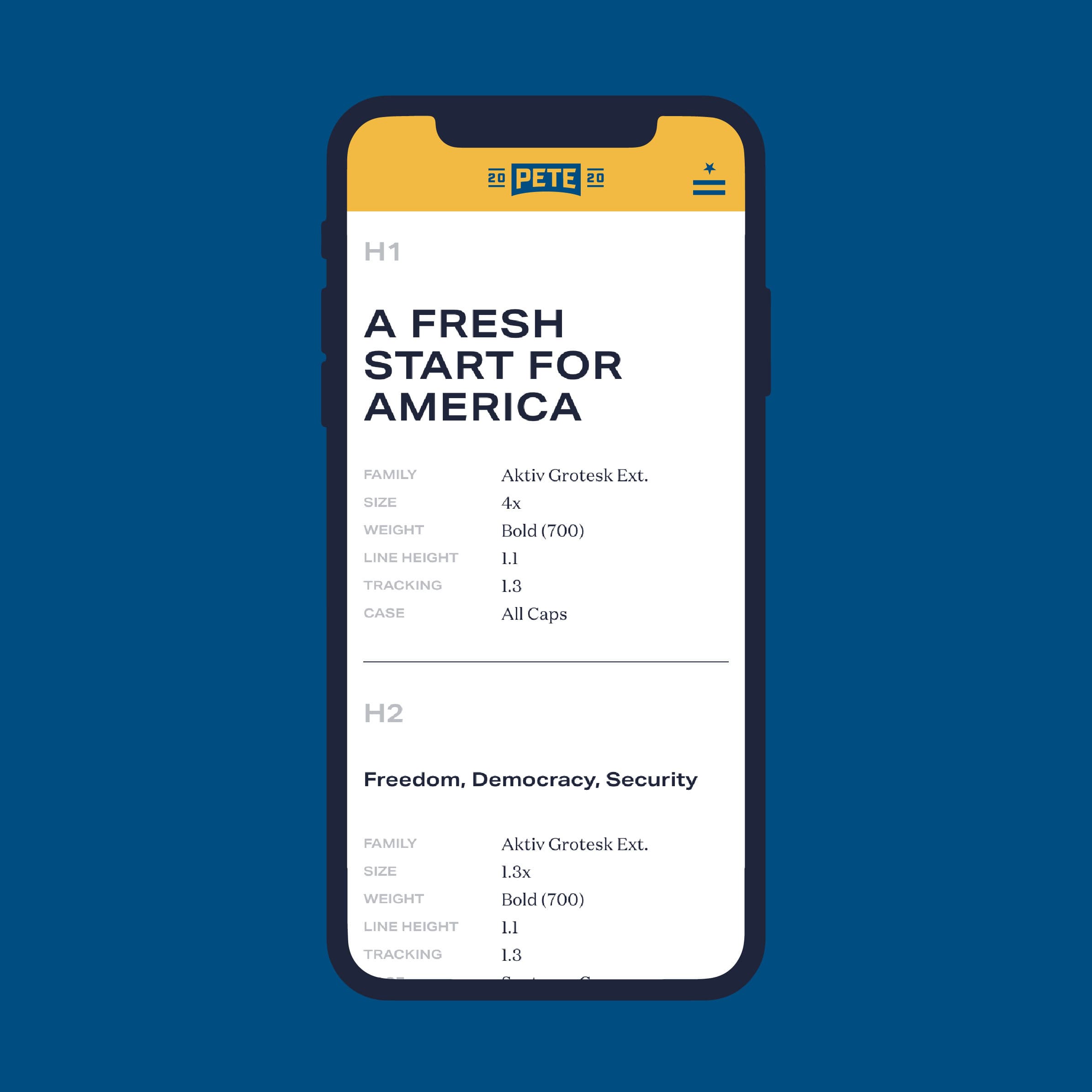
A truly personal color story

Our color palette includes 9 colors rooted in Pete’s perspective of a heartland city. The colors are intentionally evocative of the America Pete has lived in most of his life, with color names that pay tribute to South Bend's history, local lore or landscape.

A collage features color swatches paired with images for visual association. Swatches include Strato Blue, River Blue, Heartland Yellow, Claeys Cream, Calm Blue, Buddy Gold and Truman Brown, and Rust Belt and Blue Sky.
The color palette is excellent, avoiding the traditional red-white-and-blue in favor of a set of colors that manage to look both warm and fuzzy but also industrial.
Armin Vit
Co-Founder & Critic, Brand New

Making it memorable

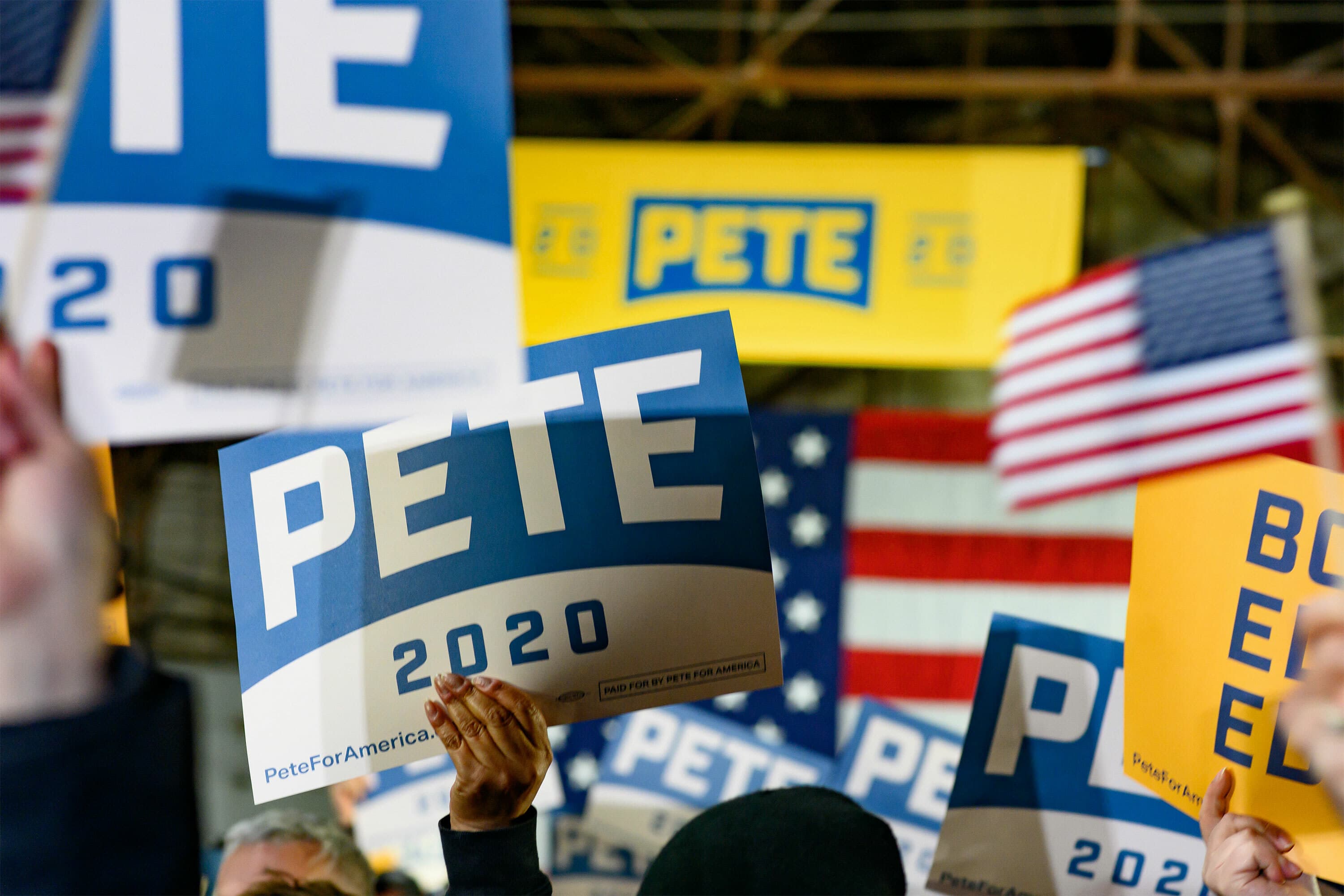
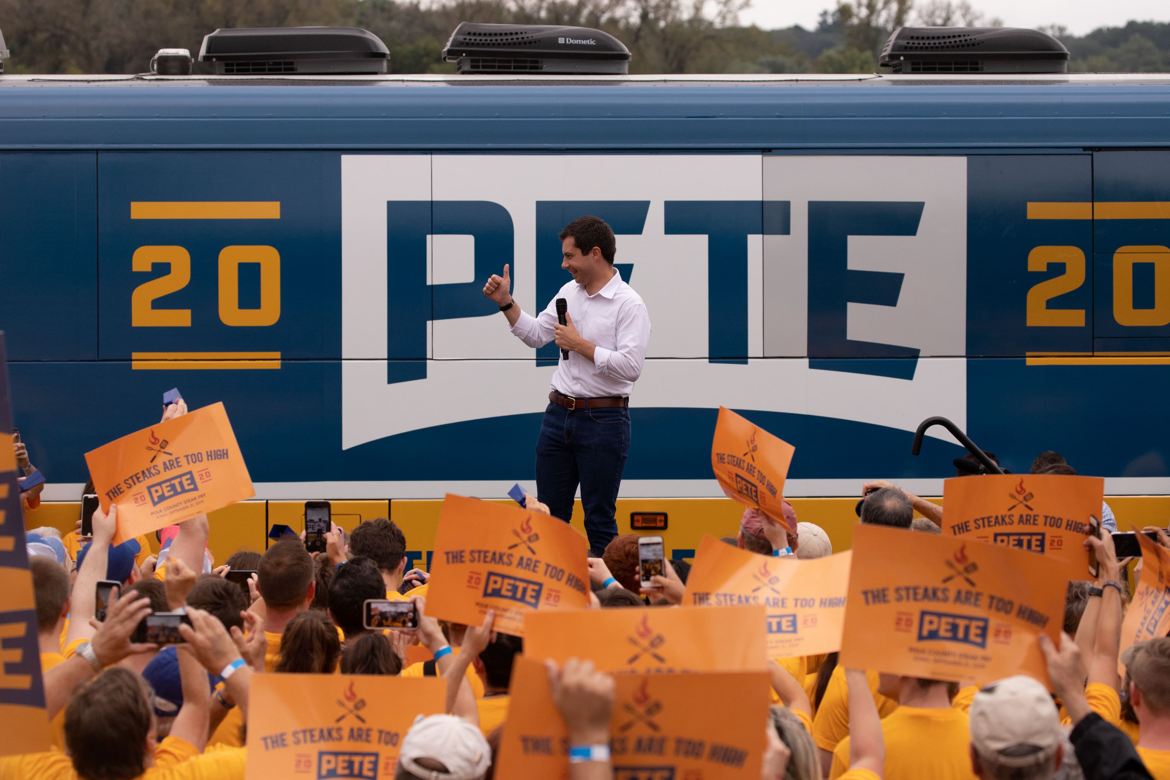
The brand, and the way it was made accessible to the public, played an important role in cementing Pete’s story at a time when he was attracting more and more attention on the campaign trail. But Pete isn’t just a one-name guy. Early on in his bid, people had trouble pronouncing his last name. We turned his three-syllable Maltese surname into an asset and a rallying cry, using the phonetic spelling of his last name prominently—and almost completely foregoing the harder to read version of his last name in the brand.

A crowd holds up a yellow sign reading "BOOT EDGE EDGE" at a political rally. Other signs are partially visible, including one with "2020" and American flag patterns. The atmosphere is lively and energetic.
The last-name logo easily translates into a campaign trail chant that many sports teams would kill to have.
Armin Vit
Co-Founder & Critic, Brand New

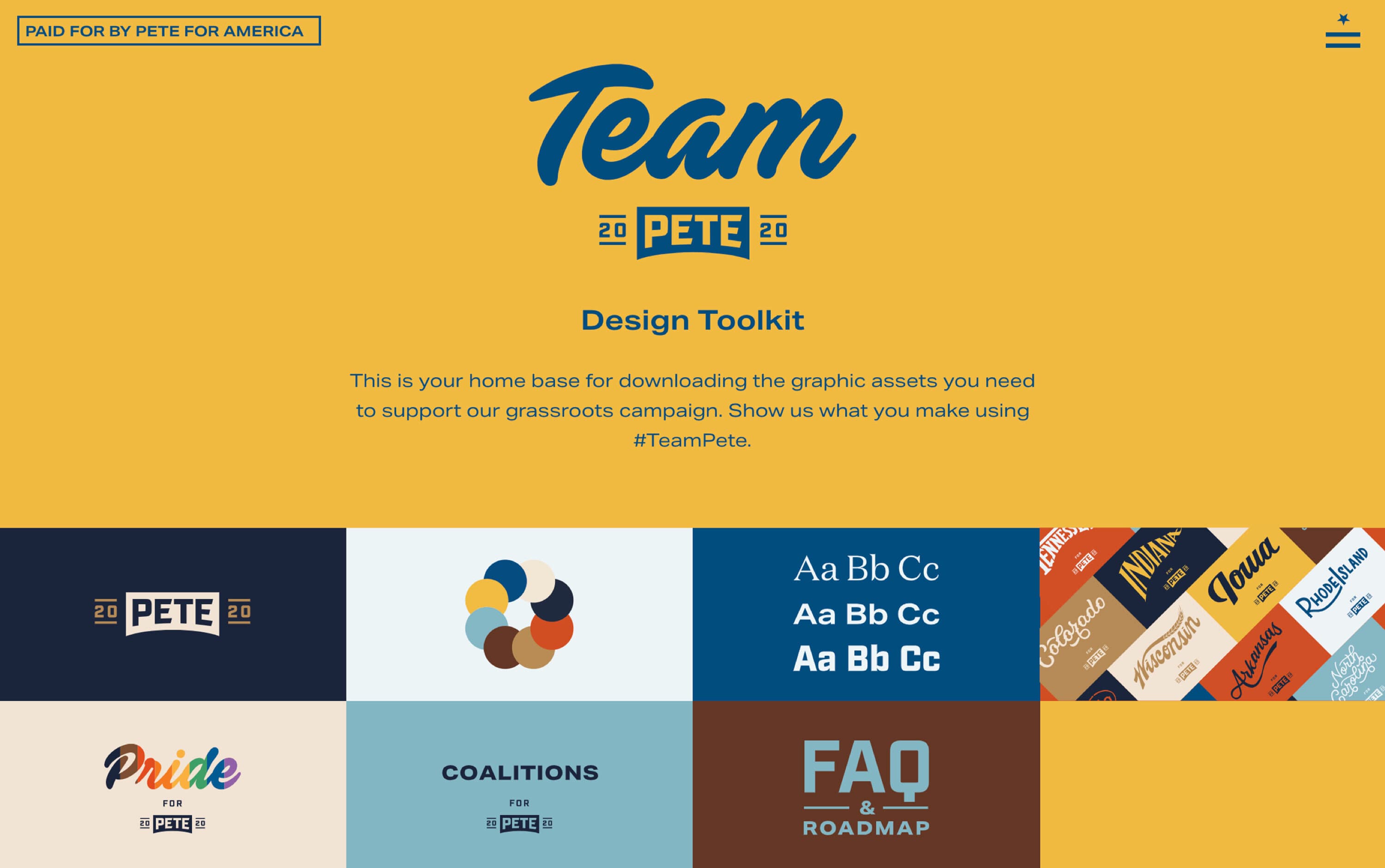
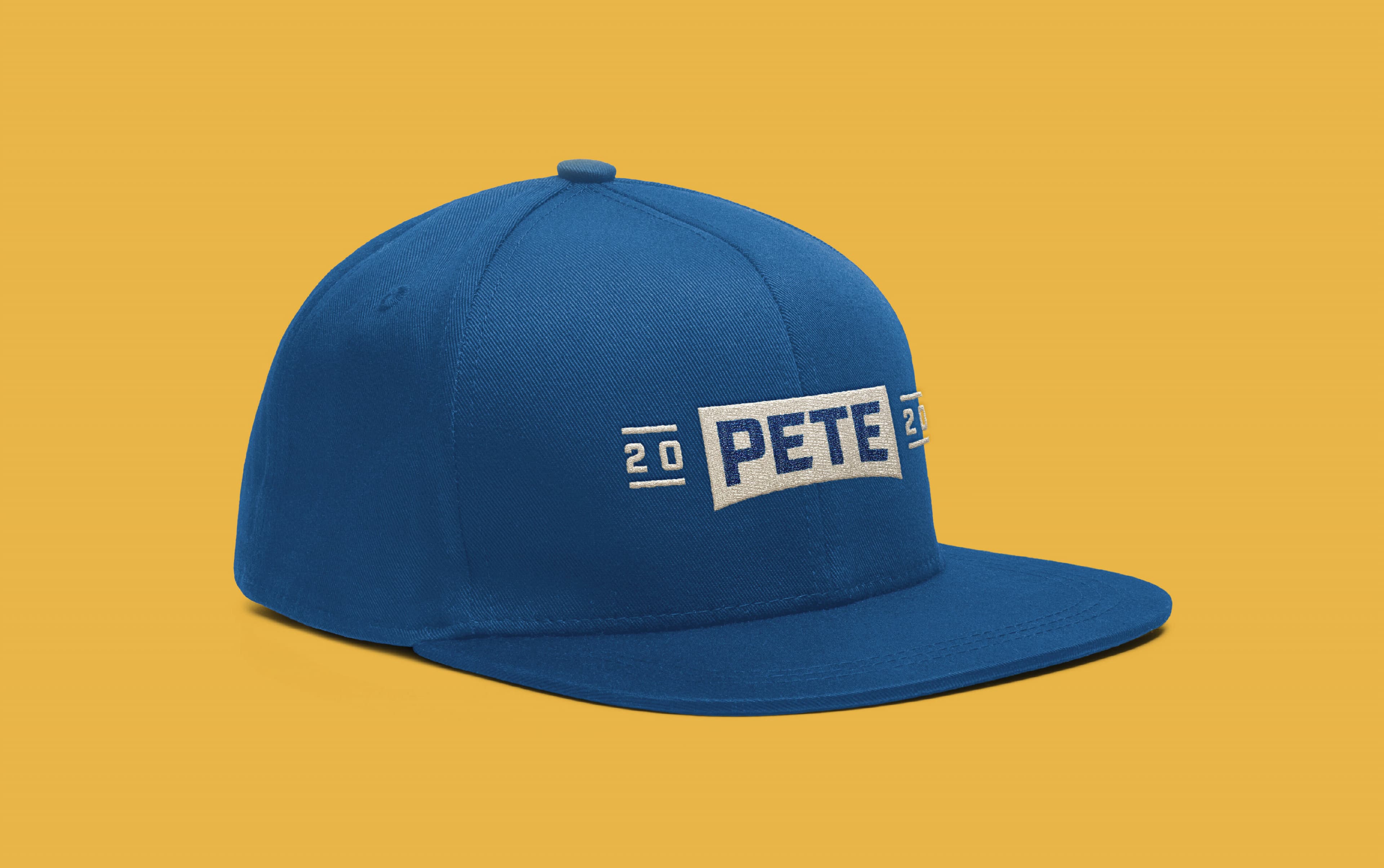
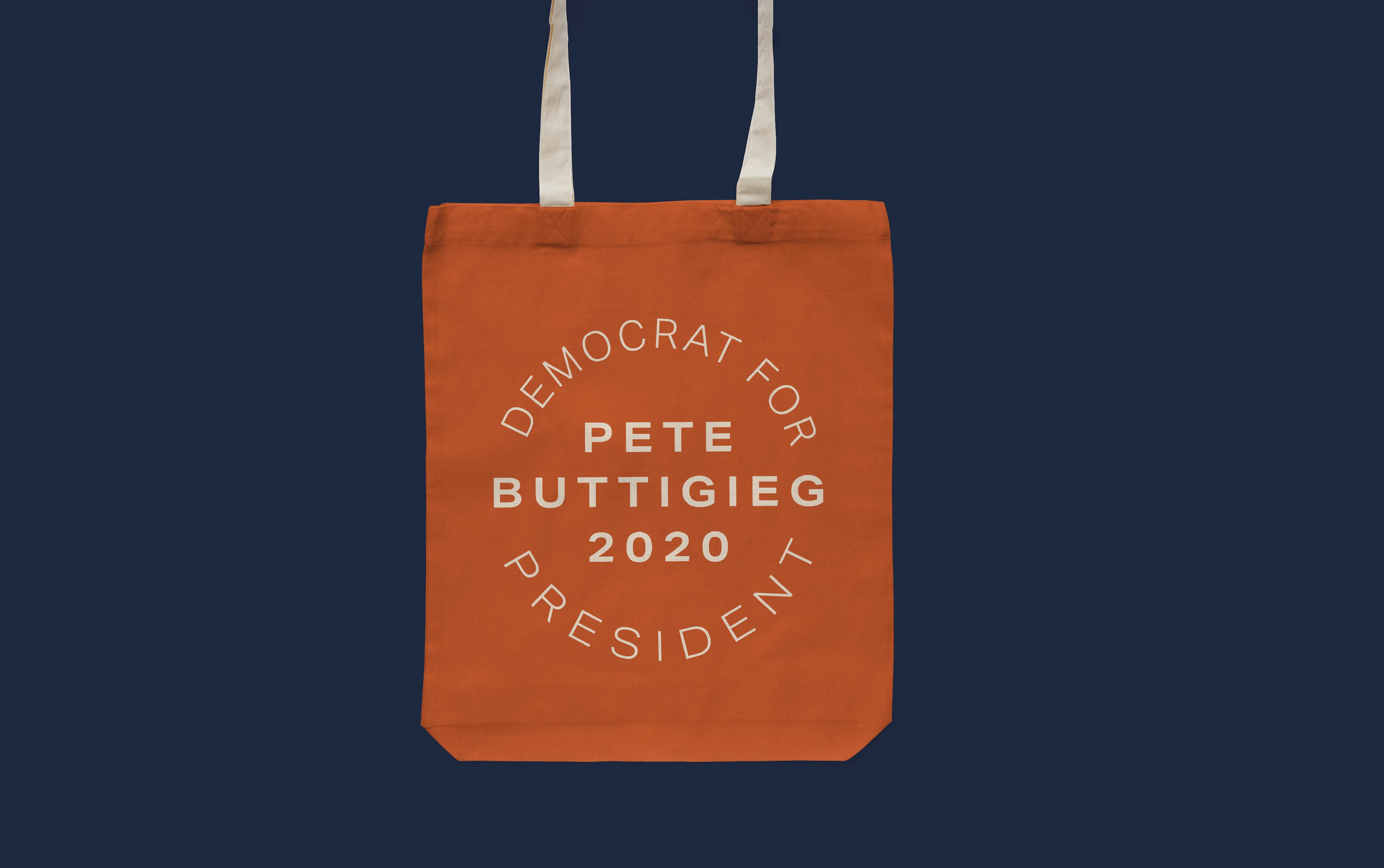
The most democratic brand in presidential campaign history

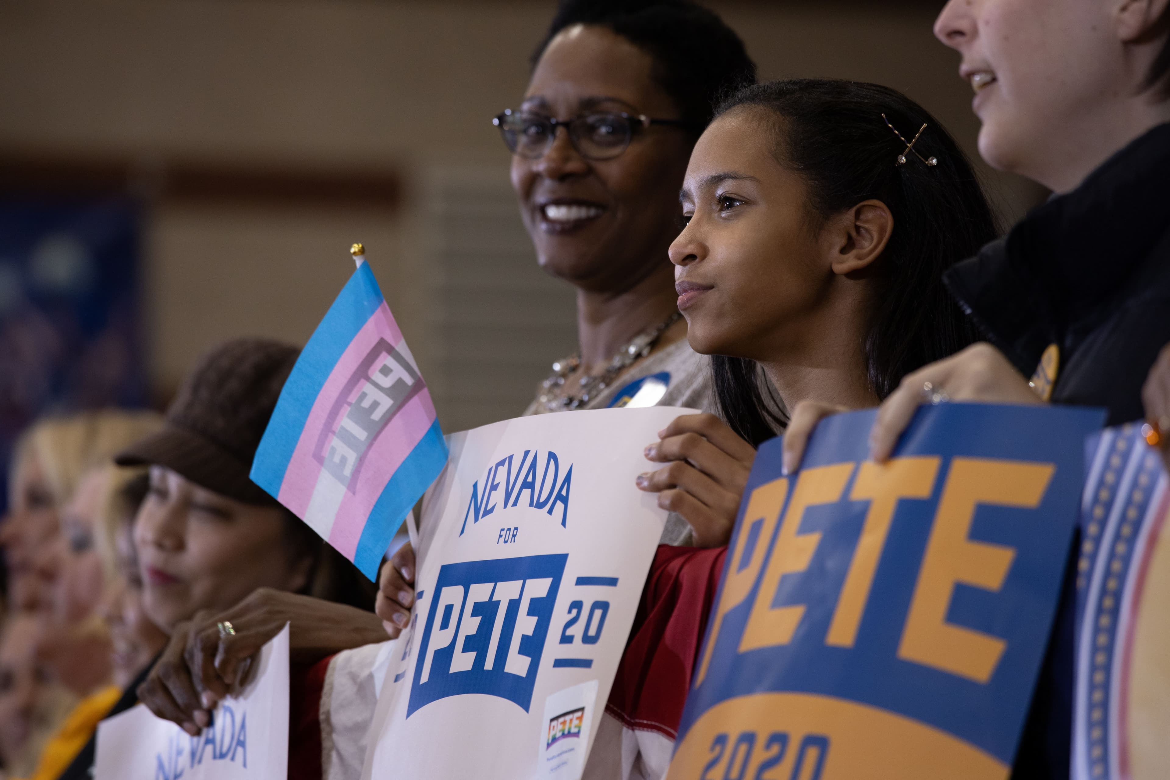
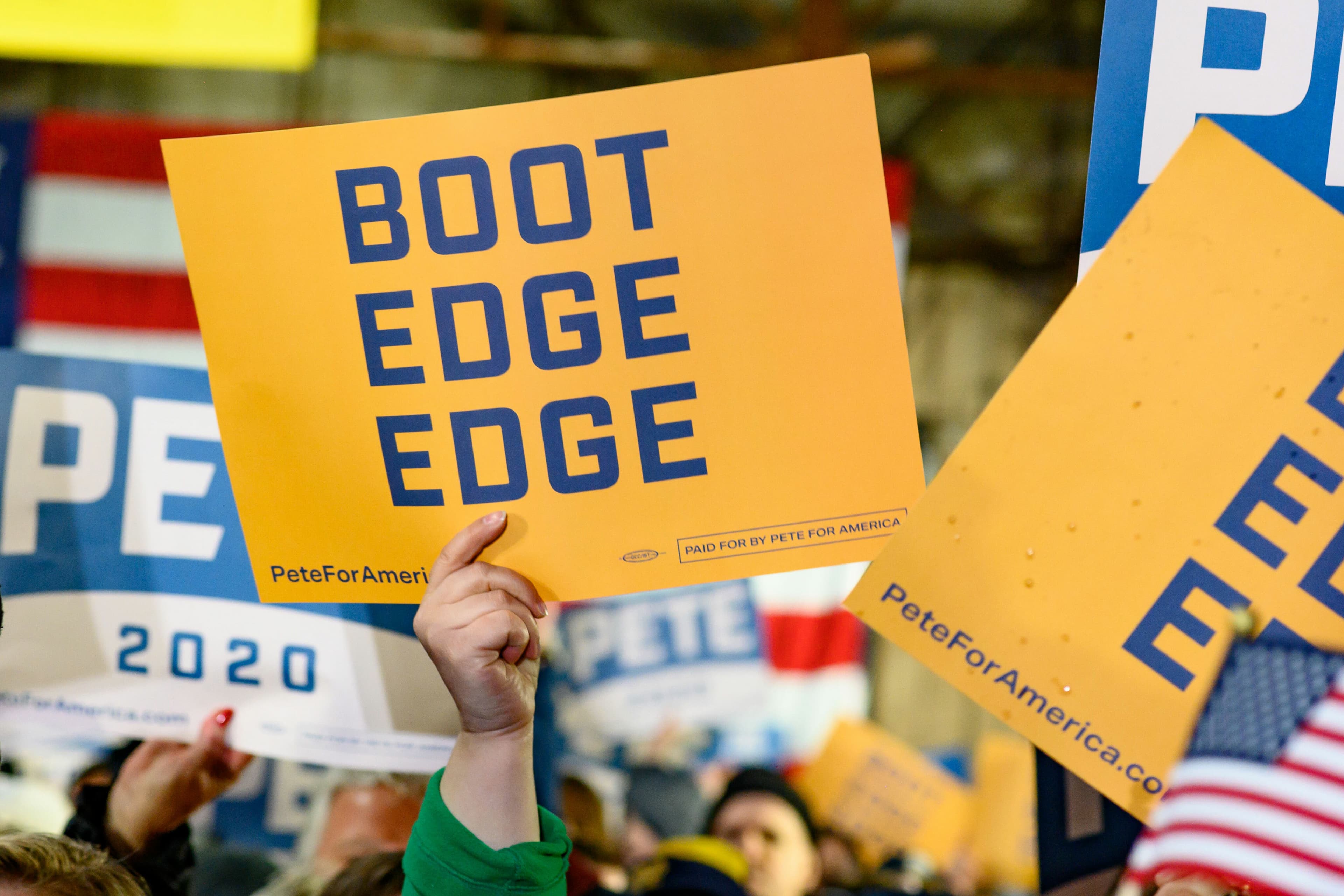
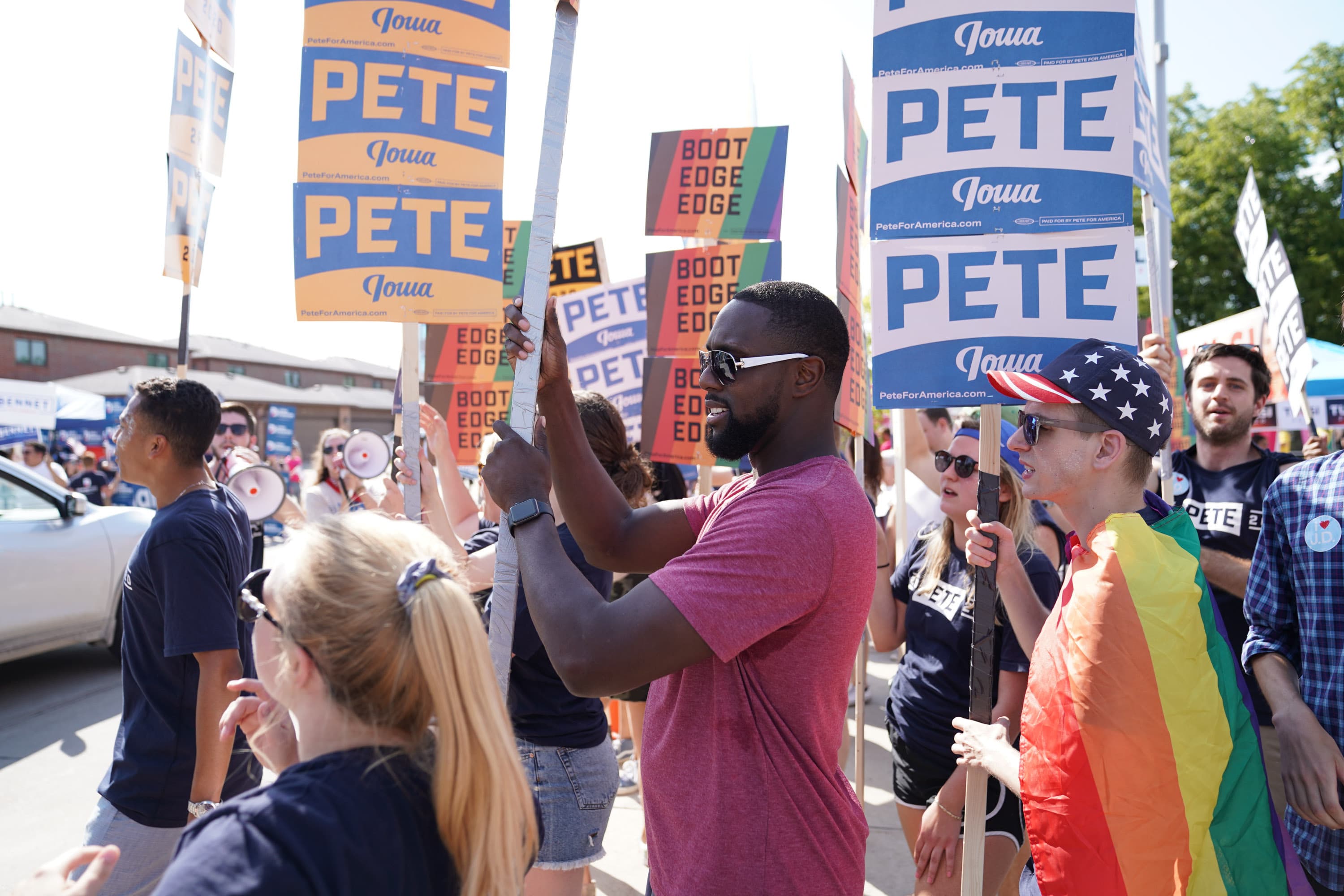
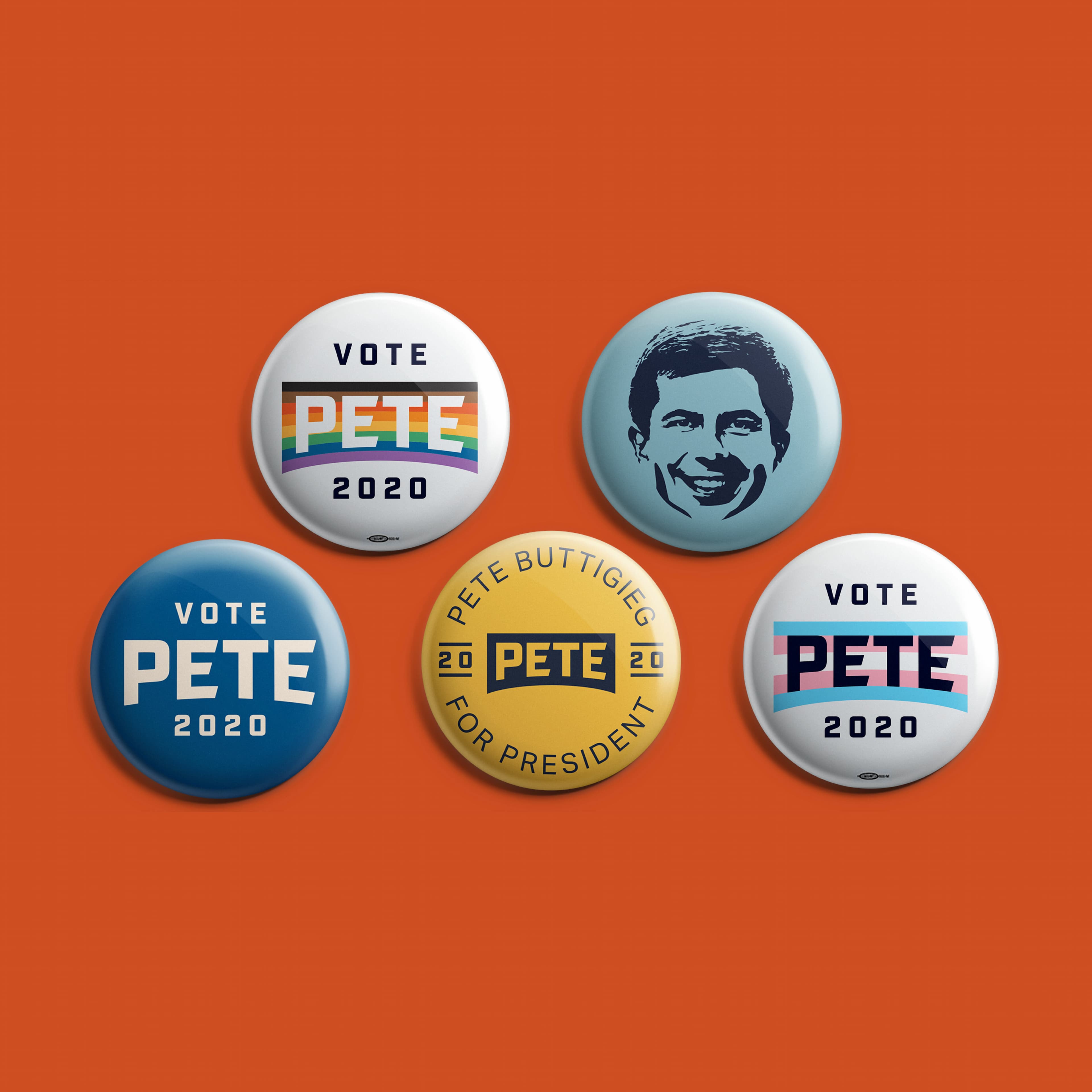
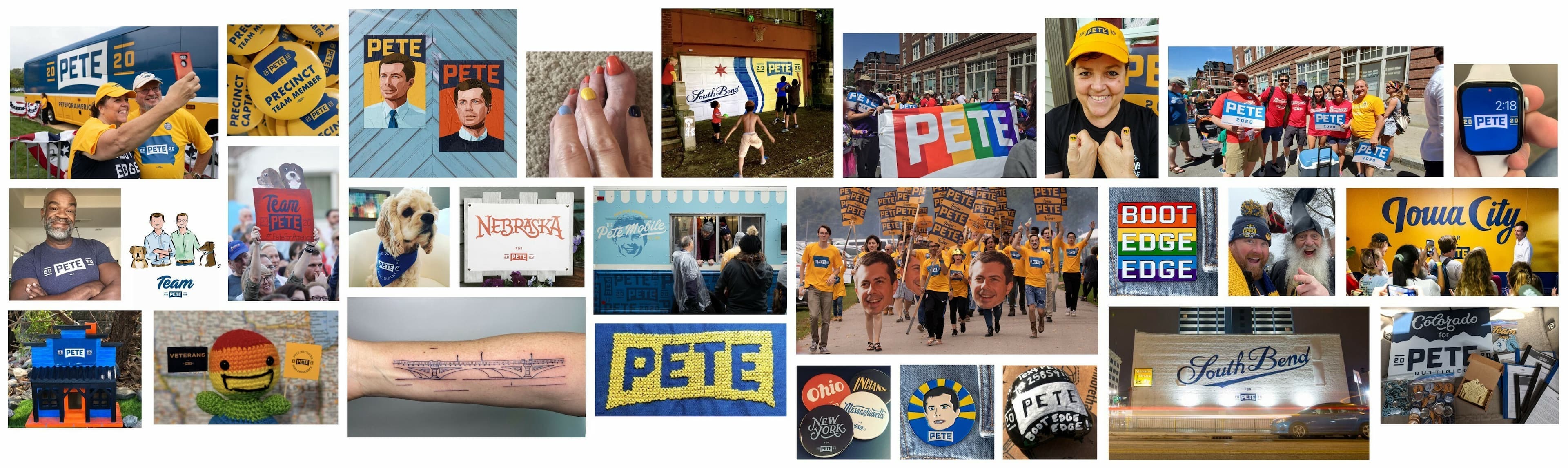
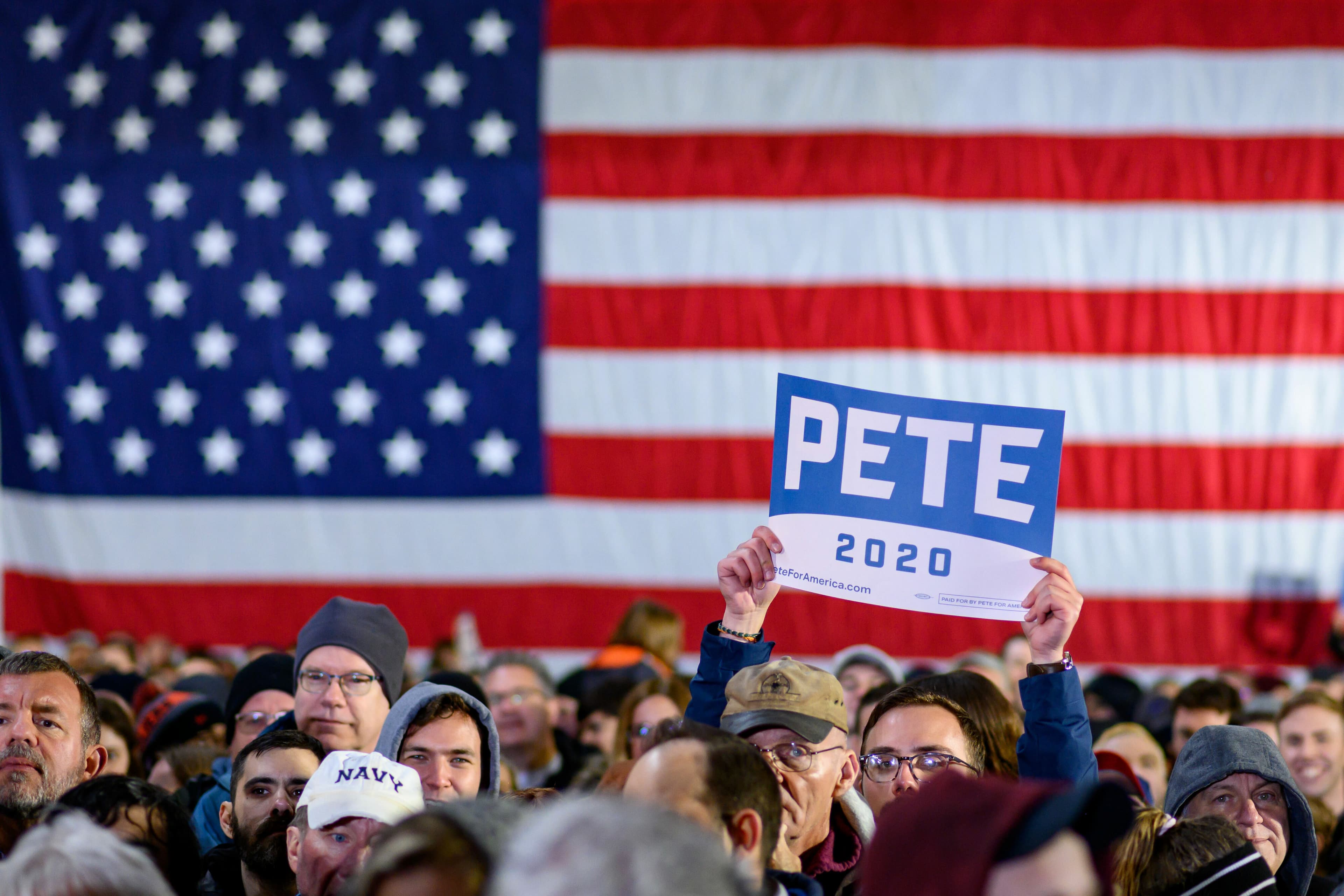
We wanted supporters of the campaign to be empowered to use and have as much fun with the brand as possible! We created a toolkit to give the public everything they need to show support for Pete. All of the campaign logos, colors, and supporter signs were downloadable in multiple formats. Supporters could customize their downloads, choosing from multiple marks and color combinations.

A webpage displaying the "Team Pete" design toolkit. It features a central text block with a yellow background, surrounded by various colorful graphics, logos, and texts. The navigation menu is at the top right, with "PAID FOR BY PETE FOR AMERICA" in the top left.
A radical new approach to campaign branding. This is the first time a campaign has made a design tool kit so easily available to supporters.
Elizabeth Segran, Ph.D.
Fast Company
A blue baseball cap with a flat bill is displayed against a yellow background. The cap features the text "PETE" embroidered in white, along with the numbers "20" situated on either side of the text.
A bright orange tote bag against a dark blue background has the words "DEMOCRAT FOR PRESIDENT PETE BUTTIGIEG 2020" printed in white text, arranged in a circular pattern in the center of the bag. The bag features white handles.
An image of a smartphone screen displaying a webpage layout example. The top section shows a header with text "PETE" and navigation icons. Below is the heading "A FRESH START FOR AMERICA" with font details and another section labeled "Freedom, Democracy, Security".
A smartphone displays a webpage promoting Pete. The screen shows three campaign poster designs with stylized texts for "Idaho for Pete" by Kaitlin Lewis, "Illinois for Pete" by Lydia Stutzman, and a partially visible “Indiana” poster. The background is orange.
With little nods to some states — like Pennsylvania’s bell or Texas’ horns — each custom lettering job gives remarkable ownership and pride to supporters there and it makes for a hell of a group image.
Armin Vit
Co-Founder & Critic, Brand New
A colorful poster displays the names of all U.S. states in various styles and fonts. Each state name is individually featured in a rectangular block with different background colors, creating a visually diverse and vibrant design.

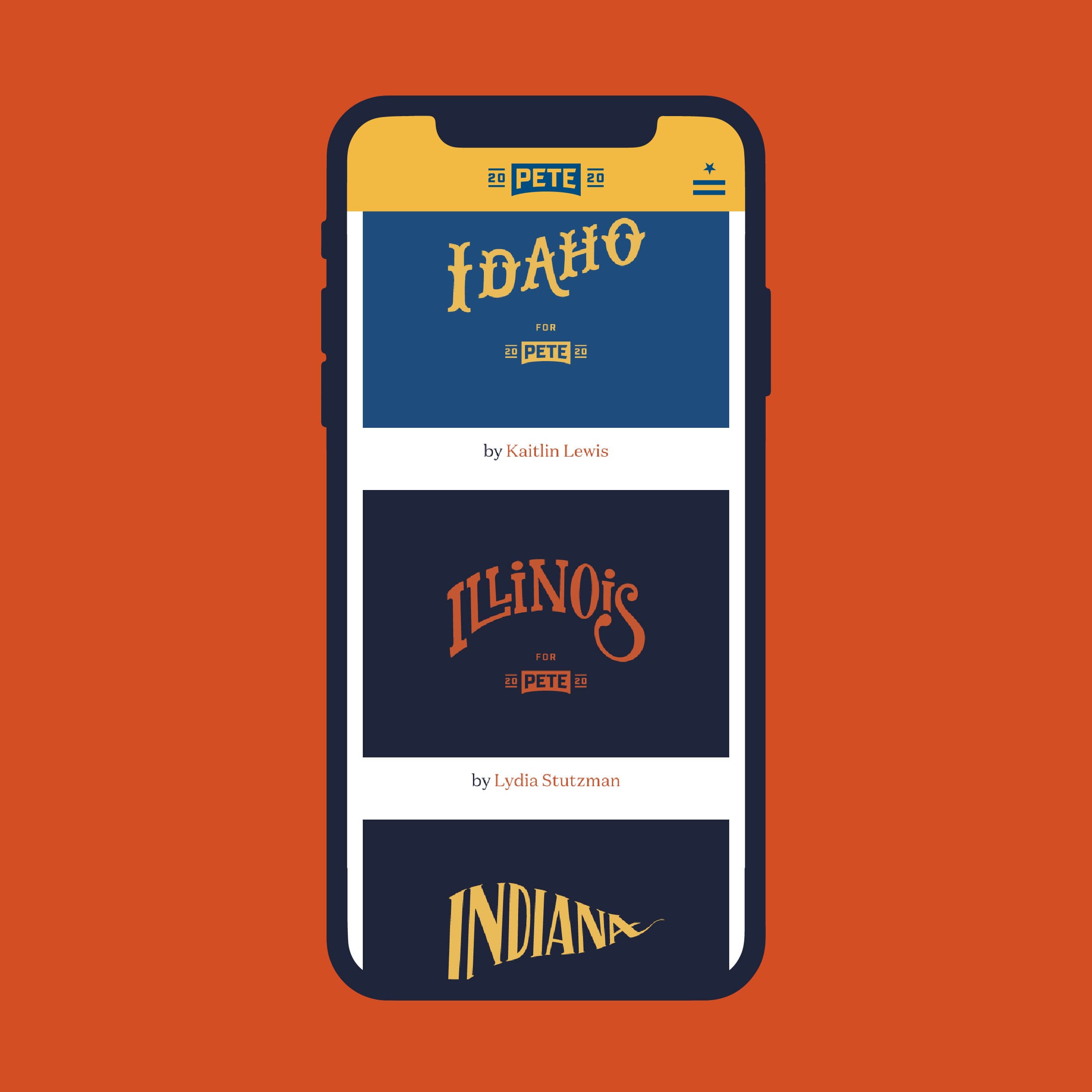
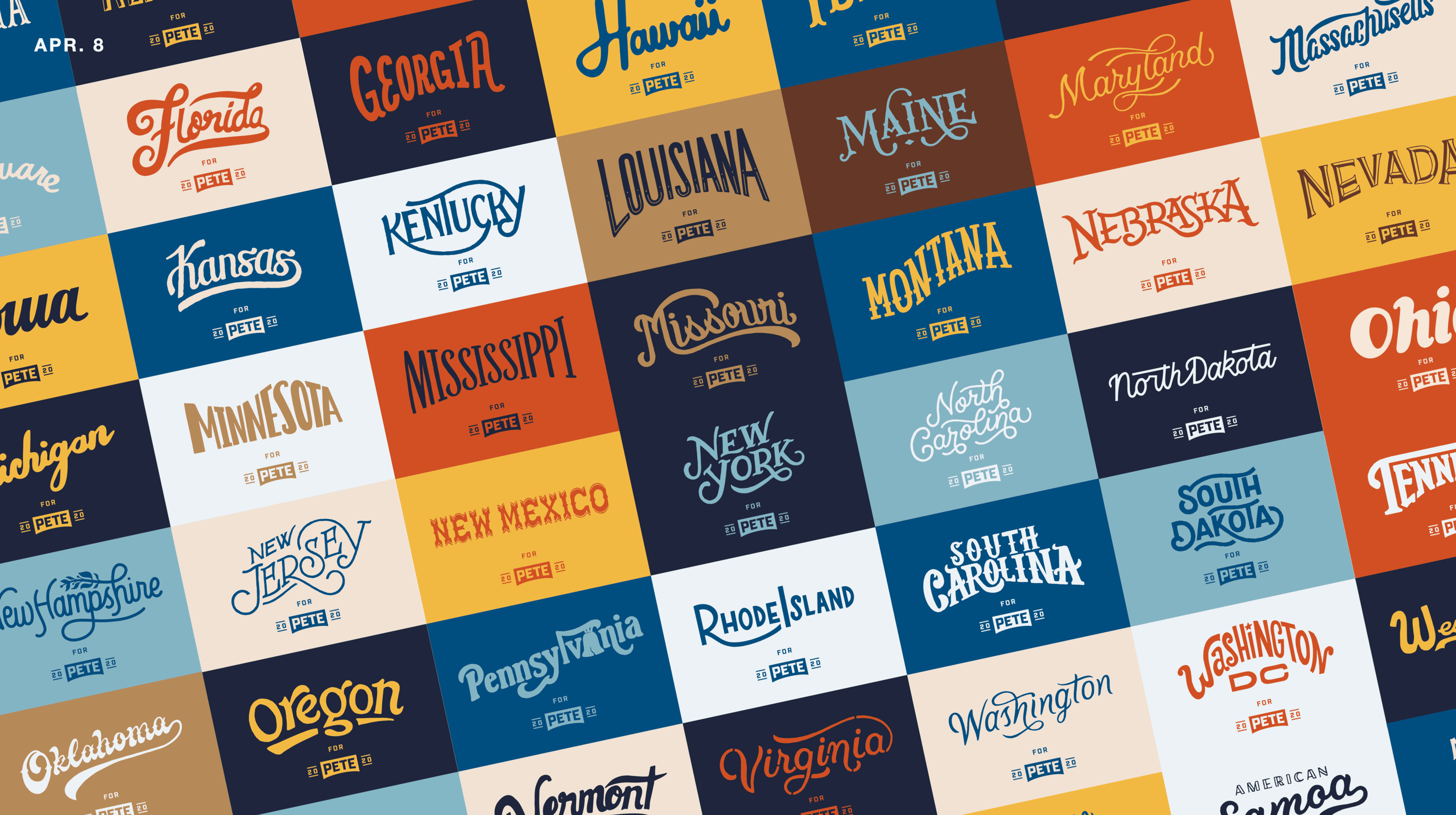
Hand-crafted in the midwest

We worked with artists, mostly based in the midwest, to hand letter every state and territory to celebrate local pride and to add more texture and personality to the brand. The state signs were all available for supporters to download from the Design Tool kit and were used by the campaign on the road.

A person standing on stage in front of a "New Hampshire for Pete" sign, holding a microphone and gesturing while speaking to a large seated audience. The audience appears attentive and engaged. The setting seems to be an indoor venue with overhead lights.
A group of people is holding signs that say "Iowa" and "Pete" at an outdoor event. One person is draped in a rainbow flag, and another person is wearing sunglasses and a red shirt. The background shows more people and trees.

Giving supporters what they need

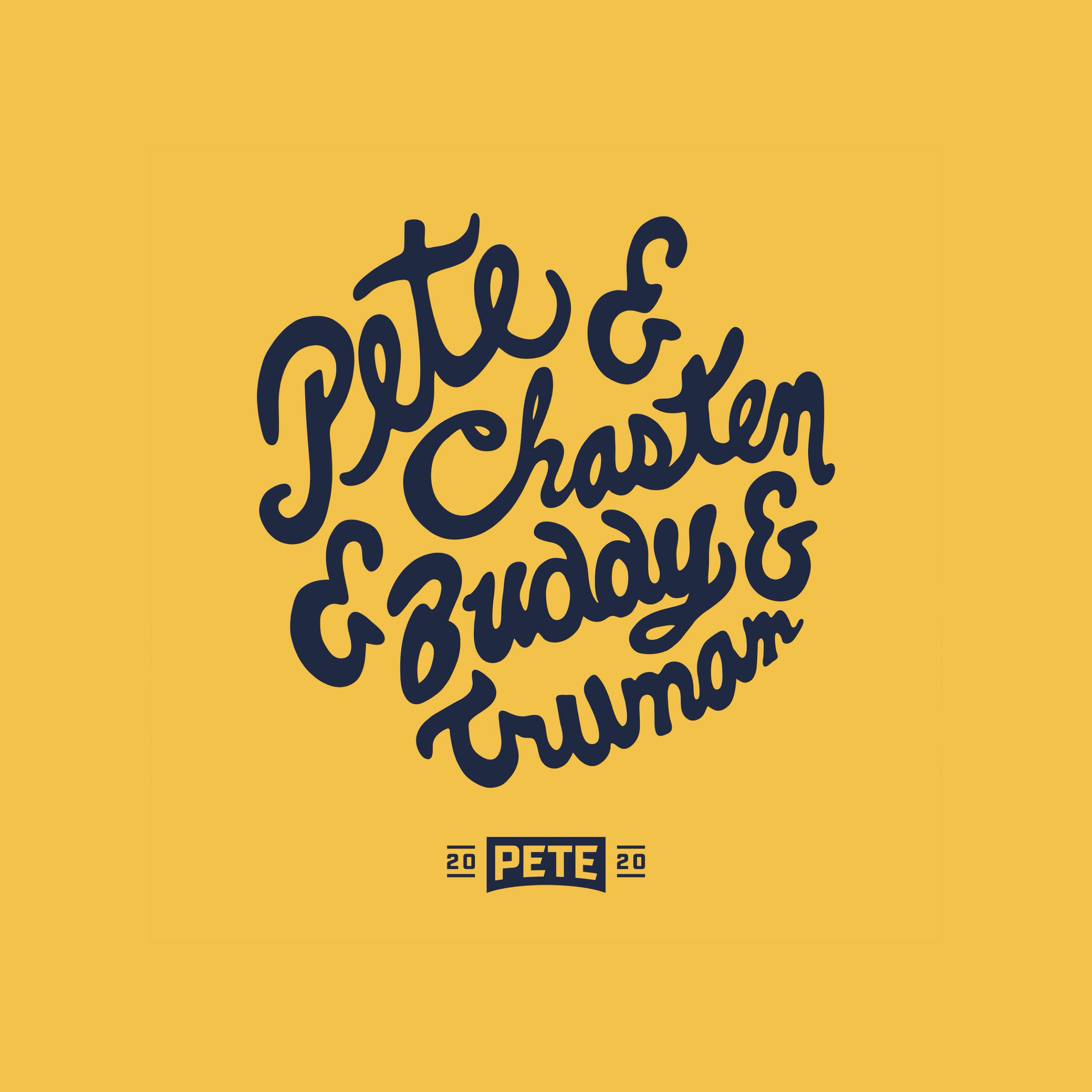
As the campaign evolved, new material was consistently added to the Toolkit. Dedicated assets were created for Pride Week, for dozens of coalitions as well as to celebrate the role Pete's husband, Chasten and their two dogs, Buddy and Truman played in the campaign.

Image of five campaign buttons on an orange background. The buttons feature slogans like "Vote Pete 2020" in various designs and colors. One button includes a black and white image of a person's face. Another says "Pete Buttigieg for President" in yellow.
A yellow background with dark blue, playful font text that reads "Pete & Chasten & Buddy & Truman." Below, there is a small, dark blue graphic resembling a campaign logo with "20" on either side of the name "Pete.
A collage of various images featuring "Pete" campaign materials, including signs, t-shirts, tattoos, buttons, and knitted items. Supporters are shown participating in rallies, holding signs, and displaying campaign symbols in diverse and creative ways.
A crowd of people, dressed in winter clothing, stands in front of a large American flag. One person in the middle holds up a sign that reads "PETE 2020" above the crowd.
A diverse group of people stand closely together behind a metal barricade, attentively listening at an outdoor event. Some hold blue signs that read "South Bend for Pete 2020." The background shows part of a building.
  • 277K
    different people visited the Toolkit
  • 115K
    unique downloads of design assets
A large group of people stands outside a building holding "Pete 2020" and "Boot Edge Edge" signs. They are smiling and posing for a photo, wearing shirts and buttons that also support Pete. The marquee behind them reads, "The music lives on, Welcome Rock & Roll Fans To The Legendary Surf Ballroom.
A person in a white shirt giving a thumbs up stands on a stage in front of a blue and yellow campaign bus with the name "Pete" on it. The crowd around the stage holds orange signs that read "THE STEAKS ARE TOO HIGH.
Buttigieg’s — well, Pete’s — logo is a strong, perfectly executed logo rooted in something meaningful and relevant to the candidate.
Armin Vit
Co-Founder & Critic, Brand New
Two people standing on a stage wave to a crowd. The person on the right holds an American flag. Behind them is a large sign with the name "PETE" and the year "2020." Several people on the stage and in the audience clap and smile.
A large campaign bus with "20 Pete 20" prominently displayed on the side is parked in a rural area. The bus is blue and yellow and has a website address "TROMAMERICA.COM" written on the side. The landscape features open fields and power lines against a cloudy sky.

Behind the scenes

The visual language of a quintessential, midsize, post-industrial city in the heartland.

In February of 2019, our team flew to campaign headquarters in South Bend to meet with Pete’s core team of advisors and tour the city he calls home. Photos from our trip, inspired us to draw from the industrial visual heritage of the midwest. Vintage signage, old railway logos, local landmarks, and the legacy of the Studebaker factory, once the largest in the world, all served as initial inspiration for the brand. We immediately started sketching ideas.

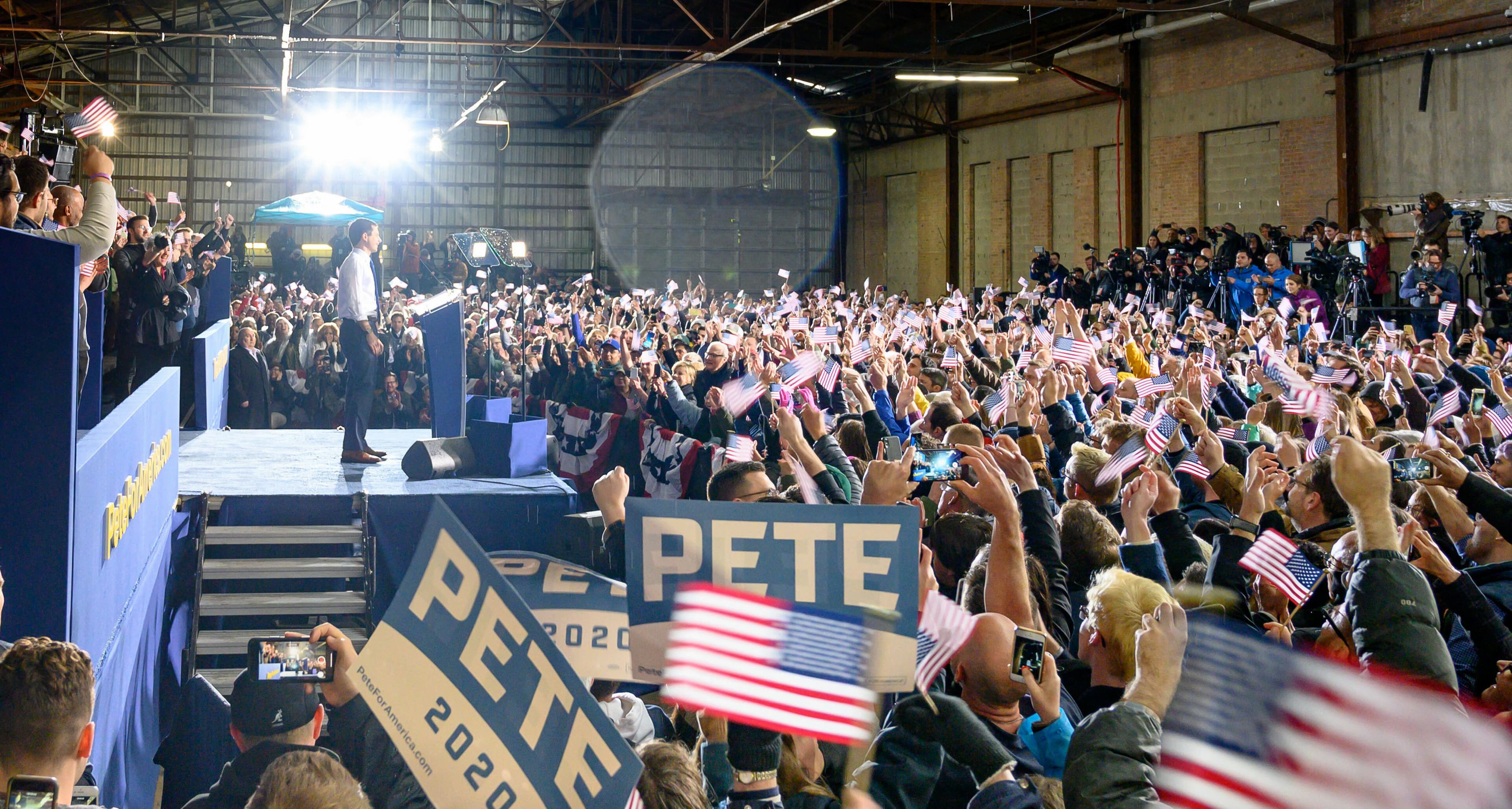
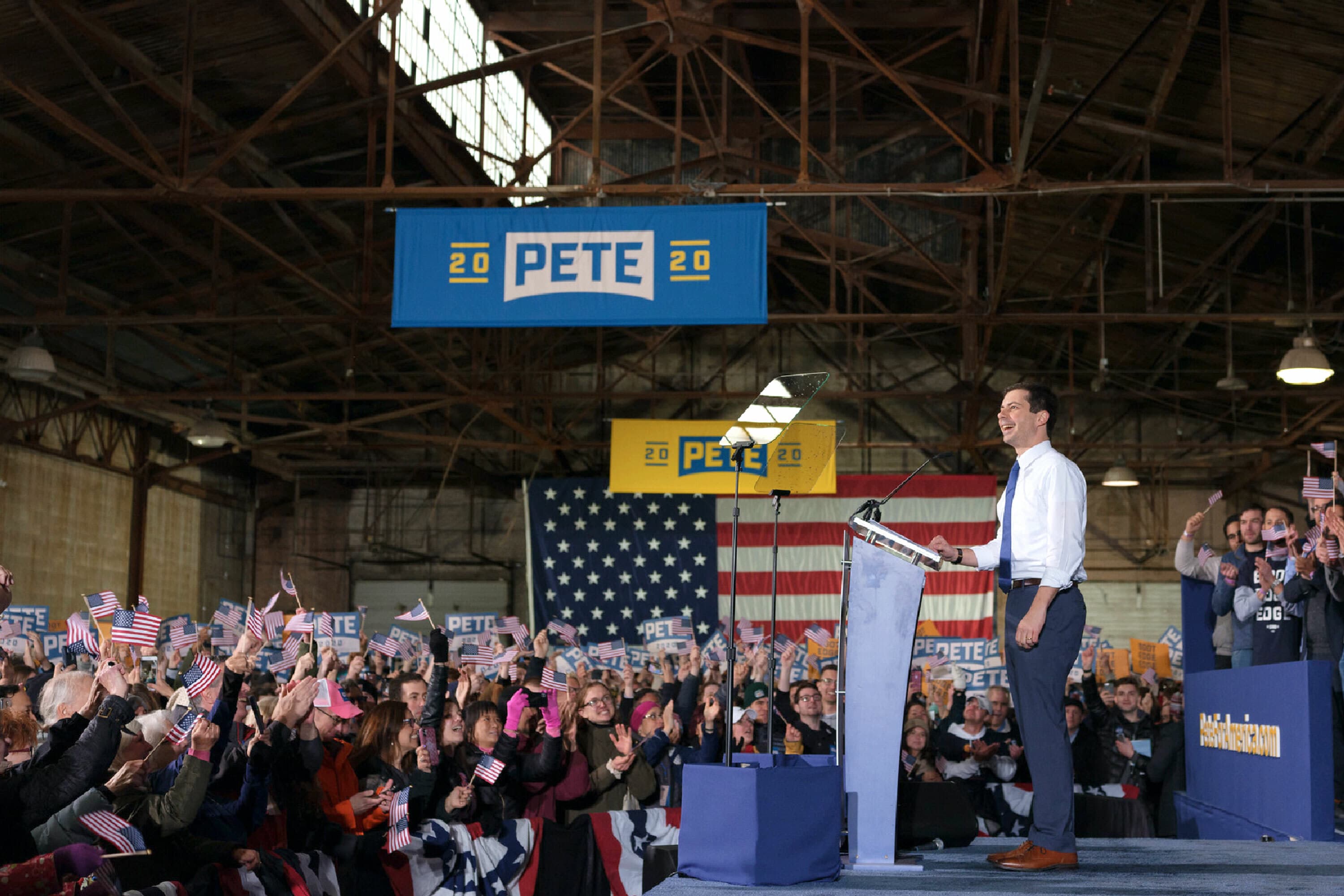
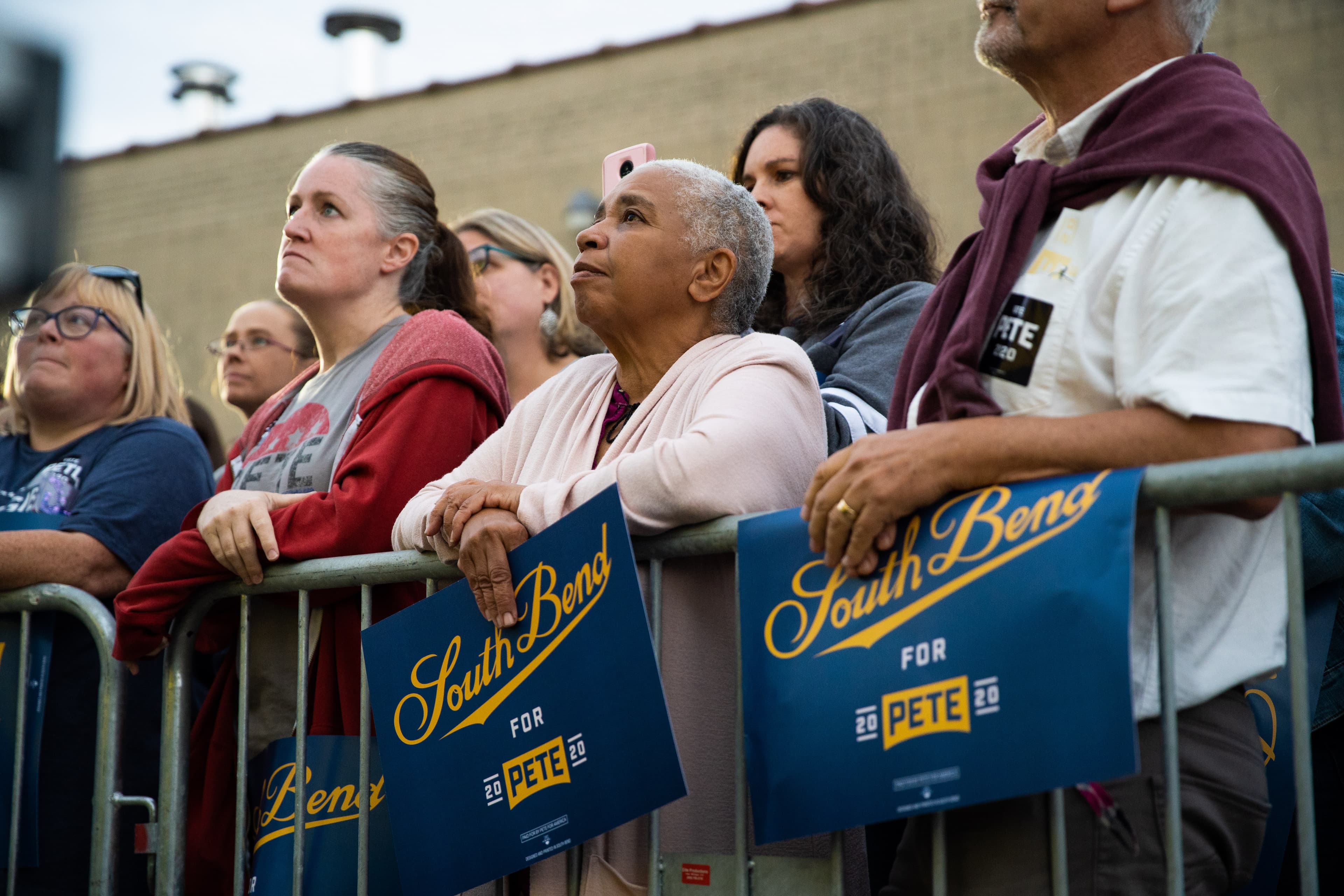
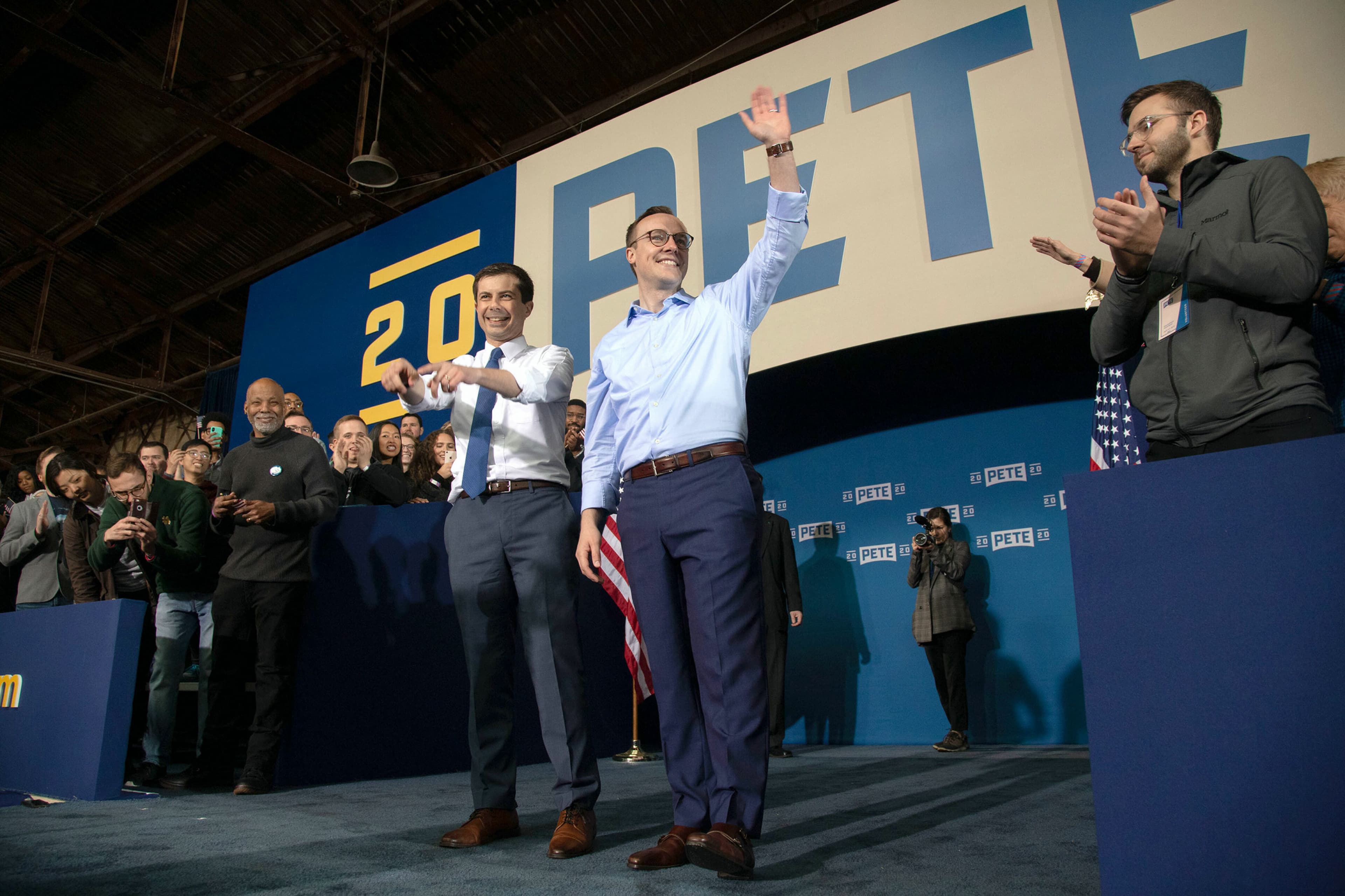
Launch day in South Bend

We had the opportunity to chat with Pete directly on a few occasions to learn more about him and his influences. We presented our work directly to him and his core team via video chat on March 8, 2019, eleven days after we began work on the project. Pete offered thoughtful feedback and gave us the thumbs up on the spot.

Two days later on March 10, 2019, the campaign had a watershed moment when Pete participated in a CNN Town Hall and delivered an impressive performance before his first national audience. Over the next 24 hours, the campaign raised $600,000 from over 22,200 donations, more than it had raised in the two months prior. At this point the campaign was still an exploratory committee but this momentum solidified Pete's decision to enter the Democratic primaries as an official candidate. The official announcement, and unveiling of the brand Hyperakt designed for the campaign took place on April 14, 2019, in South Bend, Indiana. This allowed us to spend 5 weeks building out the public-facing Pete For America Design Toolkit. The Hyperakt team flew out to South Bend to be there for the unveiling of the brand as Pete delivered his announcement speech to thousands of people packed in a hanger at the Studebaker complex.

Project Credits

Ready to unlock the potential of your nonprofit's brand?
Reach Out