Work

HRW: Students Not Products

A study by Human Rights Watch exposing the harm governments and education tech companies are causing children by harvesting their personal data.

Illustration of people communicating through various devices such as smartphones, laptops, and monitors. The devices float above a globe with robotic arms and eyes observing. The background is dark with subtle stars, symbolizing global connectivity and surveillance.

Background

During the COVID-19 Pandemic, students were forced to rely on technology for educational attainment more than ever before. As governments moved to quickly approve the EdTech products for use at scale, child privacy was left unattended. Human Rights Watch set out to research the extent of child privacy violations worldwide and present them to parents, teachers, policymakers, journalists so they can advocate for greater protection.

A logo with a blue square on the left containing the text "HUMAN RIGHTS WATCH" in white, and to the right, the text "STUDENTS NOT PRODUCTS" in green and black, with a black underline extending from "STUDENTS" to past "PRODUCTS".

The challenge

With incredibly important implications, HRW needed to ensure their research didn’t go unheard. They needed powerful, intuitive design for both the branding and digital experience to help present their evidence effectively.

An image displaying a grid with six vertical, equally sized rectangles, each a different color: green, blue, black, white, purple, magenta, pink, and orange.

The opportunity

Their visual identity system – coupled with their microsite – is an opportunity to craft a compelling brand for this report: one that is clear, motivating and approachable for all of their key audiences.

An infographic showing the impact of Covid-19 on children's learning. "Children depend on technology to learn, more than ever." It states that kids' screen time increased by 90% six months into the pandemic. Text mentions the shift to online learning for safety.
A white text box with black text reads: "Human Rights Watch examined 165 EdTech products, recommended by 49 governments of the world’s most populated countries, to check how they handled children’s data." Below is a blue button labeled "Read the Report" with a downward pointing arrow.

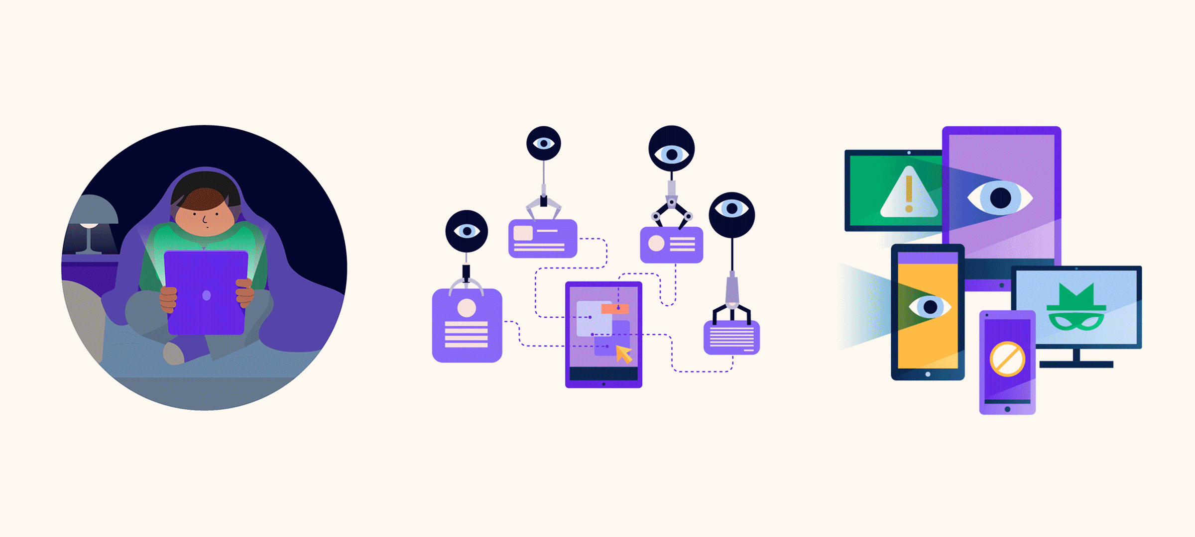
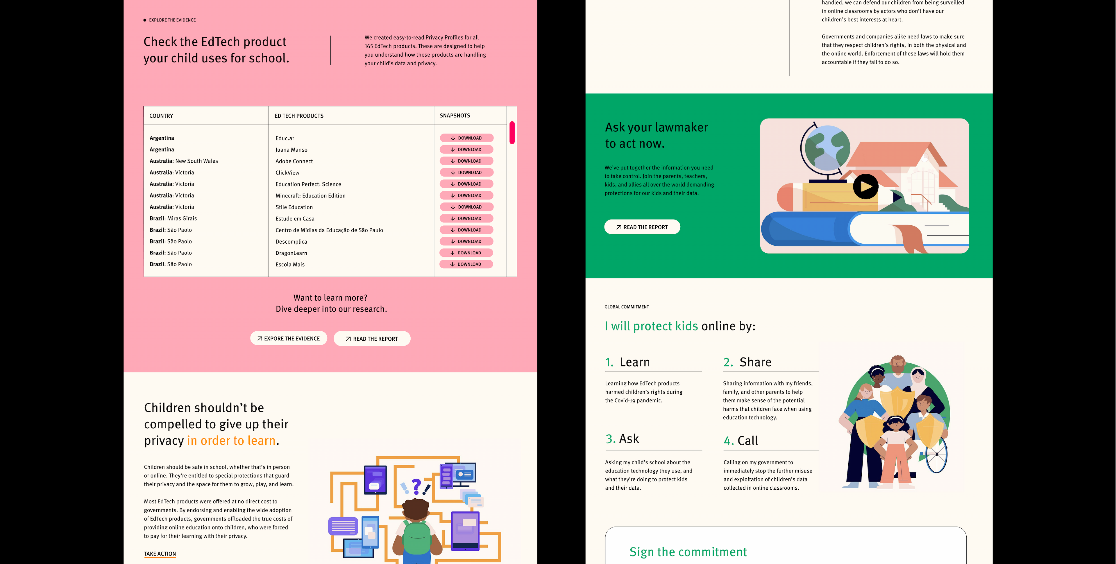
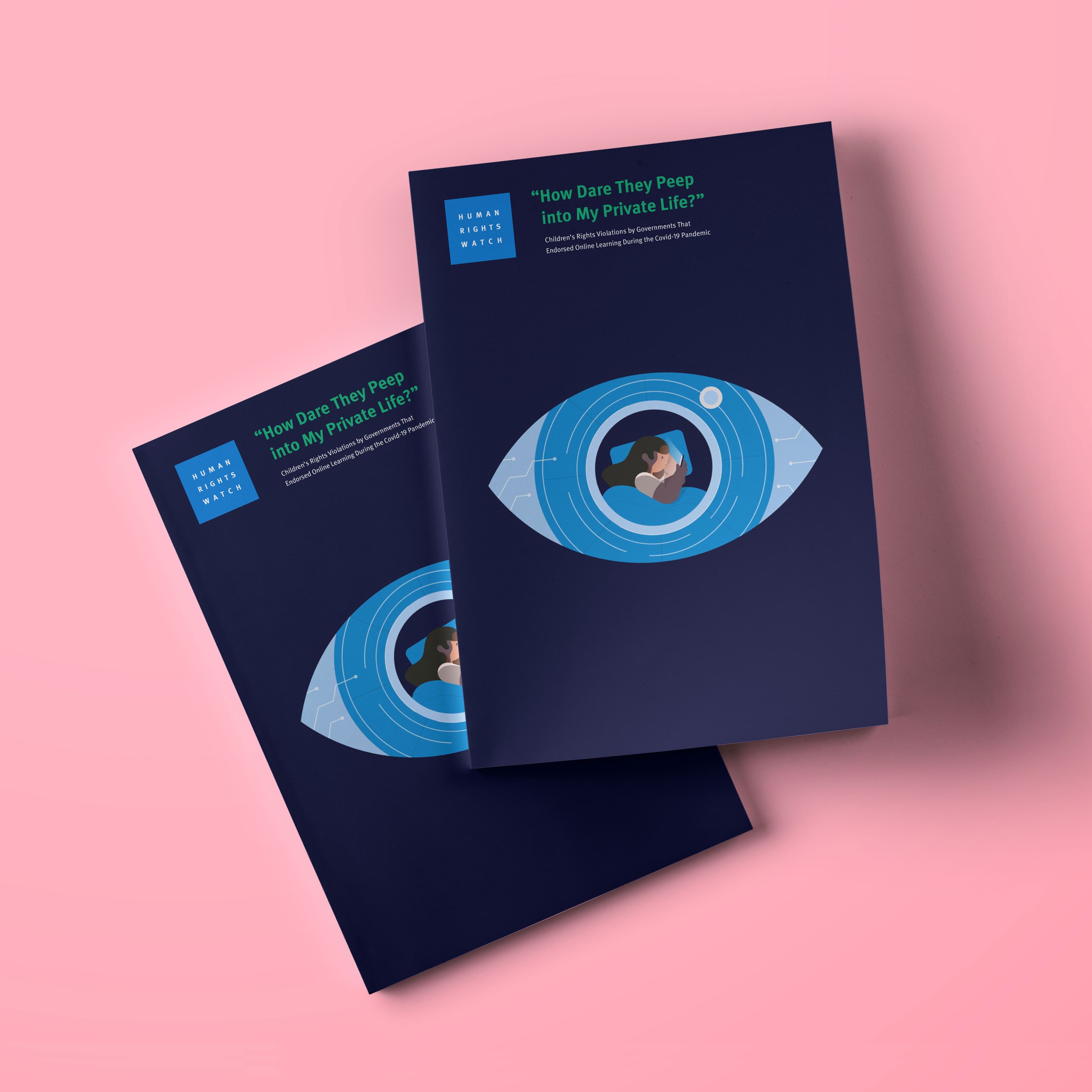
A clear visual identity

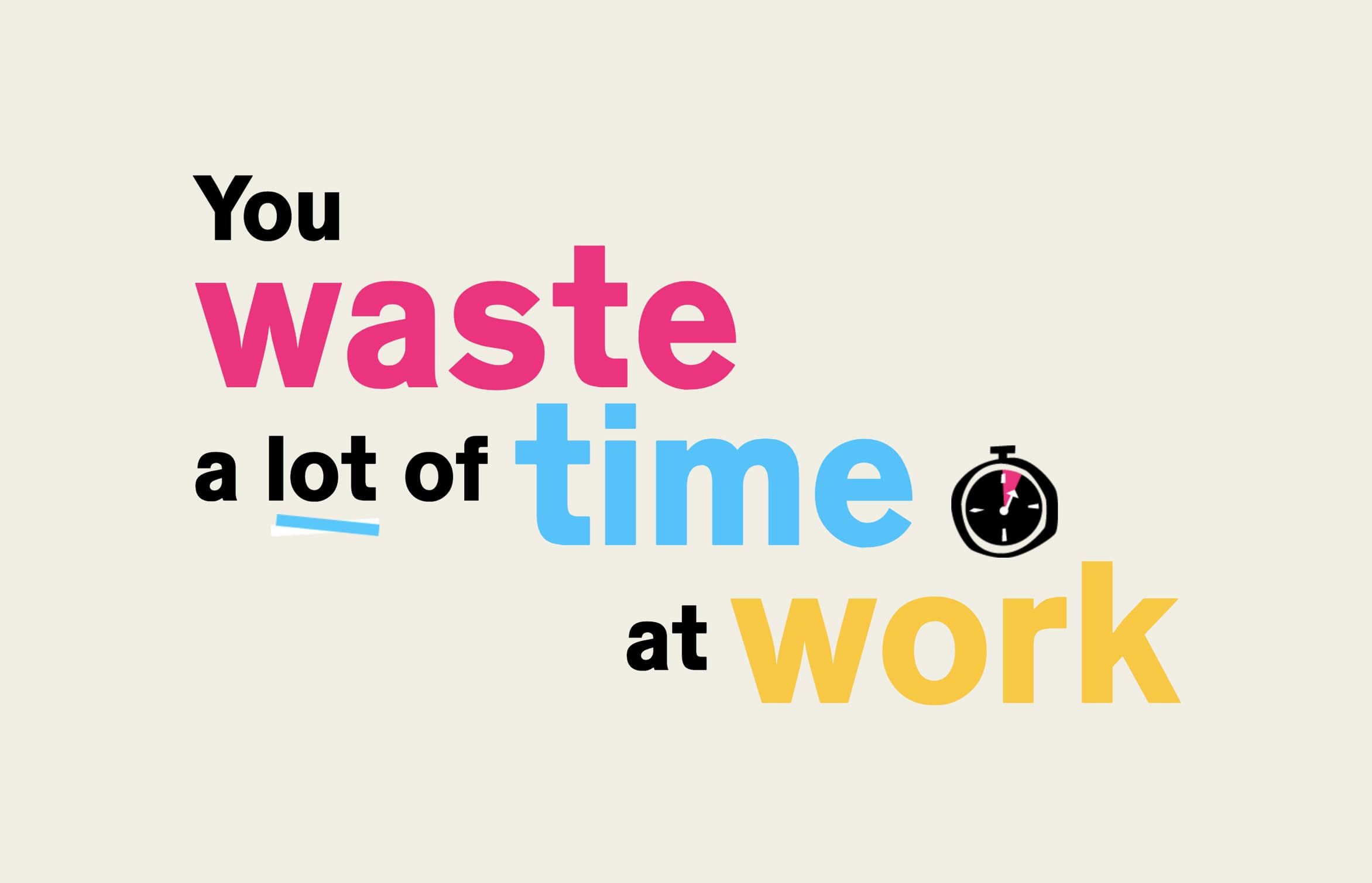
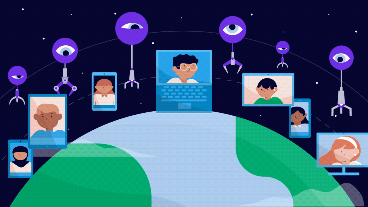
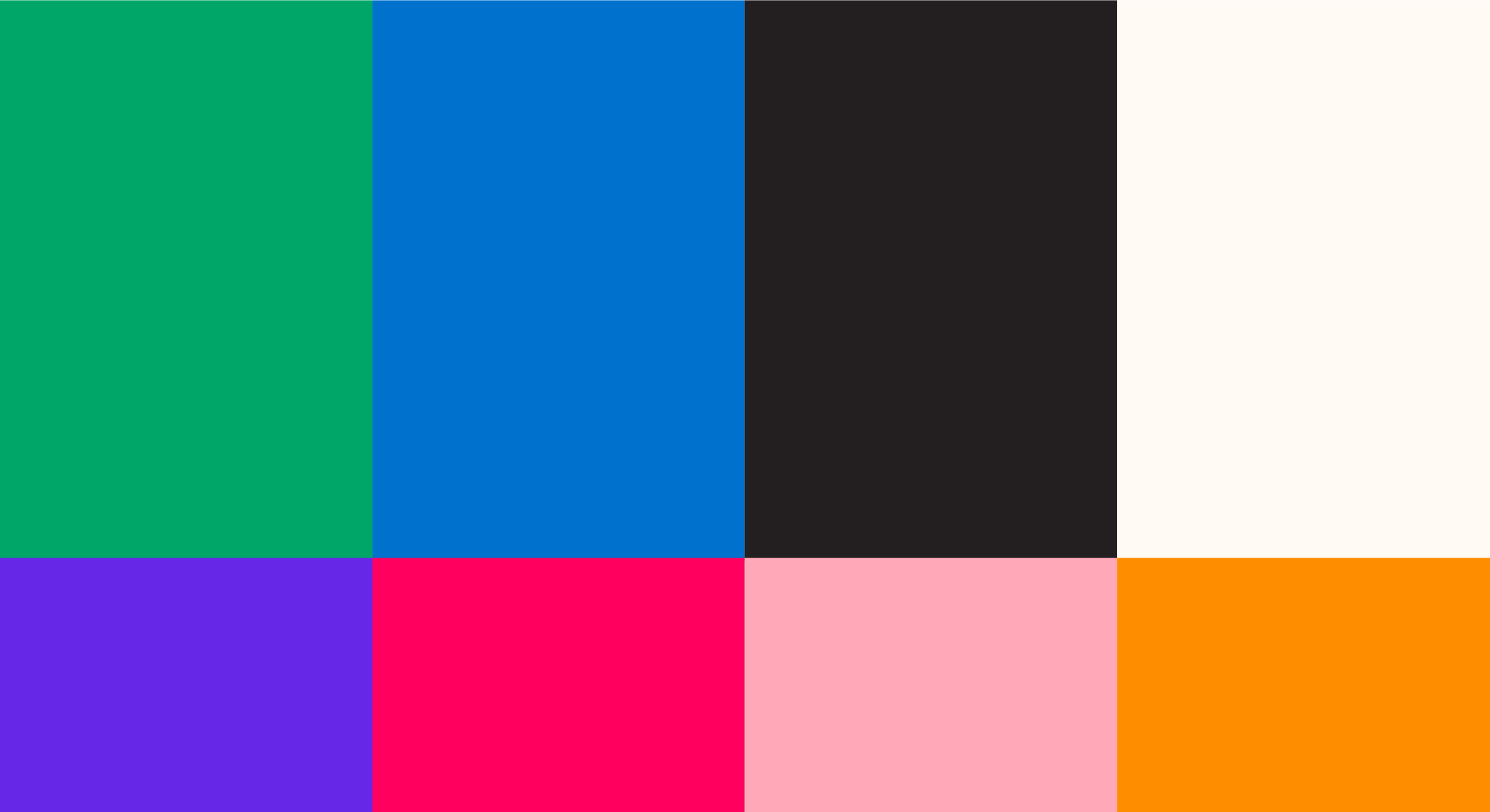
With bold colors, playful iconography and powerful data visualization, Students Not Products’ visual identity prioritizes clarity above all, while balancing a light-hearted tone with the urgency the situation demands.

Abstract illustration showing a person on a blue screen, monitored by three robotic arms, each ending with an eyeball. The arms are connected to various documents, symbolizing surveillance and data analysis.

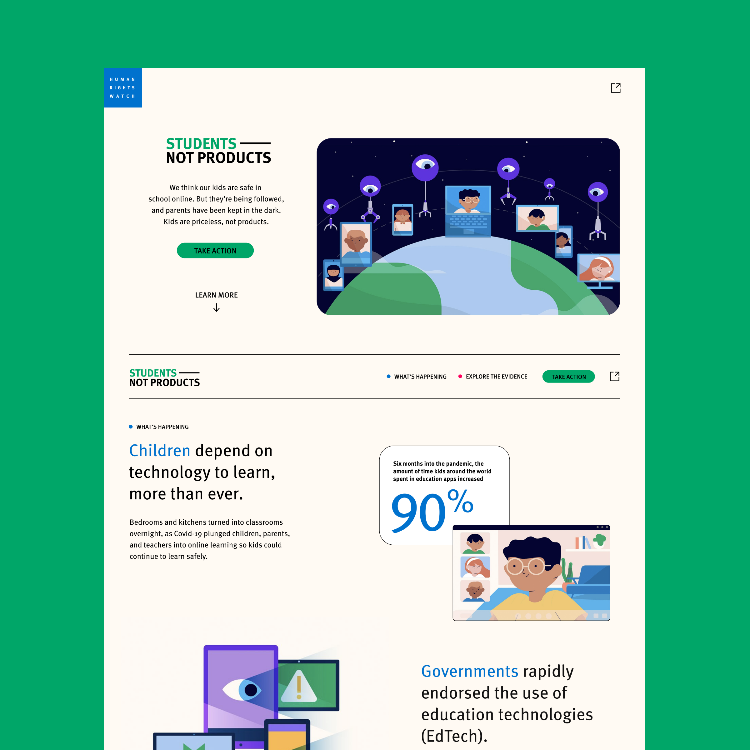
A story built for the web

The Students Not Products microsite is built to tell a powerful story. The information architecture is built to draw audiences in with urgency and emotion. As readers get into the meat of the report, it’s designed to be trustworthy, but not overly technical. It ends with a clear call to action for users to learn, share and act at both a local and national level.

In terms of the policy work, we've seen both target countries and companies say they will investigate their EdTech after seeing the report, website and campaign. These victories are all of ours. The design played an important role in the storytelling of this very complicated research.
Amanda Alampi
Acting Director/Deputy Director, Campaigns and Public Engagement, Human Rights Watch
An illustration shows three scenes: a person under a blanket using a tablet at night, a network of various icons representing data connections, and multiple devices (phone, tablet, monitor) displaying security symbols like padlocks, an eye, and an incognito icon.
A webpage from "Students Not Products." The header image shows children on screens with earth in the background. Below, it emphasizes children's dependency on technology, advocating for safer learning tools. Various illustrations depict kids using tech devices and a statistic on EdTech.
A quote on an orange background reads: "'This is scary. Especially us kids, we blindly trust our country, the whole education system, because we don’t question these things yet. We don’t have enough experience. ... As kids, we feel powerless. What can I even do as a kid to stop these companies? That idea itself hurts a lot.' - Aadya S, 16, Uttar Pradesh, India.
Hyperakt was an important sounding board for our team. They were great active listeners and asked good follow up questions. It is easy to get lost in groupthink, policywonk speak and internal deliberations. Hyperakt was able to be a strategic partner, guiding us to the right design decisions to help better tell our campaign's story to the public.
Amanda Alampi
Acting Director/Deputy Director, Campaigns and Public Engagement, Human Rights Watch
Illustration of a hand holding a smartphone showing a messaging app, surrounded by four robotic arms with eyes at the ends. The robotic arms appear to be observing and interacting with the phone's screen in various ways.
A purple background features white text. On the left, the text reads: "An invisible swarm of tracking technologies surveils our kids throughout their day. 89% of the EdTech products we looked at monitored children secretly and without the consent of their parents." On the right, the text explains how tracking technologies collect data on children in virtual classrooms and their device usage.
We've gotten a lot of feedback that the website is easy to read and understand. We also have gotten a lot of inbound requests to create similar campaigns for other researchers. That's usually a sign that our campaign hit the mark.
Amanda Alampi
Acting Director/Deputy Director, Campaigns and Public Engagement, Human Rights Watch
An illustration of a diverse group of people standing together. Some individuals hold golden shields. The group includes a person wearing a hijab, a person using a wheelchair, and another standing confidently in front, symbolizing protection and unity.
A webpage split between two main sections. The left side lists countries and their educational software with a red button to take action. The right side depicts a green-themed section urging readers to protect kids' online privacy with illustrations and a commitment button.

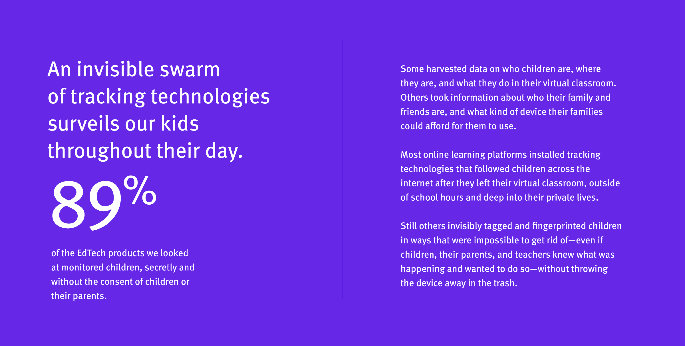
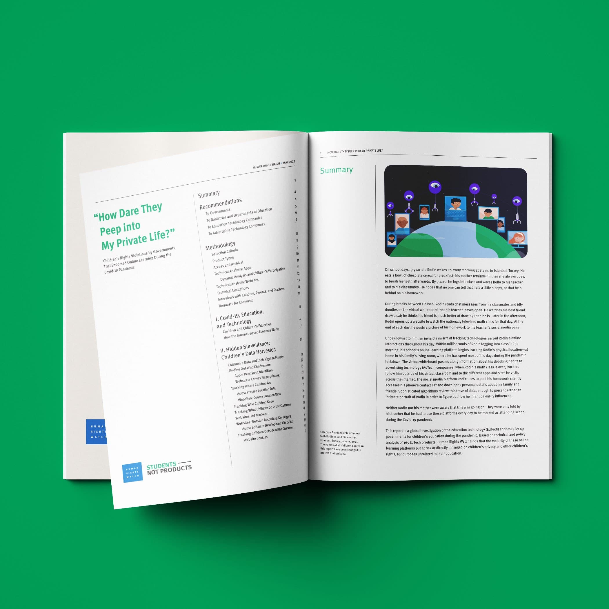
A boldly simple report

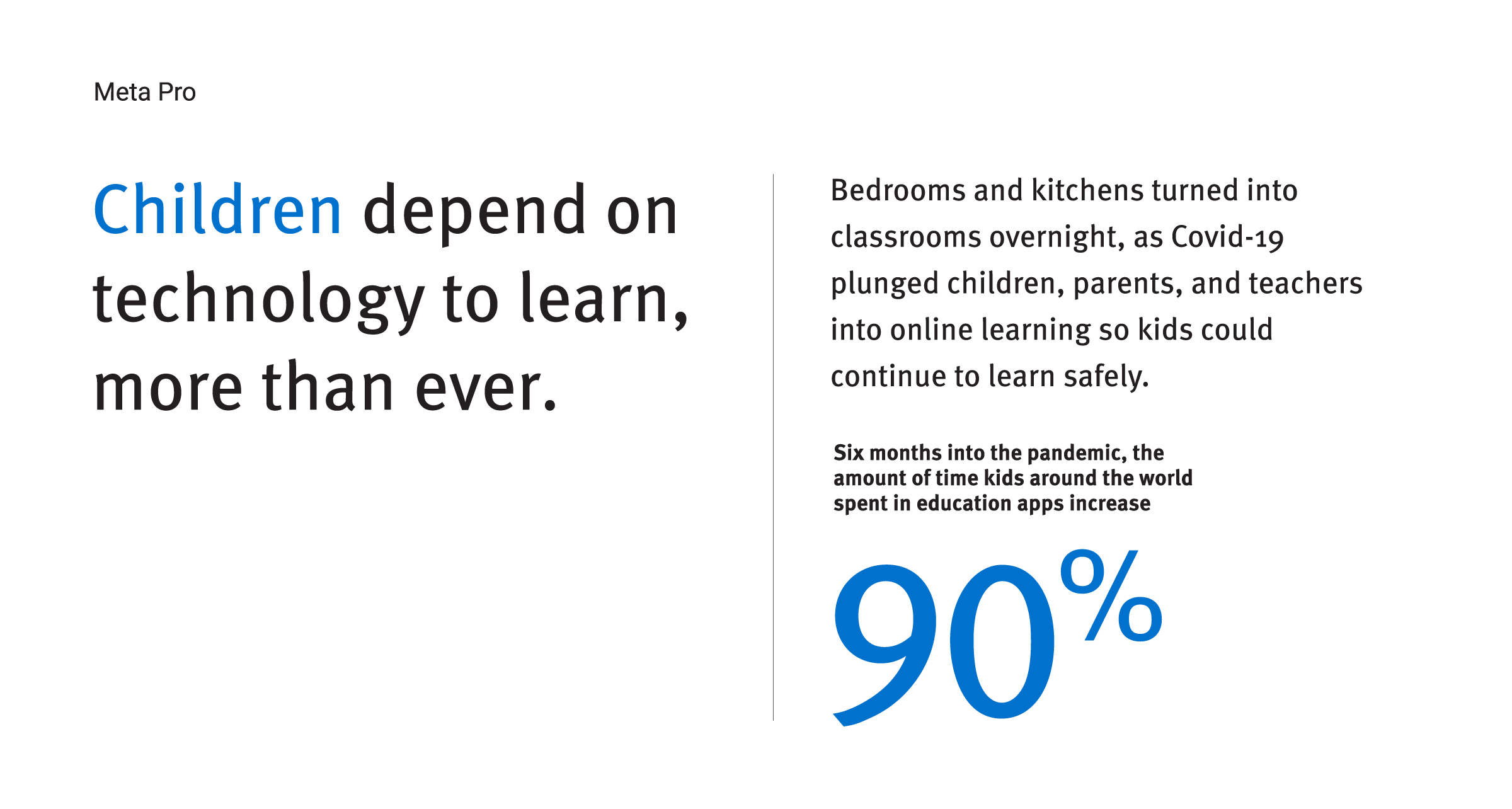
The final report was laid out simply, with pops of color and helpful illustration throughout to help guide readers through the information.

Two booklets on a pink surface, each featuring a large eye illustration with a person sitting on a laptop inside the iris. The cover text reads "How Dare They Peep into My Private Life?" by Harvey Waters in green and blue fonts.
Open magazine displaying an article titled "How Dare They Peep Into My Private Life?" on the left page, while the right page shows a summary and an illustration of people using electronic devices with icons floating above them. The background is green.
The folks at Hyperakt are quite different. They are a progressive design studio which is an important distinction from just design firms that work with nonprofits. They understand the role design plays in digital advocacy and activism. Their art is resistance. That makes them great collaborators.
Amanda Alampi
Acting Director/Deputy Director, Campaigns and Public Engagement, Human Rights Watch

Project Credits

Ready to unlock the potential of your nonprofit's brand?
Reach Out