Work

Tuyo Media

A mentorship program working toward a more equitable, interconnected, and global generation of regional journalists whose perspectives are underrepresented in media narratives.

A young girl in a red top and yellow shorts dances barefoot on an empty narrow street lined with colorful, worn buildings. A boy stands in the background with his back turned. The words "Tuyo Media" are overlaid on the image.

Background

Tuyo is building a more equitable press corps that amplifies the voices and perspectives of communities and regions underrepresented in journalism. Founded by a collaborative of 22 renowned journalists from around the world, the cornerstone of Tuyo’s work is a global media camp. The 10-day intensive sharpens skills, facilitates mentorship, and produces high-quality reporting. This immersive, cross-cultural program fosters lasting personal and professional bonds across borders. Tuyo’s curriculum instills ethics and develops strategies to improve the methods of media coverage for populations that are, historically, not well or accurately represented.

A name for you and me

Previously named Resident Voices Media, our goal was to create a fresh brand that’s proud of its social justice roots and is inspiring to funders and applicants alike. We wanted a name that captured one core idea: one-to-one mentorship that fosters local ownership over local stories. The organization’s new name, Tuyo Media, is short, jargon-free, fun to say and memorable.

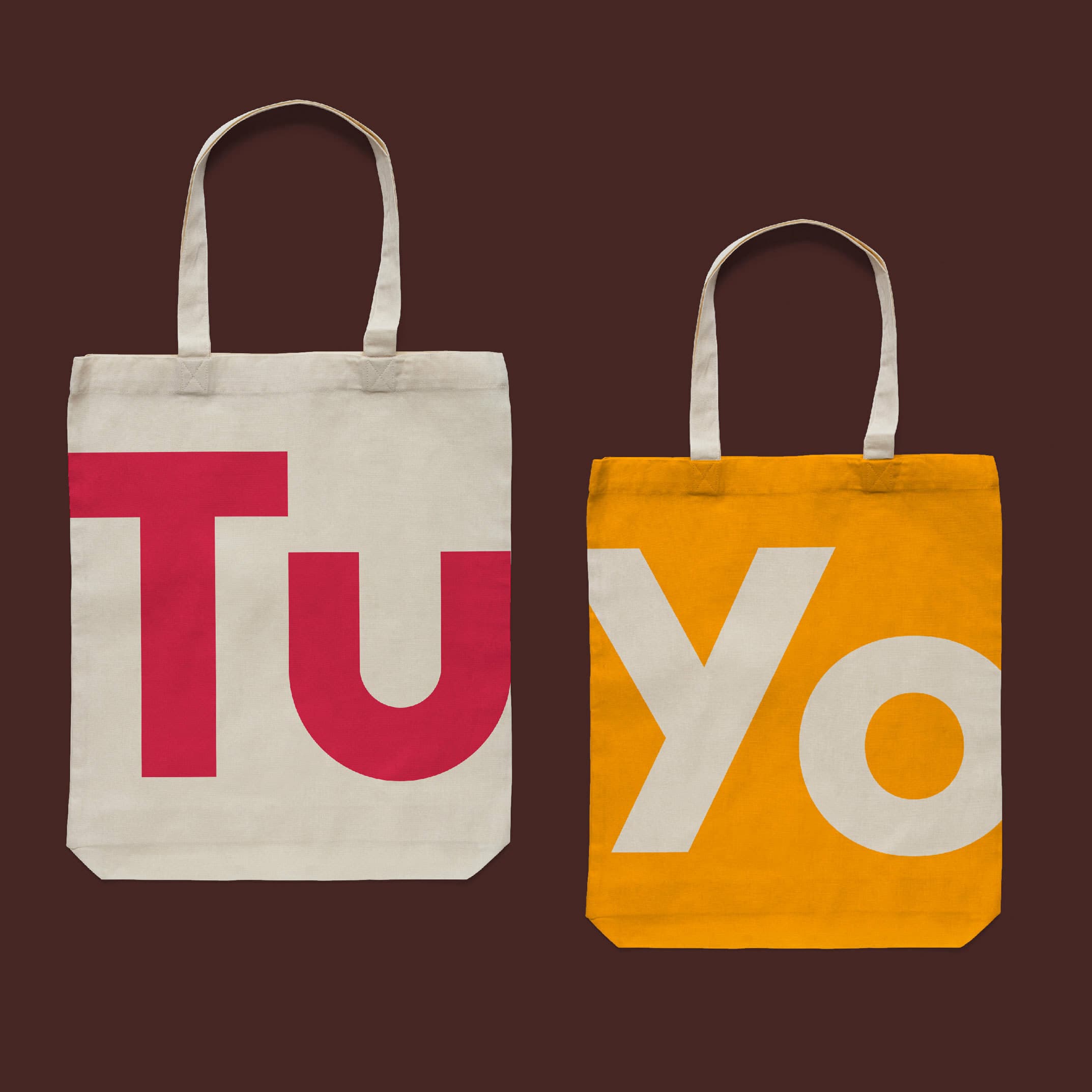
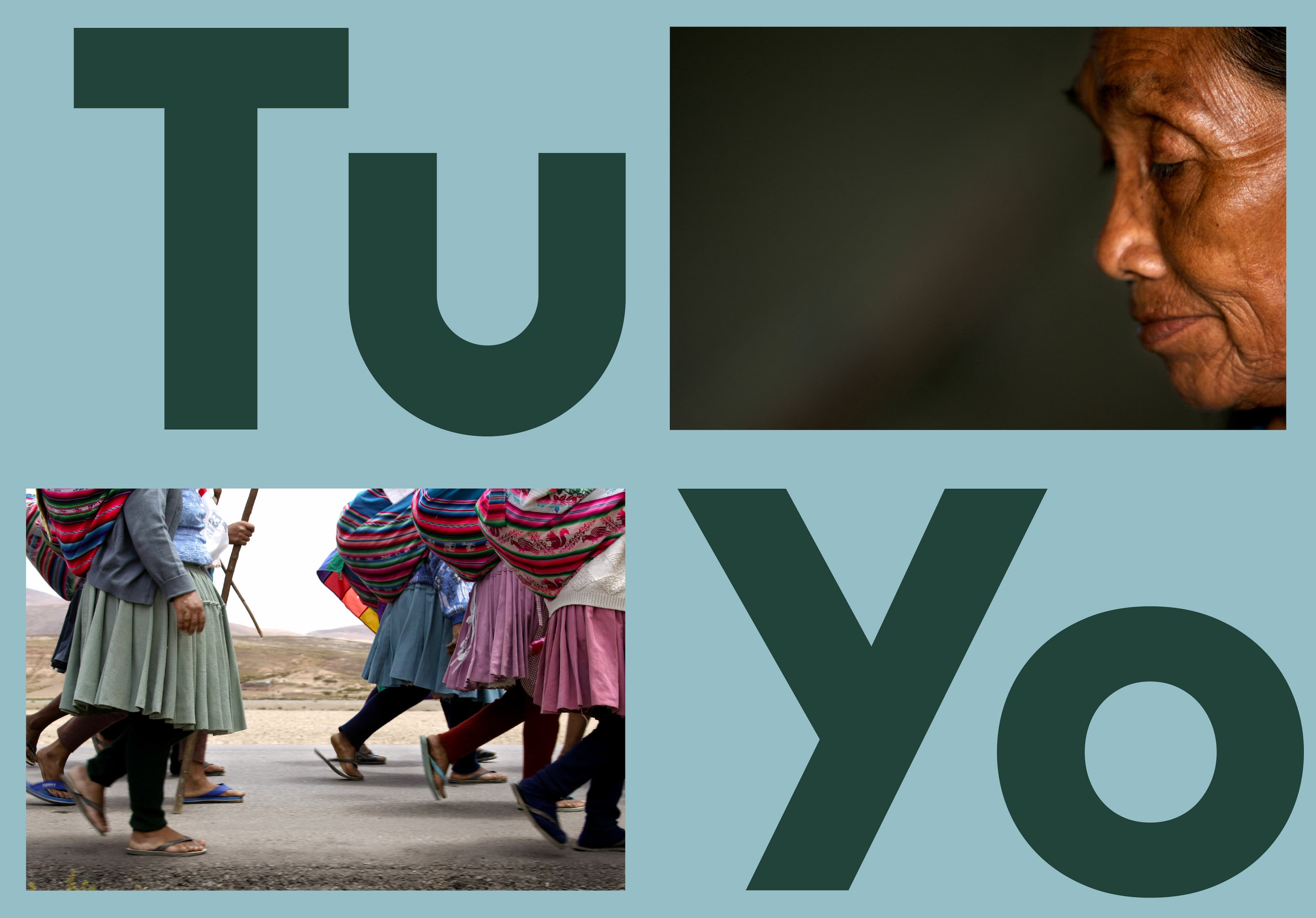
In Spanish, Tuyo means “Yours” which captures their central mission as an organization: owning the concept of local reporting. If you split Tuyo in half you get tu y yo: you and me, a nod to the deep one-to-one mentor/mentee relationship that is an integral part of their program. Spanish is an authentic part of the organization’s origin story. Their first pilot program landed in Mexico and Central/South America are now central hubs for their work.

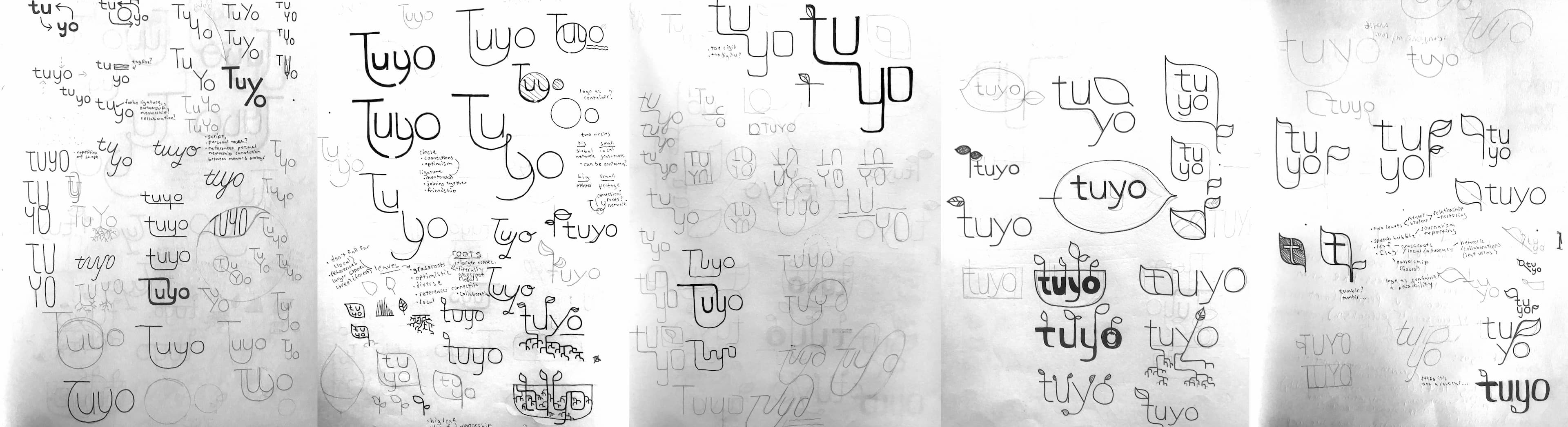
Building a personality

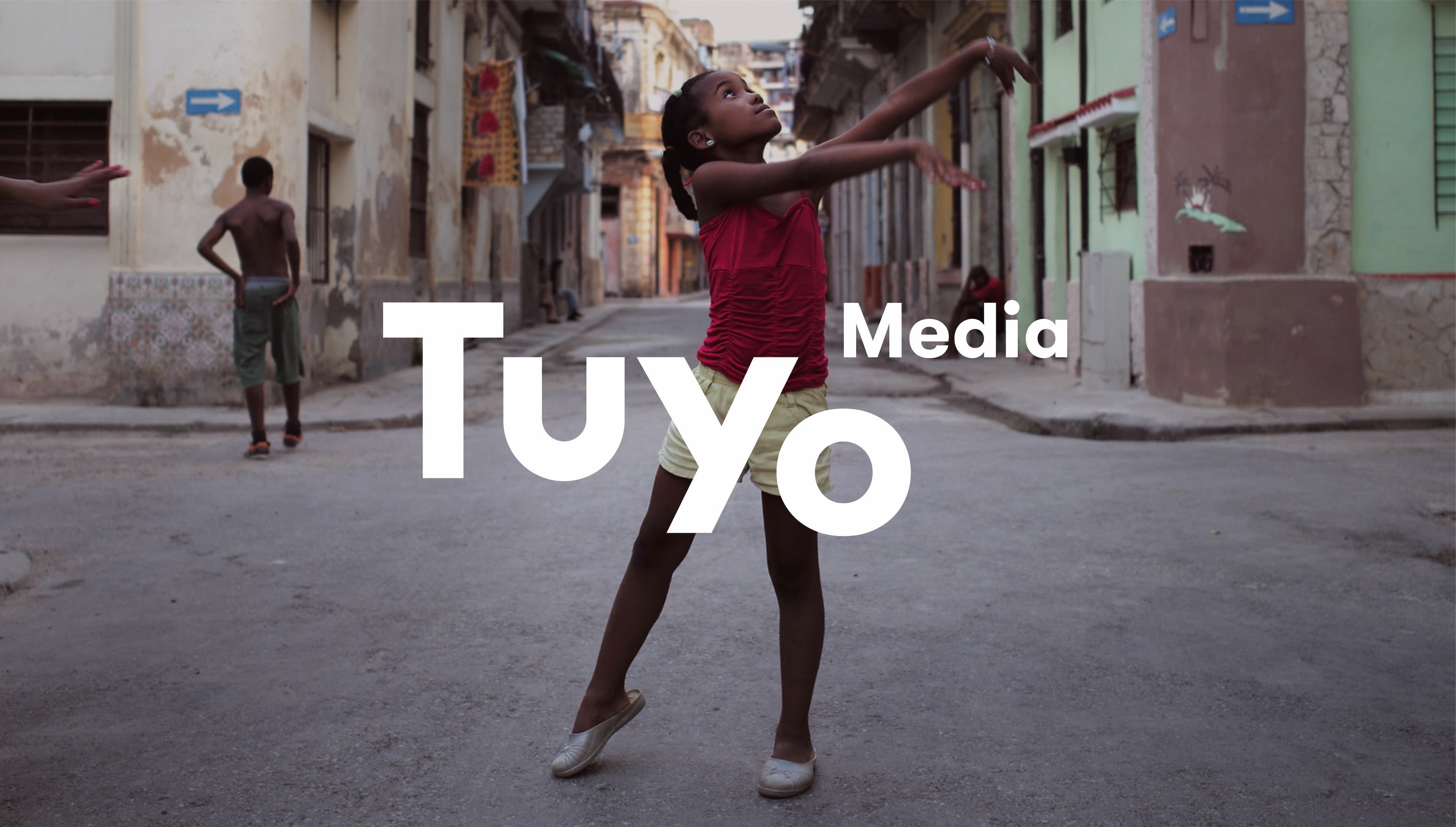
With a clear mission and strong name, we dialed in on core character traits of the brand: sincere, direct, vibrant, and grassroots. To carry these traits into the mark, we shifted down the baseline of the “o” making it possible to read Tuyo as one word, while also showing that it’s composed of two smaller words—tu and yo. The dropped “o” became the wordmark’s memorable quirk.

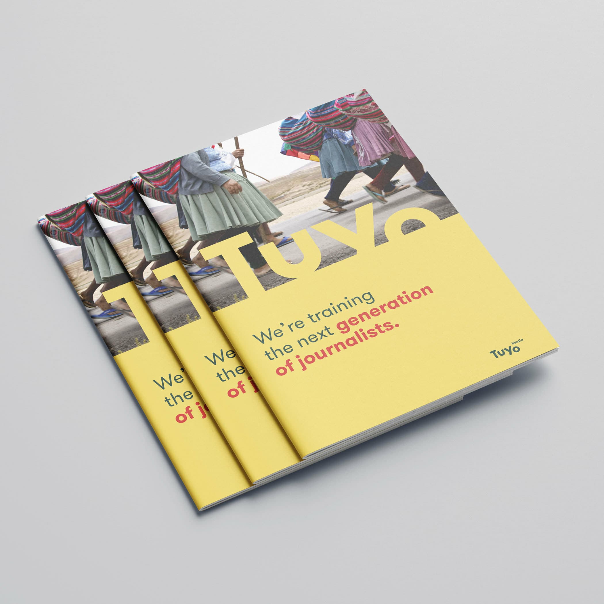
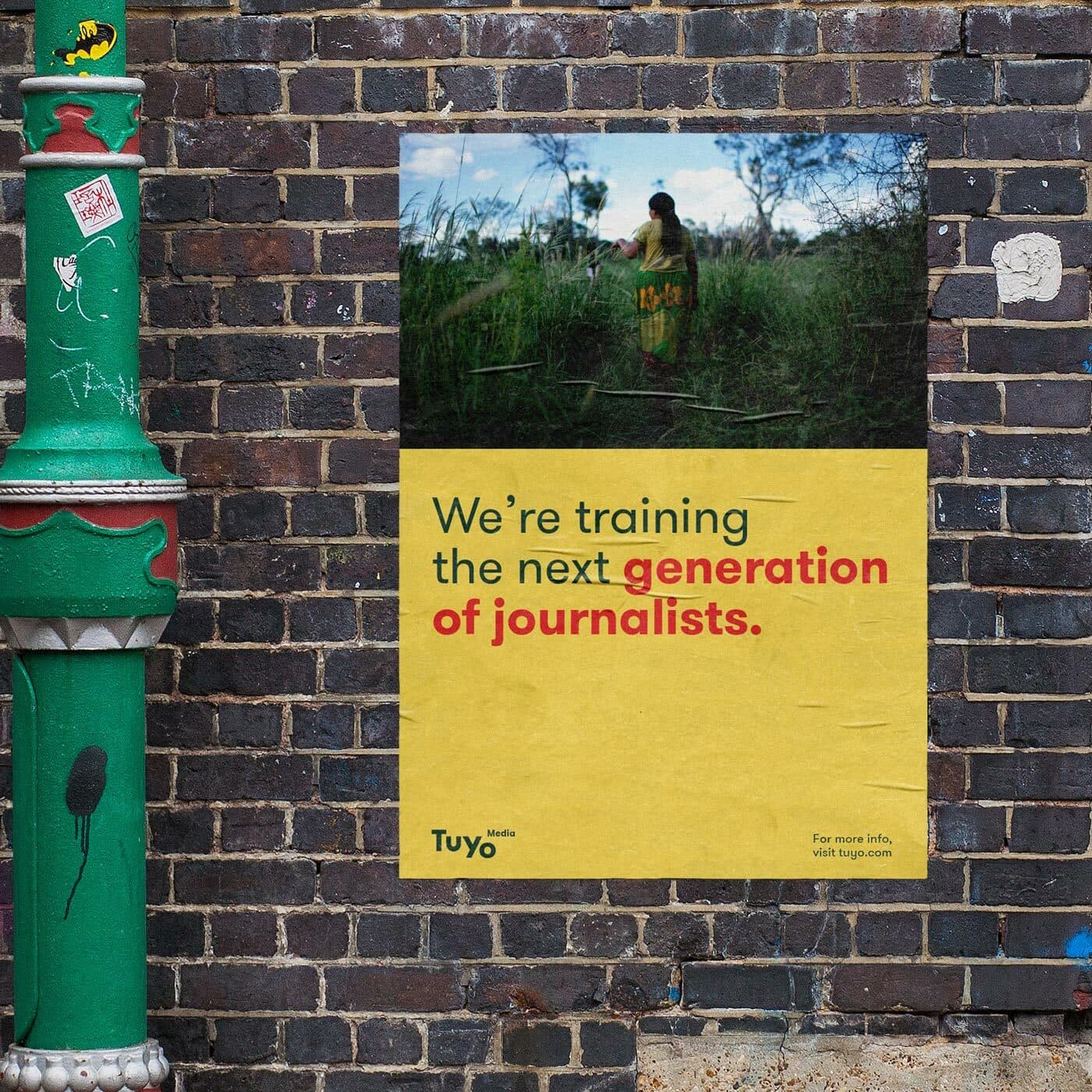
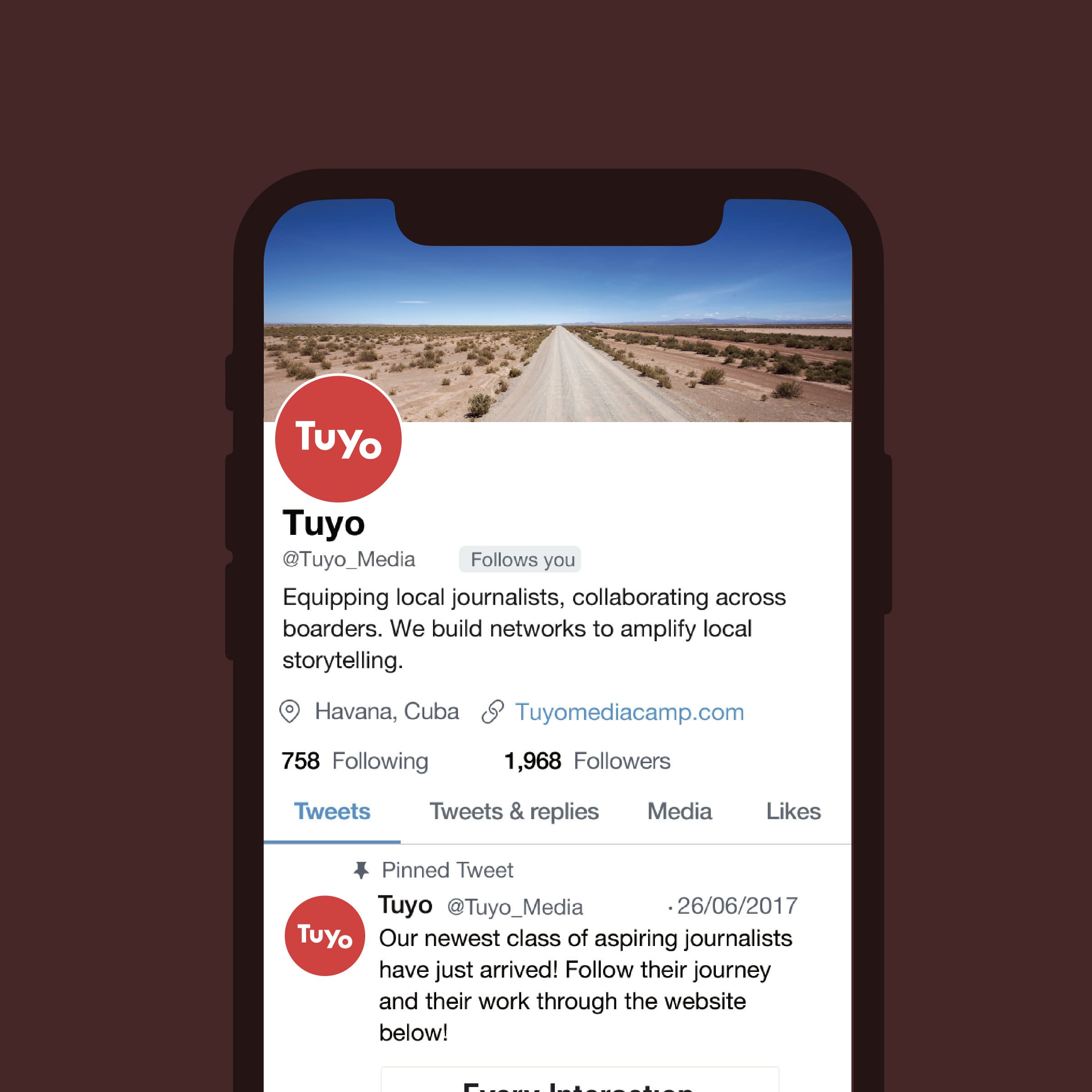
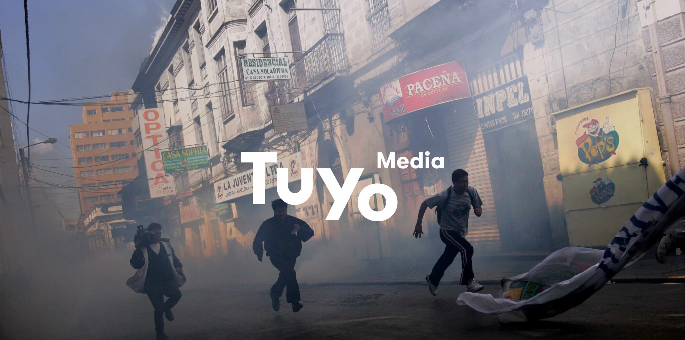
Tuyo relies heavily on storytelling through powerful photographs. To incorporate this functional perspective, the mark has to harmoniously coexist with a wide spectrum of imagery. The mark has to be adaptable to overlay on an image, while not overpowering an individual photograph's moment of hope, danger, joy or reflection.

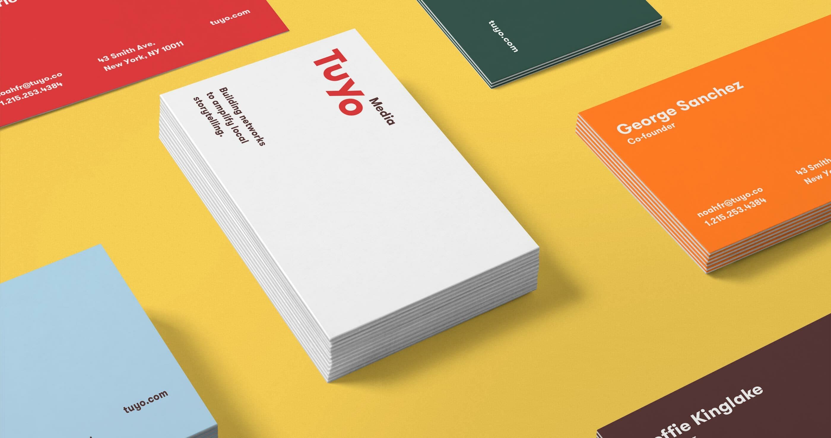
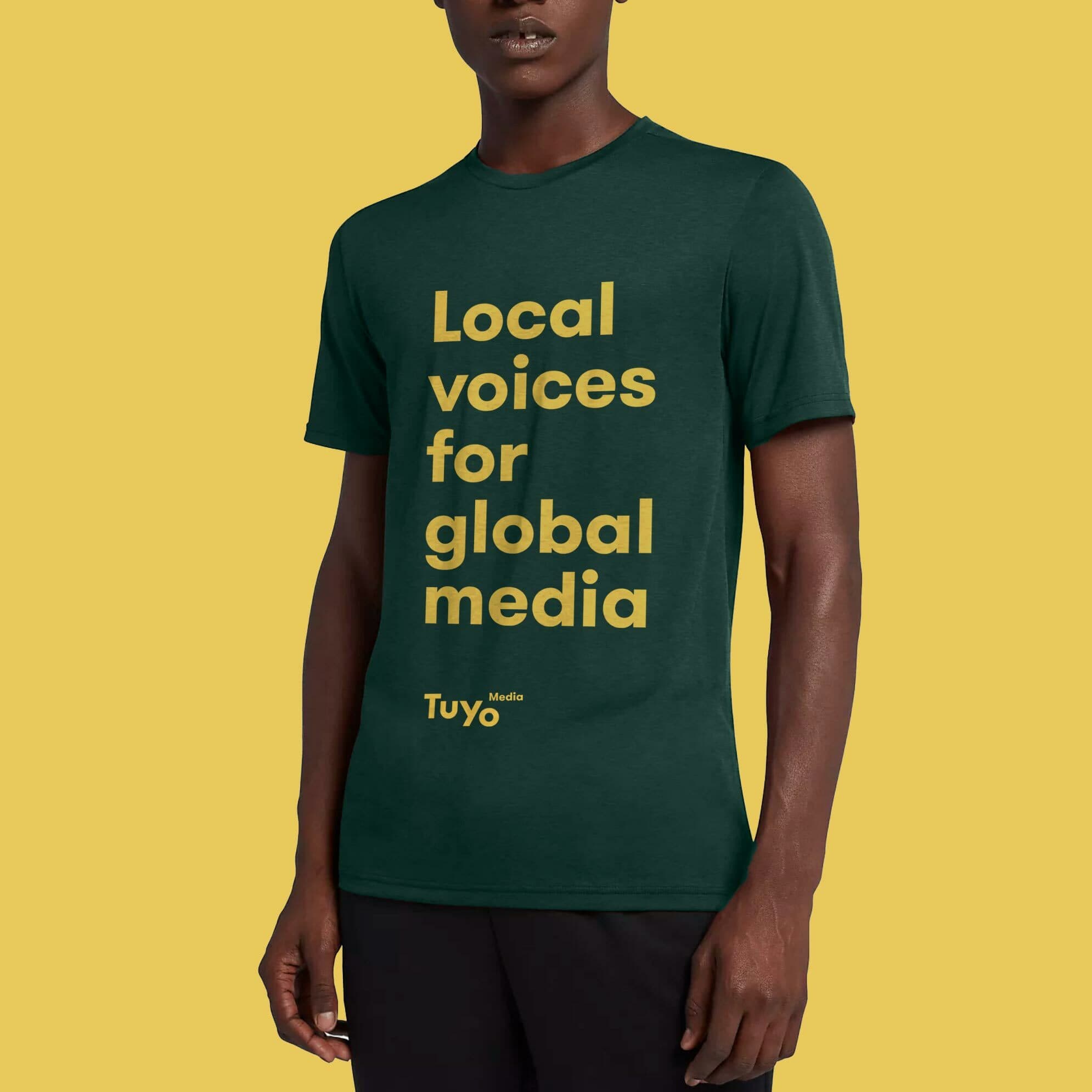
A naturally diverse palette

Anchored by a vibrant vermillion red, the full range of the brand’s color palette pays homage to earth’s natural and cultural diversity. This softer, complementary tonality allows the imagery’s bright moments to be the focal points.

A variety of business cards are spread out on a yellow surface. The central pile features the "Tuyo Media" logo prominently in red. Other cards display names, job titles, and contact details in different colored cards like red, green, blue, and orange.
Two tote bags are placed side by side against a dark brown background. The left bag is beige with large red letters "T" and "u". The right bag is orange with large white letters "Y" and "o". Both bags have long handles and a minimalist design.
Three copies of a magazine are laid out slightly overlapping. The cover features an image of people walking, legs visible, with the bold text "We're training the next generation of journalists" on a yellow background. The word "Tuyo" appears on the bottom right.

A visual system that makes its mark

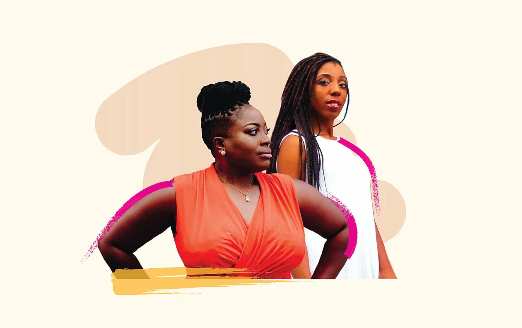
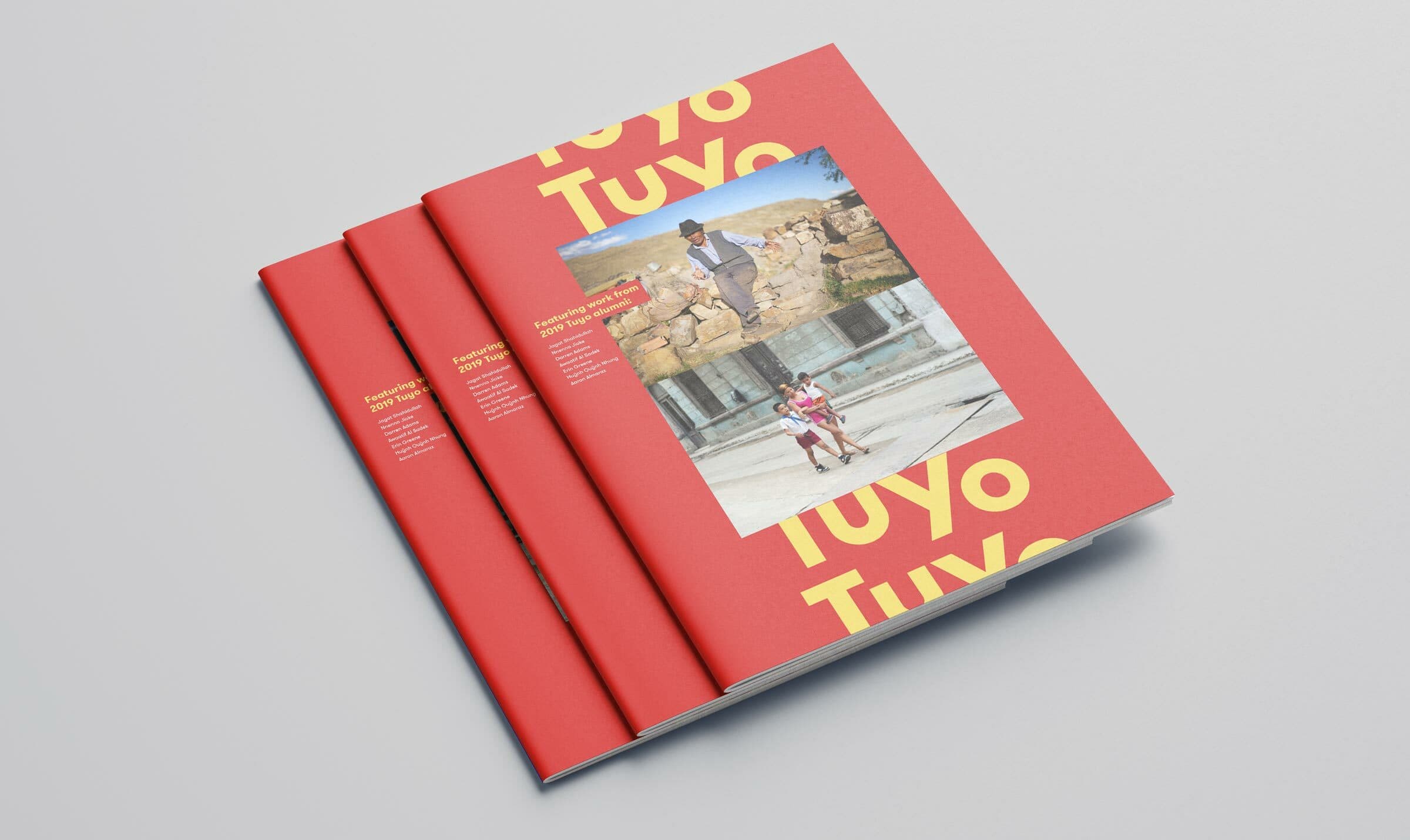
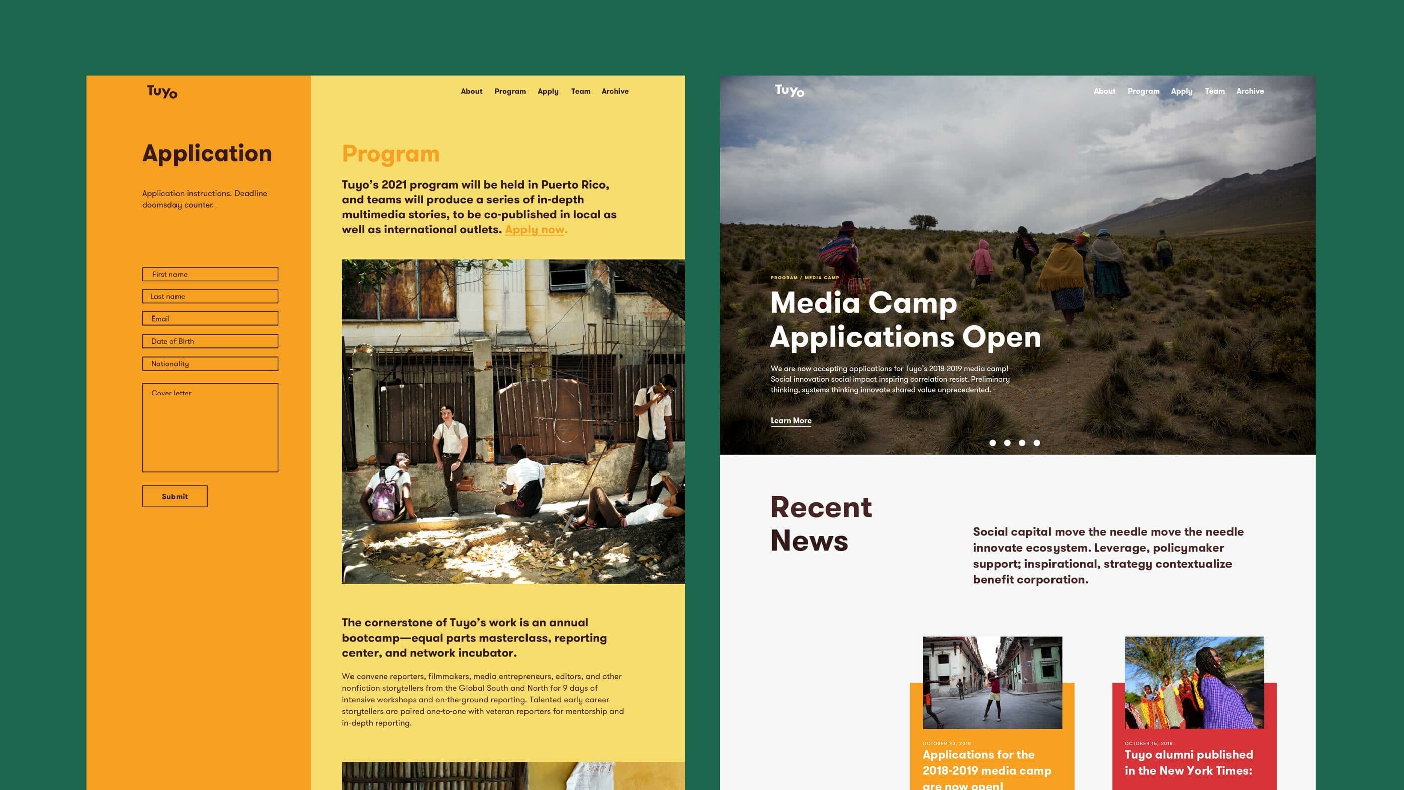
The word mark and palette together afford huge variety on collateral, with the mark legible in multiple formats, from small screens to large posters, even juxtaposed as a magazine masthead. The website combines these compositional assets—mark and color—while showcasing the vibrant diversity of its participants.

A poster on a brick wall shows an image of a person in a field. The text reads, "We’re training the next generation of journalists." Below is the logo for Tuyo along with a note for more information. A decorated green pole is partially visible on the left.
A person wearing a dark green t-shirt with the words "Local voices for global media" and the logo "Tuyo Media" in yellow text. The background is a solid yellow color. The person is standing with one arm by their side.
Three red-covered books titled "Tuyo Tuyo" are stacked in a fan arrangement. The cover features bold yellow letters and an image of a man in traditional attire alongside a child, set against a backdrop of stone structures and a clear blue sky.

A digital homebase

The Tuyo website serves as an inviting touchpoint for students considering applying for the program. With team bios, an overview of the program, and application details, the website's aim is to give writers to have the confidence and conviction needed to press "send" on their submissions.

Two sections display different web pages. The left section shows an application form with a yellow background, while the right section has a photograph-heavy news layout with mountains, highlighting a media camp and recent news. The design features a modern, clean aesthetic.
Our materials had the feel of an abstract idea. Our new branding has been crucial in helping us to both think through and present our vision.
Noah Friedman-Rudovsky
Co-Founder and Executive Director, Tuyo Media
A smartphone displaying a Twitter profile for "Tuyo," an organization focused on equipping local journalists. The profile background image shows a desert landscape with a winding road. The tweet reads: "Our newest class of aspiring journalists have just arrived!.
A top view of a smartphone showing an Instagram post by TuYo Media. The image in the post captures an aerial view of a stark white tree lying horizontally in a green and brown landscape. The phone's screen displays a time of 4:07 and a single heart icon underneath the post.
The image features the Spanish words "Tu" (top left) and "Yo" (bottom right) on a blue background. The "u" in "Tu" contains a photo of an elderly woman's face in profile, while the "o" in "Yo" shows the legs of people walking and colorful fabrics.
Our new visual identity is flexible, professional, and cool.
Noah Friedman-Rudovsky
Co-Founder and Executive Director, Tuyo Media
People are running down a smoke-filled street lined with buildings and shop signs. The street appears to be in turmoil. In the foreground, three individuals are actively moving away from the smoke. White text overlay reads "Tuyo Media.

Behind the scenes

A collection of hand-drawn sketches on a white background featuring various iterations of the word "Tuyo" in different fonts, styles, and orientations. The sketches are spread across multiple sheets of paper, showcasing diverse creative designs.

Project Credits

Project Team
Ready to unlock the potential of your nonprofit's brand?
Reach Out