Background
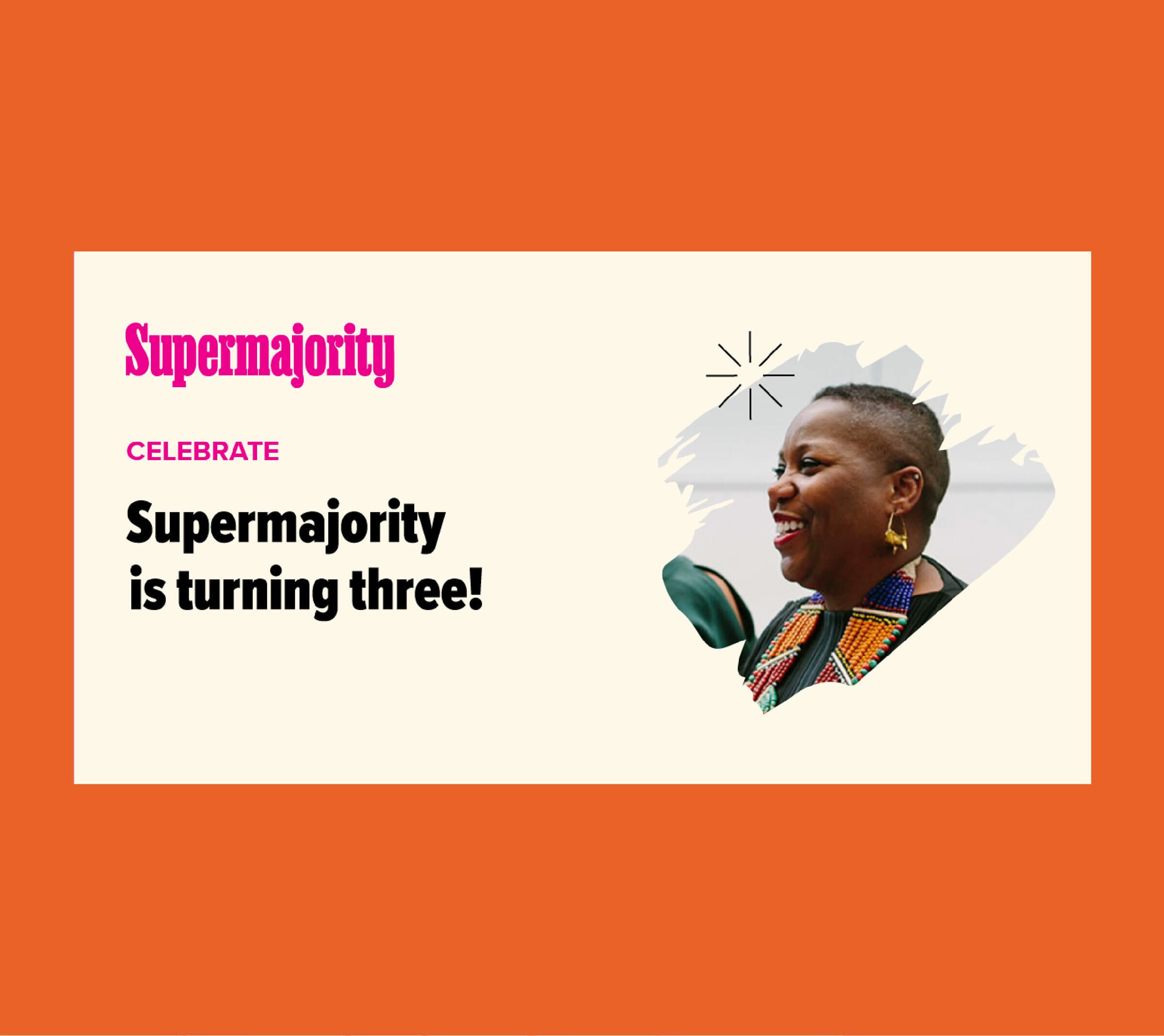
Supermajority was founded on the wave of anger and resistance that followed the 2016 election and the singular question that came from that jarring moment: “What could women do to build the world we deserved?” The organization (which is actually made up of two legal entities) focuses on two lanes of work: education and community building under their 501c3 entity and organizing and political action through their 501c4 entity.

Original wordmark created by Champions Design. Updates by Hyperakt.
The challenge
In the first few years, Supermajority was centered on removing Trump from office. Following the election of Biden, their brand had lost direction and focus. What was the animating purpose of the organization? Why did they exist? Whom did they wish to serve? It was time to renew the purpose of the organization and their promise to audiences.
The opportunity
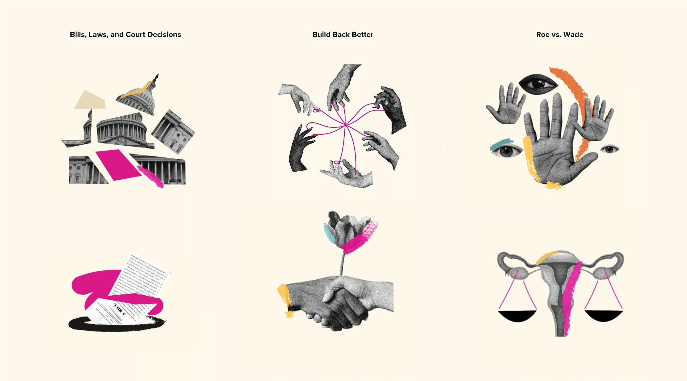
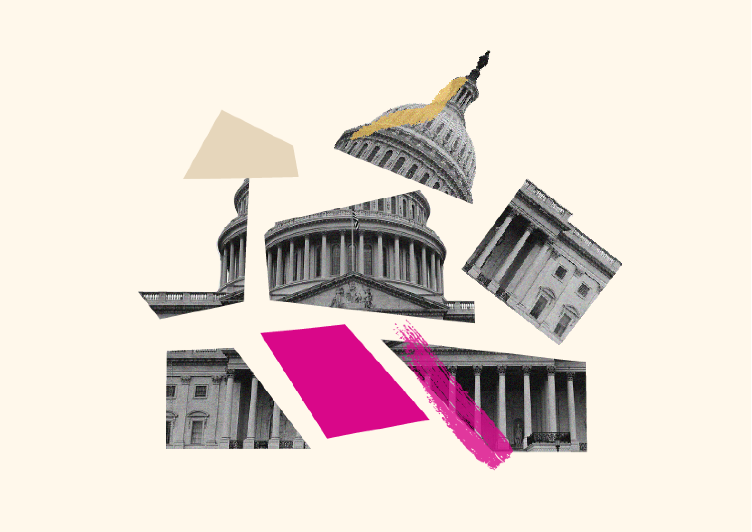
The first step was to decenter the founders’ identities in the brand and build out a clear value proposition for the organization. To do this, we needed to pull apart the often-conflated identities of their community-building entity (501c3) and their political mobilization entity (501c4) and clarify what each one does, for whom, and why.
Supermajority (501c4)
Supermajority Education Fund (501c3)
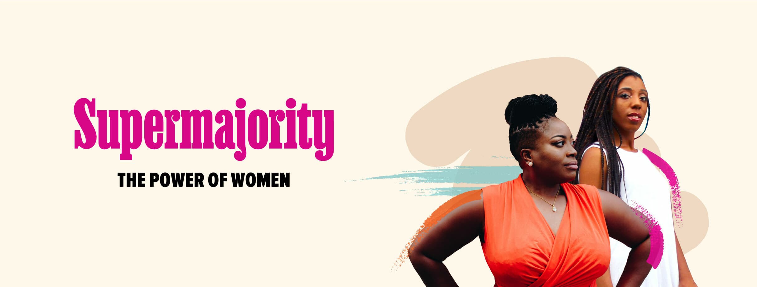
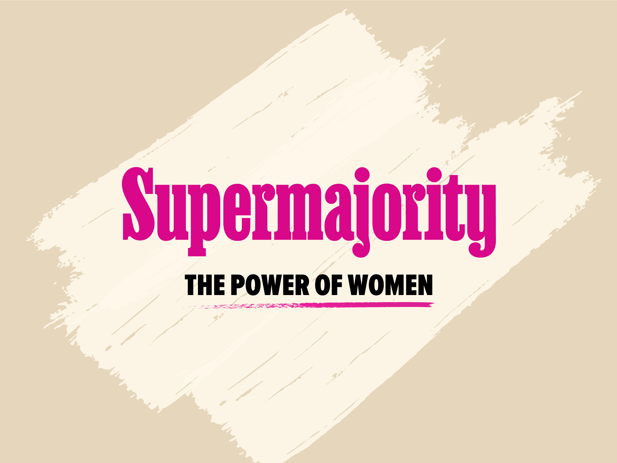
Supermajority
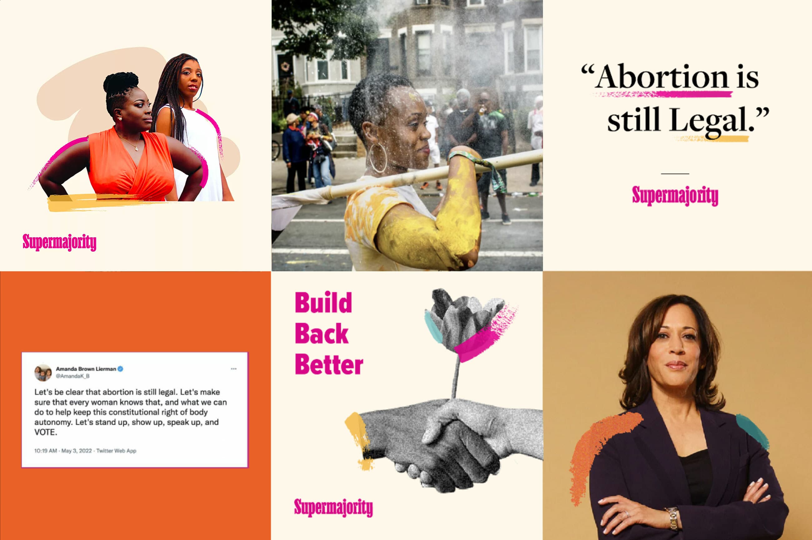
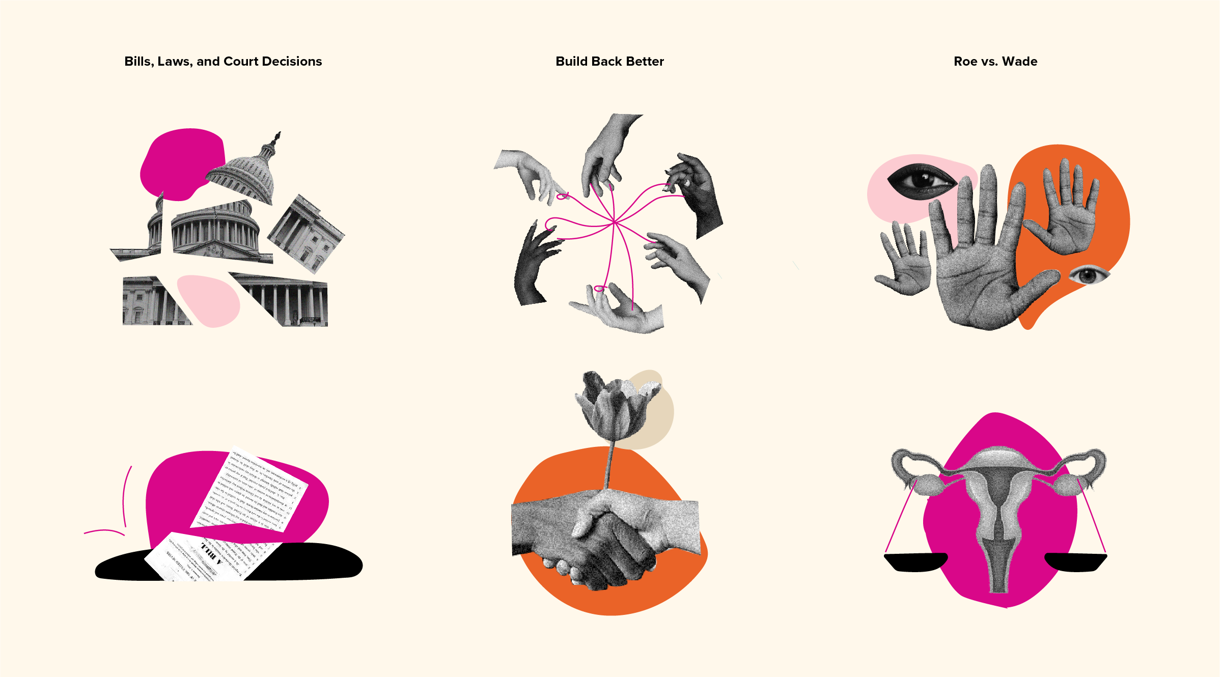
Supermajority (the 501c4) focuses on activating a politically-curious community of women from all backgrounds into a voting bloc with collective strength to take action on issues that matter to women. Supermajority is steered by shared values, shaped by activism and engagement, and driven to build agenda-setting influence. This brand was distinctly about lighting a fire, stirring courage, and breaking down barriers.

Supermajority visual identity
The more political and action-oriented 501c4 was invigorating, powerful, and edgy. It leaned into the original brand color of hot pink and supplemented it with a powerful orange. The photography was raw and moving, showing women on the march, fighting for their rights.


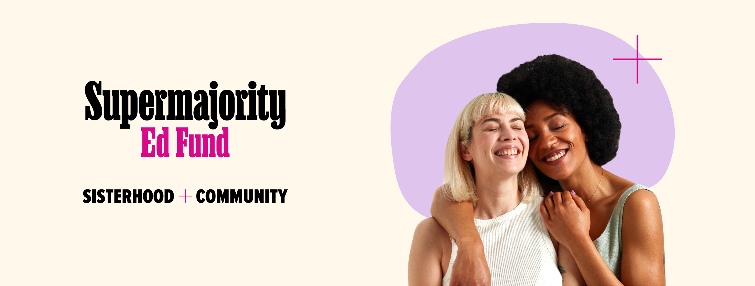
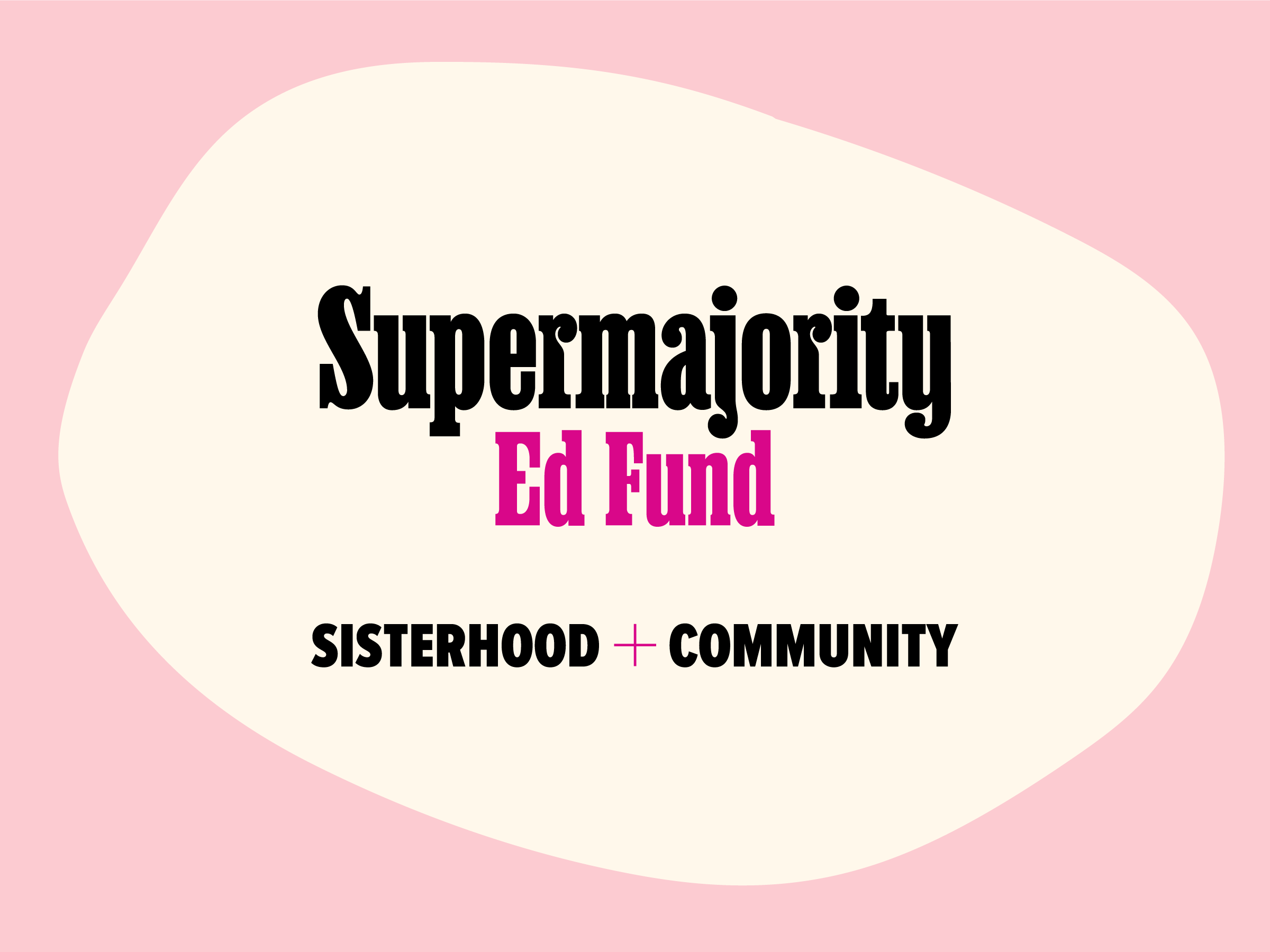
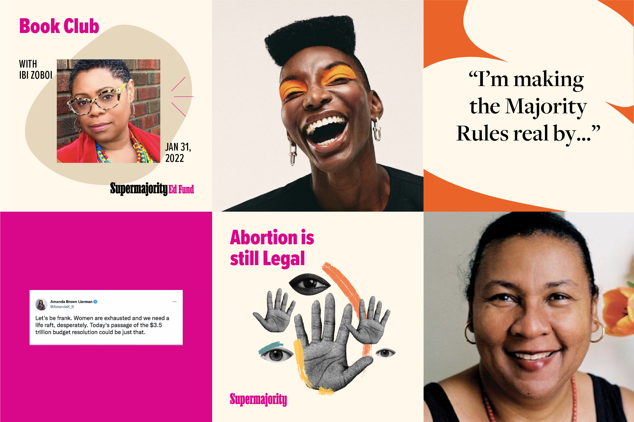
Supermajority Education Fund
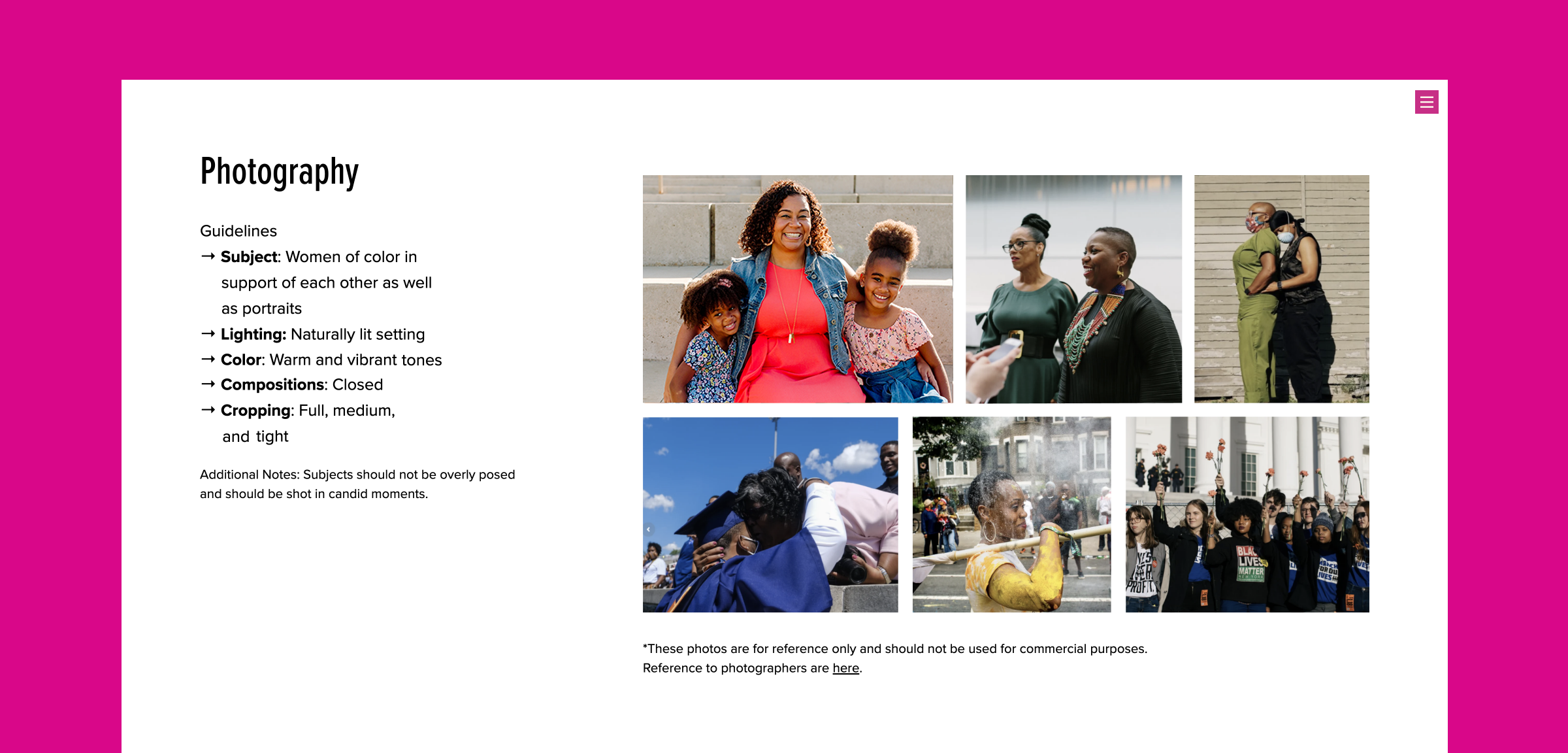
Supermajority Education Fund (the 501c3) brings together women from historically excluded communities to learn from each other's lived experiences. Ed Fund is about valuing connections and encouraging women to become leaders in communities, workplaces, and at the voting booth. This meant building a brand that plants seeds of hope, strengthens solidarity among women, and lifts spirits.

Supermajority Education Fund visual identity
The visual expression of the 501c3 was about light, effortless, and encouraging, and used warm pastels and photography that depicted women in community with each other.


Project Credits
- Pauline Shin
- Lola Jacobs
- Deroy Peraza
- Ritesh Gupta