Work

Amplify: Science of Reading

A bright, inclusive, and friendly design system for Amplify's Science of Reading campaign.

Background

A pioneer in K–12 education since 2000, Amplify leads the way in next-generation curriculum and formative assessment. Amplify programs are backed by Science of Reading: brain science from their research about how kids learn to read.

The challenge

Amplify's brand, which incorporates many illustration styles across its campaigns, was suffering from stylistic inconsistency. Hyperakt was tasked with evolving Amplify's design and illustration system with unified styles that could be applied across campaigns and products. This new system needed to be reflective of Amplify's innovative DNA and needed to be flexible enough to communicate a broad set of concepts and brand stories.

A poster titled "Science of Reading and Middle School Literacy Instruction." It features a child in a red shirt writing in a notebook, with an illustrated pencil curving toward two smaller circular images of diverse people reading. Text in orange and gray provides details.

The opportunity

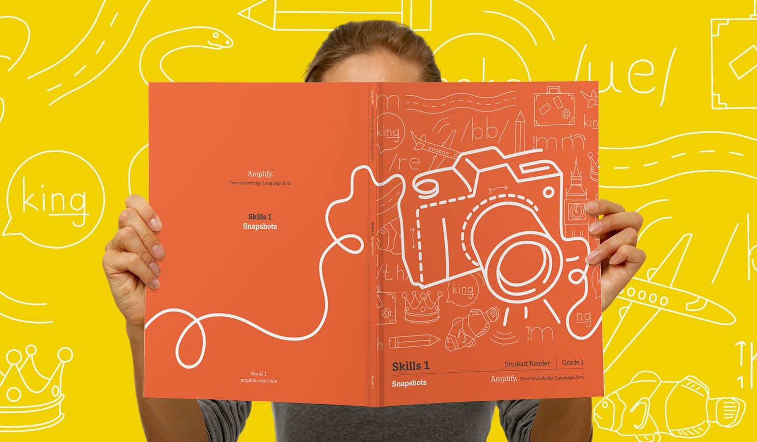
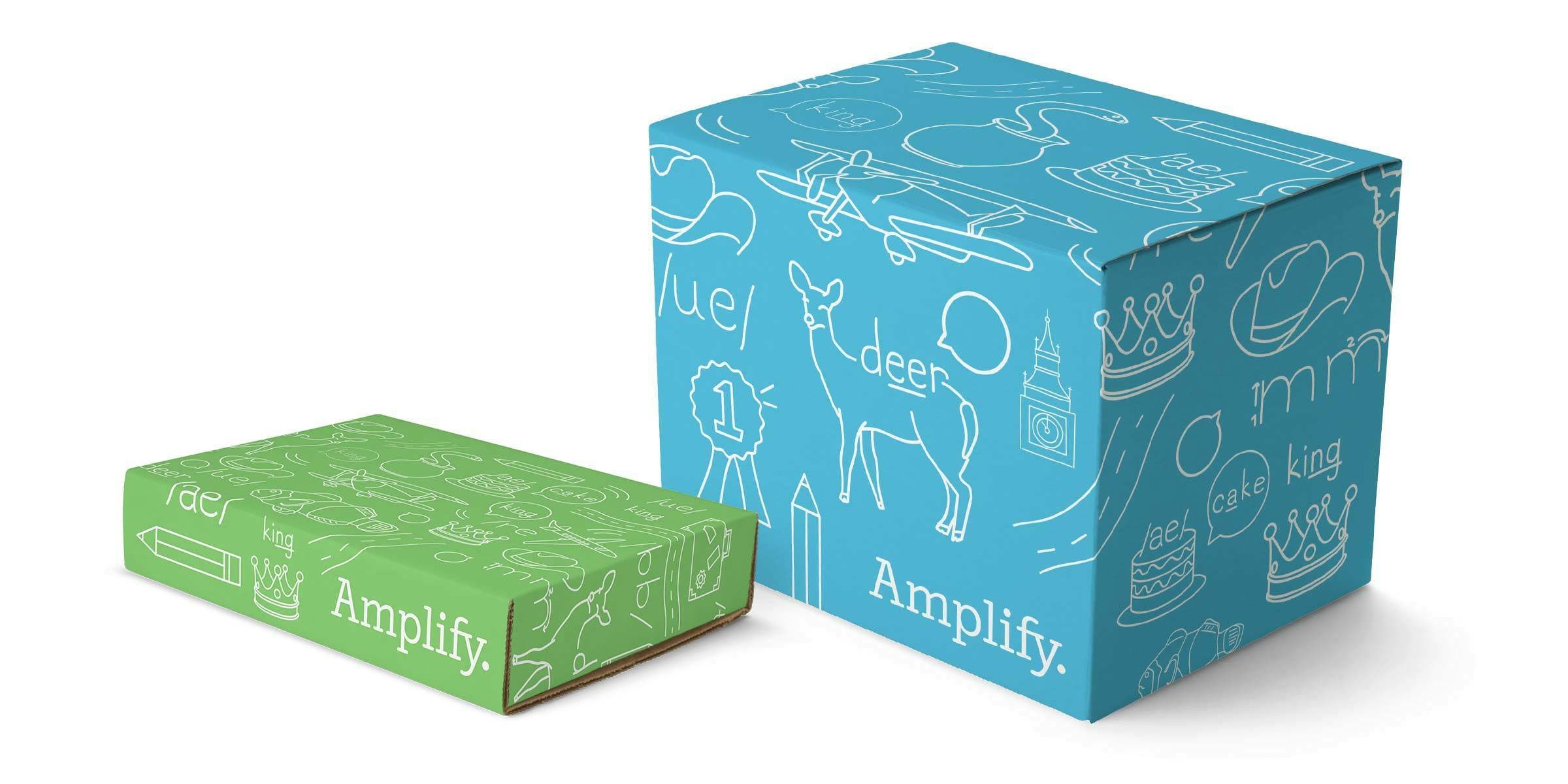
Following a comprehensive review of their brand system and marketing landscape, we developed a design framework Amplify would be able to build on for future campaigns. This system prioritizes inclusivity, accessibility, coherence, and scalability. It features subtle geometry and suggestive lines, allowing viewers to complete the picture with their imagination.

A unified color palette

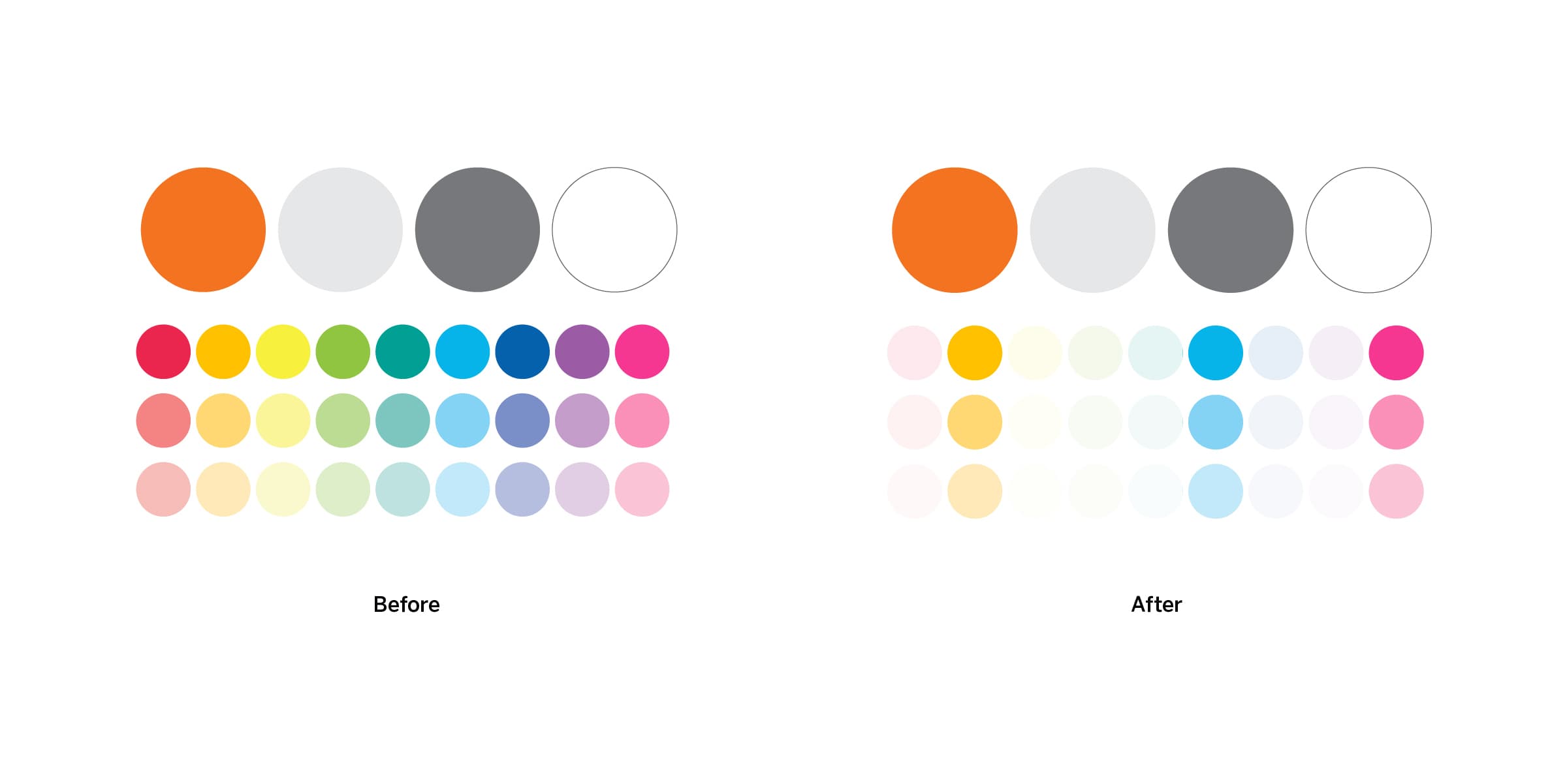
The color palette utilizes Amplify orange and gray supported by tones of gold, cyan, and magenta. The color palette, which is more limited than it had been, allows for compositions to live in harmony with one another.

Comparison image showing four circles labeled "Before" on the left and "After" on the right. Below are five rows of colored circles, with colors in the "After" section appearing lighter and less saturated than those in the "Before" section.

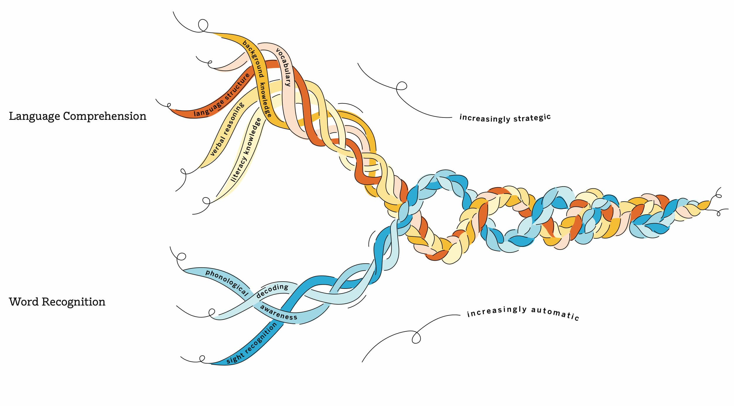
Our own Scarborough Reading Rope

Dr. Hollis Scarborough's Reading Rope, comprised of intertwined strands, illustrated the intricate process of achieving fluent reading with comprehension. We illustrated the Scarborough Rope to match Amplify’s palette and illustration style. Individual strands from this rope are then incorporated into the illustration system.

A diagram illustrating reading comprehension using two strands: Language Comprehension and Word Recognition. The strands intertwine, moving from 'increasingly automatic' to 'increasingly strategic' processes, including vocabulary, background knowledge, and phonics.
The image shows a split design with the left side displaying a webpage titled "Science of Reading: Your guide to making the shift," featuring a smiling child and an undulating ribbon. The right side shows a tablet screen with the podcast "Science of Reading The Podcast.

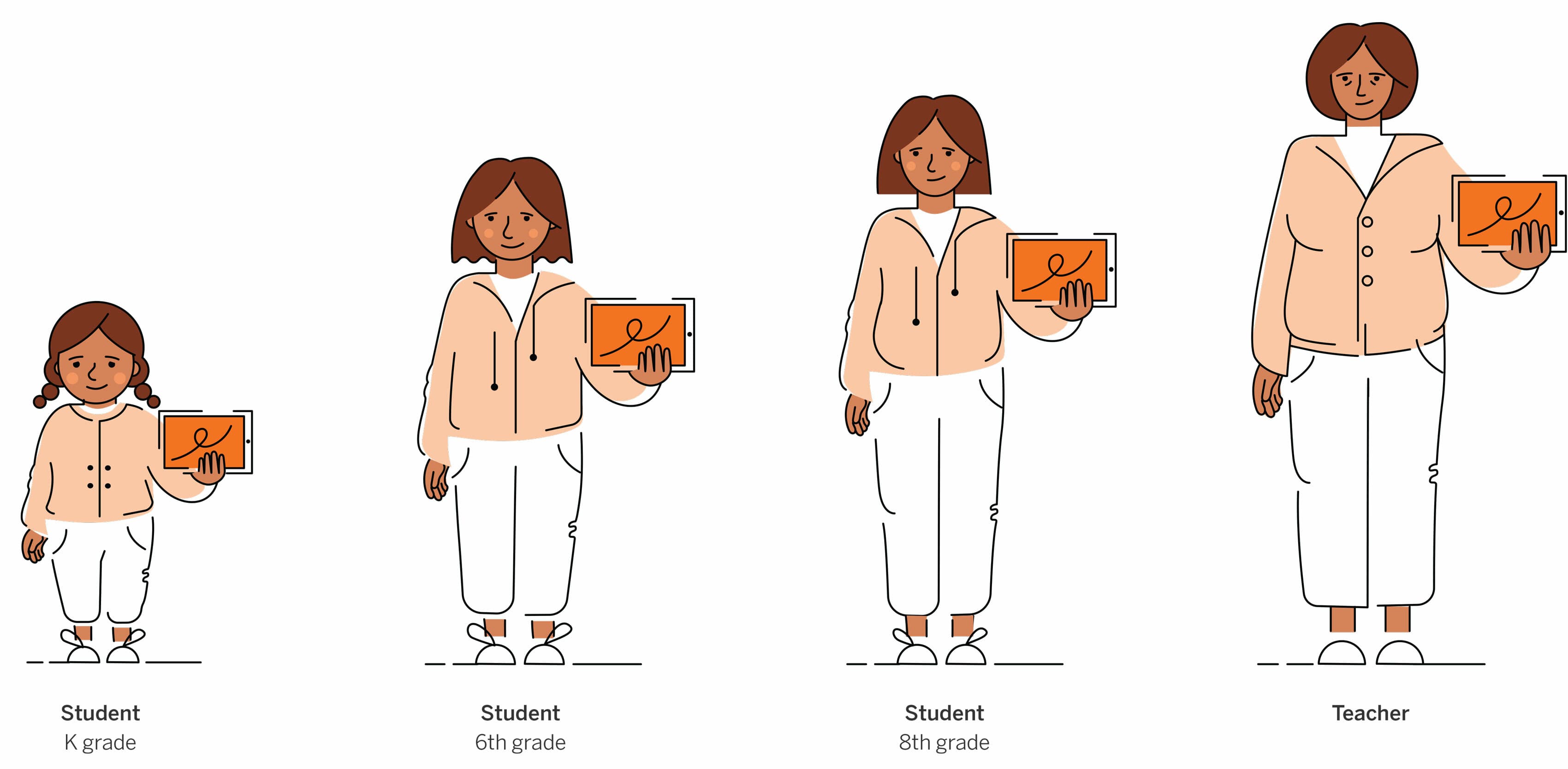
Illustrating diversity

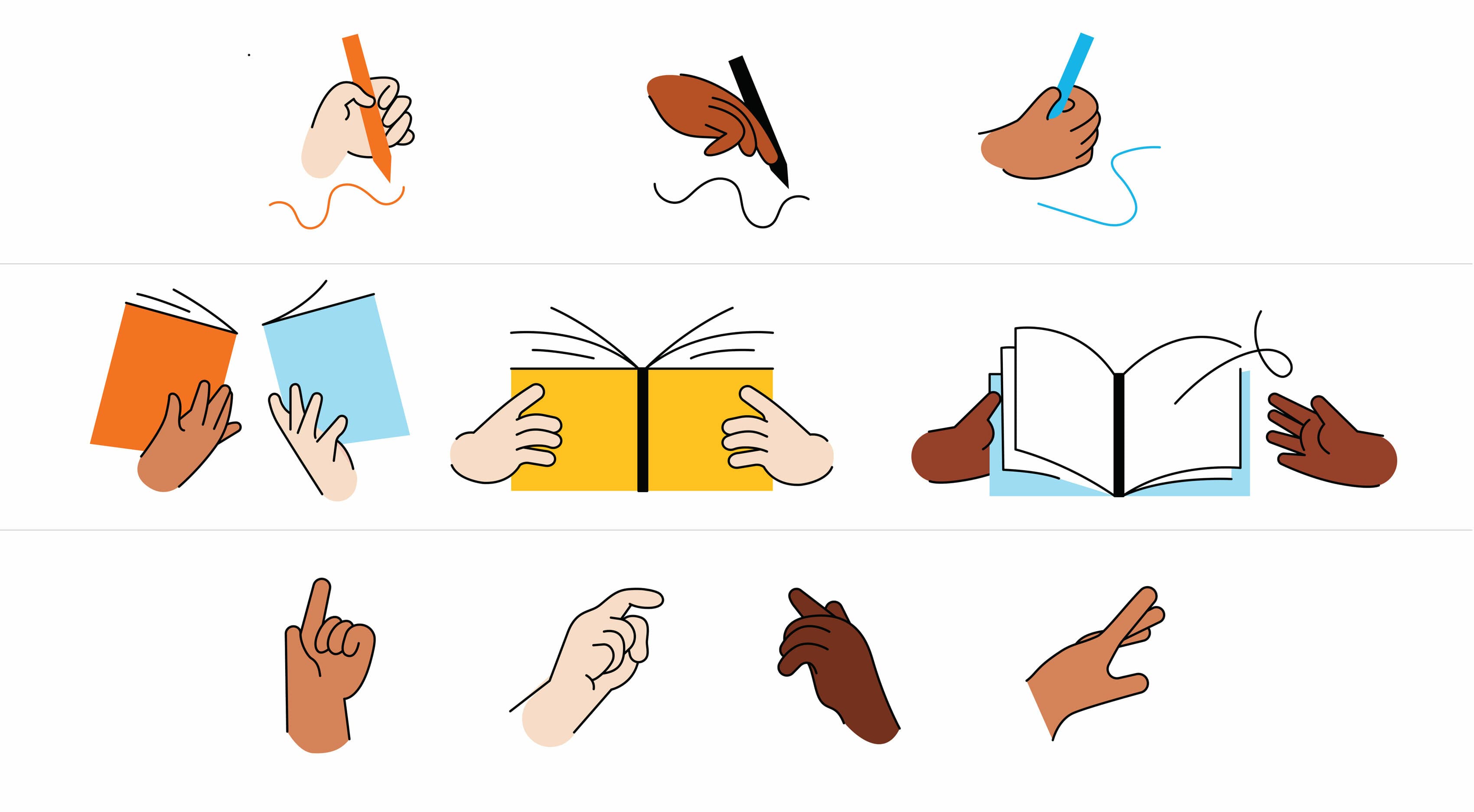
Our illustration system carefully considers facial views, scale, and color palettes to accurately represent people of different ages and diverse backgrounds. Emotions are expressed through detailed facial and body expressions, utilizing photo references for accuracy. Movement is emphasized, with a foundational library established for hand illustrations.

The image depicts a grid of various skin tone shades on the left, ranging from light to dark. On the right, there are nine cartoon-style portraits of people with different hairstyles and skin tones, each showing a unique profile or expression.
Illustration featuring nine faces with varied hair and skin tones on the left. The right side shows a color palette with various shades ranging from light to dark, organized in a grid.
A series of six cartoon illustrations show a girl expressing different emotions and actions. Top row: "Normal", "Happy", "Excited", "Frustrated", "Concentrating", "Aha!". Bottom row: corresponding body language for each emotion with relevant props.
An illustration depicts a student progressing from Kindergarten to 8th grade alongside their teacher. The first three figures, labeled as students in K grade, 6th grade, and 8th grade, show a child growing older. The final figure is labeled as a teacher.
A set of illustrated hands performing various actions. Top row: hands holding writing tools and scribbling. Middle row: hands holding books. Bottom row: hands pointing, snapping, and making gestures. Each action is depicted with diverse skin tones.

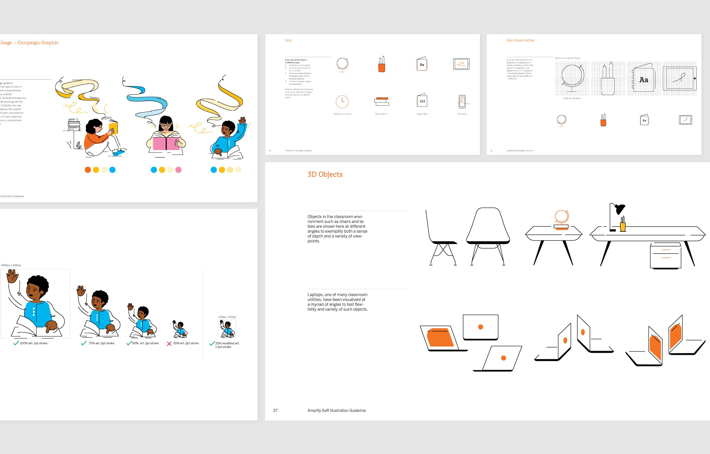
Illustrating activity

When illustrating scenarios, we focus on the main activity: for independent reading, we emphasize student interaction with an item and omit extraneous details like table legs. For teacher-student interactions, we convey the relationship through body motion and linework.

An open magazine on an orange background shows illustrations of people collaborating at desks and engaging in various activities. On the right page, a section titled "COMPONENTS" lists elements like "Student Readers" and "Tech Tools," with accompanying icons.
Illustration of an active teacher handing an orange book to an active sixth-grade student who is running towards them. The teacher wears a yellow vest over a white shirt and white pants, while the student is in a light pink hoodie and white pants.
Illustration of three children sitting at a table, reading books, with a teacher standing nearby holding a pink book. The children appear engaged in their reading, while the teacher looks on, prepared to assist. A wall-mounted device is visible in the background.

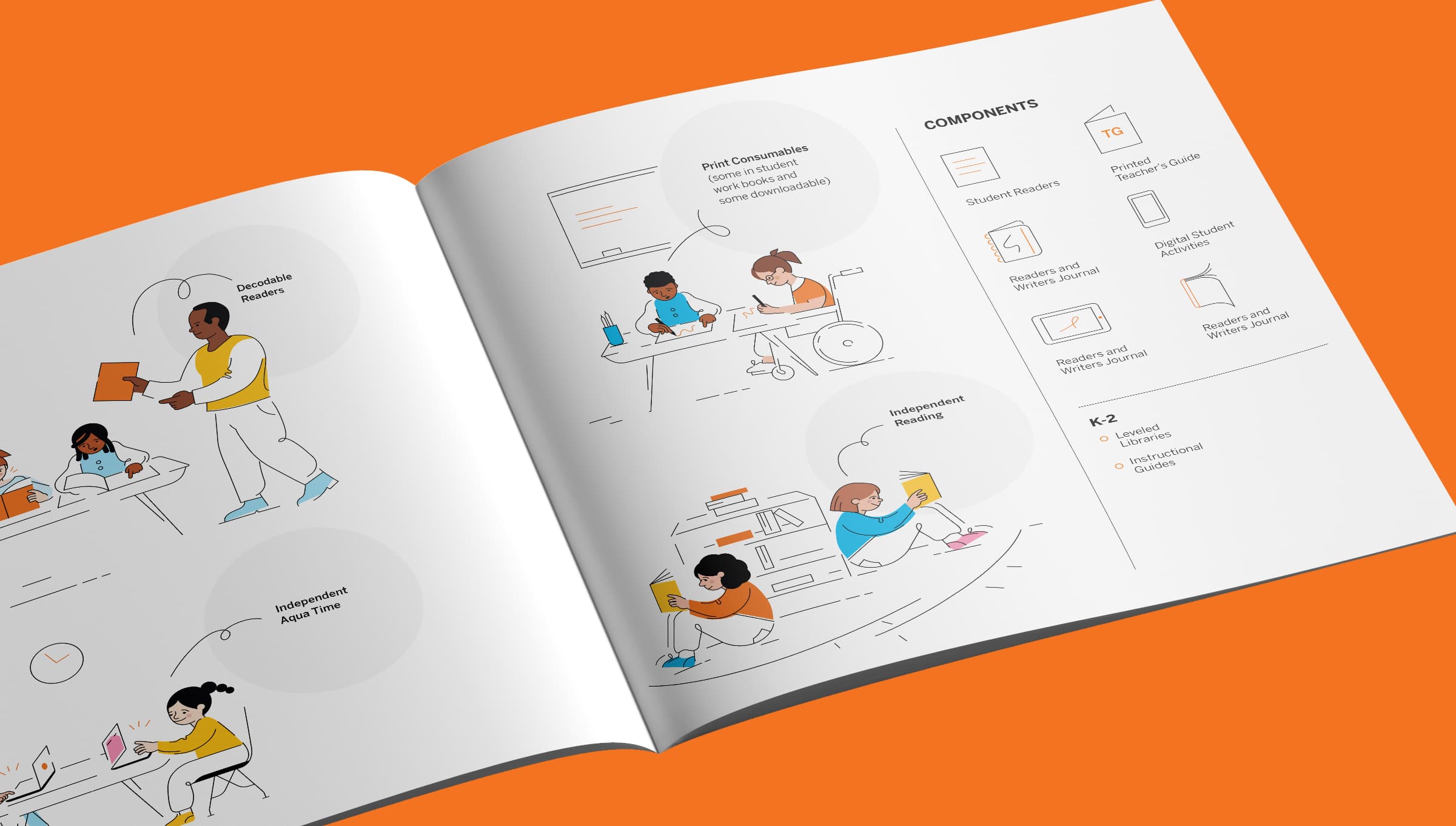
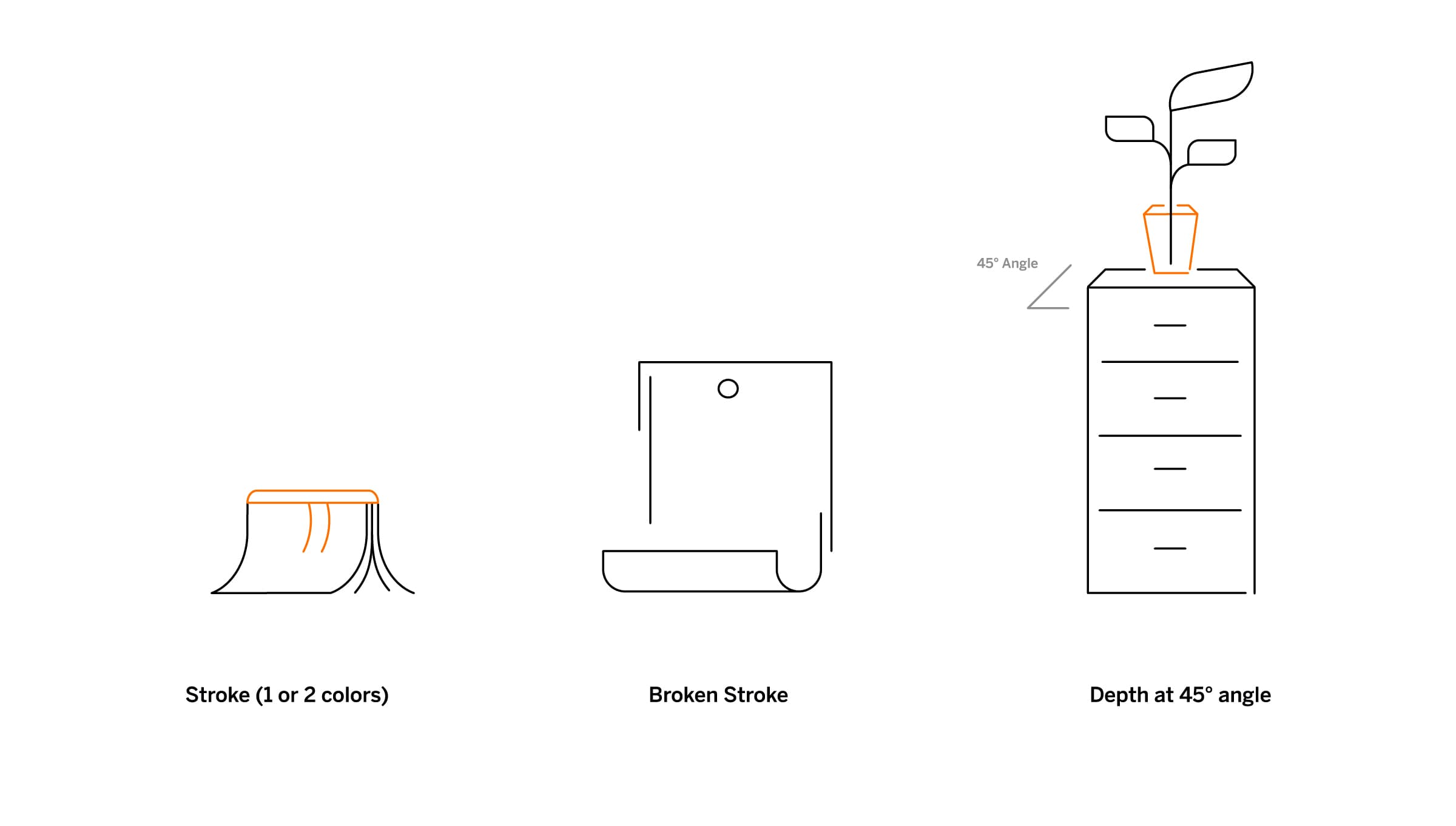
Illustrating objects of literacy

Literacy icons are designed on a square grid with a 2pt. stroke, and can be constructed in four distinct ways for variety while maintaining consistency. Objects, either in 2D or 3D, play a pivotal role in scenario illustrations; 3D objects are angled at 45 degrees for depth. Classroom essentials like chairs, laptops, and books are depicted from various angles, with books being a primary visual showcased in multiple formats.

A detailed design guide featuring sections on changing diapers, breastfeeding, 3D objects, proper and improper diapering methods, 3D object dimensions, and digital devices. Illustrations of parents with babies, chairs, tables, and various digital gadgets are included.
Three minimalist icons show design techniques. "Stroke (1 or 2 colors)" has a waving cloth with a contrasting stripe. "Broken Stroke" depicts an abstract shape resembling a paper roll with a gap in the outline. "Depth at 45° angle" shows a potted plant on a cabinet.

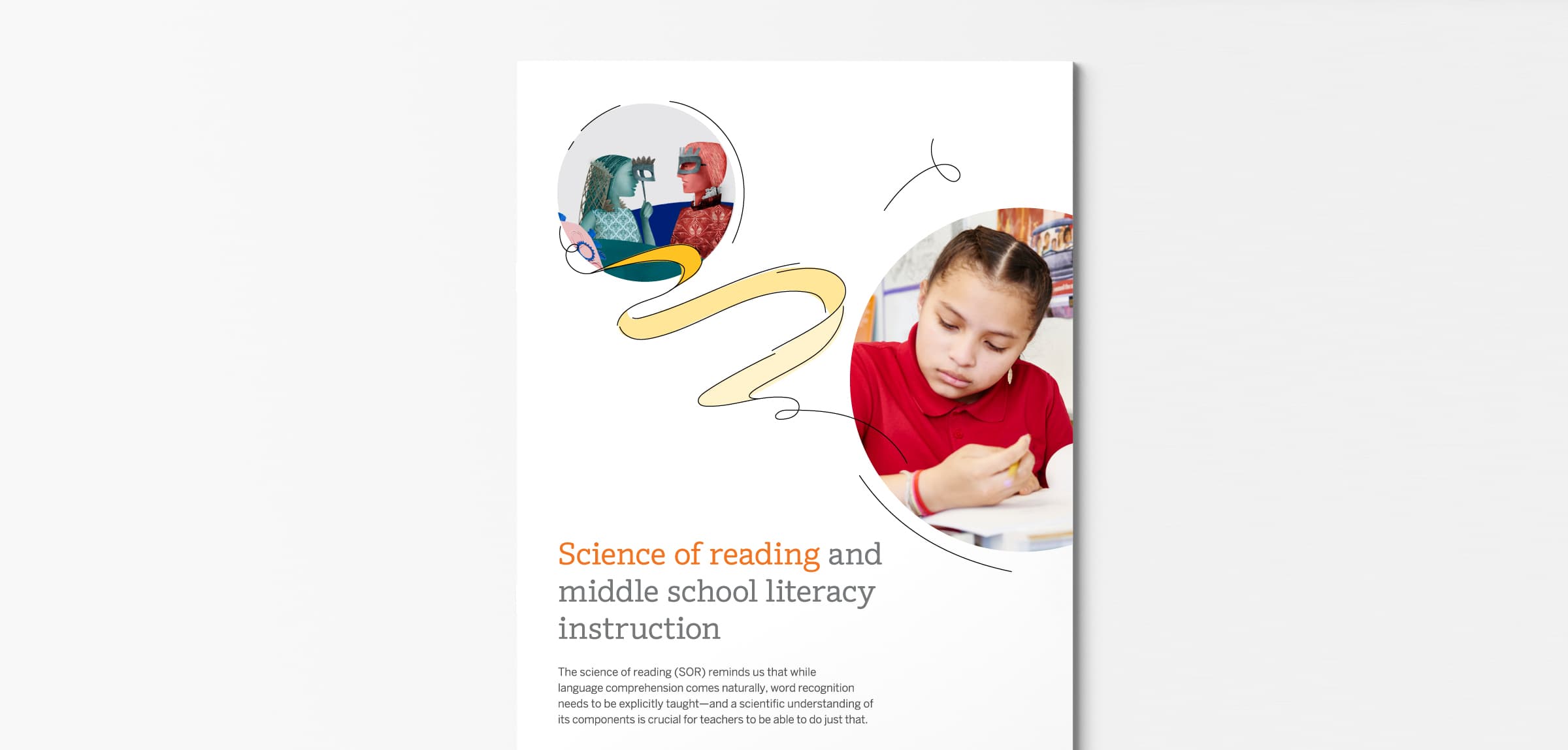
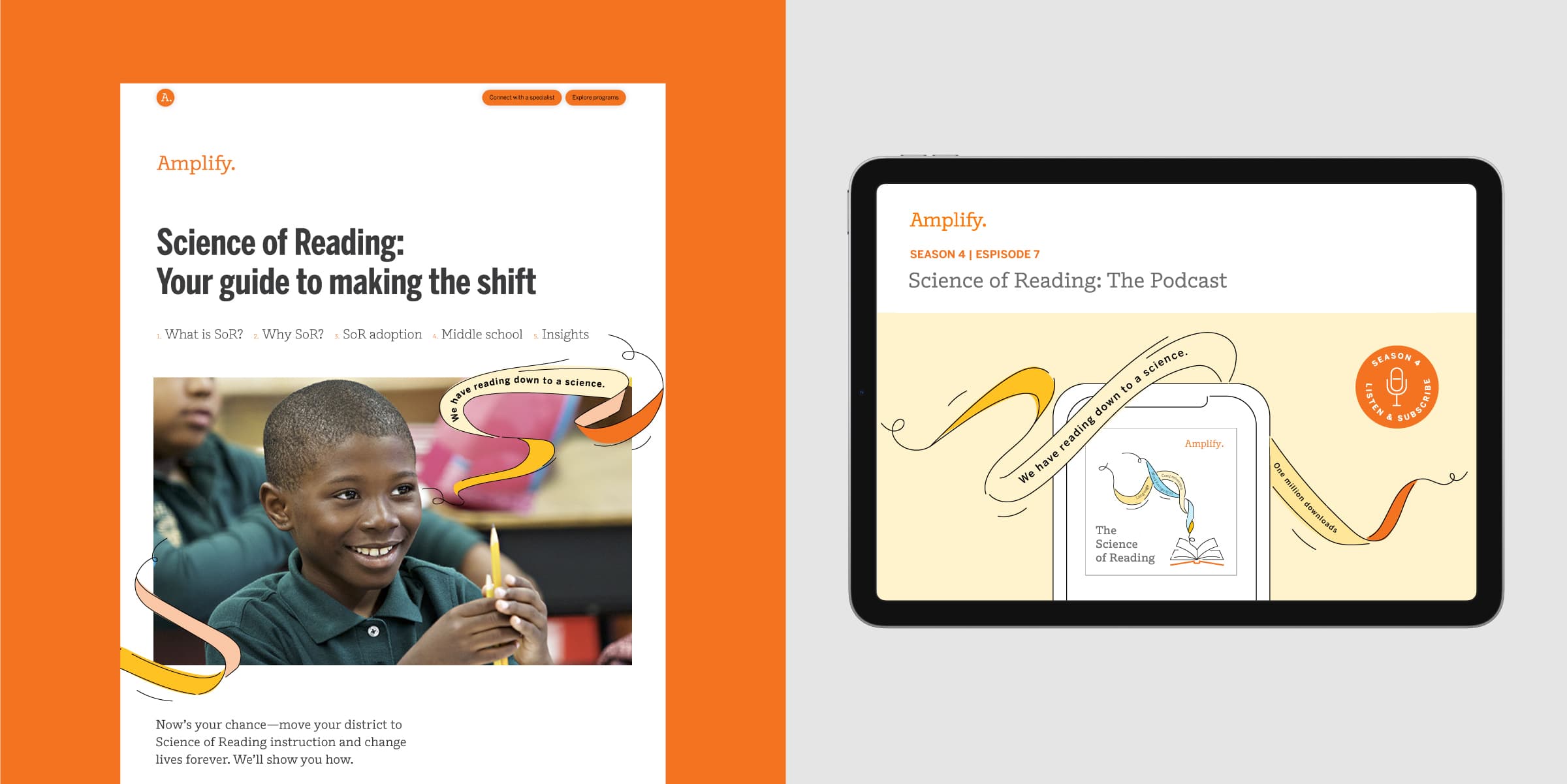
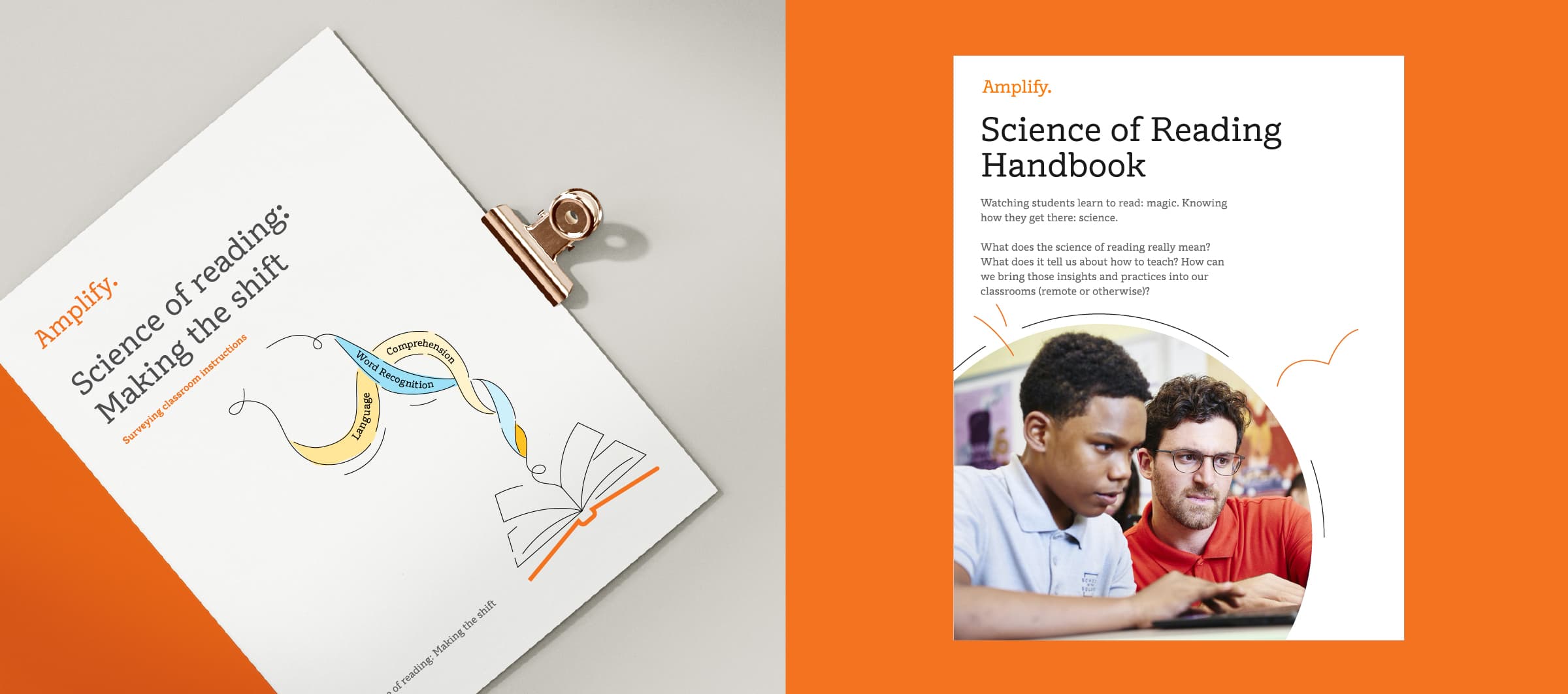
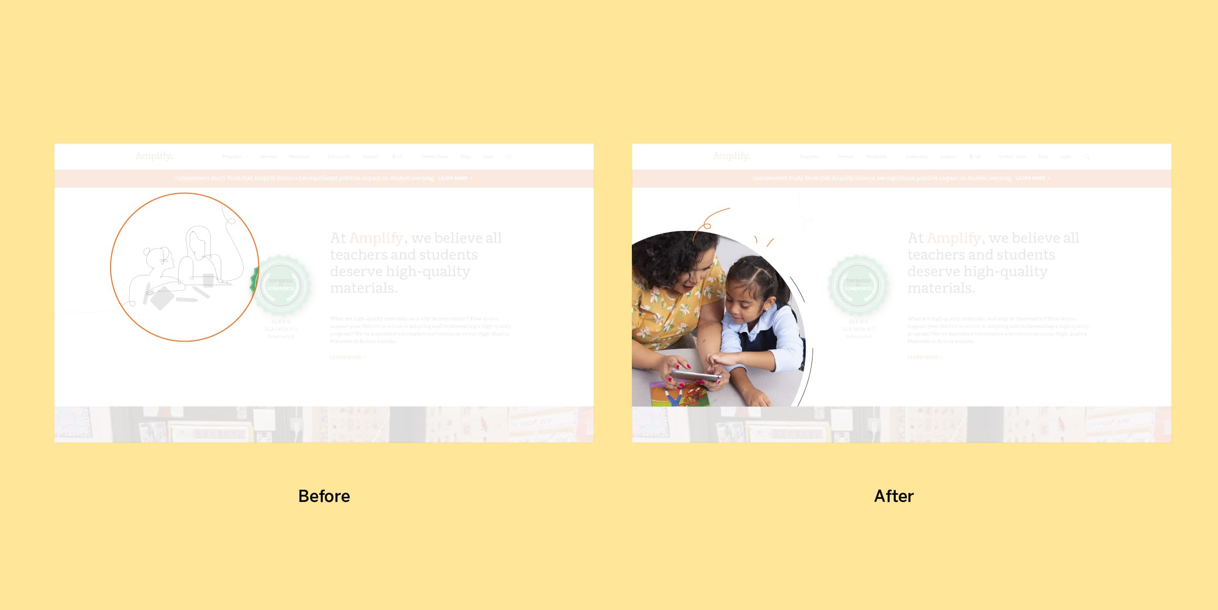
Integrating photography

Campaign images are sourced from the Amplify photo library, appearing in rectangular and circular crops, with the latter complementing the brand's illustrative style. Photos are enhanced using "squiggles" for whimsy, indicating dynamic thought processes in learning to read. Line activation adds flow and interaction with photographs, while the Scarborough rope ties cross-products and photography, sometimes integrating content information directly.

An image featuring two sections: on the left, a pamphlet titled "Science of Reading: Making the Shift" with illustrations of arrows and an open book; on the right, a handbook titled "Amplify Science of Reading Handbook" showing a teacher helping a student with text.
An image showing a website interface update. On the left, the "Before" version displays people outlined in grey. On the right, the "After" version features a colored image of a teacher helping a student, making the website more engaging.

Project Credits

Client
Year of Completion
Issues
Project Team
Ready to unlock the potential of your nonprofit's brand?
Reach Out