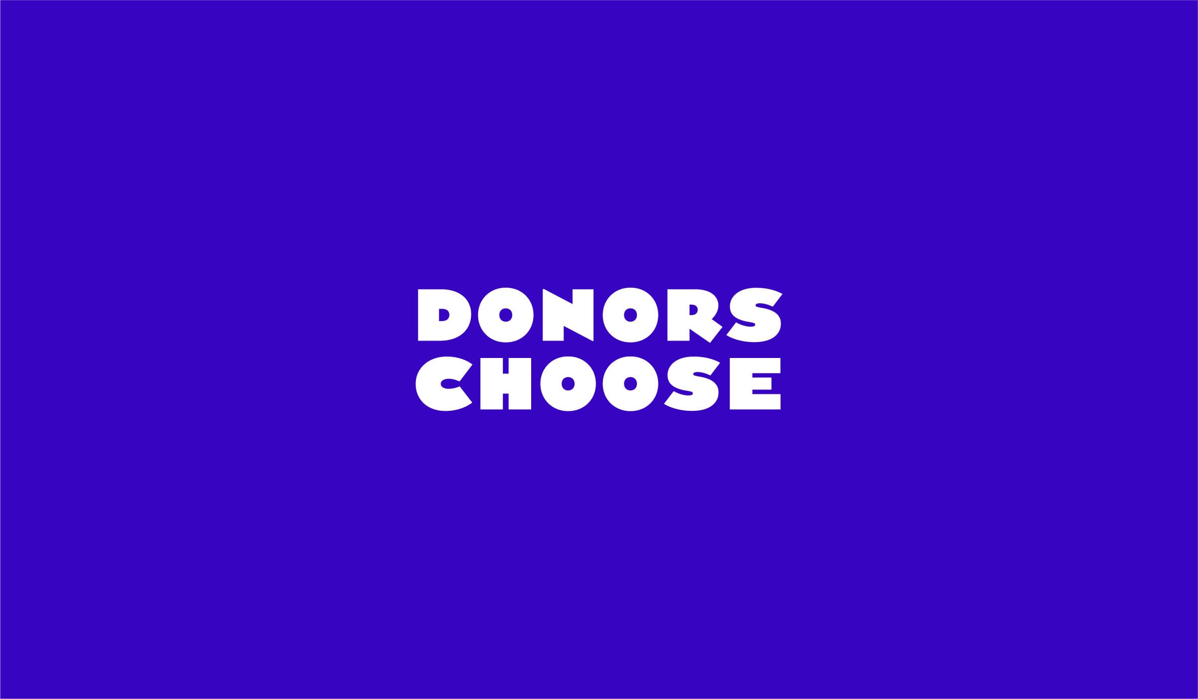
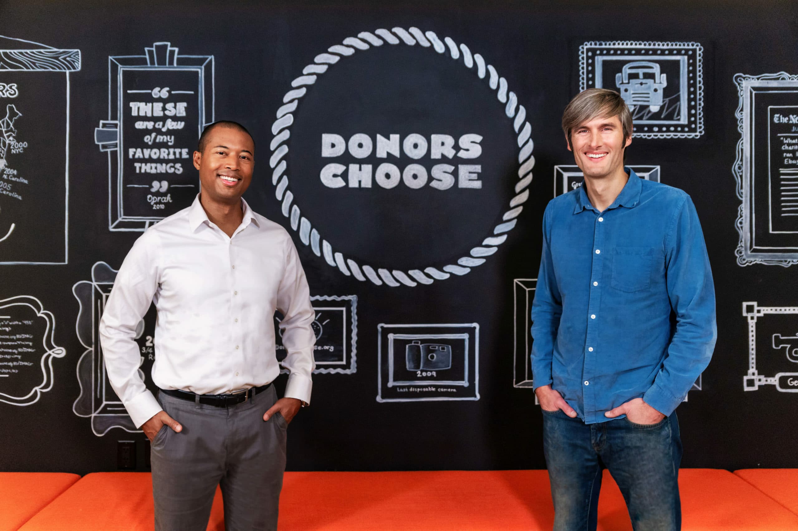
DonorsChoose
After 20 years of bringing joy to classrooms all over the country, DonorsChoose was ready to reintroduce itself to the world with a fresh face and new visual story.
The challenge
Over two decades, a lot had changed. The company had grown substantially, proving the value of its concept and triggering a whole set of competitors and copycats. Classrooms also evolved, placing greater emphasis on technology, flexible learning, and integrated curricula. It was time to level up. And it wasn’t uncommon for first-timers to ask, “Donors choose...what?” In order to compensate for a challenging name, the brand leaned on an ad hoc visual language of outdated symbols like apples and books which no longer felt fresh or representative.

The opportunity
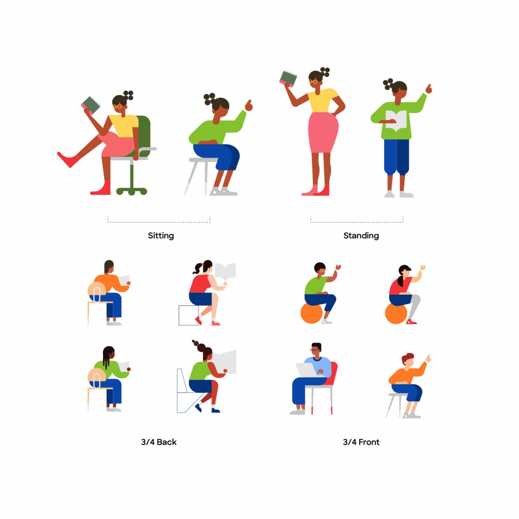
It was time to reposition DonorsChoose as a leading, heart-centered educational nonprofit with a brand that fostered meaningful connections with both new and existing donors. Hyperakt created an adaptable, teacher-friendly visual identity system grounded in vivid, high-contrast colors, custom typography, and dynamic building-block motifs inspired by the energy and imagination of classrooms. This refreshed identity invites teachers to make the brand their own and helps spark limitless possibility for students.
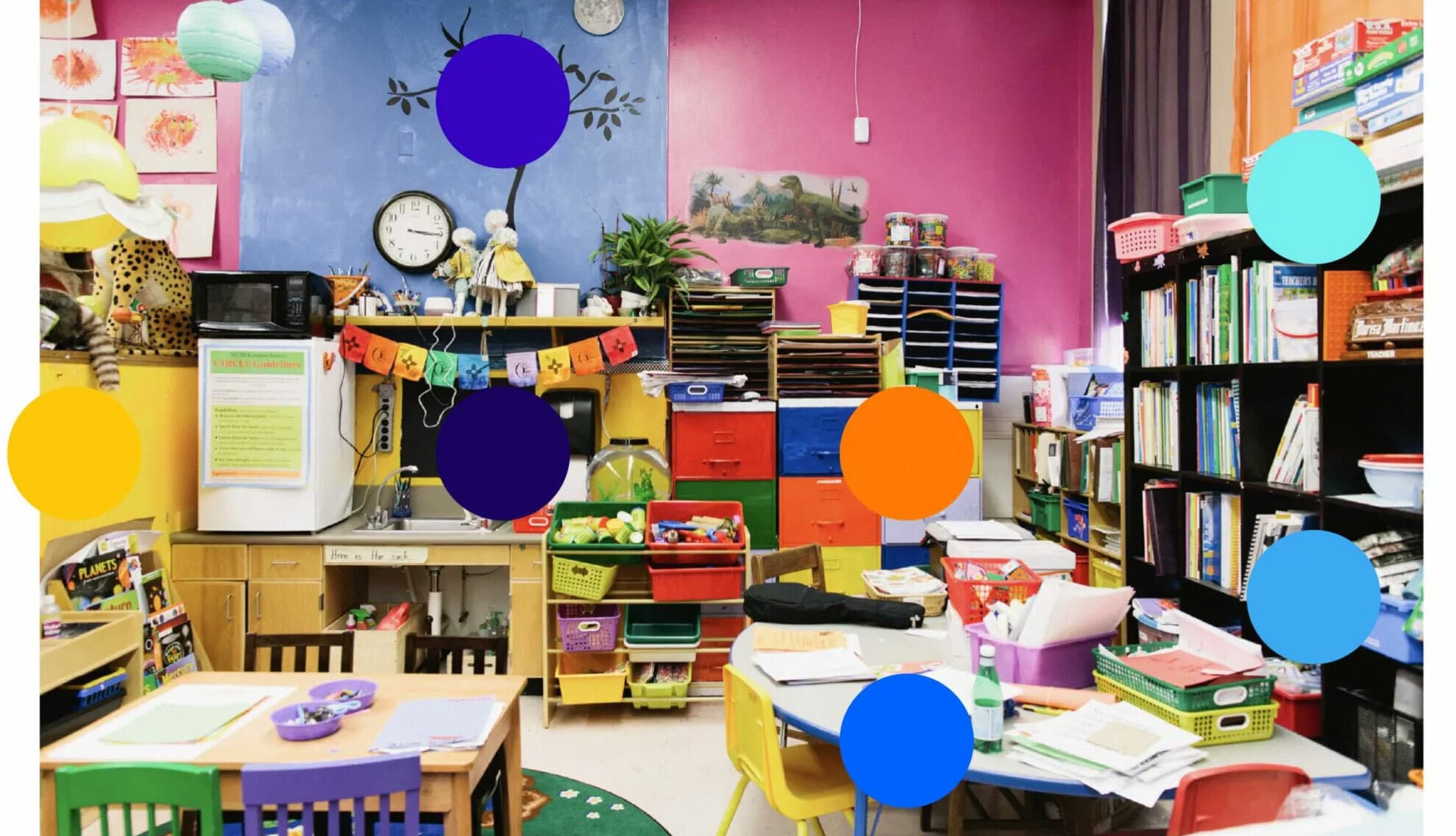
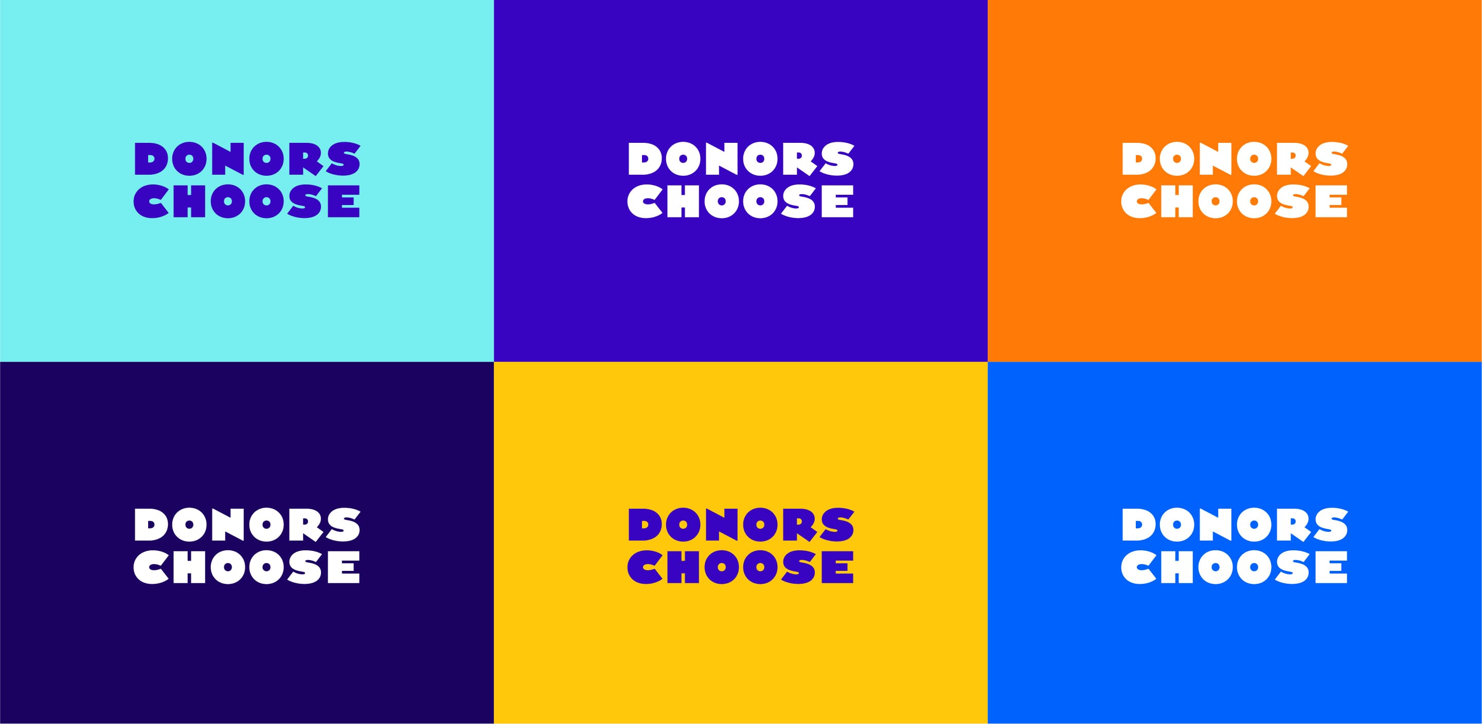
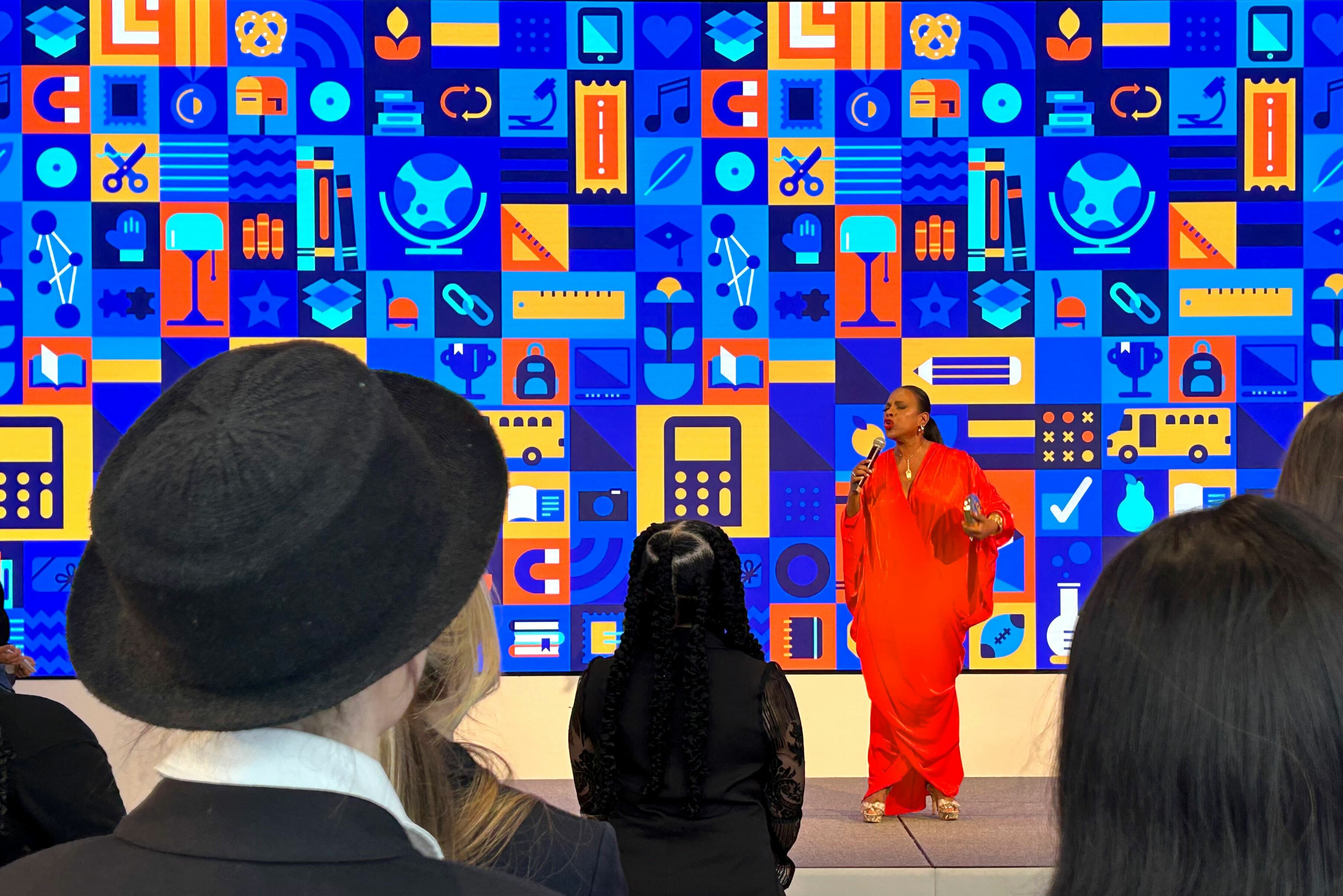
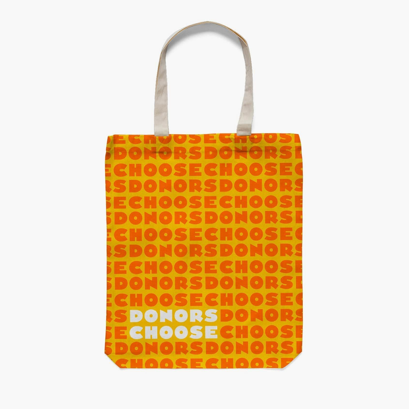
A kaleidoscope of color
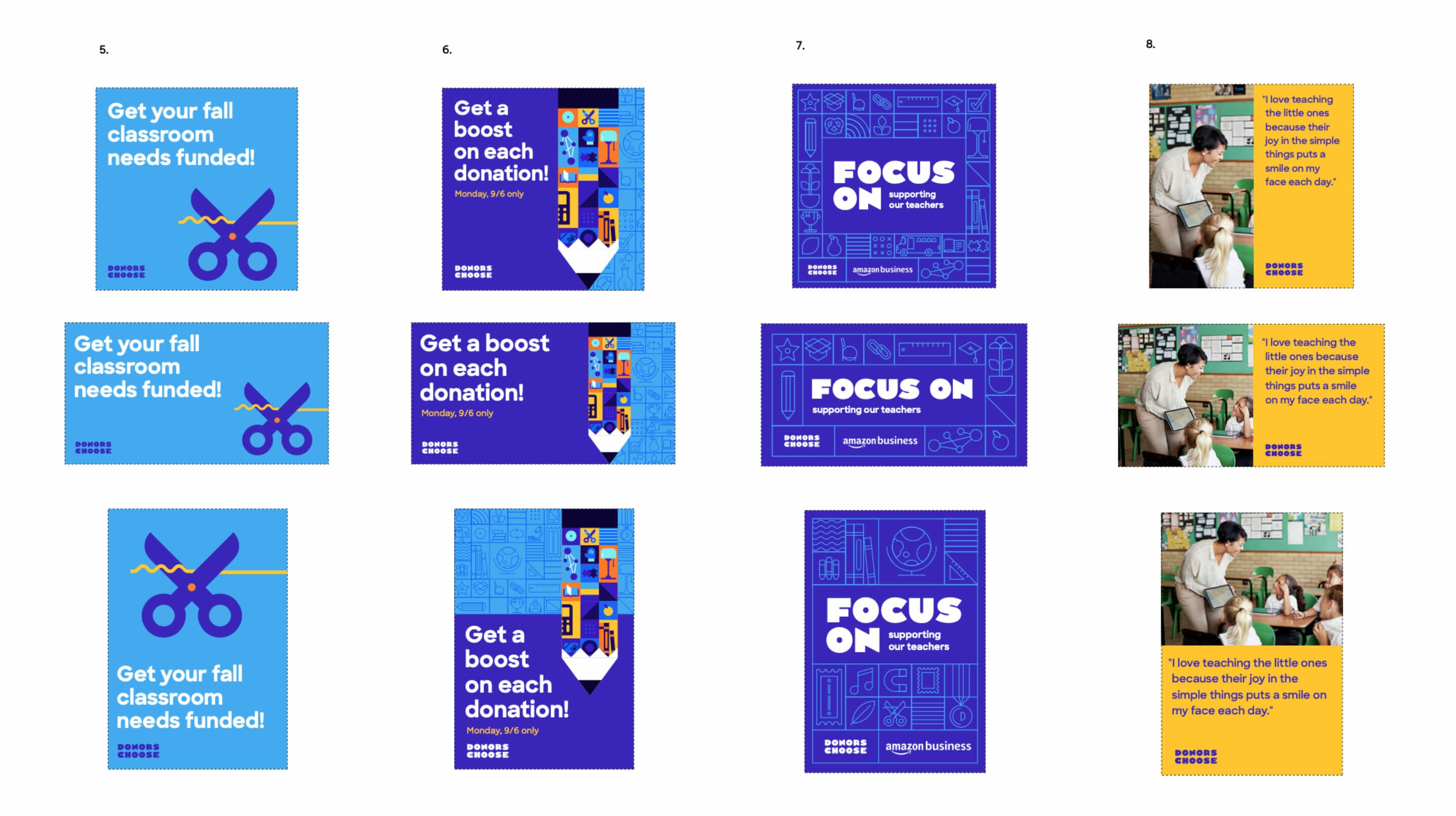
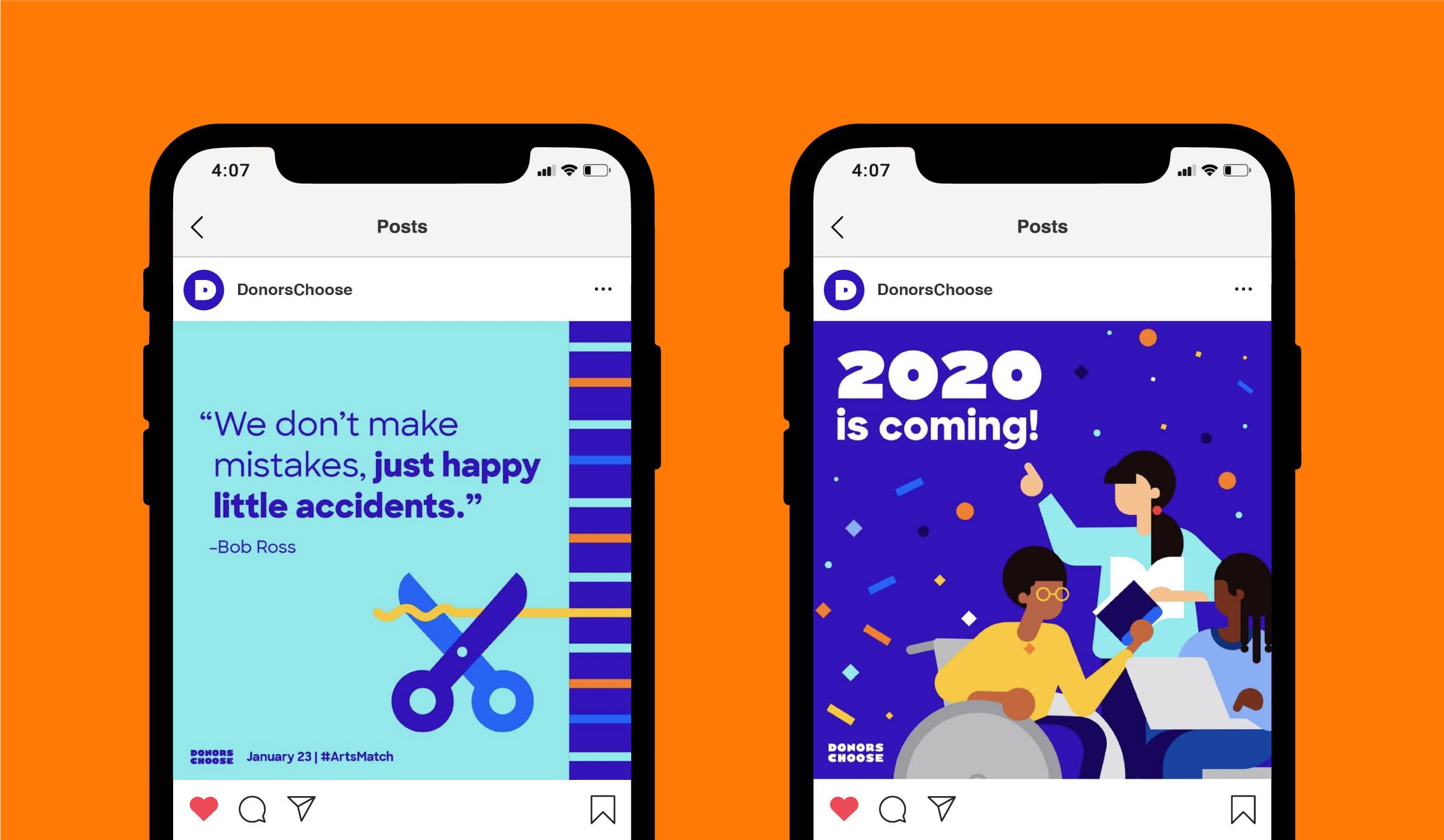
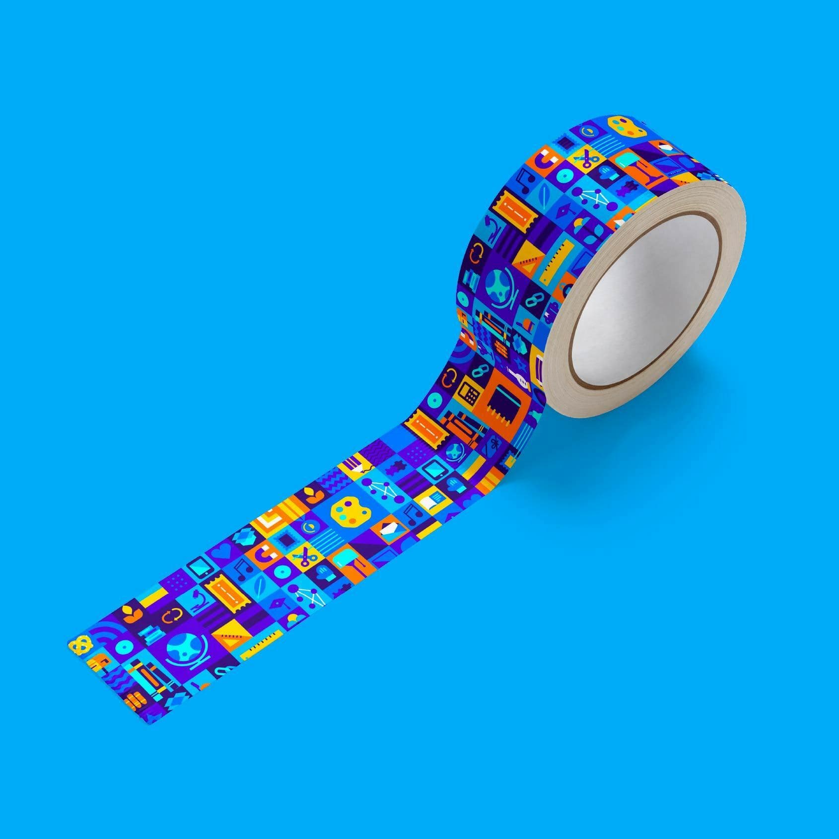
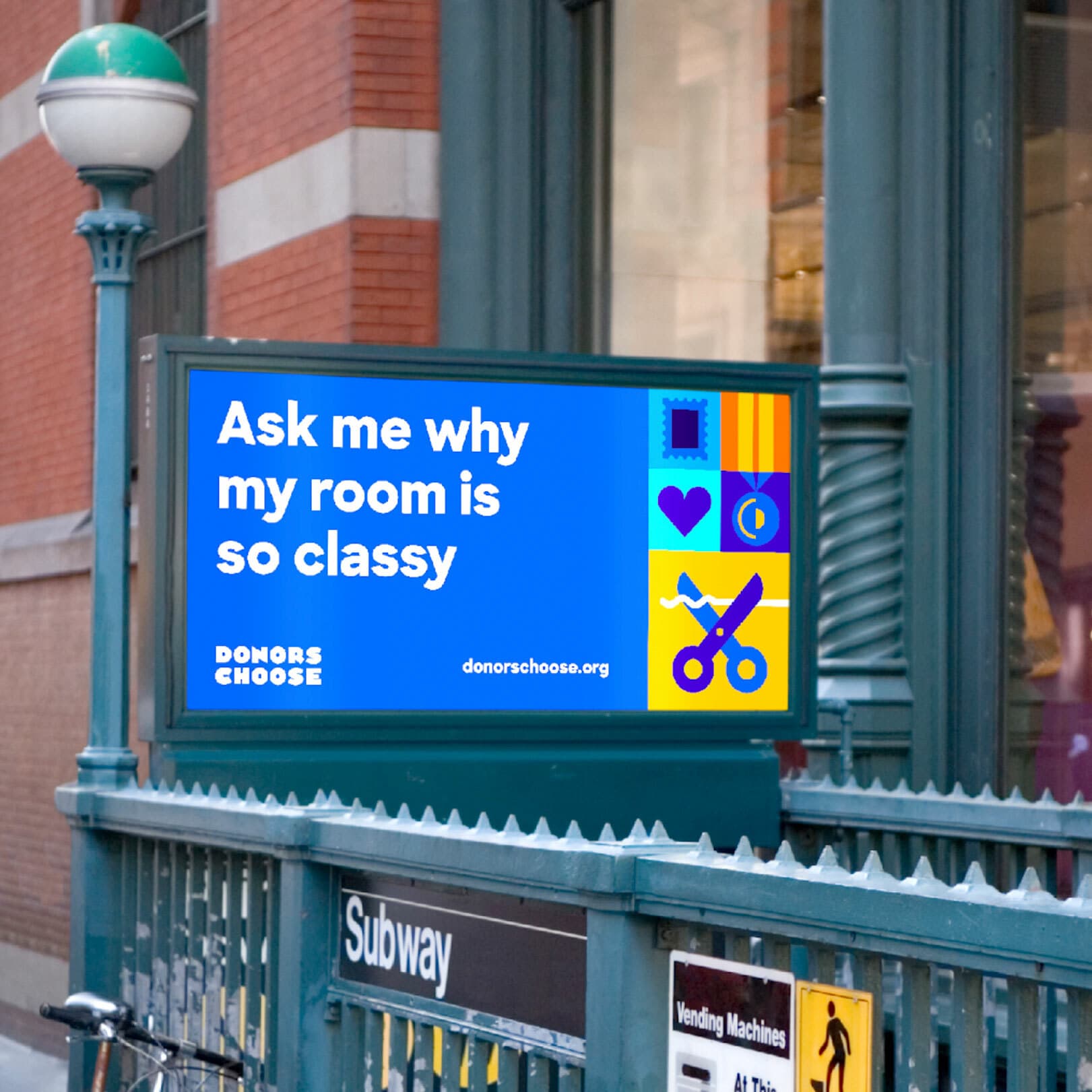
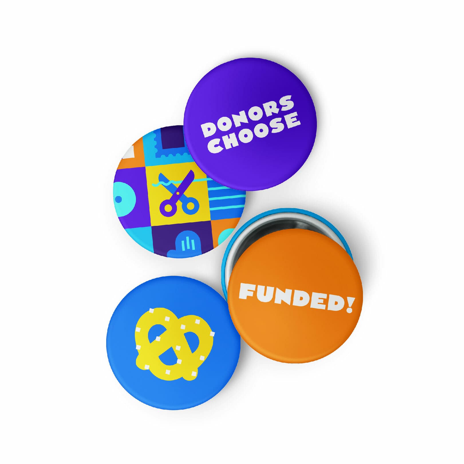
Classrooms are playgrounds of color, where bright hues mix and mingle, building energy in their spontaneous, ever-changing combinations. The main brand color, Buxton blue, is a rich tone that anchors the broader palette of aqua, yellow, and orange. We also prioritized accessibility, selecting bold, high contrast colors that are clearly legible in all brand applications in print and online.


A brand of boundless possibility
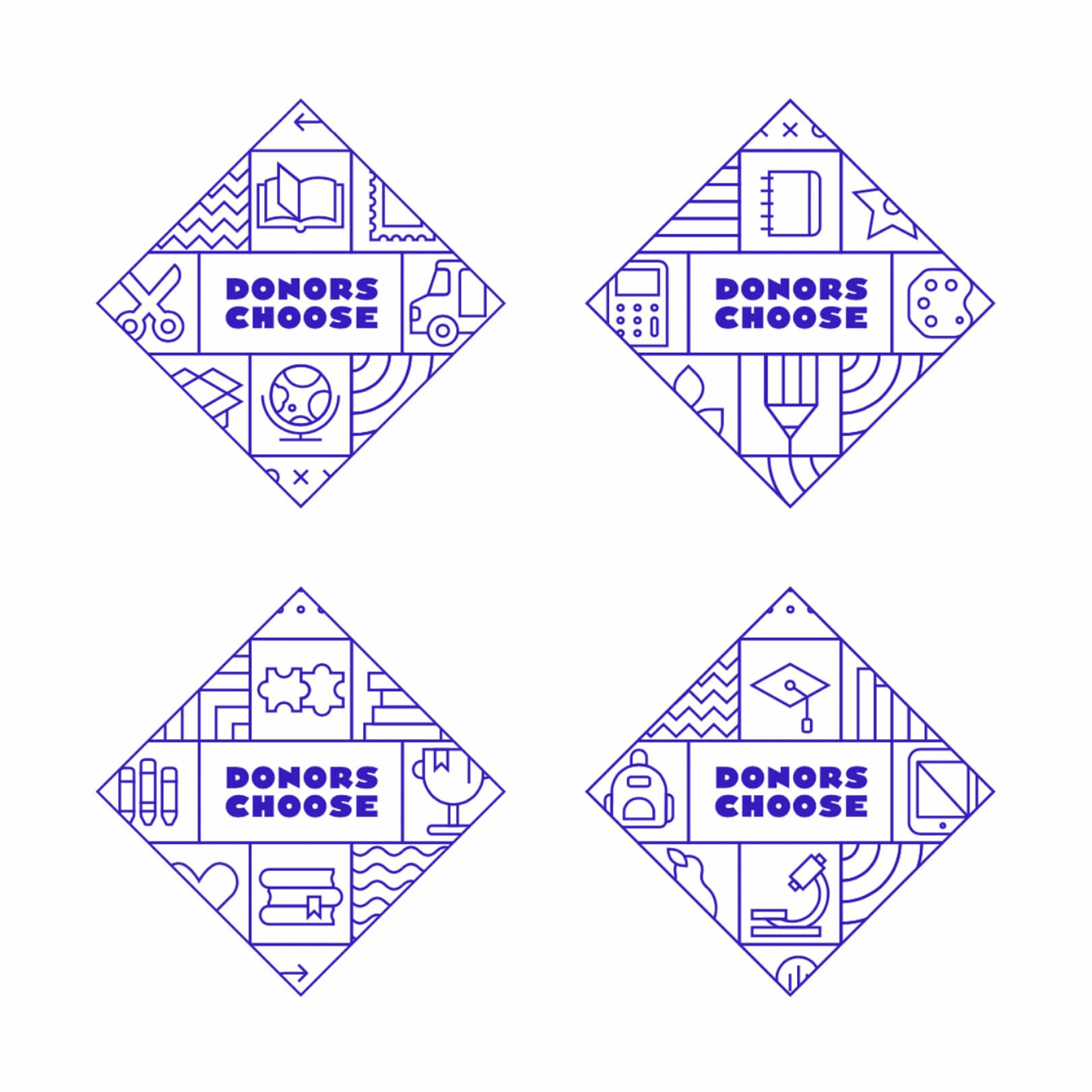
No teacher or classroom should ever feel limited by geography or money. The new brand is all about DonorsChoose making teachers’ dreams come true and empowering them to spark their students’ curiosity, awe, and wonder.
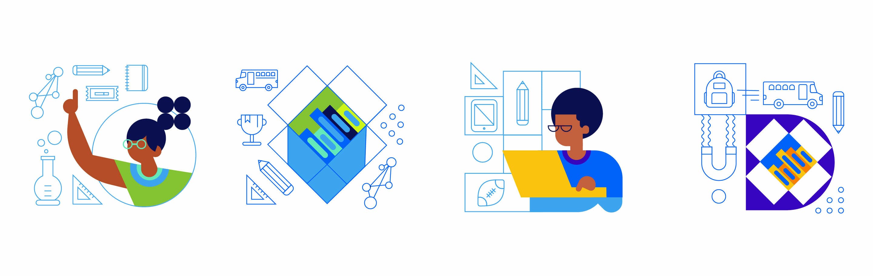
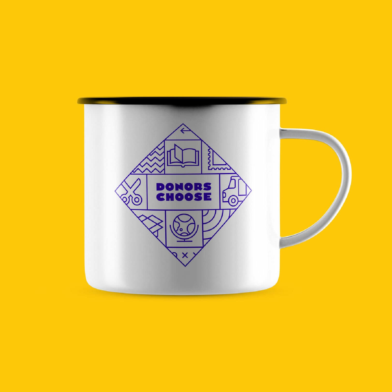
The brand is made of infinite building blocks, showing that when teachers and DonorsChoose join together, students can learn, grow, create, and explore a world with boundless possibilities.
The platform quite literally helps fill the shelves of classrooms around the country. Anything is possible. Donors can give to who they want. Teachers can ask for what they want. The new brand evokes a sense of classroom abundance and limitless imagination.


A custom font and a solid foundation
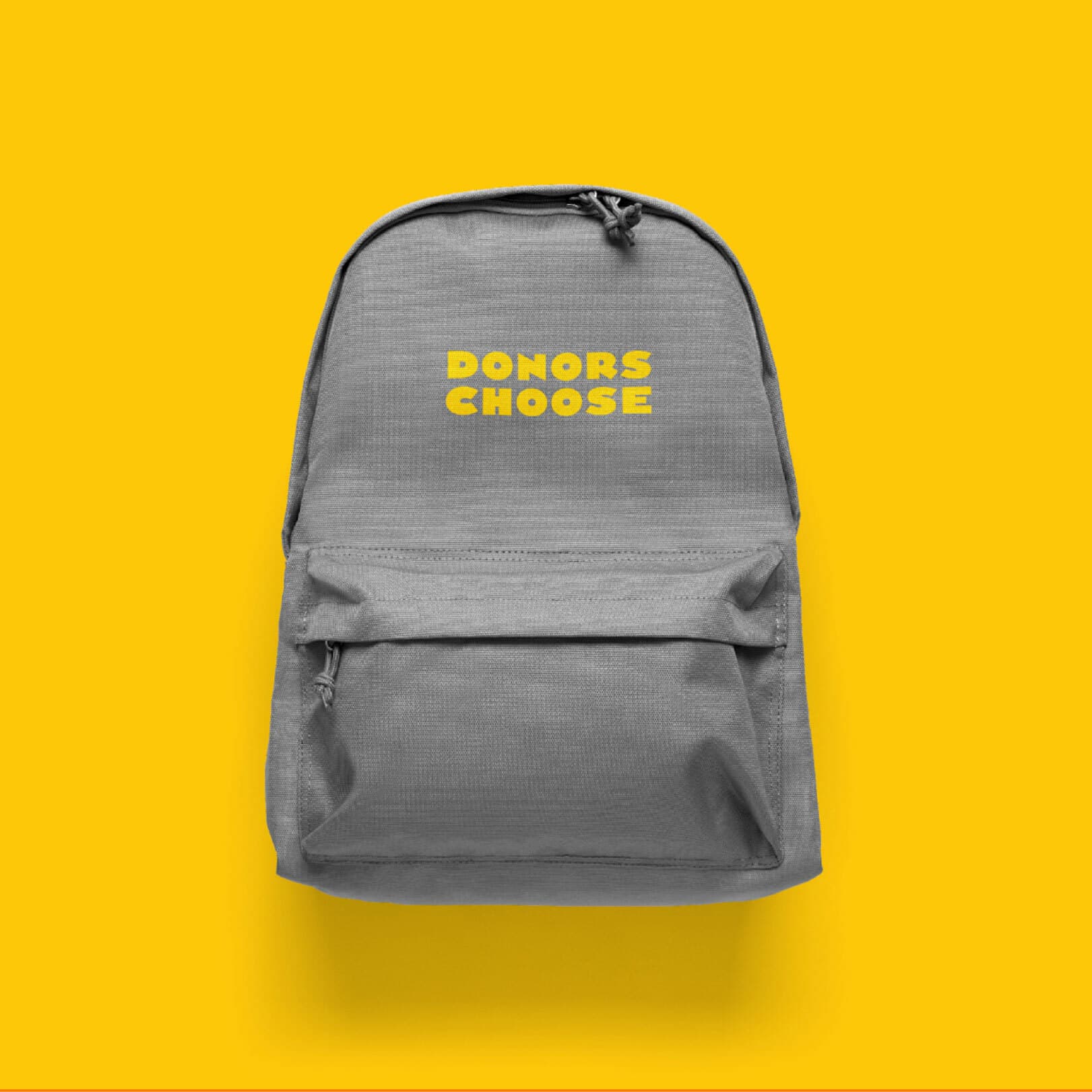
Even after dropping the original .org, the brand name posed some challenges. With 12 characters and 2 words, we had to ensure the logo didn’t become too wide. And we needed legibility and presence at very small sizes because this is first and foremost a digital brand. To solve for all of these challenges, we worked with Frere-Jones Type to develop a custom typeface for the primary wordmark. From there, the team developed a full-body display face that conveys a sense of playfulness yet holds its ground, striking the right tone between playful and reputable— it’s a brand for both students and teachers.
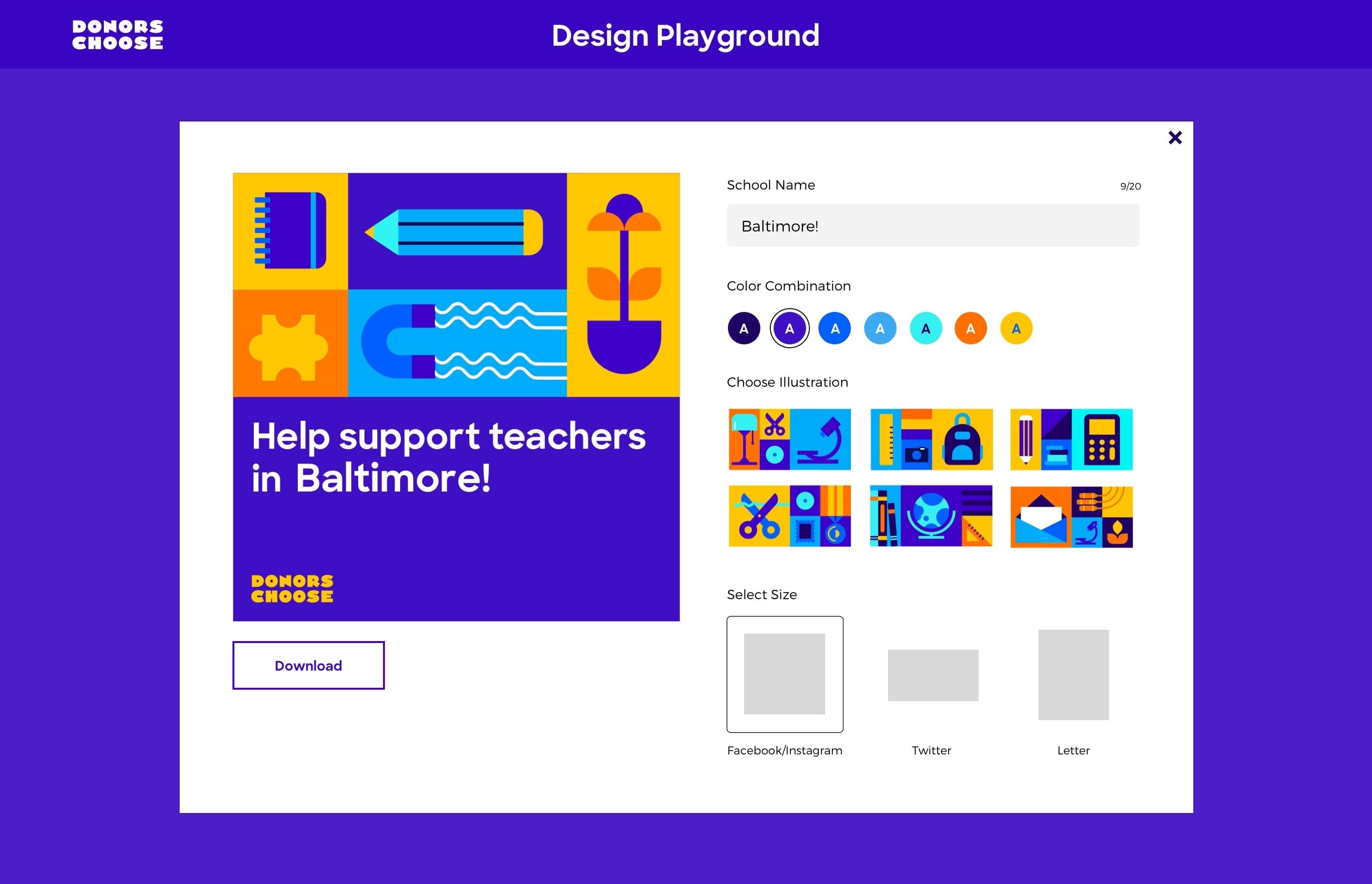
A toolkit for teachers
Make it “teacher-friendly” was our north star throughout the rebrand. Teachers are ambassadors who push their campaigns to their friends and families and advocate for their classrooms with unparalleled energy and vision. We needed to create a brand that teachers could make their own and infuse with their unique identities and personal stories. The Design Playground, an innovative outgrowth of the rebrand, gives teachers the power to create personal, beautifully branded social media assets, with custom messaging, colors & illustrations, to help them amplify their classroom campaigns.
Creative collaboration
While the Hyperakt team took the lead on crafting every detail of this brand, our work was all the better because of the rich, thought-provoking ideas generated by the DonorsChoose team. From the outset of the project, we designed a series of creative workshops that enabled the team to step away from their day-to-day roles, see their brand and organization in a new light, and experiment with what it could look like in the future.

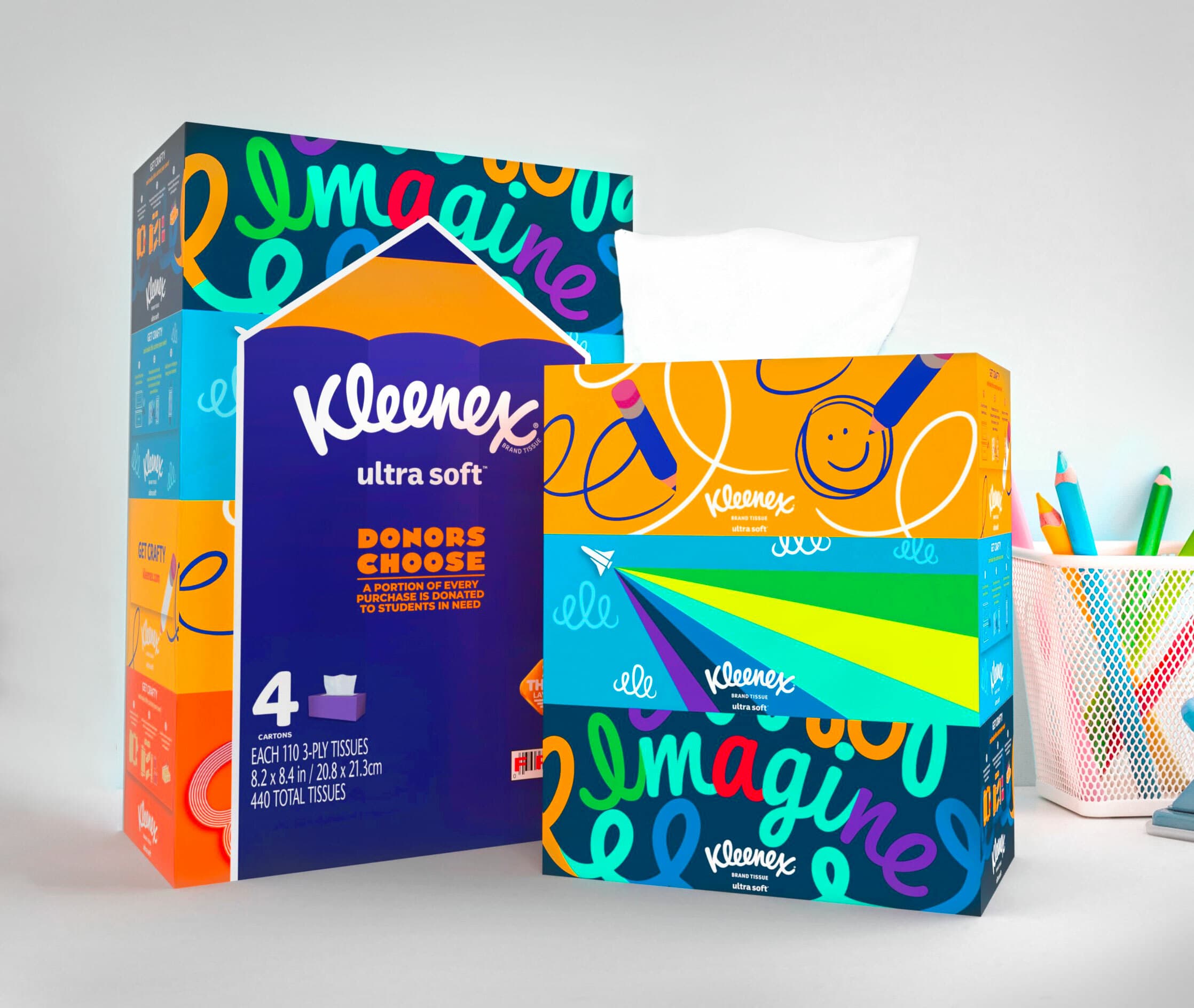
A brand built for partnerships
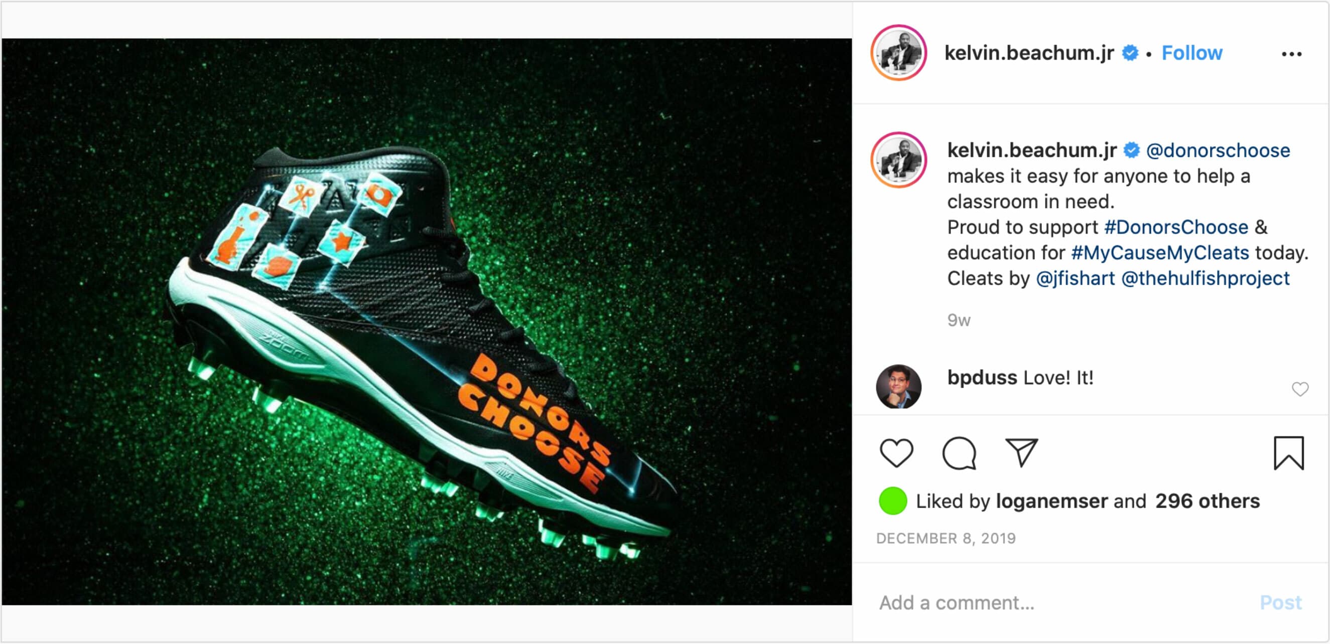
DonorsChoose is naturally positioned to partner with brands of all kinds. They needed a logo that other brands would be proud to apply to their products and feature at events.

- 24%of visitors downloaded assets from the Design Playground
- 2 mins.average time on site for the Design Playground
News & Recognition
Behind the Scenes
Project Credits
- Jarrod Mayes
- Julia Zeltser
- Sruthi Sadhujan
- Laura Jo Hess
- Logan Emser
- Dylan Viola
- Anjali Nair