Robert Wood Johnson Foundation
Redefining what it means to be a philanthropy in a world underpinned by structural racism.

Background
RWJF has been at the forefront of improving health in our country for decades—from the development of the 911 emergency call system to the national effort to decrease tobacco addiction and smoking rates.Then in 2020, the world changed. As the pandemic, racial reckoning, and economic crisis collided in the perfect storm, the foundation found itself on the threshold of both an opportunity and a challenge. Here was a venerable institution, with an abundance of influence and resources, ready and willing to help. But how?
The challenge
The story of RWJF in 2023 is one of shifting power, underscored by the urgency of racial equity. Long before 2020, the Foundation had been pivoting to address structural racism in health. Breaching this new terrain had spurred the Foundation to ask itself some existential questions: What is our power for? Are we putting it to the best use? Should we wield it, share it, or cede it?

The opportunity
The time had come for RWJF to acknowledge its power, articulate how they will use it and share it, and make a compelling case for why. For too long, norms and practices for achieving health and wellbeing had been driven from the top, by traditional institutions, with a narrow point of view. We had an opportunity to unleash community wisdom and expertise and combine it with institutional knowledge and resources, to get us to health equity, faster and together.
Brand Idea
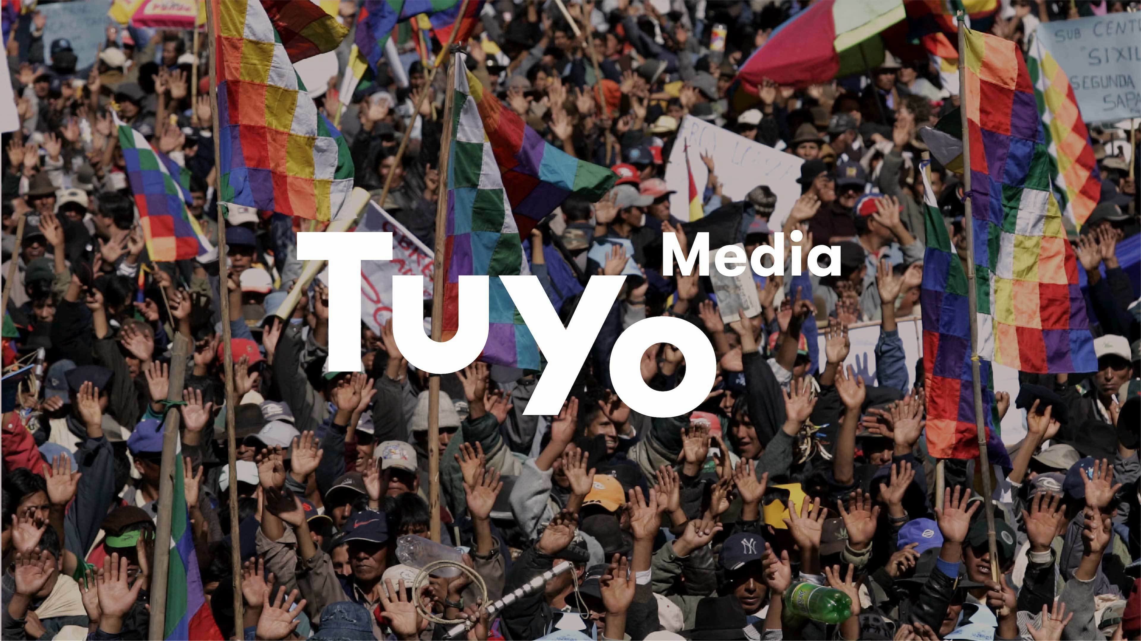
Expanding Boundaries
Old ways of working were based on a strict set of rules, determined and controlled by the few – rigid, linear, and designed to keep some people in and others out. This visual identity is about breaking rigidity and finding fluidity. RWJF is expanding its thinking to be more dynamic and emergent and its ways of working to be more like a call-and-response system rooted in deep listening and adapting quickly. Both are necessary components for expediting a future of racial and health equity.

Shedding RWJF’s wings
RWJF’s new logo sheds the wings of the previous, to create a crisper, cleaner mark. It also embraces their shorter acronym, RWJF, rather than the longer Robert Wood Johnson Foundation. This allows us to center the work of the Foundation itself, rather than the founder. The lowercase lettering shows RWJF’s shift in power: recognizing the power of community wisdom with humility - while the type itself still conveys their confidence and ambition in the space.


New purpose for a new paradigm
To reflect RWJF’s new commitments and new perspective, we created a new purpose statement for the organization: combining their mission and vision. This new purpose shows the world what they stand for - a future where health is no longer a privilege but a right.
Purpose:
Take bold leaps to transform health in our lifetime and pave the way together to a future where health is no longer a privilege, but a right.


A visual identity that expands boundaries
RWJF’s new brand was built on power bilingualism: acknowledging the power the Foundation holds and the influence it wields over systems, with a promise to combine this power with community power and wisdom. The new visual design system was built to mirror this fluidity – breaking out of rigid, linear systems to a more dynamic and adaptive one.


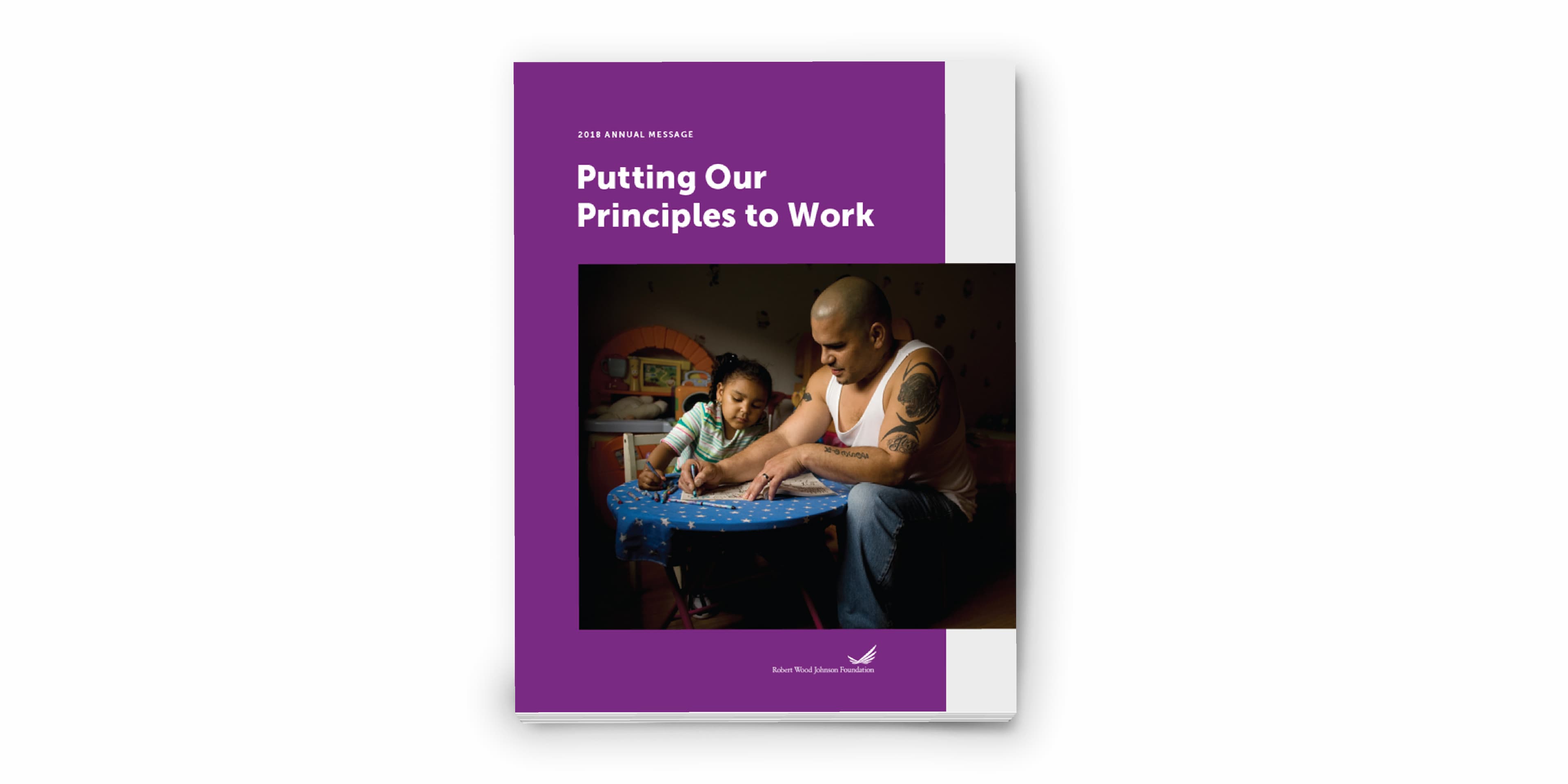
Urgent colors for an urgent issue
RWJF’s new brand colors convey more urgency and vibrancy. The primary palette leads with expansive purple, deep blue and off white that reflects the new boldness of the organization, and the secondary palette maintains and complements that brightness.


Project Credits
- Sana Masud
- Pauline Shin
- Sruthi Sadhujan
- Julia Zeltser
- Deroy Peraza
- Domenica Ceballos